It’s funny, because I ended up discovering this effect during my trial and error of working out the Rain tutorial.
I didn’t think I’d end up actually making a tutorial for this effect – since I only know of one application for it – but I figured, maybe someone else out there needs to add creepy/broken-down/horror vibes to their project.
So if that’s you: you’re welcome!
Step 1
Get a picture of a television set and add it to your project.
I personally decided to go with an older looking set because I think it will help make the effect look more real, but you can use any television picture you like.
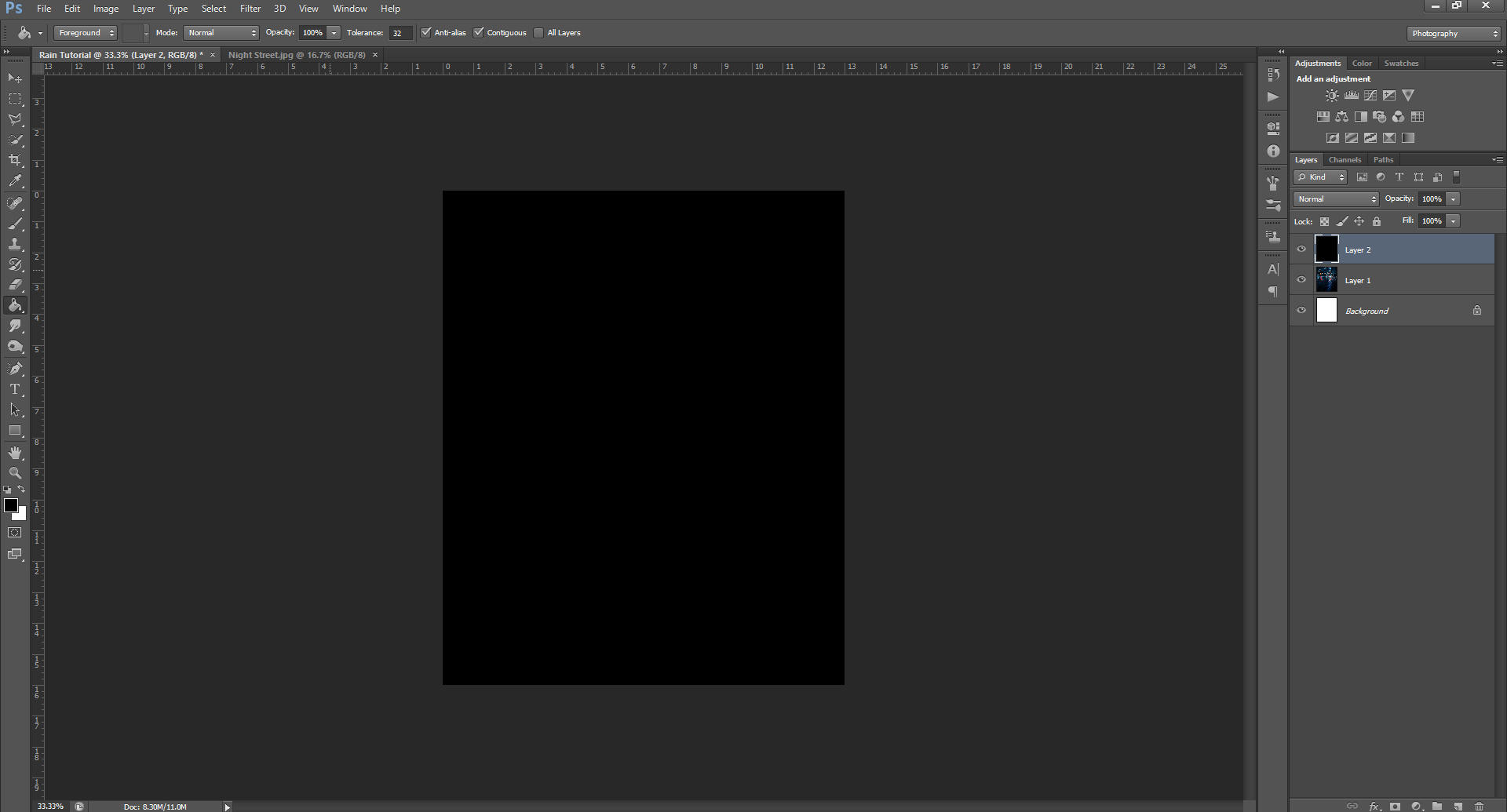
Once you’ve decided on a picture to use, create a New Layer and then fill the layer with the colour black.
Step 2
Next, go up to the top menu bar and find Filter – Noise – Add Noise from the drop down menu.
You can play with these values later, but for now, we’ll want to keep them to:
Amount of Percent 25%
Distribution Mode: Gaussian
Also make sure the Monochromatic box is checked.
Step 3
Now, we’re going to add the static to the television. There’s a couple different ways to do this, but I’ll show you the fastest way first.
Go to the Layer Opacity and change it so you can see the picture under the Noise layer, but are still somewhat able to see the Noise layer. For me, this was 40%.
Once you’ve done that, go up and use the Rectangle Select tool, then outline a rectangle shape that’s a little bigger than the screen on the television set.
Next, we’re going to right-click on the layer and select Inverse Selection from the drop-down menu. Then, you’re going to use the Eraser tool and start erasing everything outside of the box you created.
This is getting rid of the Noise that’s over the rest of the layer, and will leave us with just the Noise over the screen of the television.
Continue erasing until you’ve got everything outside of the box you created.
Step 4
To deselect the box you’ve created, go back to the Select tool, right-click and then choose the Deselect option from the drop-down that comes up.
We’re going to need to zoom in for this next part, so go ahead and zoom in until the television screen is about the only thing we can see in the document.
Now that we have a better view of what we’ll be doing, the first thing we’ll be doing now is erasing the box to fit the screen of our television better.
If yours is already pretty perfectly fit, with minimal overlap, you can skip this step.
If you need to, don’t forget you can change the size of your Eraser to make it smaller and easier to work with while being zoomed in.
Step 5
Right-click on the Noise layer and select Warp from the drop down menu.
Then, very carefully, drag the edges of the Noise layer until it appears to bend slightly into the curves of the television screen. If you chose something closer to a flat screen/modern television set, you may not need to do this step as drastically, but slightly warping the layer will still help give it an air of realism.
Once you’re happy with the Warping of your Noise layer, hit Enter on the keyboard or try to click the Pointer tool, and then in the dialogue box that pops up, select Apply changes.
Step 6
If needed, you can re-erase the edges of the Noise layer so they match up with the edges of the television screen.
If not, go ahead and you change the Opacity of the Noise layer back to 100%.
If you want a subtler static on the television, you can keep the Opacity lower. Depending on why you’re adding the static, you can even keep it semi-see through, and add a picture to the screen, so it looks like it’s a bad connection, instead of just being completely out.
Once you decide you’re happy with whatever you decide, you can go ahead and save this bad boy because we are done!
Like this tutorial? Check out the rest of the series here!
This chalk effect can be used for all kinds of pictures – fake children drawings in summer, blackboard writing, etc. – but the reason I taught myself this effect was because I needed a chalk person outline for my book Crimson Smile’s cover.
Luckily, whether you’re using it for faux murder or something a little more PG, the steps are exactly the same!
Today I’ll be showing you how to do the effect with the murder outline, just because it’s the first way I learned, and I think it’s cooler than the other uses, but rest assured: I’ll show the more everyday use examples at the end of this tutorial.
Step 1
You’ll want to have a background image for this effect, so go through your library of royalty free images, or if you don’t have any saved, check out Pixabay or Pexels to download some. Today, since I’ve decided to keep the murder theme, I’ve chosen a night time road.
I’ve also changed it’s name from the default Layer 1 to Background, just to help keep things straight.
Once you have the Background picture, you’ll also need the person to apply the effect to. The simplest way to do this, is to find a silhouette picture of a person laying down (preferably, with their limbs out) and then outline and erase the inside. (Don’t worry, I’ll show you how to do that)
If you want to do it the long way, pick any picture of a person you want to use, and then manually erase all of them until just an outline of a person is left, and then dye the outline black.
All that’s left to do now is to erase the background of the person image (if your picture has one) and re-size the image to a more appropriate size, so it fits into your background image. You can also rotate the picture if needed.
Step 2
To get my person picture as just an outline, I’m actually going to use the Outer Glow technique, so go ahead and read through that tutorial if you need to. If you don’t, go ahead and skip to Step 3.
For this instance, instead of making the outline ‘glow’, I’m going to keep it a solid colour – I chose red for now, so you can see which part this step is – and keep the Opacity at 100%. I’m also going to change the Spread and Size values.
You can go ahead and play with these until you’re happy with your own outline.
Once you’re happy with the outline, all you need to do is go to the Eraser tool and use the Magic Eraser, then click on the inside of your person, to erase the inside, and just leave the outline.
After this, I also just changed my outline colour from red to black. You guys shouldn’t need to do this, unless you for some reason also made your outlines a bright colour.
Step 3
Okay, now that we’re set up, we can actually begin on the Chalk Effect!
To start, you’ll want to go up to the Filter tab in the top menu, then find Stylize in the drop-down and then click Find Edges.
If it doesn’t look like anything happened, don’t worry! You probably won’t be able to see this step because of the black colour, but it’ll become evident if we did it right during the next few steps.
Step 4
Next, we’re going to find Image in the top menu, and then go down to Adjustments, and click on the Invert option from the drop-down.
Then we’re going to go back up to Image – Adjustments and this time we’re going to click on the Desaturate option.
Step 5
Now we’re going to go back over to the Filter option in the top menu, and then click through to the Filter Gallery.
Welcome back to the Filter Gallery!
As you can see, the last time I was in here was for the Stained Glass tutorial.
Today, though, we’re going to find the Rough Pastels option – which is in the Artistic folder – and then put in these values:
Stroke Length: 0
Stroke Detail: 15
Texture: Canvas
Scaling: 60%
Relief: 13
Light: Bottom
Once you’ve done that, click the Okay button to apply the changes to your person. This will also close the Filter Gallery and bring you back to the main PHSH workspace.
If for some reason, like my Preview box, yours showed nothing, you should also be able to see the effect on your person outline.
Step 6
At this point, as I said, you should be able to see the effect on your person. If you cannot, as I didn’t, you may want to skip the Outer Glow step. This will depend on the picture you use.
The person silhouette I chose for the tutorial, didn’t need the Outer Glow step. But I didn’t realize that until this point in the tutorial.
After my Step 5 didn’t seem to work, I tried it again, without stopping to take the screenshots. This is something that has happened in a couple of past tutorials. Some of these effects require you to do them one right after another, not do one, wait, take a screenshot, switch tabs, save the picture, write down the step in an article, and then click back over.
It’s a tad annoying, but you learn more through trial and error, right?
Anyway, so after trying to do the effect again and it still didn’t work (despite not clicking away), I decided to try again, but this time I omitted the Outer Glow step. This is because I realized the Find Edges step can’t find any edges of the picture if we erase the picture and just leave the Glow outline.
PHSH doesn’t recognize the Glow effect as an outline of the person, so the other effects didn’t work.
Luckily, this was the only fix that was needed!
The below screenshots are the same exact sequence, just without the Glow to make the outline:
This turned the inside of the person white, and outlined them in black
This step as it implies, inverts the black and white of the step above, so now the outline is white
And hey, look at that, we have a preview now!
Okay, now we’re exactly where we should’ve been the first time around.
At this point, now we can safely use the Magic Erasure and erase the black part of our person.
Step 7
We’re pretty much done now, but if you think your chalk outline looks a little too… crispy white, especially against a darker background, you can go to the Blending Mode of the person layer and change it to something like Screen or Overlay. If this still doesn’t look quite right to you, you can also slightly change the Opacity until it fits.
Once you’re happy with the Opacity, you can also slightly Warp the image, if you need to.
This is a little thing that can help give the effect just that little extra push into being believable. You want the chalk to look like it’s actually on the road. You might also find it helpful to zoom in for this step.
But same thing, this comes down to personal preference and what pictures you started with.
Once you’re happy with the way you’ve Warped the picture, you’re done! Don’t forget to save both a PHSH (.psd) file and picture file of the effect.
At this point, you can also start playing around with different looks to explore what else you can do with the chalk effect!
For example, if you combine this effect with the Rain effect and lower the Opacity of the chalk layer to around 20%, it can also give the illusion that the chalk is being washed away.
Or as I said at the top of the tutorial, you can use this effect to make much more than just murder outlines!
Like… blackboard drawings!
Or blackboard writing!
Or….
Like this article? Check out the rest of the PHSH Tutorial series here!
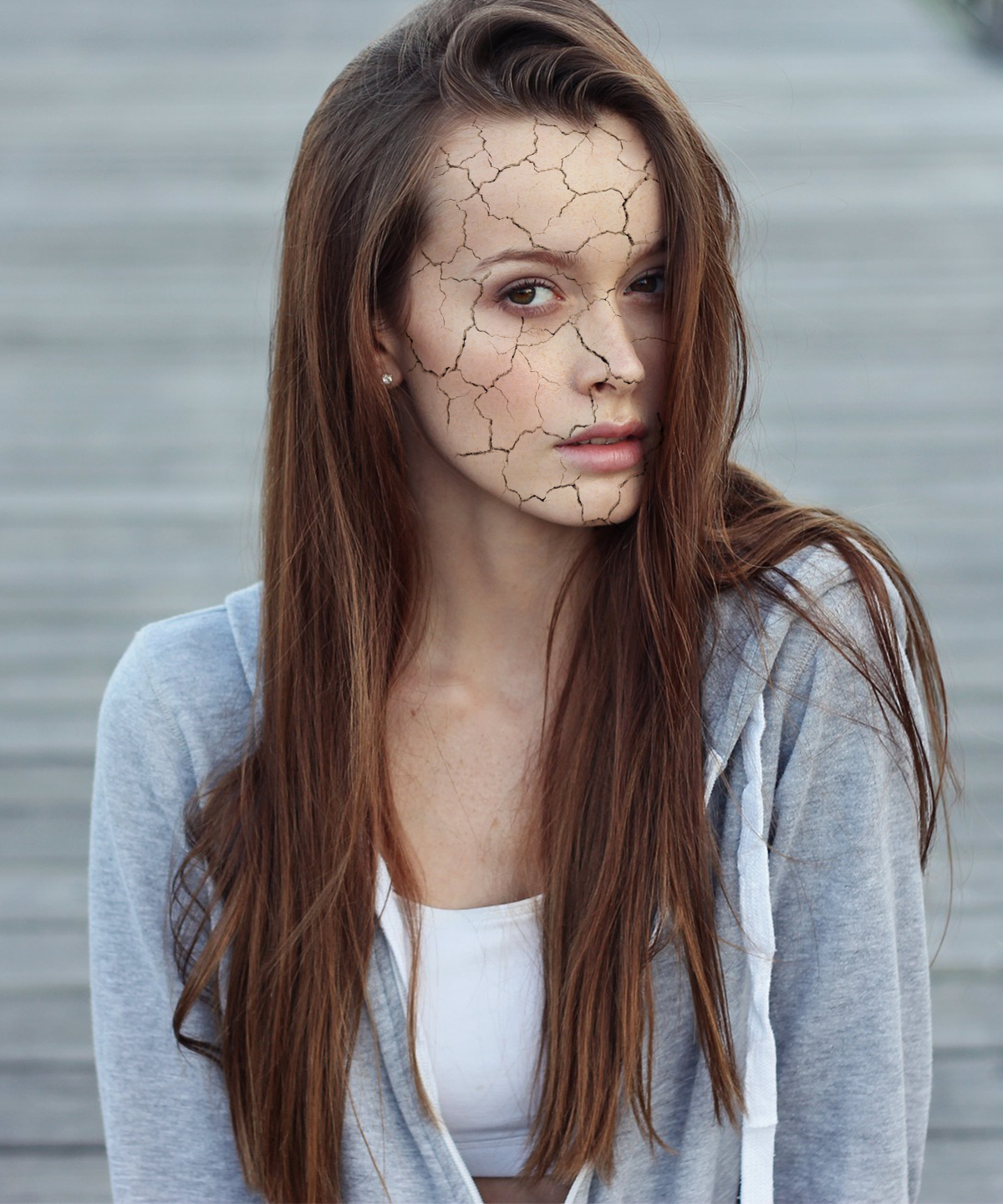
Since it’s summer, I thought I’d stay on theme and show you how to make a cracked skin effect.
Not only is this effect relatively easy (and fun) but it can also serve as a good reminder to wear sunscreen and lotion!
Step 1
As always, you’ll want to make sure you’re starting in a New Document. You’ll also want to use a picture of a person for this tutorial as well as a cracked texture of the ground. If you missed the first tutorial in this series, you should be able to find either of these pictures on a royalty free image website such as pixabay.com. You’ll need to make sure you’re using royalty free images if you plan on using them for your book’s cover or promotional posters.
If however you’re here just for fun or practice, you can use a search engine to find the pictures you need.
For the cracked ground picture, you’ll want to use one that has no obstructions, many cracks, and is more or less level.
For the person picture, you can use any picture you’d like, as long as there is a clear spot of skin somewhere. I haven’t tried this effect on clothing, but I’d imagine it would still work. Any picture with a clear spot of skin will do.
To keep things simple, these are the pictures I’ll be using.
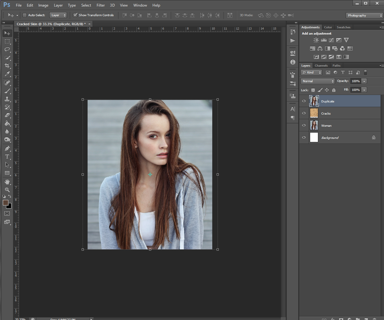
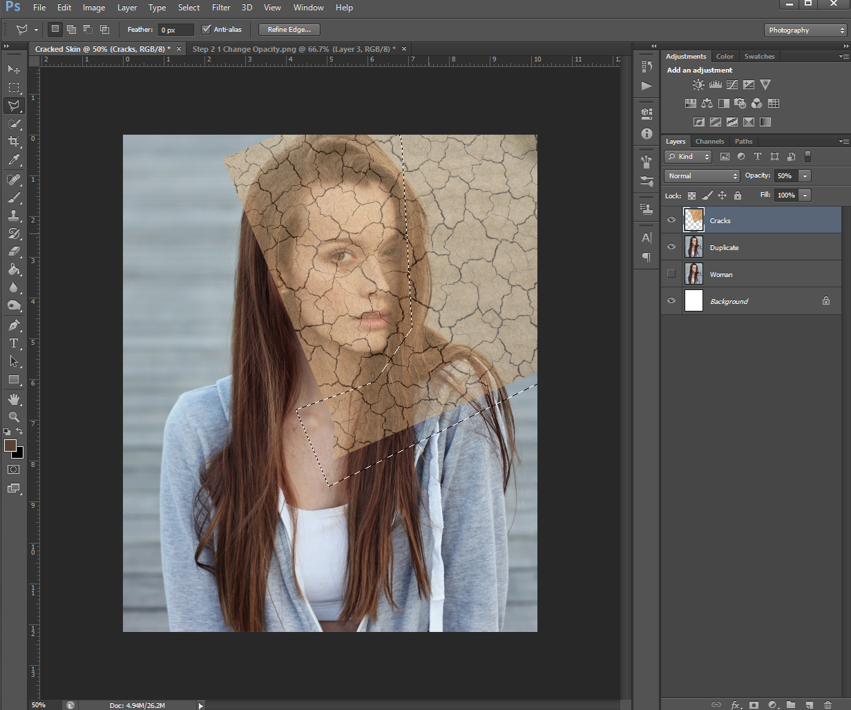
Once you choose what pictures you’d like to work on and have them in your work document, go ahead and Duplicate the person layer. If needed, you can also rename the layers to keep things straight. I renamed the original person picture “Woman”, the cracked texture “Cracks” and the duplicate layer “Duplicate”.
Step 2
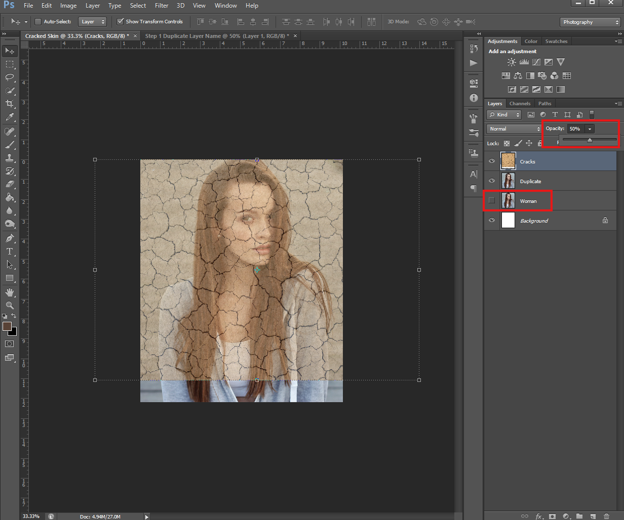
Now that you have yourself all set up, change the Cracks layer Opacity to about 50% or lower. You’ll want to be able to see the face underneath, but you’ll also want to be able to see the cracks. If needed, you can also Hide the original person layer by clicking the eye next to it’s thumbnail in the Layers panel and/or rearrange the layers so the Cracks one is on the top.
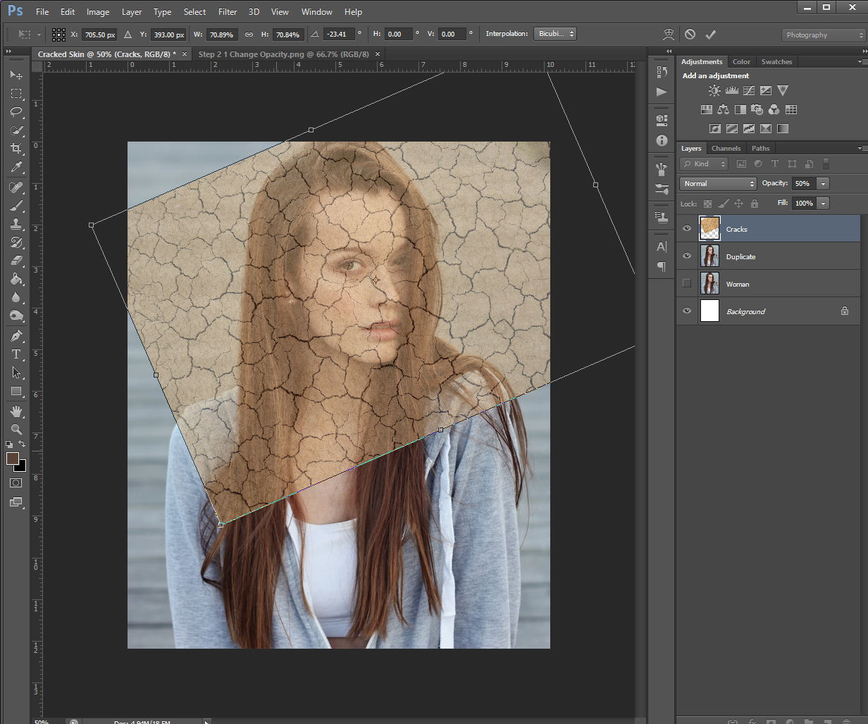
Once you’ve changed the layers Opacity, go ahead and align it over your person picture if you haven’t already done that. If needed, you can also rotate and/or resize the picture. The goal here is to get the best looking cracks over the person’s face.
Make sure you don’t resize the cracked texture picture too much, you’ll want to keep it slightly bigger than your person for the following steps. Don’t forget you can always erase what you don’t need at the end.
Step 3
Next, using the Polygon Lasso Tool, select the parts of the cracked photo that are NOT over the face (the ones you don’t need) and then Delete them.
You can Delete your selections by hitting the Delete button on your keyboard.
You’ll also want to make sure you leave some of the texture over the hair and neck (for example) because we’ll need a bit of wiggle room to work with in the next few steps.
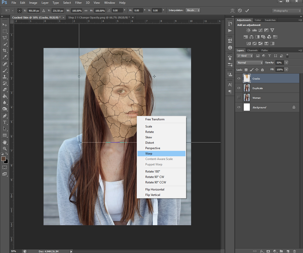
Step 4
Once you’ve removed most of the unneeded parts of the Cracked picture, right-click on it, and select Warp from the drop-down menu.
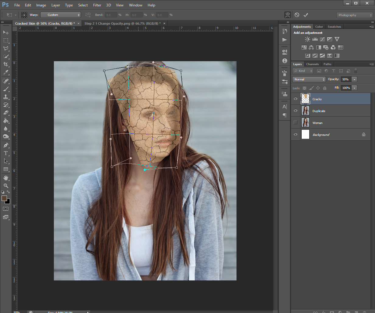
Next, Warp the Cracked layer to fit the face on the below layer. Do this part as slowly as you need to, doing a little at a time. If you warp the cracked texture too much, you may end up doing so to the point it doesn’t look good.
Once you’re happy with the amount of warping, click Enter to apply the changes.
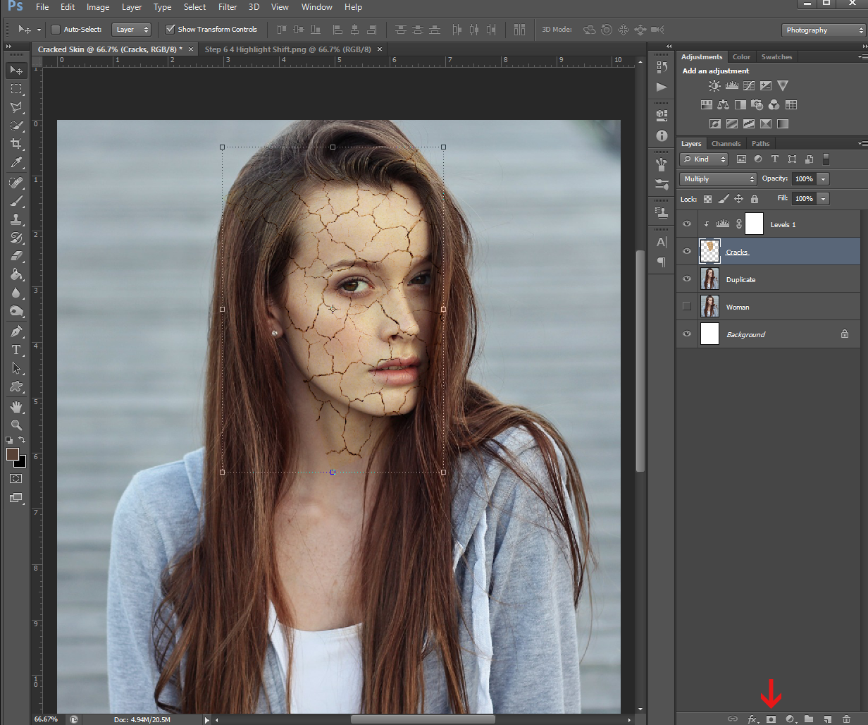
Step 5
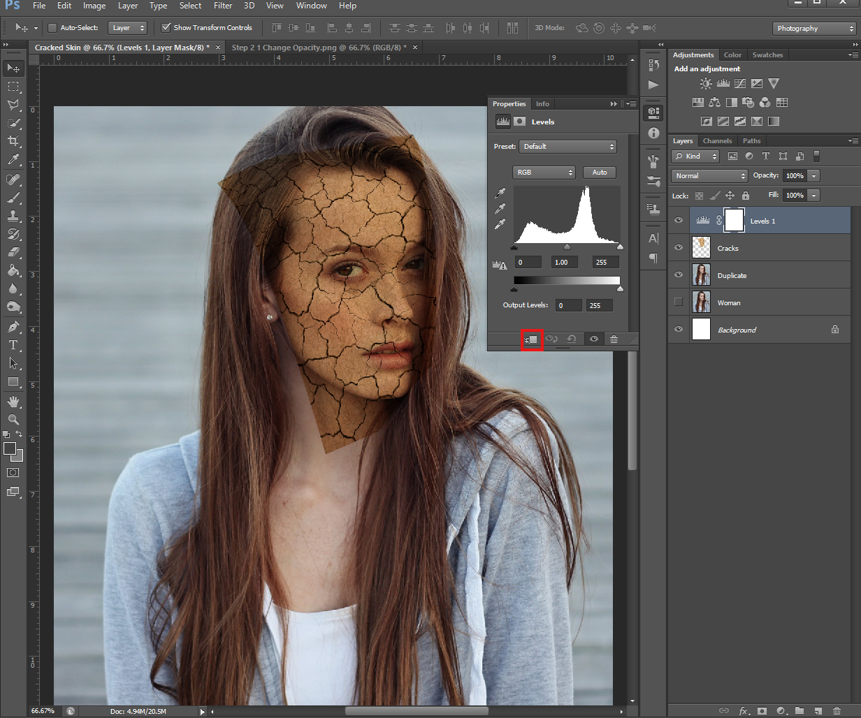
Bring the Opacity of the Cracked layer back up to 100% and change it’s Blending Mode to Multiply.
Step 6
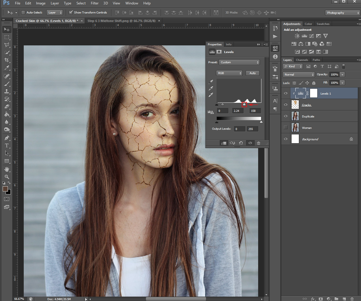
Next, you’re going to create a New Adjustment Layer by going to the Adjustments box that’s on top of the Layers panel, and clicking on the Levels button.
In the Properties panel that pops up, check mark the square at the bottom (next to the eye) this will Clip to Layer. (Meaning the effects will only affect the Cracks layer, instead of the whole project)
After that’s checked, drag the Midtones arrow toward the left. You’ll want to drag it until the Cracks are roughly the same shade as the skin of your person. For me, this was about 2.24.
You’ll also want to drag the Highlights arrow to the left to even out the lighting. Again, this will depend on the picture you’re using, but for me, it was 158.
Once you’re happy with the adjustment, go ahead and close the Property panel. Do this by clicking on the double arrow at the top right corner of the box.
Step 7
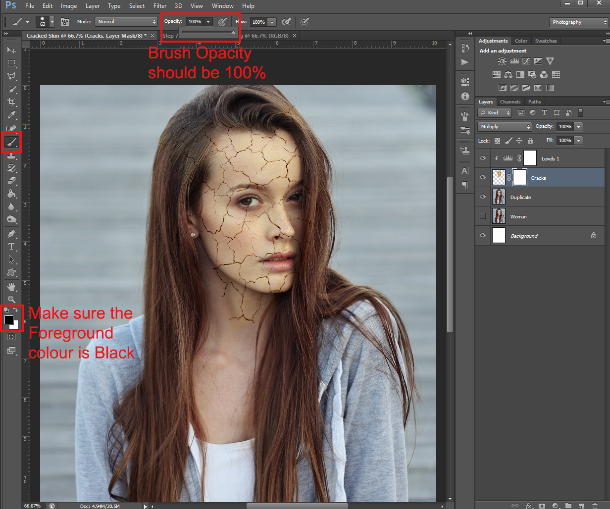
Next, we’re going to create a Layer Mask for the Cracks layer. To do this, head to the bottom of the Layers Panel, and click the Layer Mask button.
Once you have a Layer Mask, make sure your Foreground colour is set to Black, then use your Brush tool to mask the areas of the Cracks picture you don’t want. You’ll want to make sure the Brush Opacity is at 100% and the Hardness is semi-hard. (Anything over 50% Hardness would work)
You can also use this method to get rid of extra cracks that are on the persons face. (If you feel there are too many)
Alternatively, you could just use the Eraser tool for this, but you’d have to be more careful when erasing the cracks over the face.
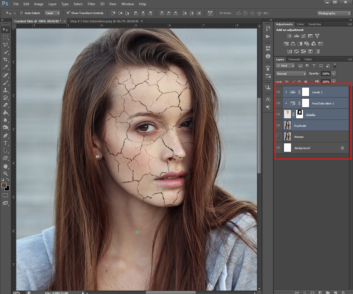
Step 8
After you finish that, we’re going to add another New Adjustment Layer. This time, it’ll be a Hue/Saturation layer.
Just as before, make sure the box on the bottom of the Properties panel is selected so the Hue/Saturation layer is Clipped to the Cracks layer.
You’ll want to change the Saturation to something low (mine looked best at -66) so the Cracks layer is almost indistinguishable from the skin colour of the person on the other layer.
Step 9
The next step is to Merge our layers. To do this, hold down Control on your keyboard and click on: the Duplicate, Cracks, Levels and Hue/Saturation layers, then right-click and select Merge Layers from the drop down menu.
After you’ve Merged these layers, you may want to change the Layer name again so you know what it is. I went with Cracked Person, to differentiate it from the original person picture that’s still in the file. However, the name can be anything you want.
And after you’ve done that, you’re done!
You may be wondering: why did I ask you to duplicate the person picture if we didn’t end up using the original?
That’s a good question!
I can’t remember if I’ve mentioned it in past tutorials, but duplicating your “base” image is a great hack when you’re learning new PHSH skills. In case you mess up, you can just delete the duplicated (messed up) layer, and start over with the original. Keeping it in the work file allows you to keep working without having to stop what you’re doing to go digging through your cache of pictures to find it again.
Don’t forget to save a PHSH file (.psd) of your work, as well as a .jpeg/.png. That way, if you want to go back and edit or change anything (or remember what you did) you can use the PHSH file to help jog your memory.
I hope you had fun with this tutorial. The next one isn’t coming until October, so you’ll have plenty of time to practice!
Welcome to the first Photoshop tutorial of the new year!
I hope you’re well rested and ready to tackle the 5 new effects I’ll be showing you throughout this year.
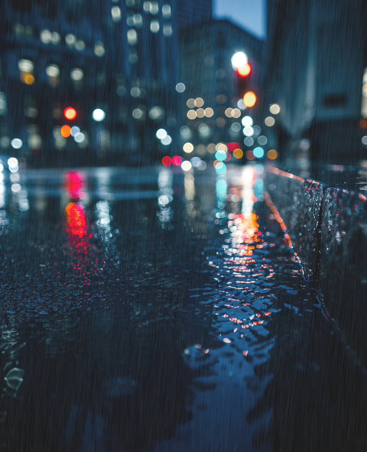
First of which, will be this cool rain effect!
Now, obviously, this effect will look best on a photo that looks like it would have rain on it, like in the picture above. That said, you can use this effect on any picture, though it might not look as realistic over a sunny day.
This effect, like many of the others I’ve shown you, isn’t that complicated once you break it down, and, is actually pretty easy.
Let’s get into it!
Step 1.
To start, pick a picture you’d like to make it rain on. It can be any image you want, but, as said above, this effect will look better on certain images than others.
Once you have your picture picked out, create a New Layer (you can do this by using the New Layer button at the bottom of the Layers panel). Next, we’re going to fill the new layer with the colour black. You can do this one of two ways: you can either go up to Edit – Fill, and then select Black and click Okay, or, you can use your Paint Bucket and dump black onto the layer.
Either way, the layer should be completely black.
You can also rename the new layer to something you’ll remember what it is, like ‘Rain’ – naming your layers is always helpful when working, but especially important the more you start working on more complicated projects.
Step 2
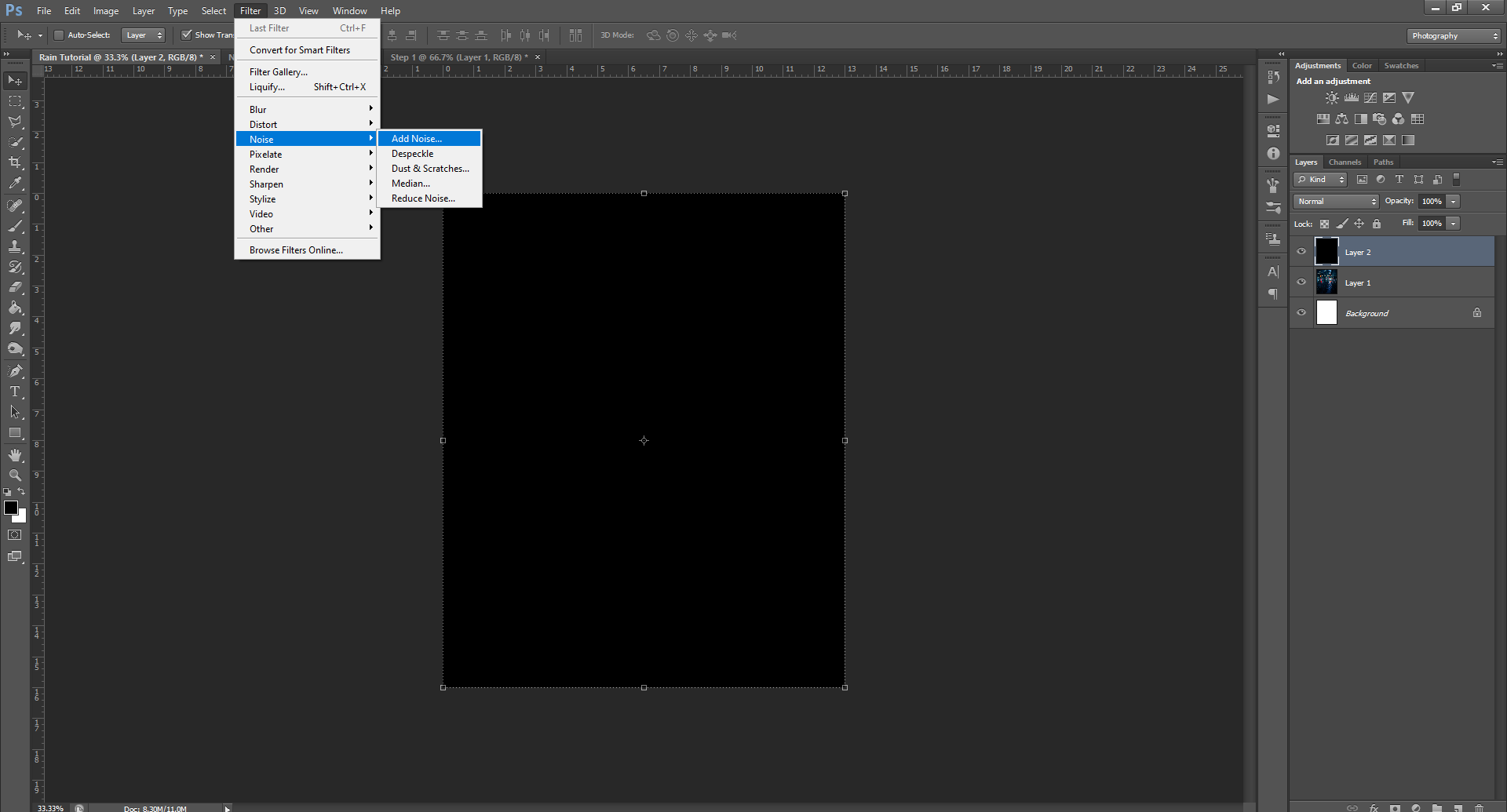
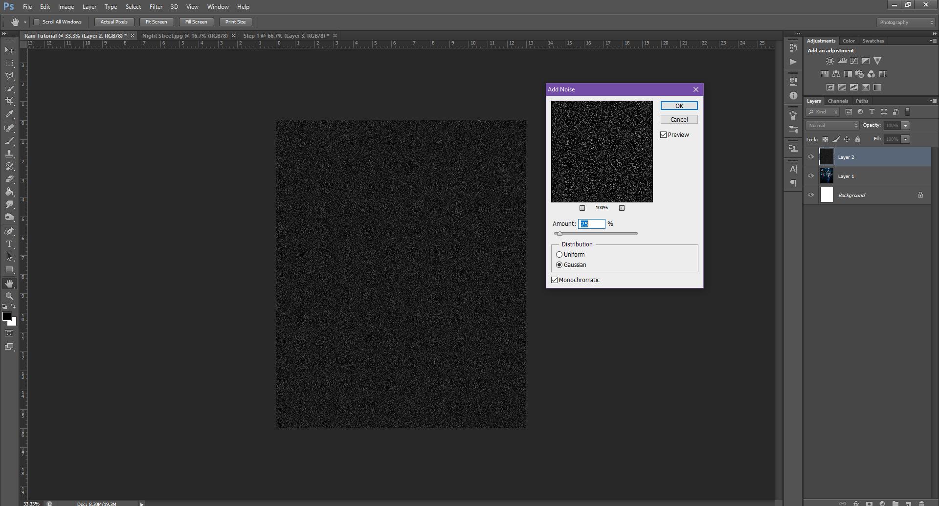
Once the layer is filled with black, go up to Filter – Noise – Add Noise. In the dialogue box that comes up, you can fill in the following values:
Amount of Percent: 25%
Distribution Mode: Gaussian
And, make sure the Monochromatic box is checked.
Once this is done, click Okay to add the Noise. At this point, the black layer should have white speckles all over it – like the ‘fuzz’ that used to show up on an old TV when you went to a channel you didn’t get.
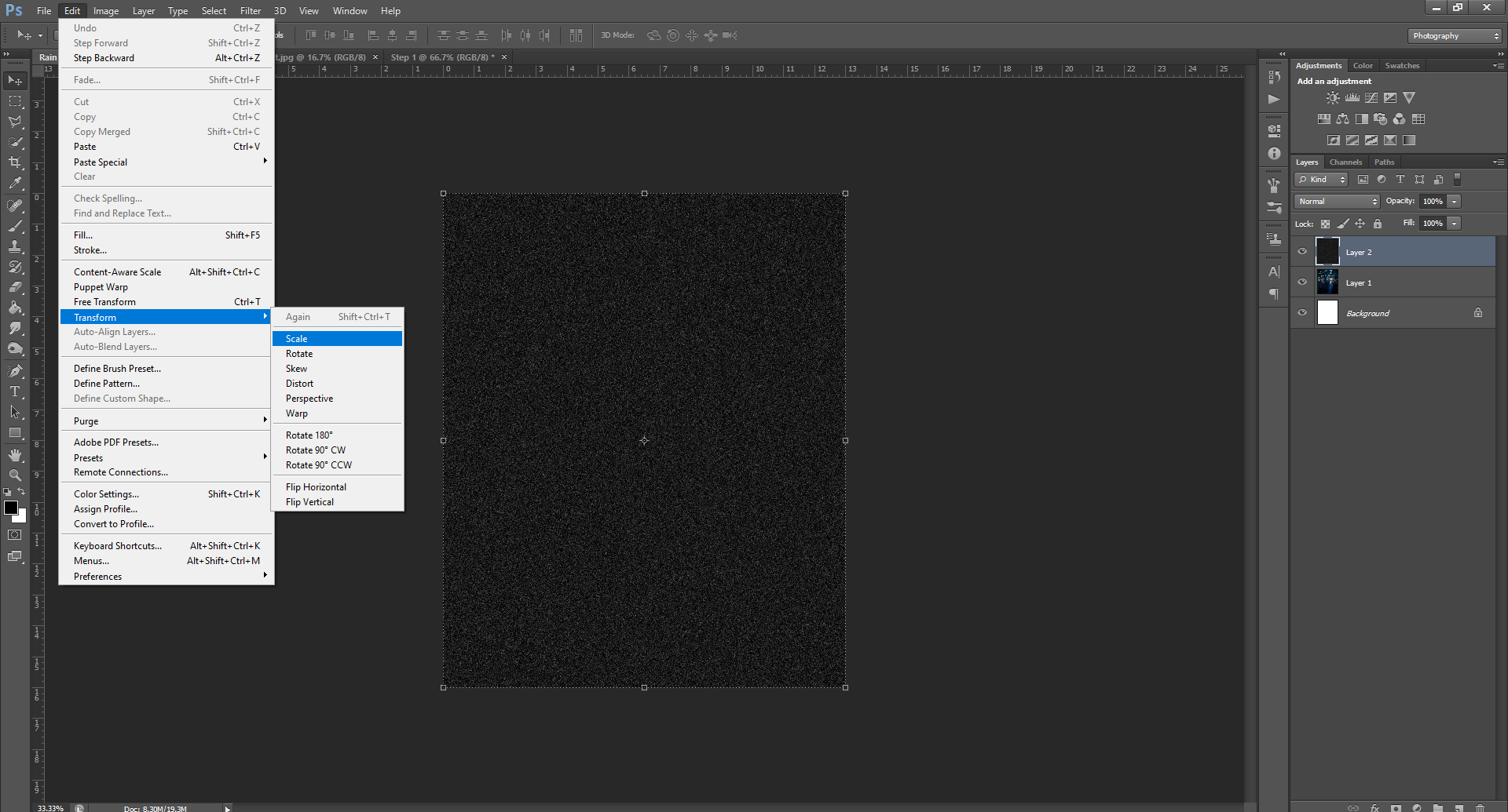
Step 3
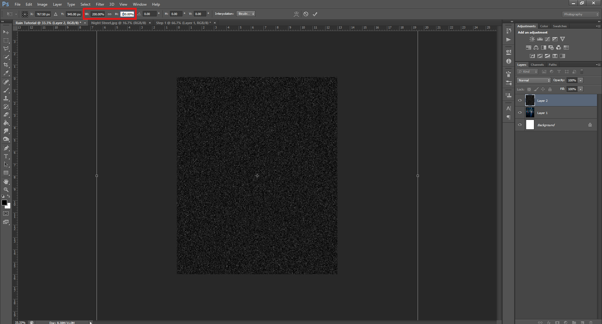
Now that you’ve added noise, you’ll need to go back to Edit – Transform – Scale. Then, in the Width/Height values that appear in the top menu (on the same line used to change a Brush size/hardness), change the values to either 200/200 or 400/400, depending on the size of your document.
Alternatively, you can just click and drag the layer’s bottom corner to make it larger, in the exact same way you scale a picture to fit your document/work size. The layer doesn’t have to be specifically that big, just make sure it’s slightly bigger than your work area.
Once you resize, the Noise/dots should (slightly) resemble falling snow.
This is to ensure a more realistic look – because rain is coming down from the sky, if you take a picture when it’s raining, the drops won’t be perfectly lined up with the top/sides of your picture – the rain began way above the scope of your lens. This helps ensure there are ‘half’ raindrops.
Step 4.
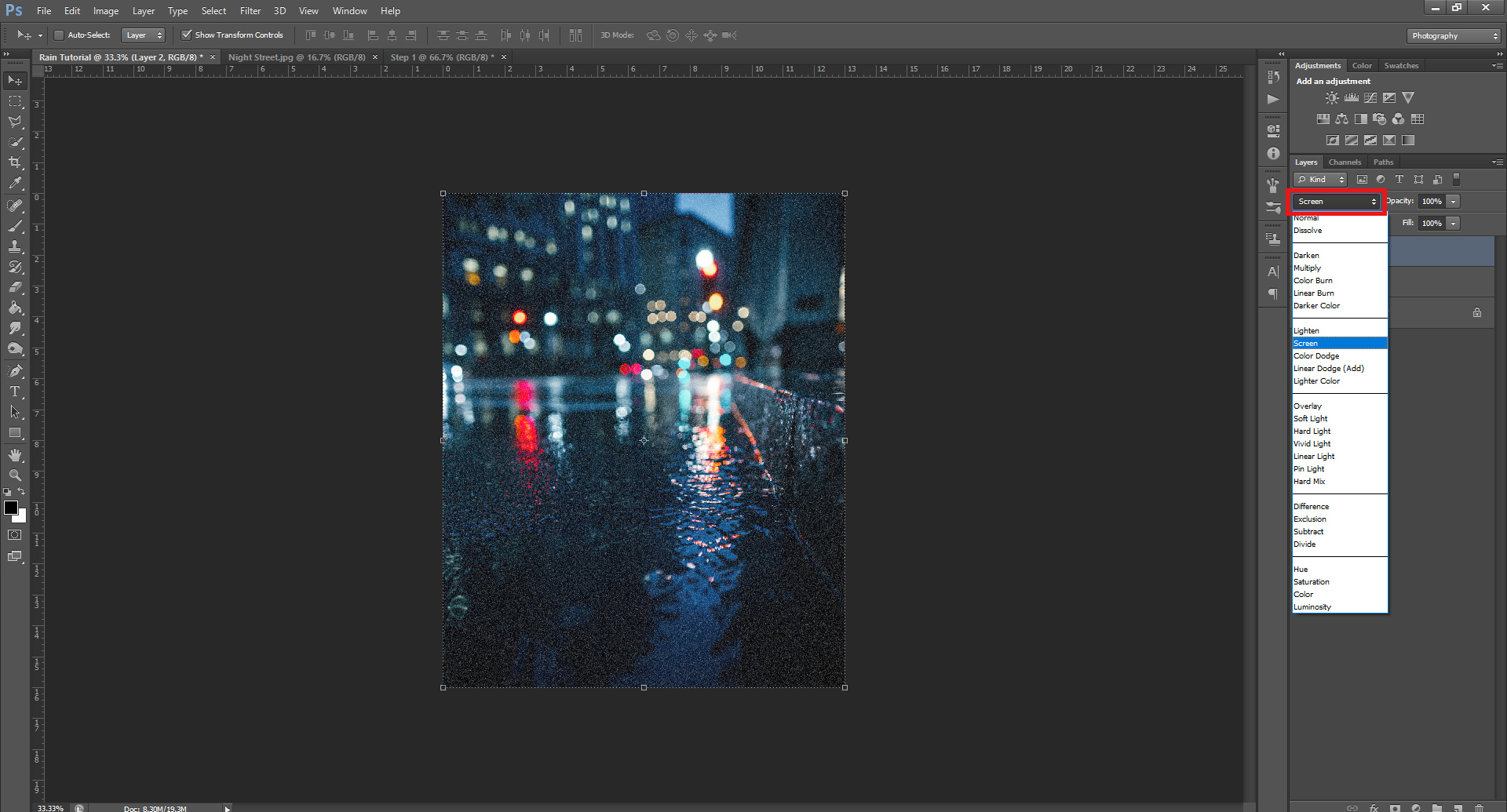
Now we’ve got our rain the correct size, we’ll need to make our picture/image viewable through it!
To do this, go to the Layers panel, and click on the Blend Mode drop down menu, and select Screen. This should allow you to see your image through the Noise layer.
If this doesn’t work, make sure your Noise layer is on top of your image layer in the Layers panel. If it’s listed underneath your image, just drag it above, so it’s the first layer in the list.
Step 5.
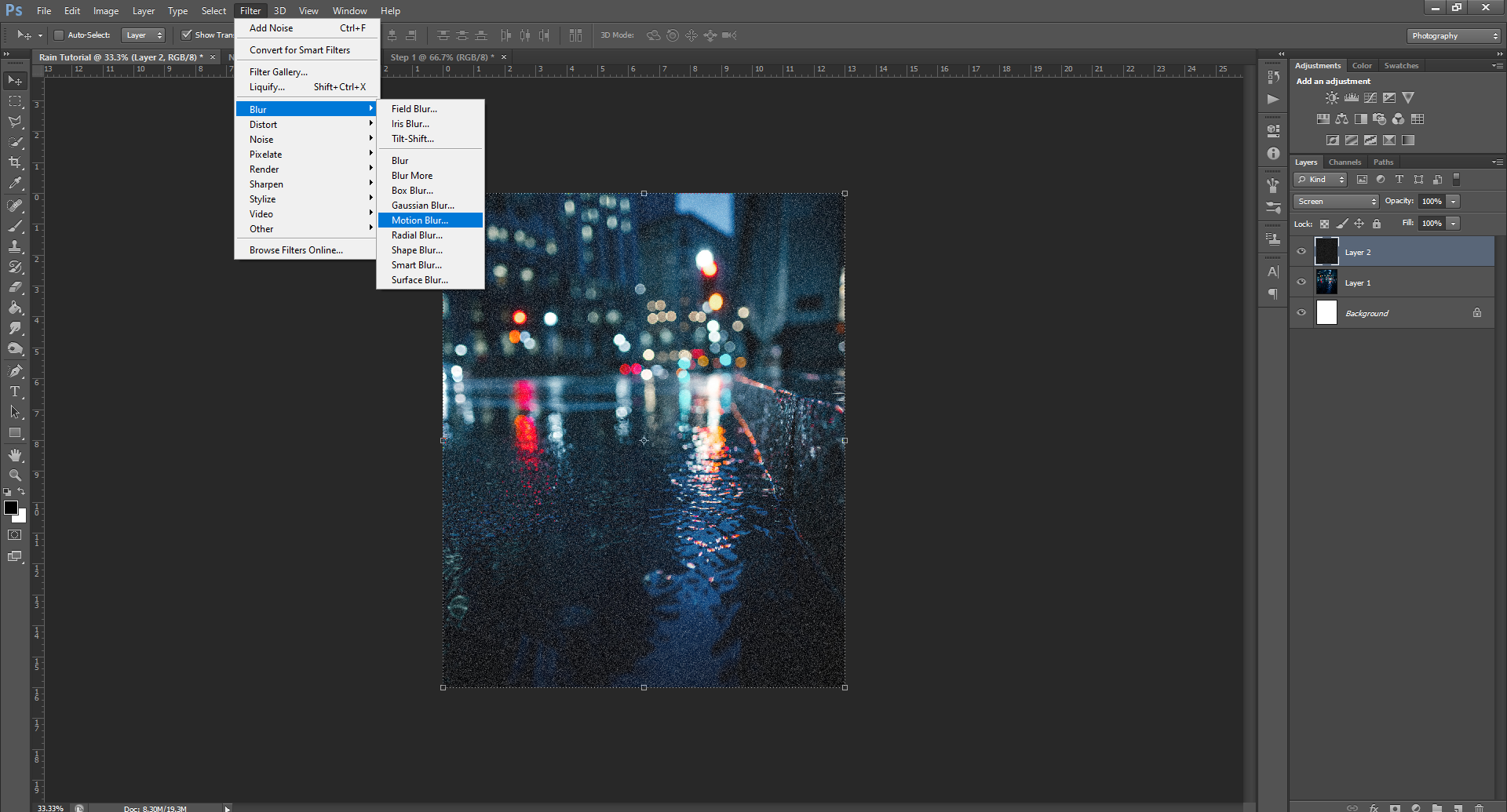
Next, to make those dots look more like falling rain. To do this, go back up to Filter – Blur – Motion Blur.
The values you input here will depend upon the image you’re using, as well as what you want the final image to look like. If for example, you want it to look like it is heavily raining on your image, you’ll want to go with a more dramatic angle, and a larger distance.
On the other hand, if you want there to be light rain, you can go with a less dramatic angle, and a smaller distance, as I did in the image.
That said, I’ve noticed a Distance of 75 seems to be the lowest that works while still looking like ‘rain’. Go ahead and play around with both values until you’re happy with what it looks like, though.
Once you’re happy with what your rain looks like, click Okay.
If you really want an image to look stormy, I also recommend using this Noise/Motion Blur effect more than once, with varying Distance/Angle attributes, so it will give the impression of a much heavier rain fall.
And that’s it!
If you notice your image has become too bright after applying the Rain, you can go ahead and either try lowering the Rain layer’s Opacity, or, you can go to the Adjustments panel (should be sitting on top of the Layers panel), and click on the Brightness/Contrast option, and change those values until you’re happy with them.
Once you’re totally happy with what your rain looks like, don’t forget to Save both a PHSH file (.psd), and a JPEG, or PNG of your work! Saving a PHSH file will allow you to go back in and make changes if you ever need to, without having to start all over.
And, while this effect isn’t too time consuming, or hard, it still sucks to have to start from scratch when wanting to change a Photoshop project.
Go ahead and practice this effect until you become comfortable with it, because in April, I’ll be keeping with this rainy theme, and showing you how to make Puddles:
Like this tutorial? Check out the rest of the series here!
Welcome to the last Photoshop tutorial for the year!
I know there haven’t been too many this year, but that’s for two very good reasons! 1) I’ve expanded the website to include different things, and thus am trying to be fair in my cycling through of each interest, and b) I’ve been busy and need time to learn more effects to show you!
At the time of writing (20.11.17), I’m almost out of effects to share, and haven’t had time to learn more. I mean, it’s 2020, can you really blame me for not having time? But, don’t worry! I’ve got a pretty good handle on scheduling (yes, I had scheduled all of 2021 back in 2020), and I’m not writing a book (or should I say ‘haven’t been’? … This is the part of writing posts in the future that gets confusing!) this year, so I should have plenty of time to teach myself some new effects.
So for now, you can go digging through the old tutorials, and practice this effect while you wait for new ones. Also, if you aren’t already, keep an eye on my Twitter, where I’ll share updates on what’s happening, so you can stay in the loop.
Okay, I think that’s enough rambling, now onto the effect!
This effect, like many others, probably looks complicated, but isn’t really, it’s more time consuming than anything else. (But we’ll get to why in a bit)
Step 1.
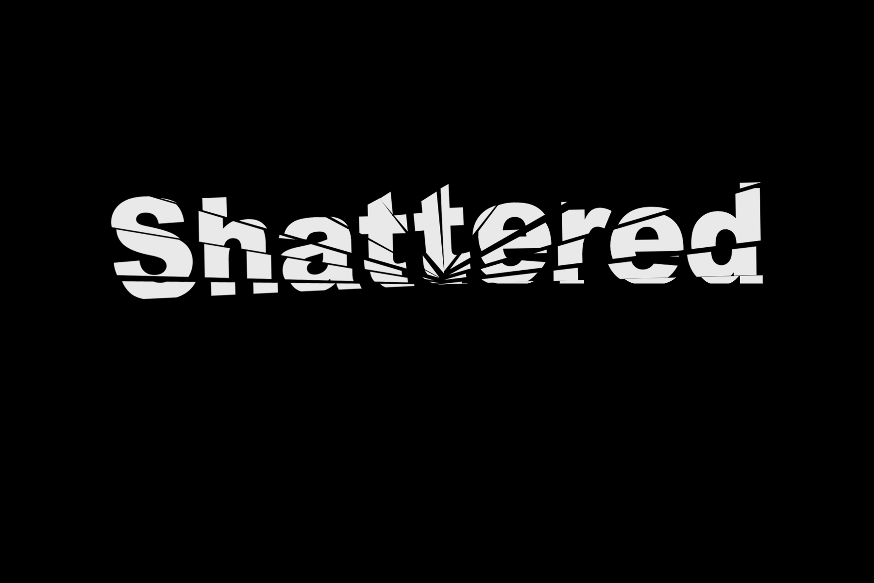
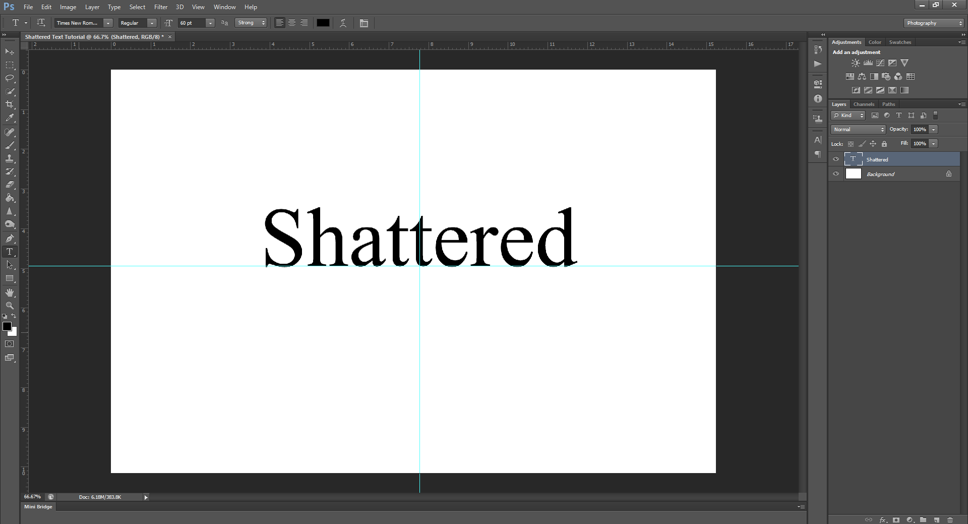
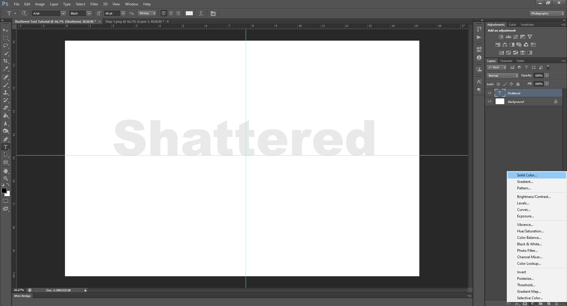
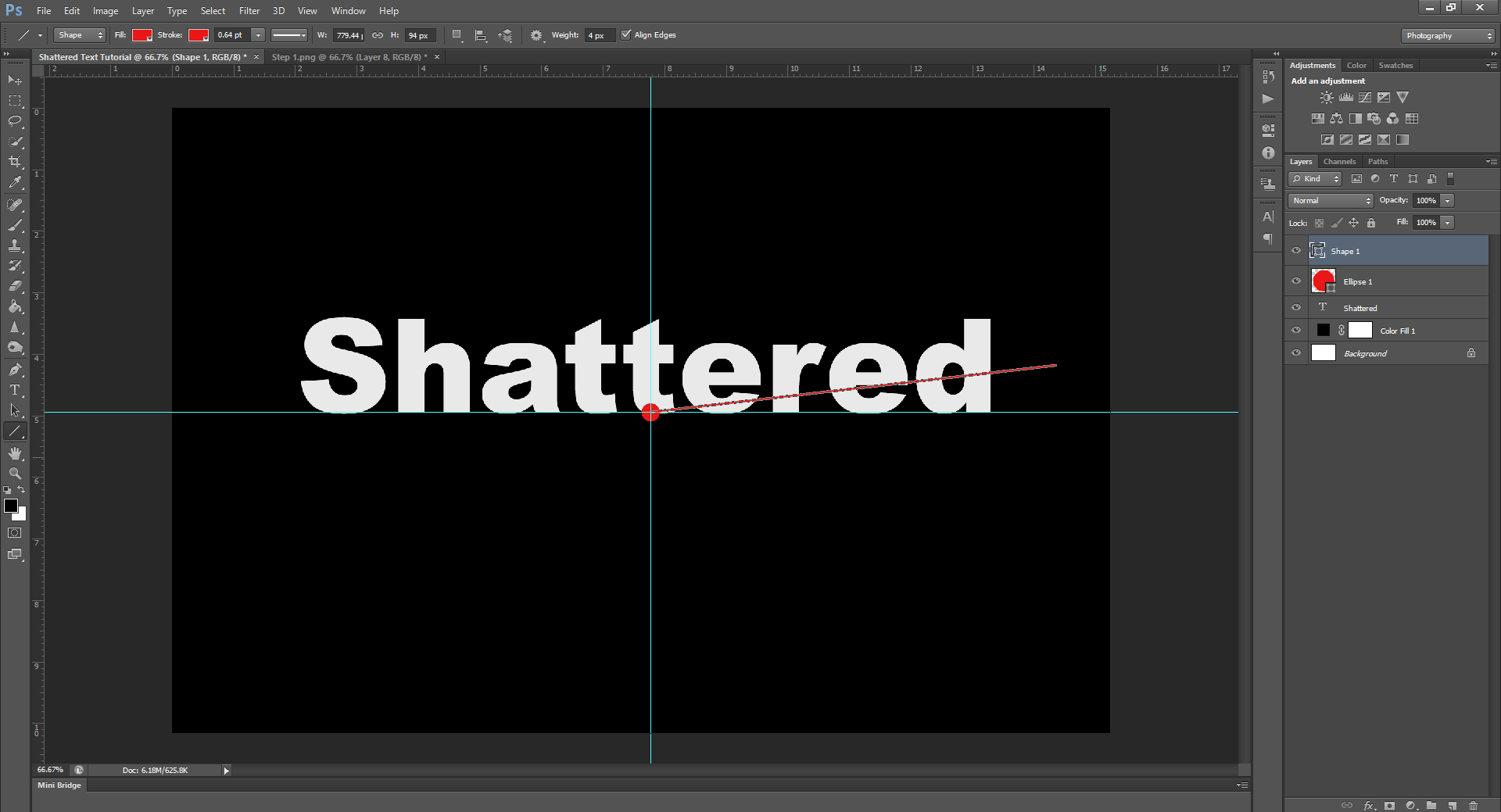
On a new project/document/file (I swear one day I’ll learn what it’s called!), type whatever text you want to shatter. For the purposes of simplicity, I’ll just use the word Shattered.
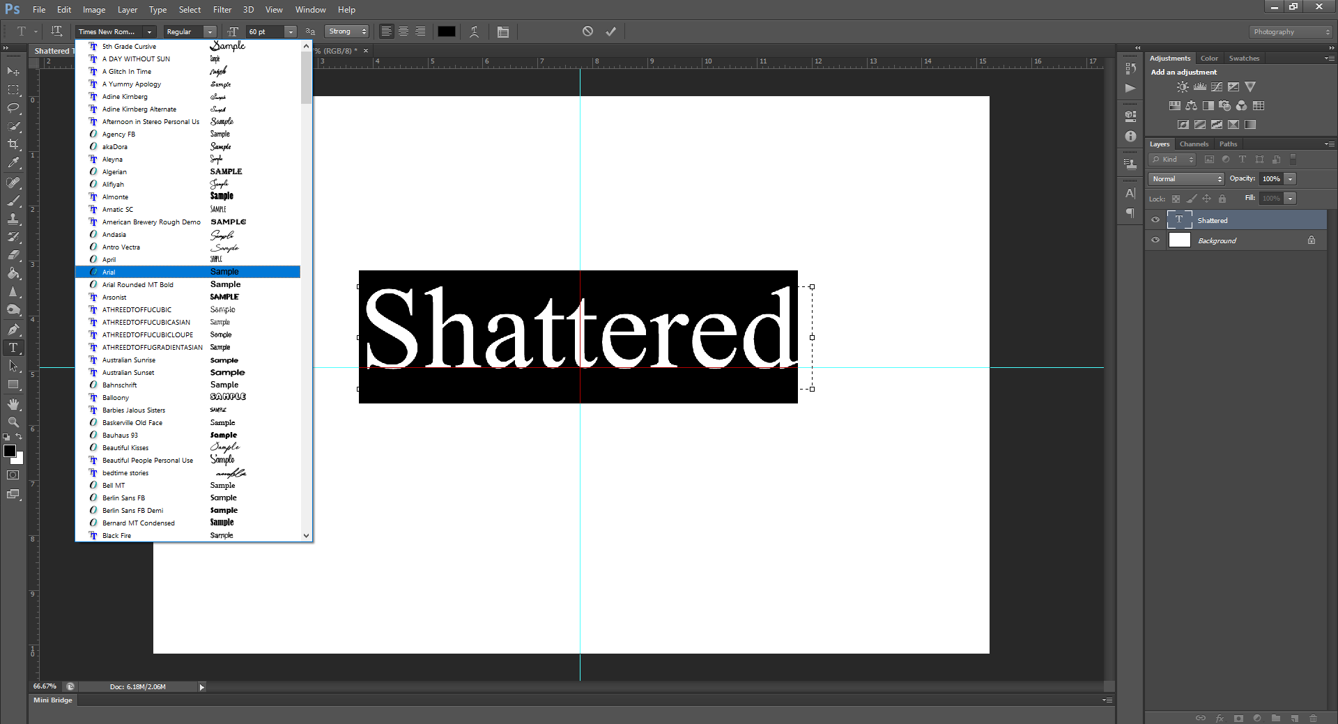
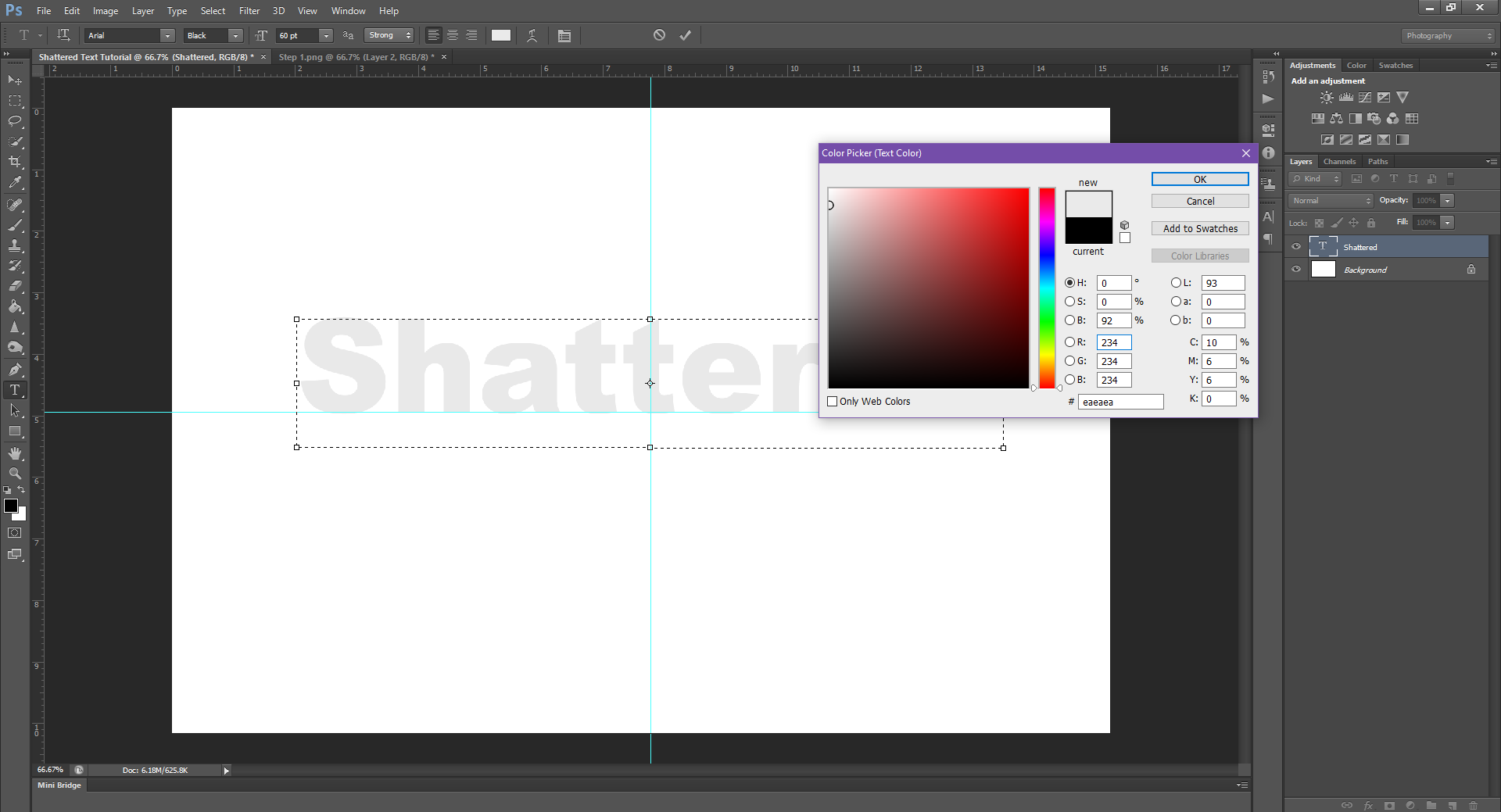
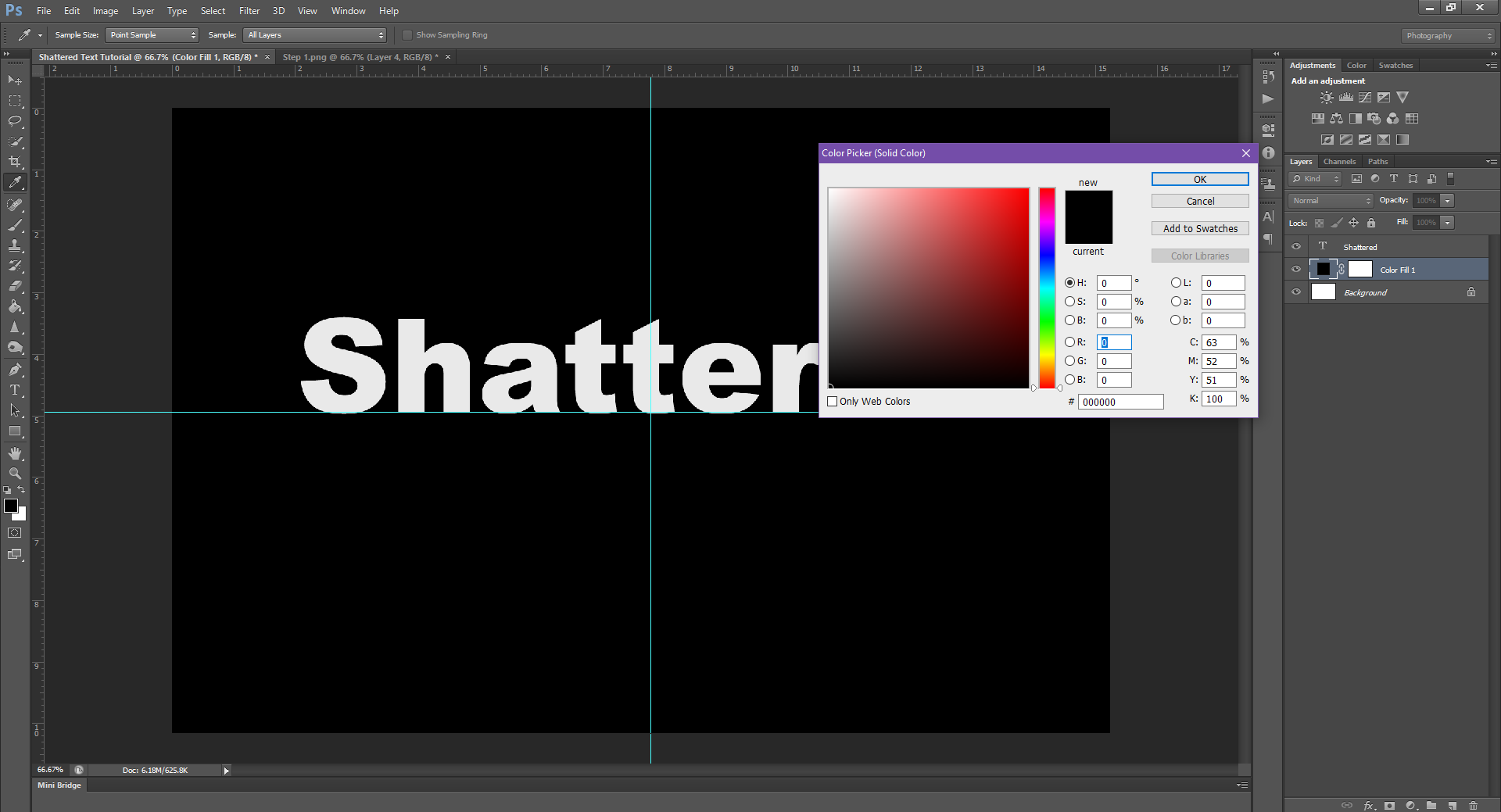
You can do this effect on any font/colour, but if you want it to really look good, I suggest using a thick font, like Arial, and to change the word colour to white/off white. (So it looks more like glass) Then, change the background colour from white to black. I’ve also centered the text, but again, this is optional. It all depends on what you want the final product to look like.
After changing the font, to make it extra thick (so we have more room to work with the effect), you can also change the Font Style so the text looks even thicker. I picked Black, but the Bold, or even a different really thick font should work.
Step 2.
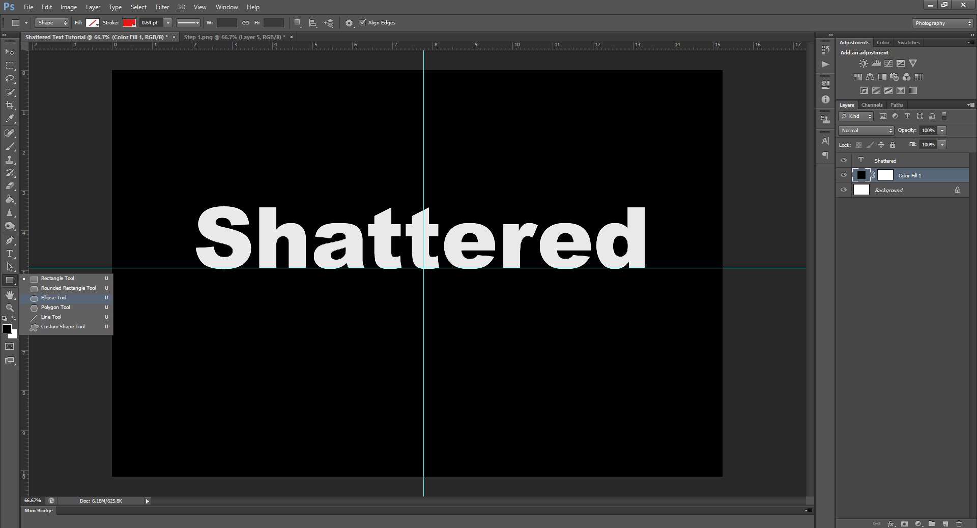
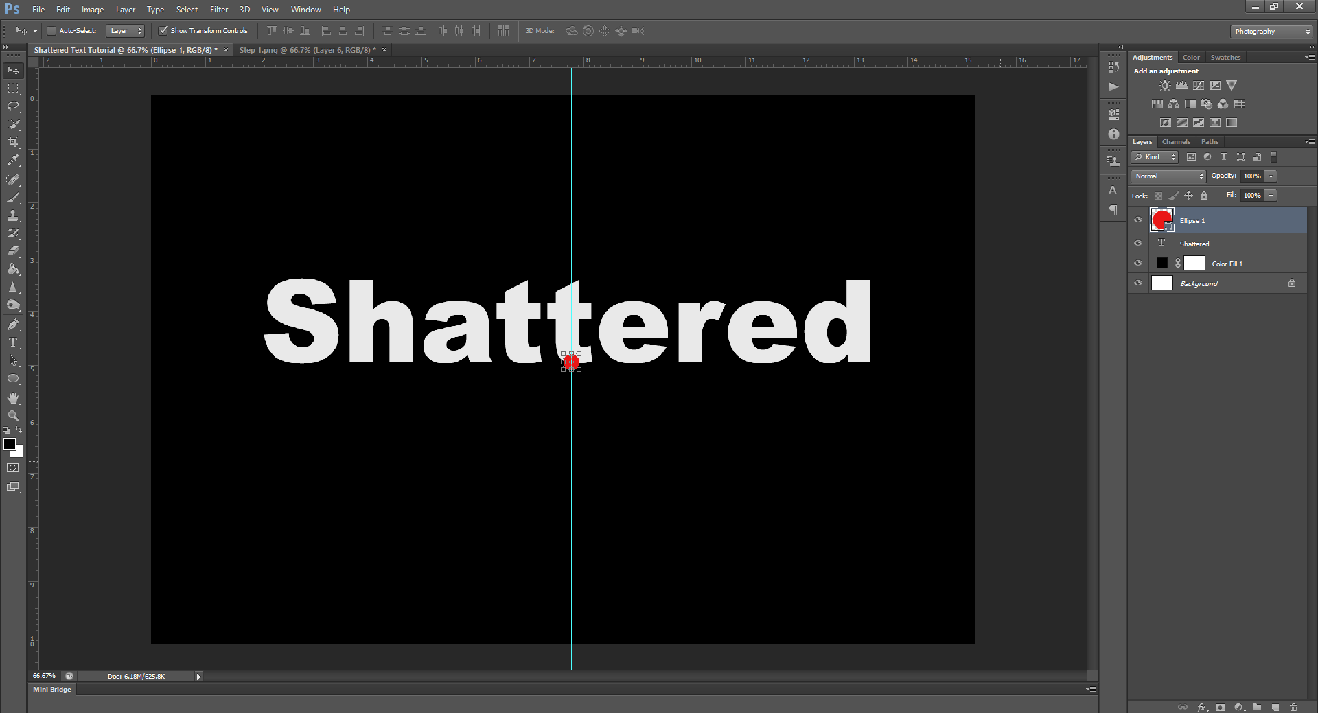
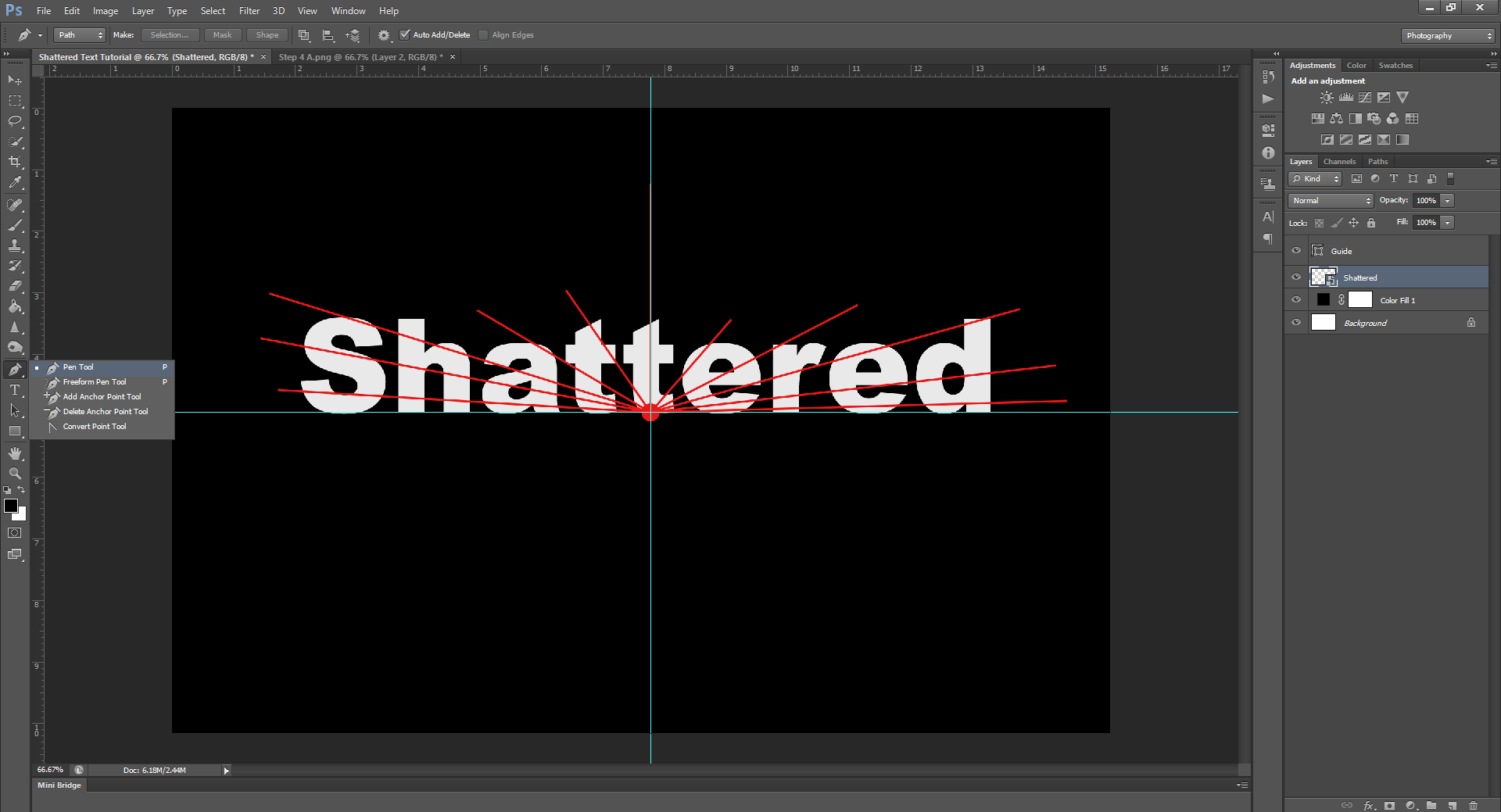
See how much better that’s already looking? Now, I want you to pick a center point on your word, and, using the Ellipse Tool, draw a small circle at the point. This will be used as the impact point, and will serve as the central part for when we begin to shatter the pieces. To keep things simple, I’ll use the bottom of the middle letter.
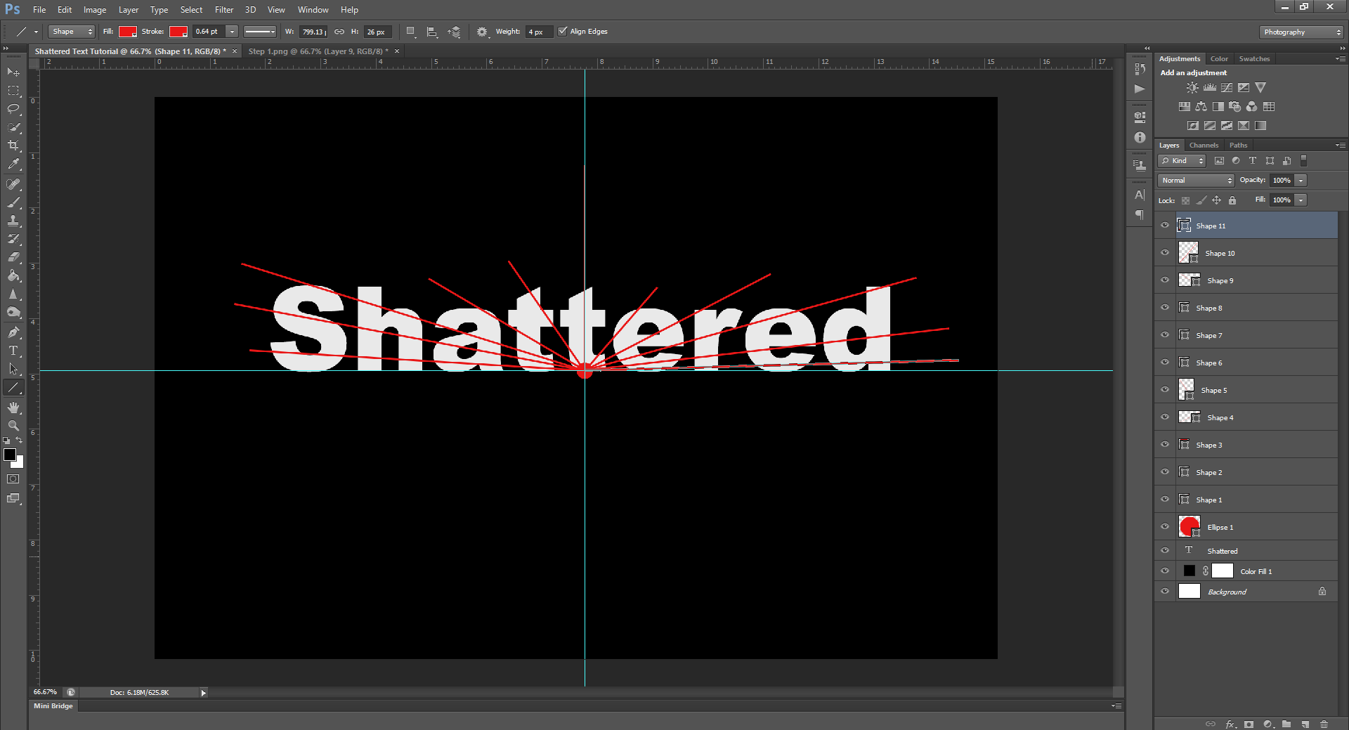
Step 3.
Now, using the same tool, switch to the Line Tool, and draw straight lines radiating out from the circle, to begin dividing the word into pieces.
Keep going until you’ve fractioned off the whole word. Hint: Holding down SHIFT while drawing the lines will keep them totally straight.
Step 4.
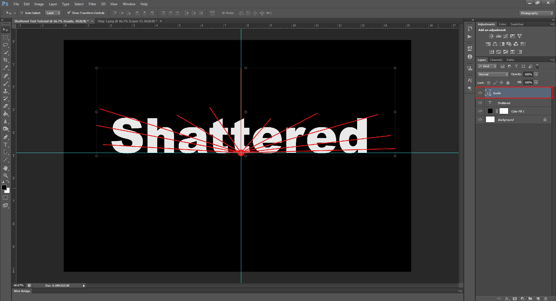
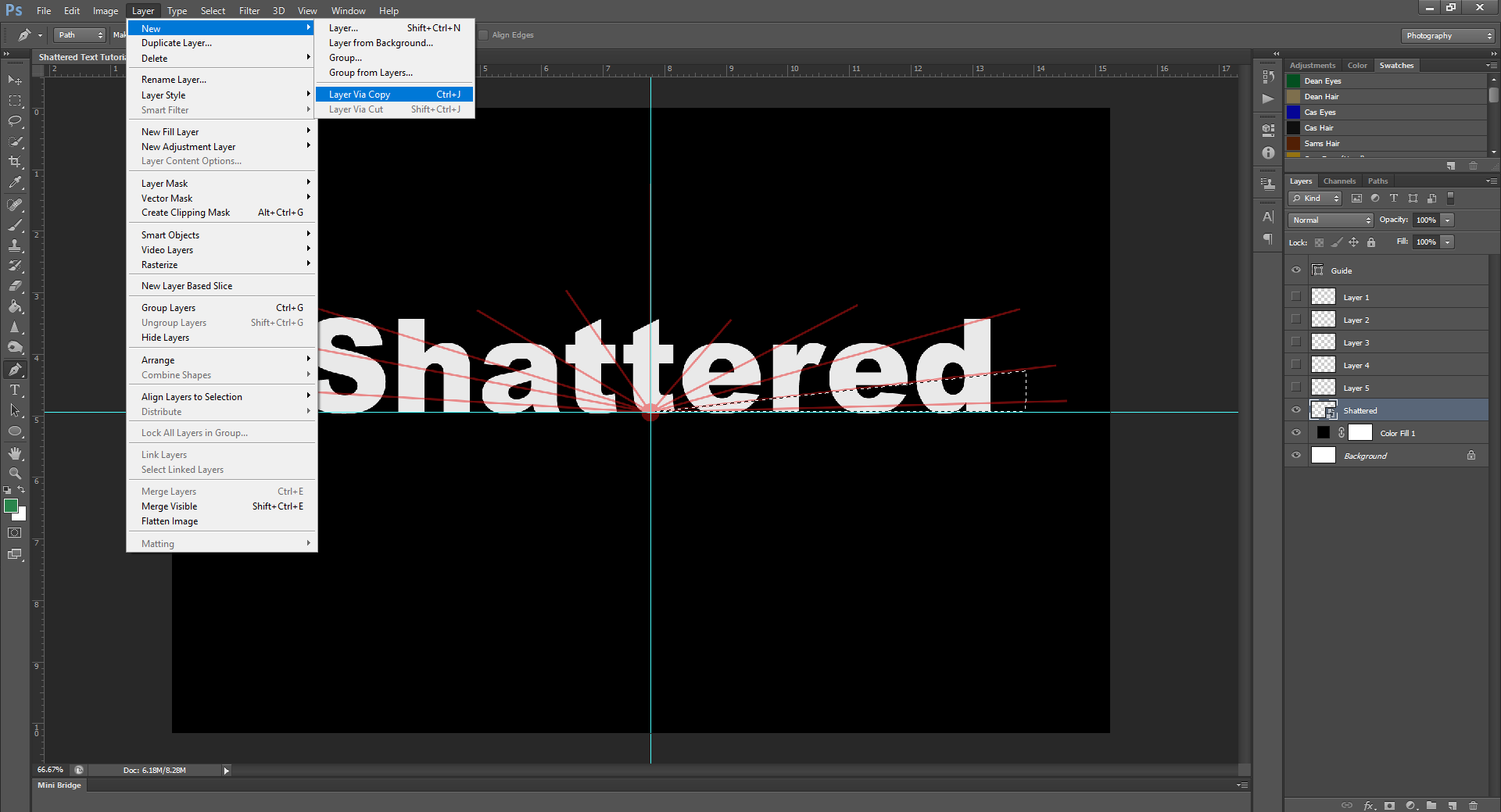
Now to make things easier, select all the lines and circle you just made (either hold CTRL and click on each layer in the Layers Panel, or press and hold SHIFT and click on the first and last shape layers), then right-click and select Merge Shapes from the menu. This will collapse the guide we just made into 1 layer.
Once collapsed, feel free to re-name it Guide or something similar, so you know what it is. To rename a Layer, double click on the Layer Name (the word beside the thumbnail picture) and type whatever you want to name the layer, then hit Enter to make the change.
Step 5.
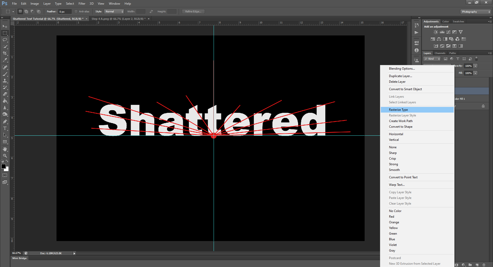
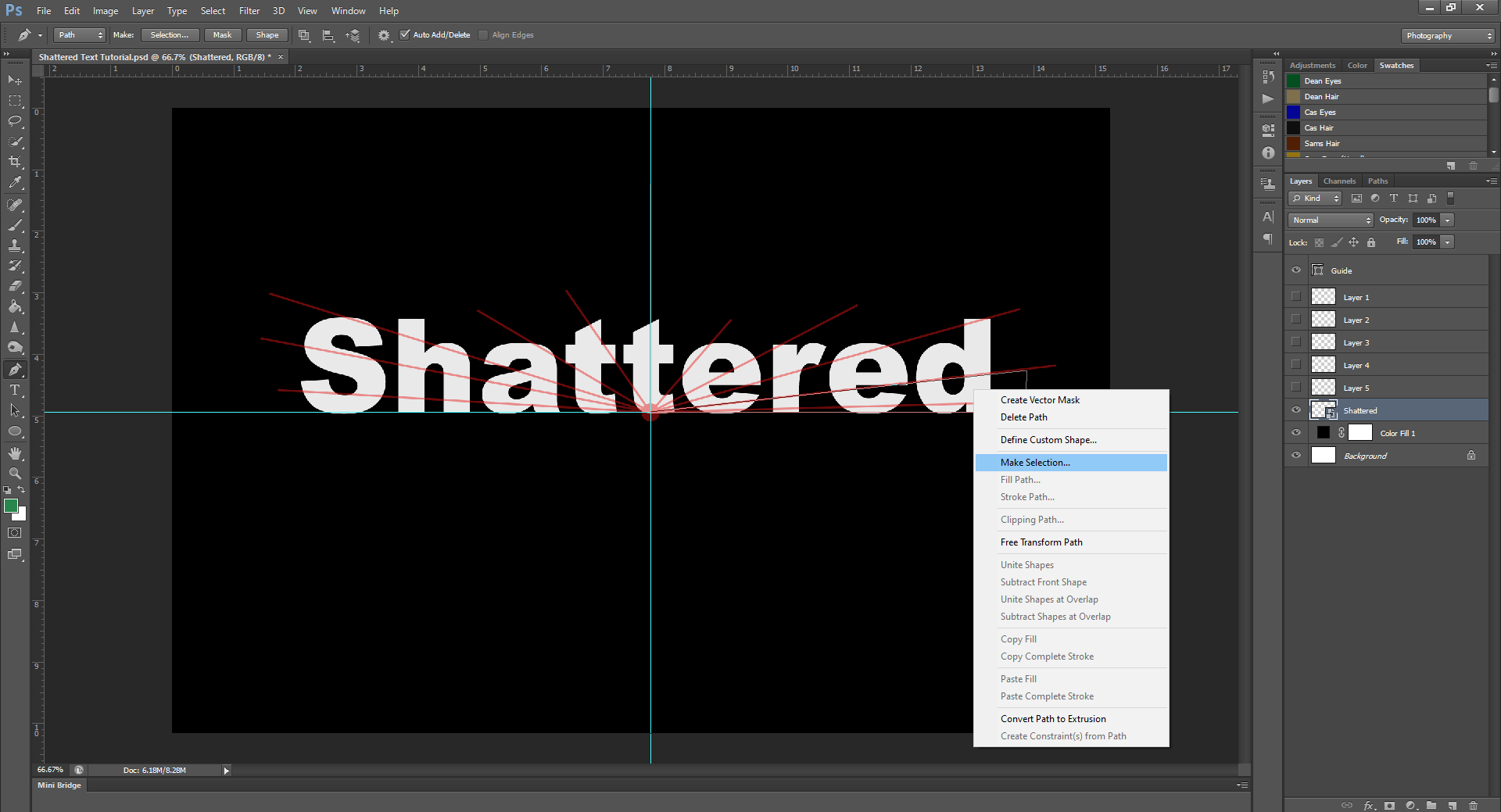
Now to actually make the shards. First, right click on the Type layer, then select Rasterize Type. This will make the text no longer editable with the Type tool, but will allow us to cut and crop it as if it’s an image. (Which is what we need)
After this, using your Pen tool, begin to cut out the shapes of the shards following the guide you created. (Make sure you do this on the word layer, and not the guide layer) You can also lower the Opacity of your guide layer, so it’s less distracting.
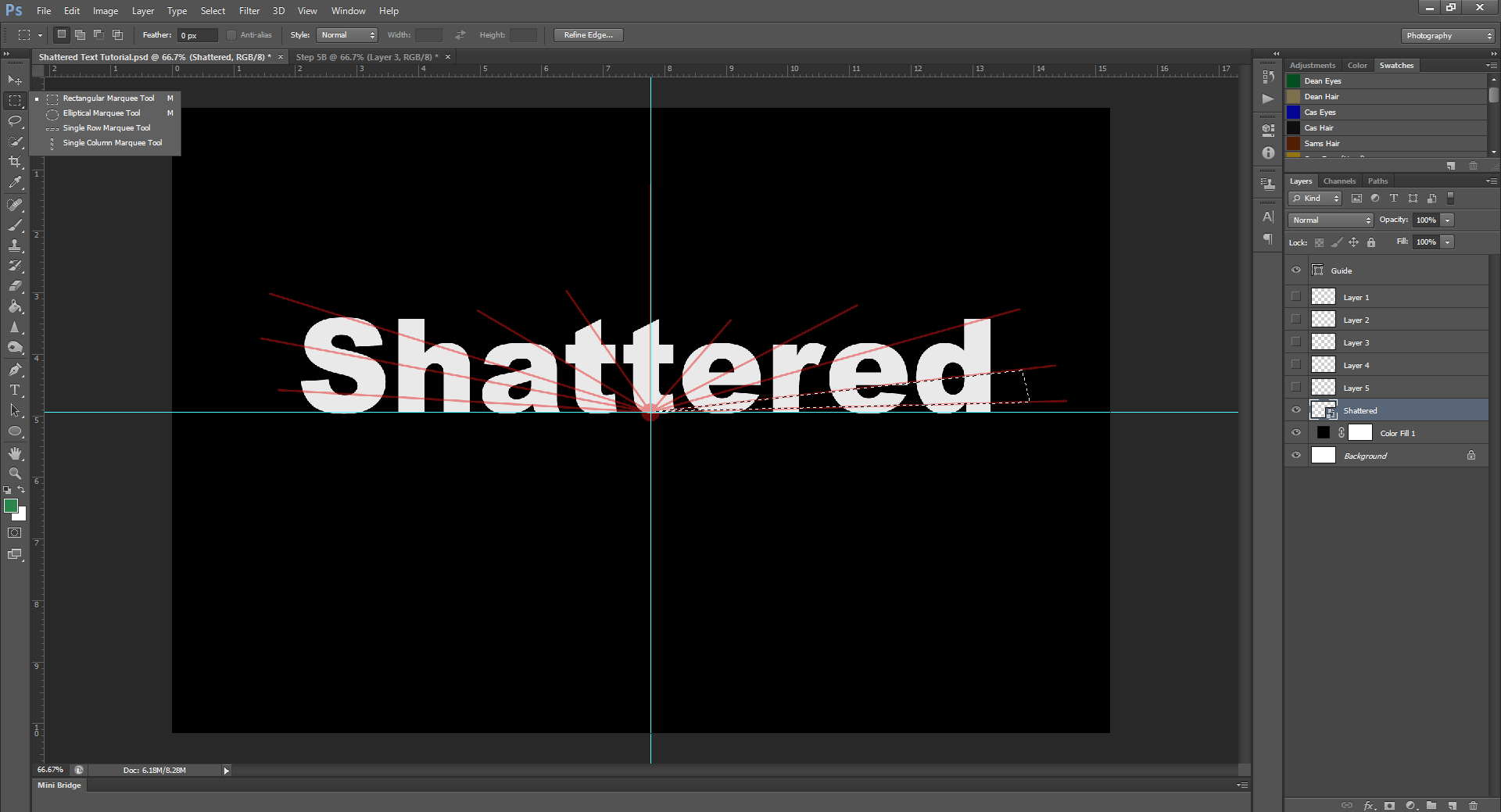
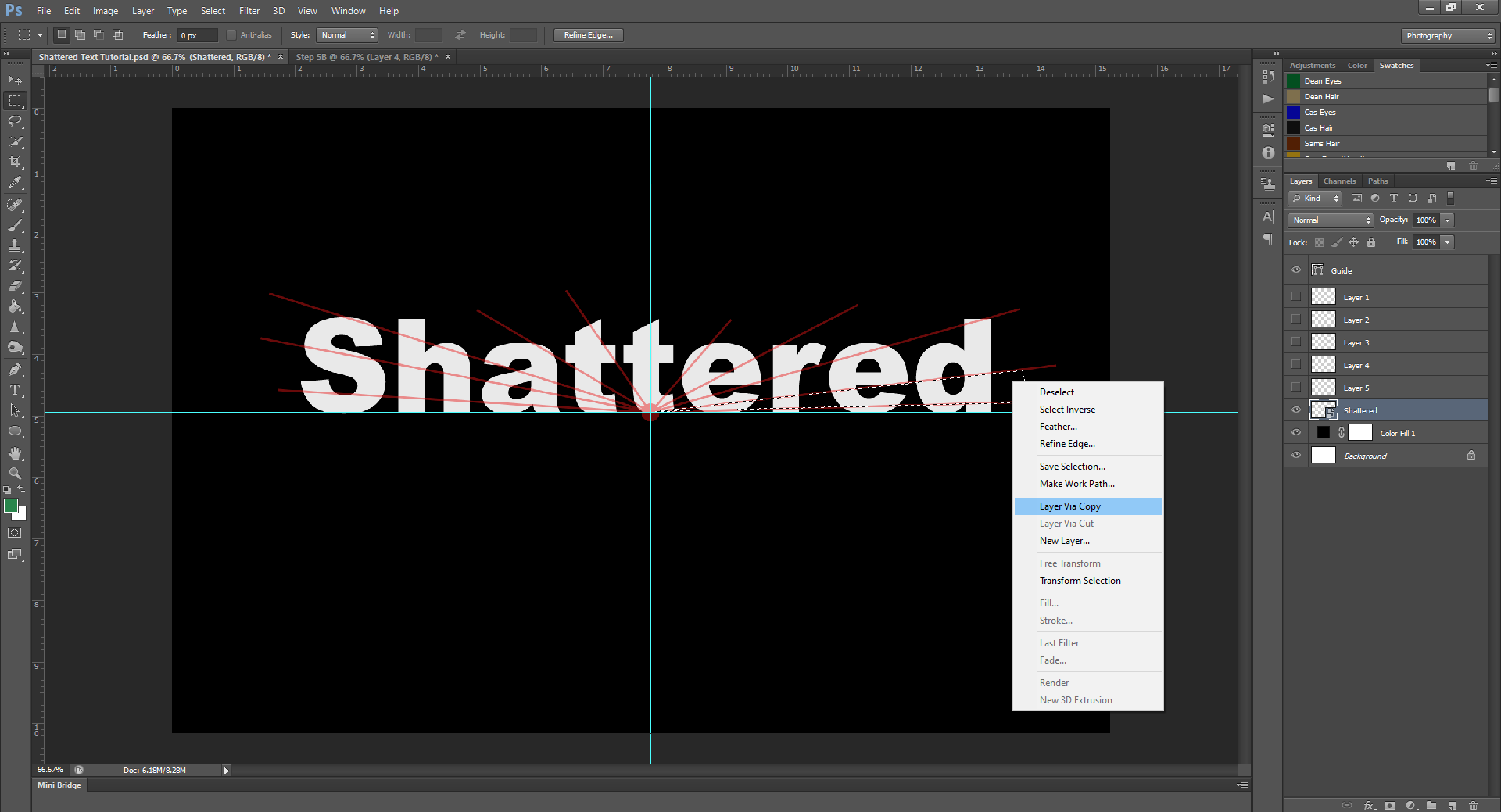
When using the Pen Tool, you’ll want to make points at the edges of the selection. Make triangles when clicking, then right-click and click ‘Make Selection’. Then, using the Rectangular Marquee Tool, right click on the selection again, and this time select Layer via Copy. (You can also do this by going up to the Layers tab in the top menu, and then going to New – Layer Via Copy)
Repeat this until you have separate layers for each section made by the Guide.
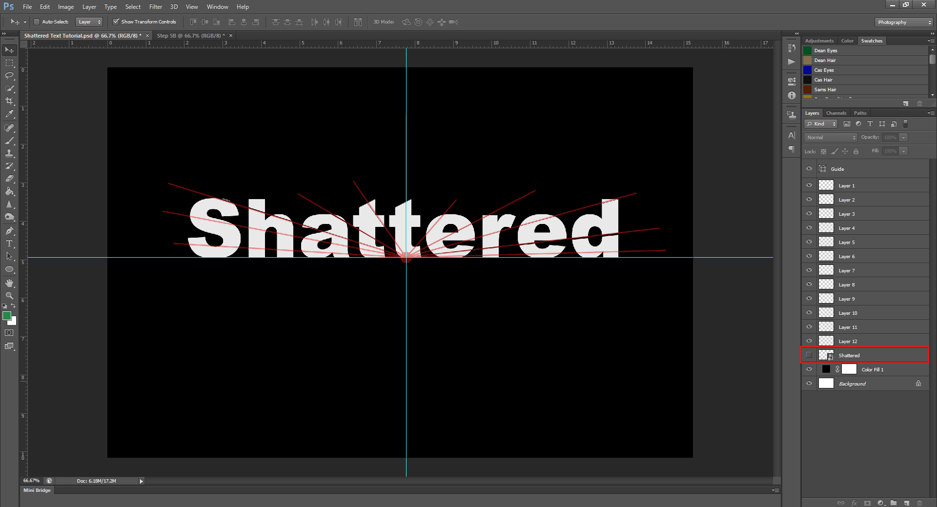
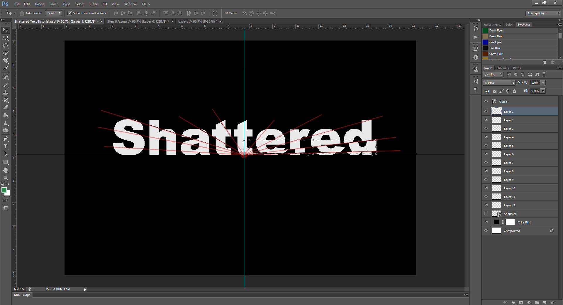
Step 6.
Now that you have all the pieces you’ll need on separate layers, comes the fun part. Hide the original text layer, so just the pieces are left visible.
Now, starting with 1 of the sections, slightly move it so it’s not touching the rest of the pieces, this will make it look broken. You can also slightly turn the pieces as well, if needed.
Continue to do this for all the pieces, keeping in mind the circle from your guide is the central point, so all the pieces should look like they ‘broke’ from there. Also keep in mind, sometimes less is more, and the effect may look better without drastic changes, but this will depend on the look you’re going for.
Also, once you’ve moved all the pieces, hide your Guide layer, so you can see what it looks like.
Now all the pieces are where you want them, you can go ahead and save yourself the PHSH file. (Which I always recommend, but especially recommend for effects that take multiple layers!) Once you have an editable PHSH file saved, you can go ahead and delete your Guide and intact Shattered layer, and then you can flatten and save as a PNG or JPEG file.
And there you have it! Another effect is done!
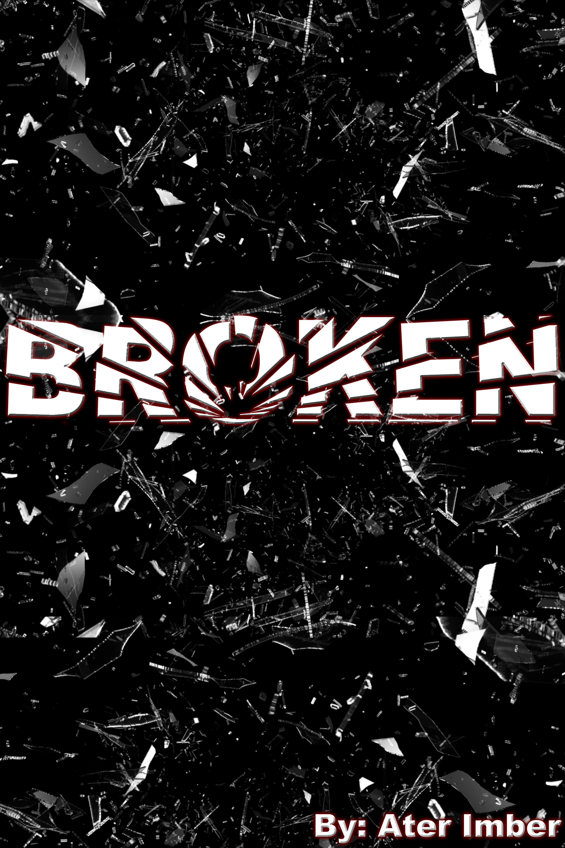
This looks pretty great on it’s own, but, if you want to really give it some oomph, arrange your text on an image of broken glass pieces. If needed, (depending on your background), you can also Bevel and Emboss the text pieces so they appear to be raised, and, you can also add an Inner Shadow as well. (Both of these are techniques I’ll be showing in later tutorials.)
Adding these extra steps are totally not needed, but can add a little extra ‘wow’ factor to your cover, depending on the look you’re going for. And, like most of the other effects I’ve shown you, this Shattered text technique works in a LOT of different contexts.
This is the same technique I used on the Broken cover, to make the title look like it was written across the mirror. It’s less shattered than what I did in the glass shards picture, but still works.
Play around with the fracturing to see what works for you.
Like I said at the beginning of the tutorial, this is the last one for this year, but I’ll be back some time next year with a brand new set of effects! So go ahead and practice, because while I don’t know exactly what I’ll show you, I do know the effects/techniques are just gonna keep getting harder from here. So make sure you take the time to master the early ones!
Like this tutorial? Check out the rest of the series here!
Liking the site? Consider signing up for my Patreon, so I can continue bringing you the content you love!
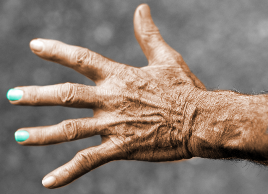
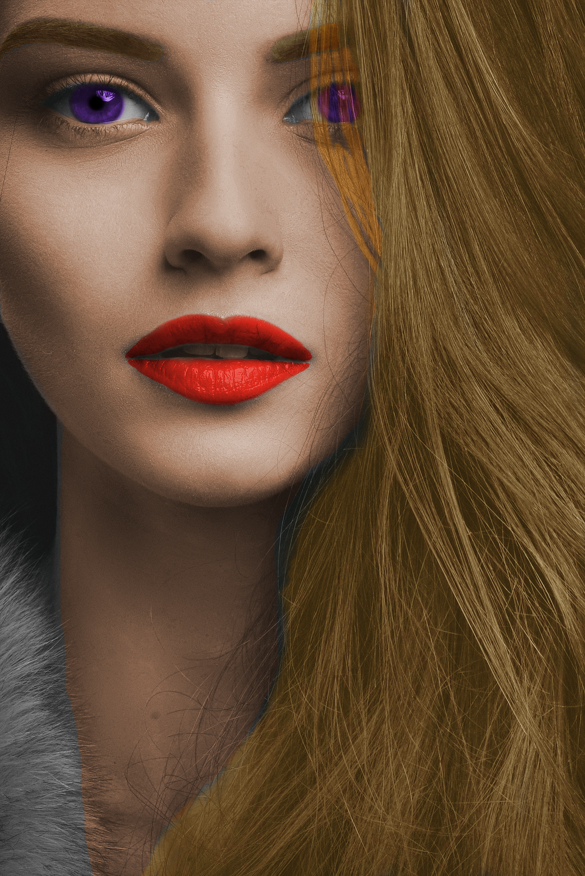
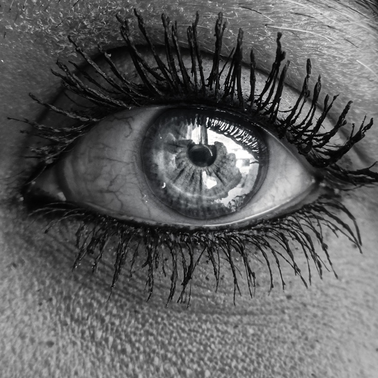
I know, I know, ‘you’re revisiting effects already? Does that mean you’re out of ideas?’ No, no it doesn’t. There’s no need to worry, I just thought I’d revisit this one, because I actually discovered an easier/more effective way to change someone’s eye colour, and this technique can be used to change the colour of more than just eyes! You can also do skin colour, hair, and pretty much whatever else you want!
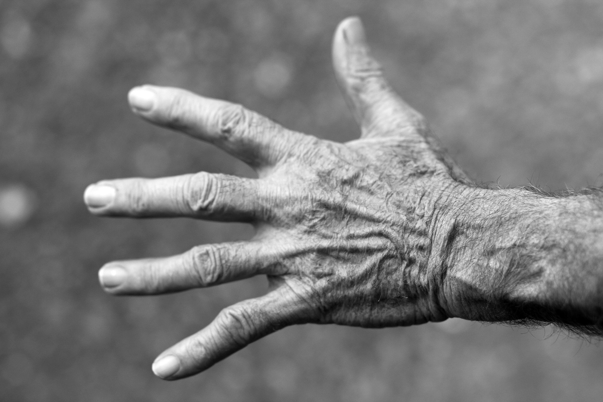
For this tutorial, we’ll be using the below black and white picture of an eye, but feel free to use any picture you like. Since you’re just starting, I’d recommending choosing a black and white picture to practice with, but note that this technique does work on pre-coloured pictures as well.
Step 1:
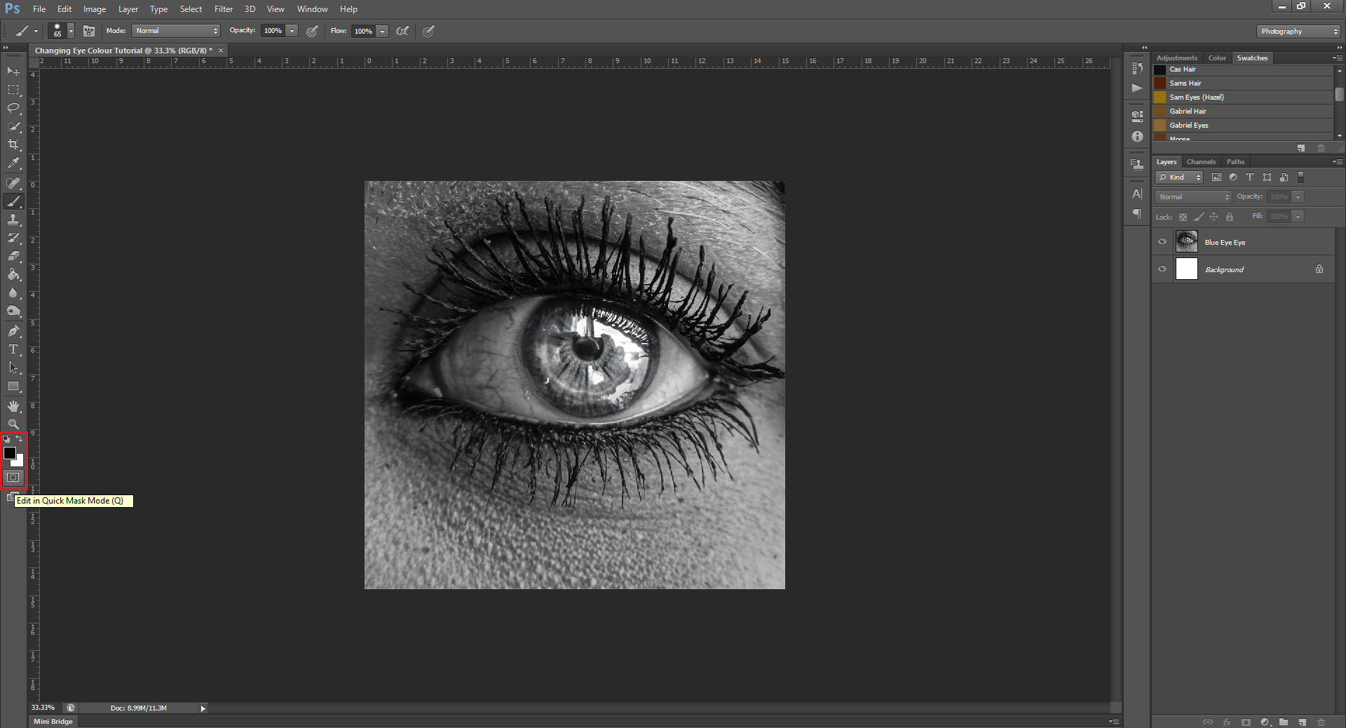
Okay, by now you should know Step 0 is to always open a new work file, and to place your picture onto the document. After this, go over to the bottom of the Tools Panel on the left-hand side, and click on the button that’s under the Colour Swatches.
Step 2:
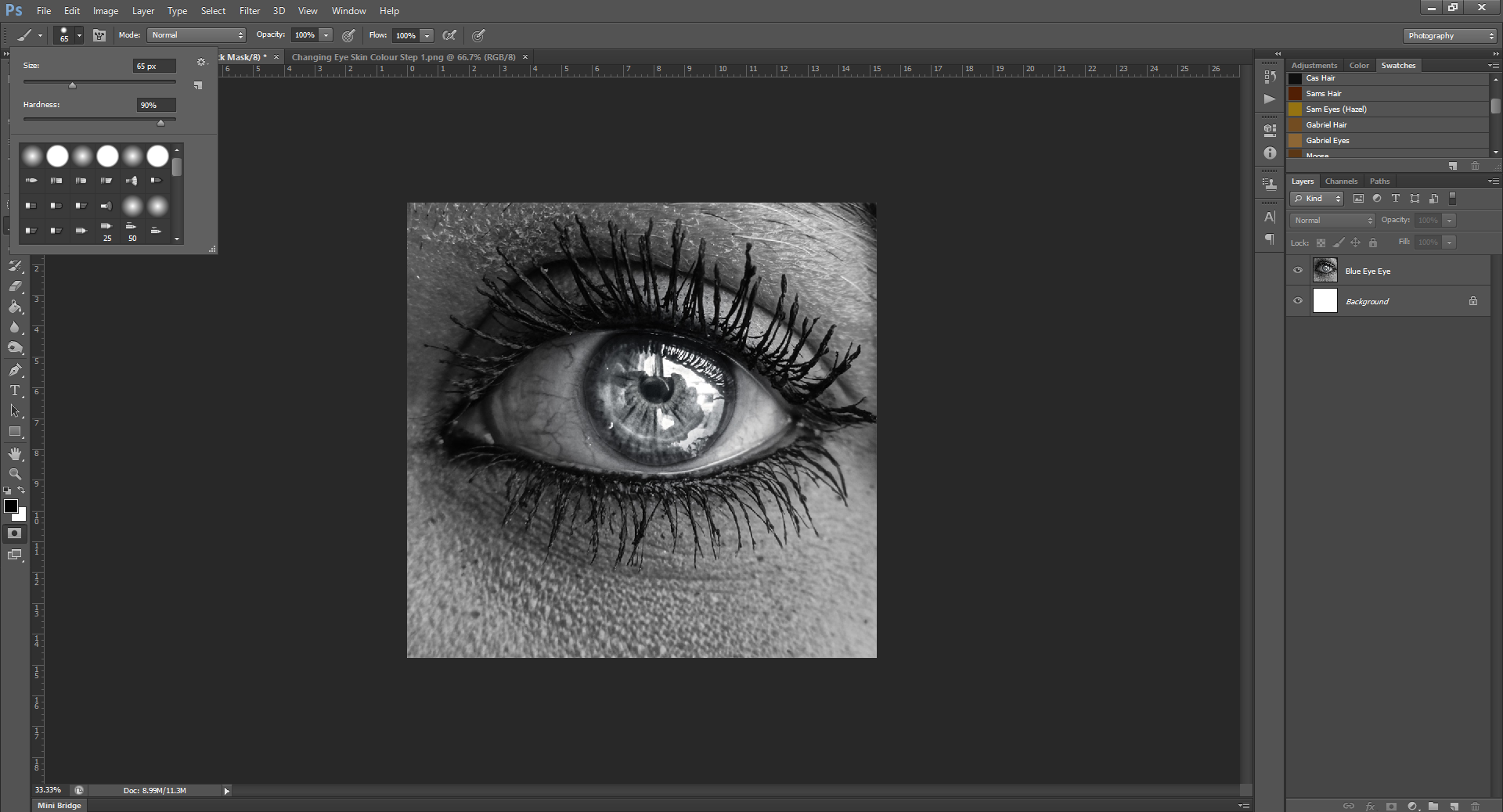
Once you clicked that, go to your Paintbrush, and change the size/hardness of it, then begin to paint over the part of the picture you want to change the colour of. (In this case, it’s the iris) When you begin painting, it may turn red-ish/orange, don’t worry! This happens just to show you the part you’re painting. It won’t stay orange after you’re done this step.
For eyes, I like to try to get the size of the paint brush as close to the size of the iris as I can, so that I can paint with just one click, so the edges aren’t ‘bumpy’. Also, don’t worry about painting over the pupil for this step. We can clean up the paint later.
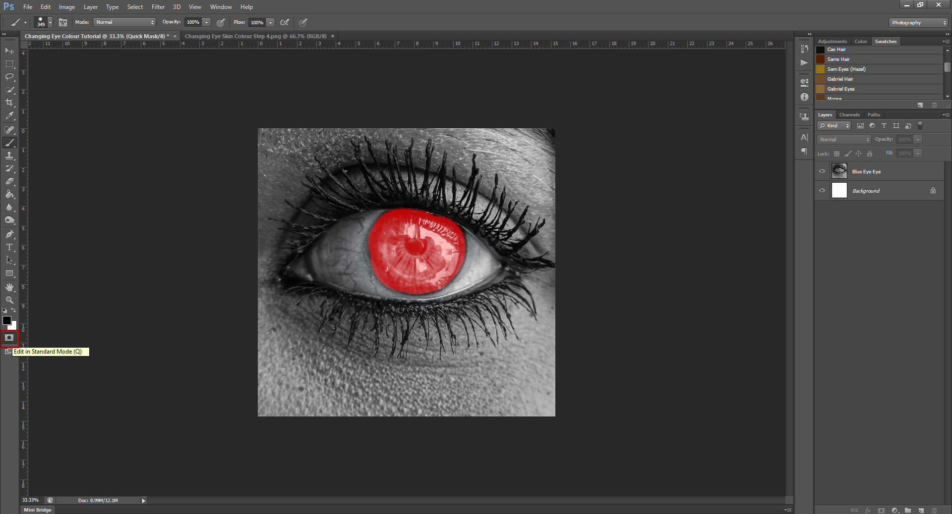
Step 3:
Now that you’ve painted over the entire part you want to change, click the button under the Colour Swatches again, and you’ll notice the red goes away, and there should now be a slow-flashing dotted line around your image – this is showing that you’ve selected it.
Step 4:
Go up to Select – Invert, this will now select the part you painted, instead of the part outside of that. (Don’t ask me why it defaults to selecting everything you didn’t paint, I have no idea)
Okay, at this point, you can now change the colour by one of two ways:
Way #1:
Step 5:
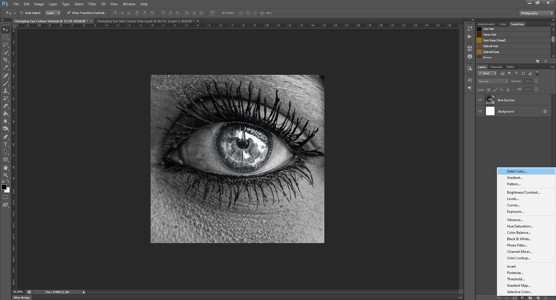
With the iris still selected, go to the bottom of the Layers Panel, and go to where you’d make a colour a background, and select Solid Colour from the menu.
Step 6:
After selecting the colour you want, at the top of the Layers Panel, there should be a box next to the Opacity drop-down that says Normal. Click on that to bring down a drop-down menu, and then select either Screen or Overlay from the menu. (Use whichever one makes the colour look the best)
OR
Way #2:
Step 5:
Now that the part you want to change colours is selected, go to the top of your Layers Panel, and you should see a panel sitting on top with tabs in it, that are labelled Adjustments, Color, and Swatches. Click on the Adjustments tab, and then click on Hue/Saturation from the pictures listed. Hue/Saturation looks like a colour picker, and is beside the thing that looks like scales.
Step 6:
After clicking Hue/Saturation, a panel should pop out, with different sliders on it. To change the iris colour, you can play with the Hue and Saturation sliders, until you find a colour you like. If you find that the colour is too subtle, (even with the Saturation on full), try checking the Colourize box at the bottom of the panel. This may help.
(Back to both ways)
Step 7:
Once you have a colour you like, go to your Eraser tool, and erase the pupil, and if there is colour outside the edges/area you want to be coloured, erase that, too. If you used the Solid Colour method, you may get a dialogue box that comes up that says something about rasterizing the layer, or that it won’t be editable anymore, just click ‘okay’.
Once you have the edges/pupil all cleaned up, you’re done and ready to save!
I wouldn’t say this technique is easier than the other one, but this one is a lot more versatile, and as I said above, can be used on more than just eyes. It also makes it look more realistic, in my opinion. Once you’re happy with the pupil, why don’t you try to colourize the skin colour as well?
Go ahead and play around with this effect, to see how it works best for your needs – the next tutorial will be coming Aug. 30th, so you’ll have plenty of time to master this one!
Next time, I’ll be showing you how to make a GIF! Oh, yes.
Check out the rest of the photoshop tutorial series here!
Liking the site? Consider signing up for my Patreon, so I can continue bringing you the content you love!
While this tutorial isn’t too realistic (we’re not adding this effect to a person or animal), I still want to say that if seeing blood makes you nauseous, faint or is in any way triggering for you, please skip this tutorial, or continue with caution.
The purpose of these tutorials is to be helpful, not to negatively affect a persons’ health or cause anyone any harm.
This is the last PHSH tutorial for 2020, so please feel free to check out the other tutorials while you wait for the next one, which will be coming some time next year.
Keep an eye on my Twitter account for posting updates and anouncements!
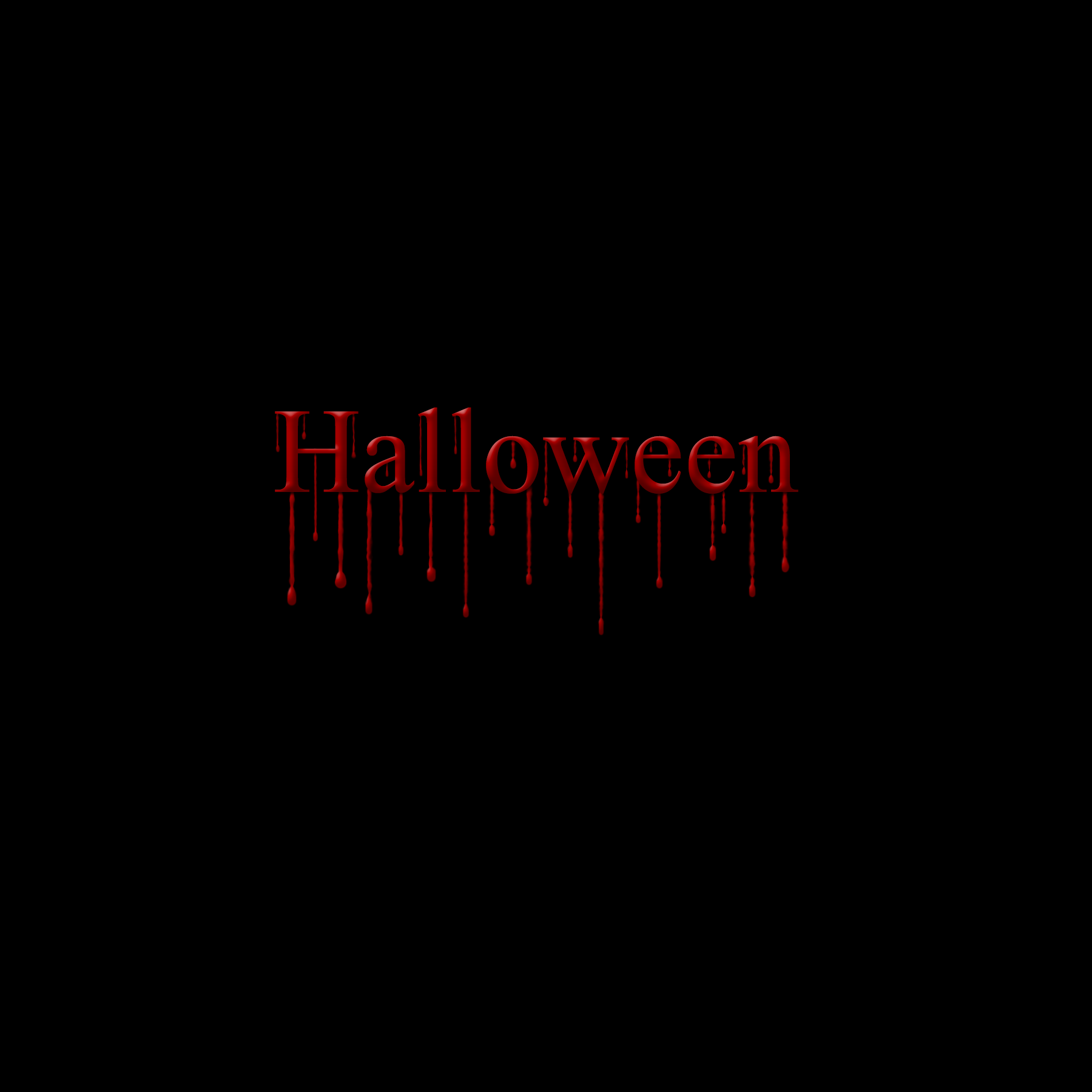
Since we’re in October now, I thought what better PHSH effect to teach you then to add blood drips to an image?
It also just so happened to work out that this is the 13th tutorial – it’s like it was meant to be!
As with most of these other tutorials, it isn’t actually that hard, once you know how to do it. There’s just a few very precise steps you need to follow. And, as always, practice makes perfect, so the more times you do it, the better you’ll get!
Let’s get into it.
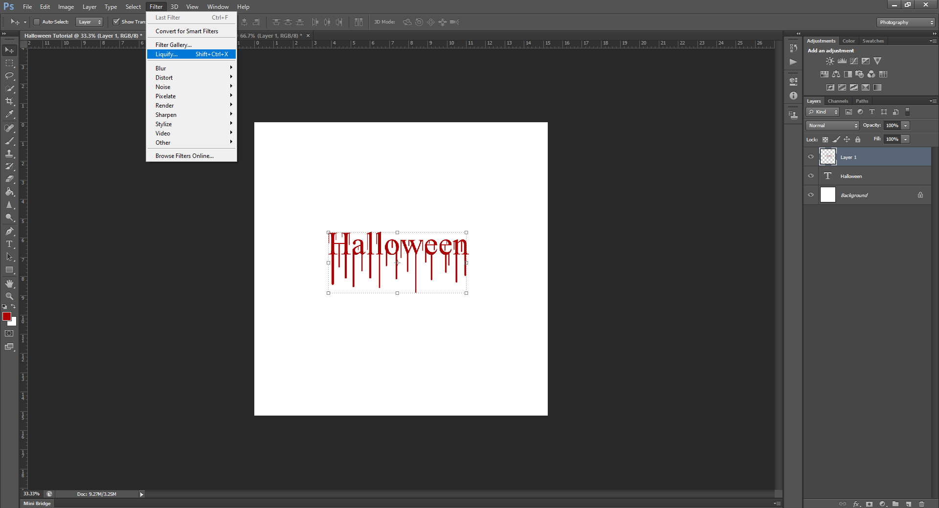
Step 1:
This will either work on text or an image, but for the sake of this tutorial, I’m going to stick with a plain text layer. The technique is the same whether you’re doing a basic picture or something more complicated, so it’s best to start simple, and work your way up.
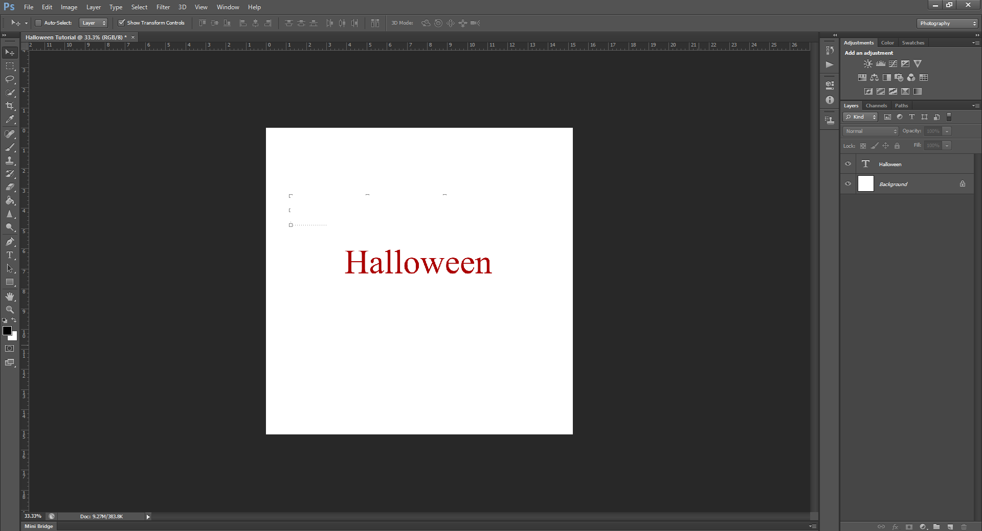
Starting with Step 1, which is opening a new document, and adding some type/a word to a layer. To keep with today’s theme, I’m just going to type Halloween. The colour doesn’t matter, but it may look more realistic to use a closer-to-blood colour.
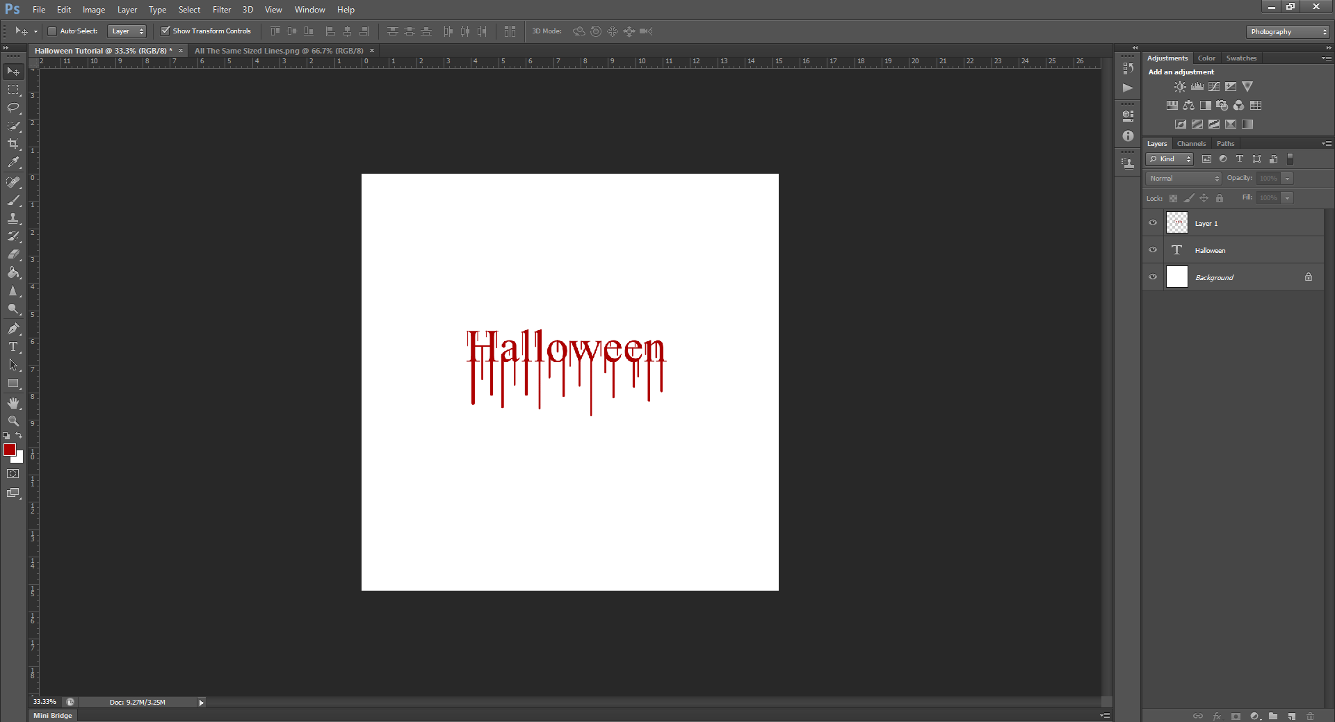
Step 2:
Using your brush tool (and a shade of red), hold down SHIFT and make vertical lines coming out of the ends of the words. (Holding down SHIFT will make the lines perfectly straight) You’ll also want to vary the length of the lines and the size of the brush you use, so it looks more realistic.
Tip: Before you use the brush tool on your Type Layer, you may get a dialogue box that says something like ‘you must rasterize this layer before proceeding, and it will no longer be editable as a Type Layer’. Just click ‘Okay’. This just means you can’t use the type tool to edit the layer anymore, but that’s okay. If you mess up you can always delete this layer and make a new Type layer.
Or if you like, you can paint the lines/drips in a new blank layer, so you don’t mess up the text.
Example:
Compared to:
See the difference? The varied length and size already is starting to look like blood!
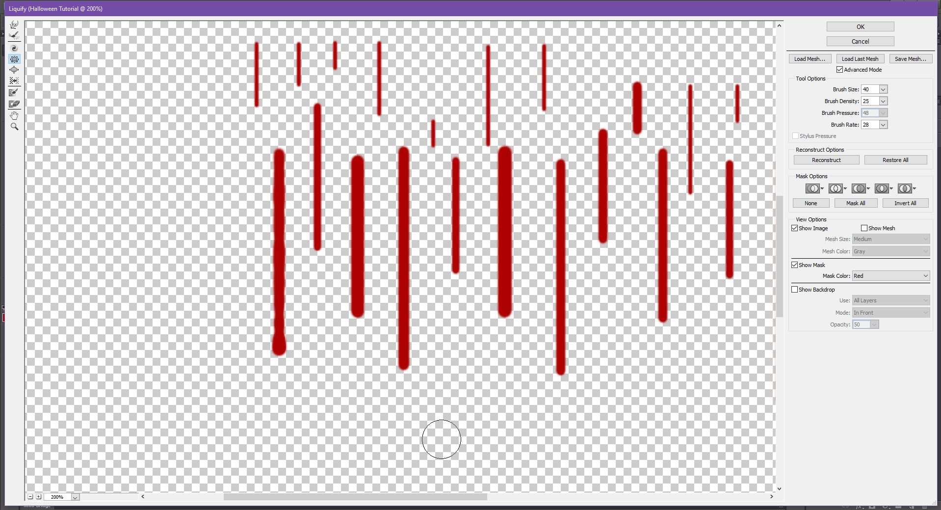
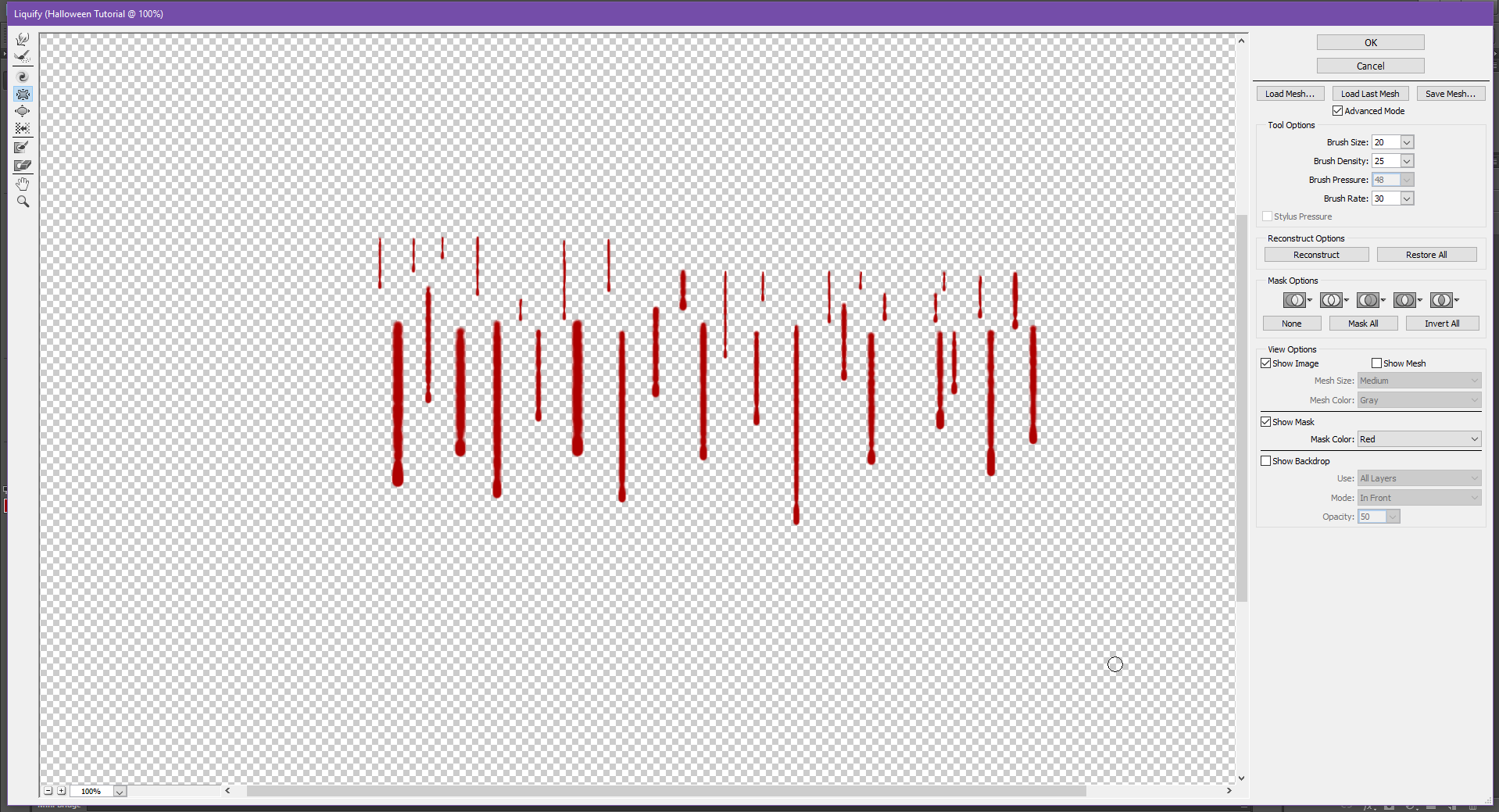
Step 3:
Now that you have your lines, we’re gonna go up to Filter – Liquify.
You may get a dialogue box that says something like ‘Liquify supports hardware acceleration to improve performance. Verify that ‘Use Graphics Processor’ is enabled in Performance Preferences.’ Just click okay, and then once it opens, set the following values in the Tool Options panel on the right hand side:
Brush Size: 40
Brush Density: 25
Brush Pressure: 48
Brush Rate: 28
The lines you made may show up by themselves in the Liquify panel, this is okay! It’s just because I painted them in a different layer than the Type Layer, just in case I needed to change something.
This technique will work whether they’re attached to the word or not.
Step 4:
Now that you’ve set the Tool Options, select the Pucker tool from the left side menu, and drag it down the line you made, stopping just short of the end. Do this for all the lines you made. To do this step, we don’t need to keep the lines perfectly straight, because blood doesn’t drip in a perfectly straight line. So, try your best to make the lines look a bit ‘wiggly’ or just non-straight.
You may also have to hold the brush an extra second above the bottom, just so this part is the most puckered. (You can also change the Brush Size if needed)
Step 5:
Now to make the actual blood droplets, use the Bloat Tool (directly underneath the Pucker Tool) and hold on the ends (or wherever you want blood drops) until you get the desired blood drop size.
Repeat on all the lines, and then once you’re done, click Okay. If you need to, you can always re-pucker parts of the lines, or if you accidentally puckered part of the line too much, you can use the Bloat Tool to make it more even.
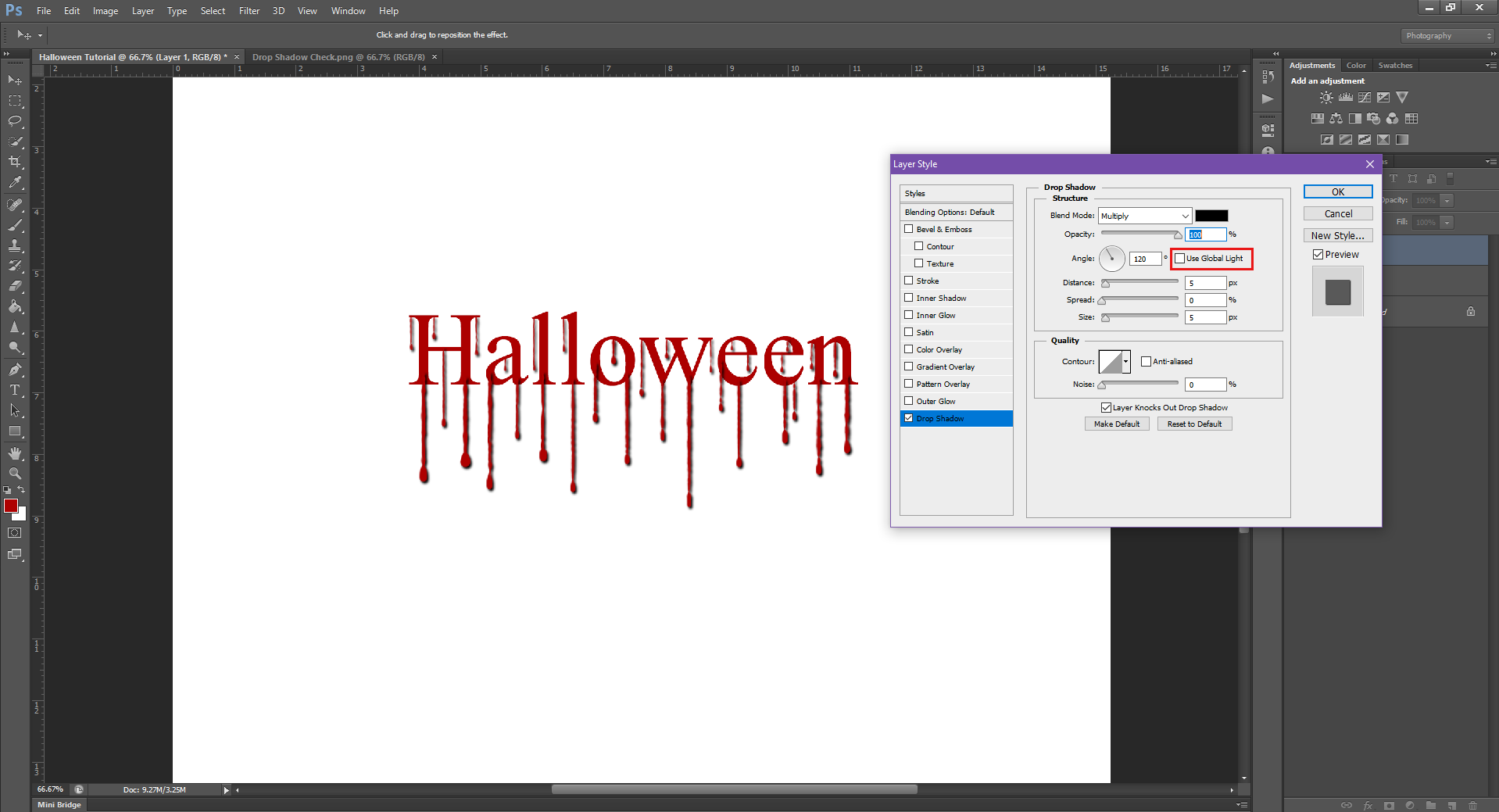
Step 6:
This is looking pretty good, but they’re still not quite as realistic as they could be. So now, we’re just going to add a simple Drop Shadow to the layer.
If you need help in doing this, head back on over to my Drop Shadow tutorial.
Be sure to un-check the box marked Use Global Light, and then play with the Distance, Spread and Size until it looks right for your document. You can also change the Opacity to 100%, and the shadow Colour by clicking on the colour square, and selecting a new colour.
I’m going to make the new colour a darker shade of red, instead of pure black.
Once you’re happy with how the drop shadow looks, click Okay.
If you did the blood drips on a separate layer like I did, then you will also have to add a Drop Shadow to the word Halloween (or whatever word you typed), because as you can see right now, it looks a bit odd to have a drop shadow on the blood, and not on the word.
These next few steps are optional, but I feel it helps take things a step further, and makes the effect look better. However, this completely depends on what you’re adding blood drips to, so it may not be needed. This is why I always suggest playing around with the effects, so you find what works best for you. That said, this is a Halloween themed tutorial, so I think the extra steps below help add that extra ‘creepy’ vibe.
Step 7:
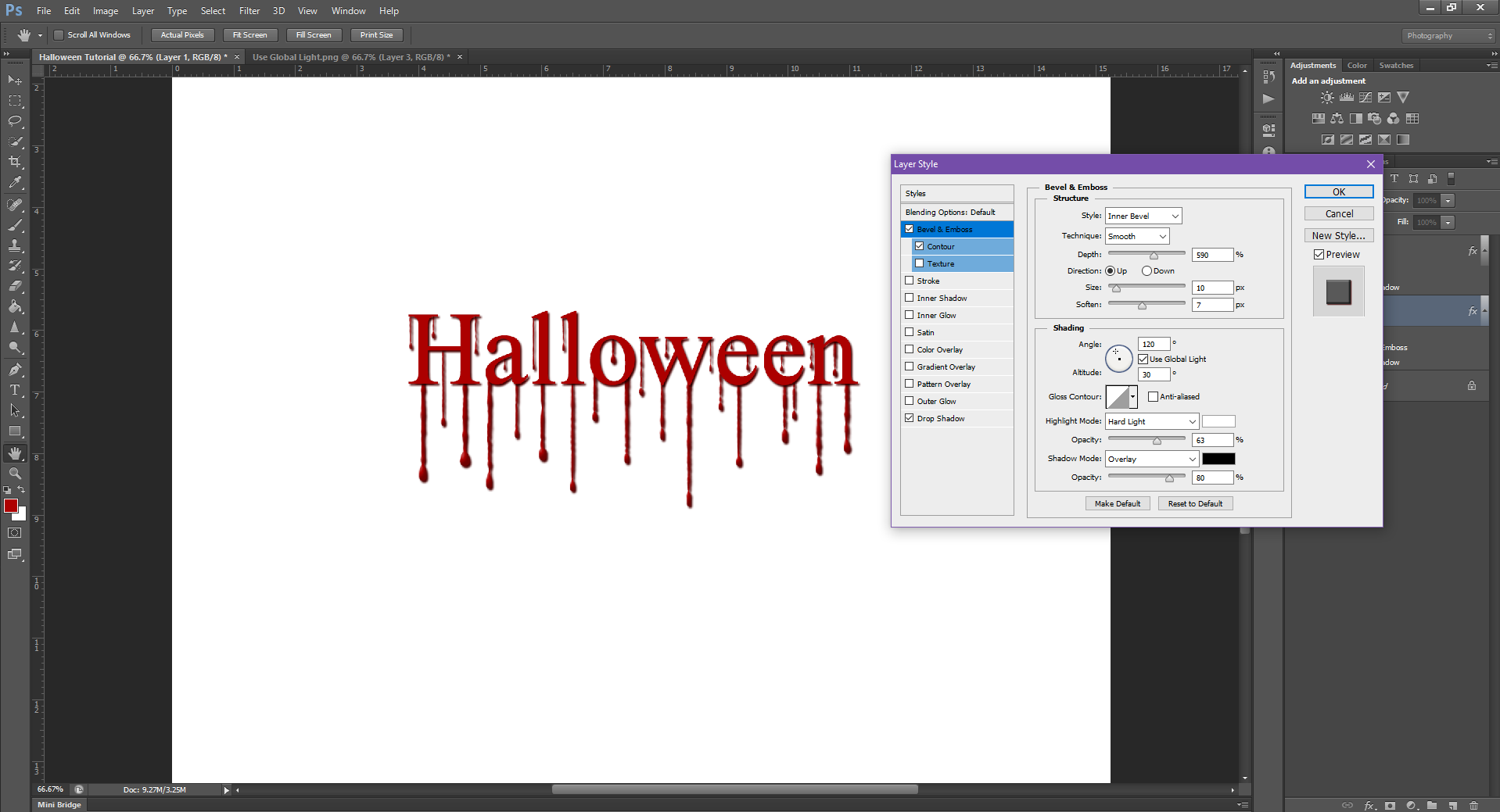
We’re going to go back into the Blending Options, and this time we’re going to click Bevel and Emboss.
Set the Levels to the settings below:
Inner Bevel
Technique: Smooth
Depth: 590
Up
Size: 10
Soften: 7
Shading:
Angle: 120, 30
Highlight Mode: Hard Light, Opacity: 63
Shadow Mode: Overlay, Opacity: 80
Then set the Contour to the below:
Gaussian (Round one that looks like a hill)
Range: 0
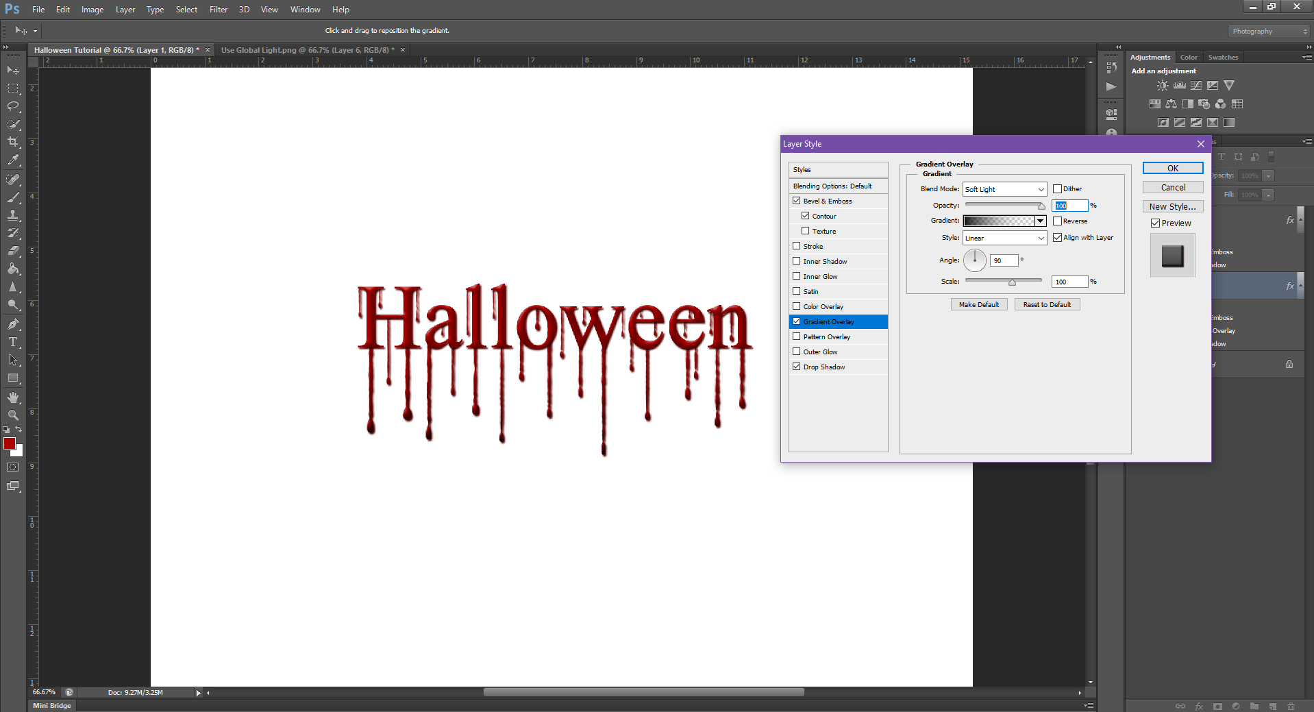
Step 8:
And finally, we’re going to add a Gradient Overlay, with the below settings:
Soft Light
Opacity: 24
And add it to the Type layer as well:
And to add just that little extra ‘oomph’ to the image, I’m going to change the background colour to black, so the red colour really pops.
As always, don’t forget to save your work! (Both as a PHSH file, and as a JPEG/PNG)
Then you can use the image to show your friends, and keeping the photoshop file is always a must, just in case you forget how some of the steps, or if the picture file somehow gets corrupt, or you need to quickly go back and change something.
And ta-da! That’s it. Not too hard, eh? I would suggest to practice this technique with different text, and then once you feel comfortable, to move on to actual pictures. Since this is the last tutorial of the year, you’ll have lots of time to practice!
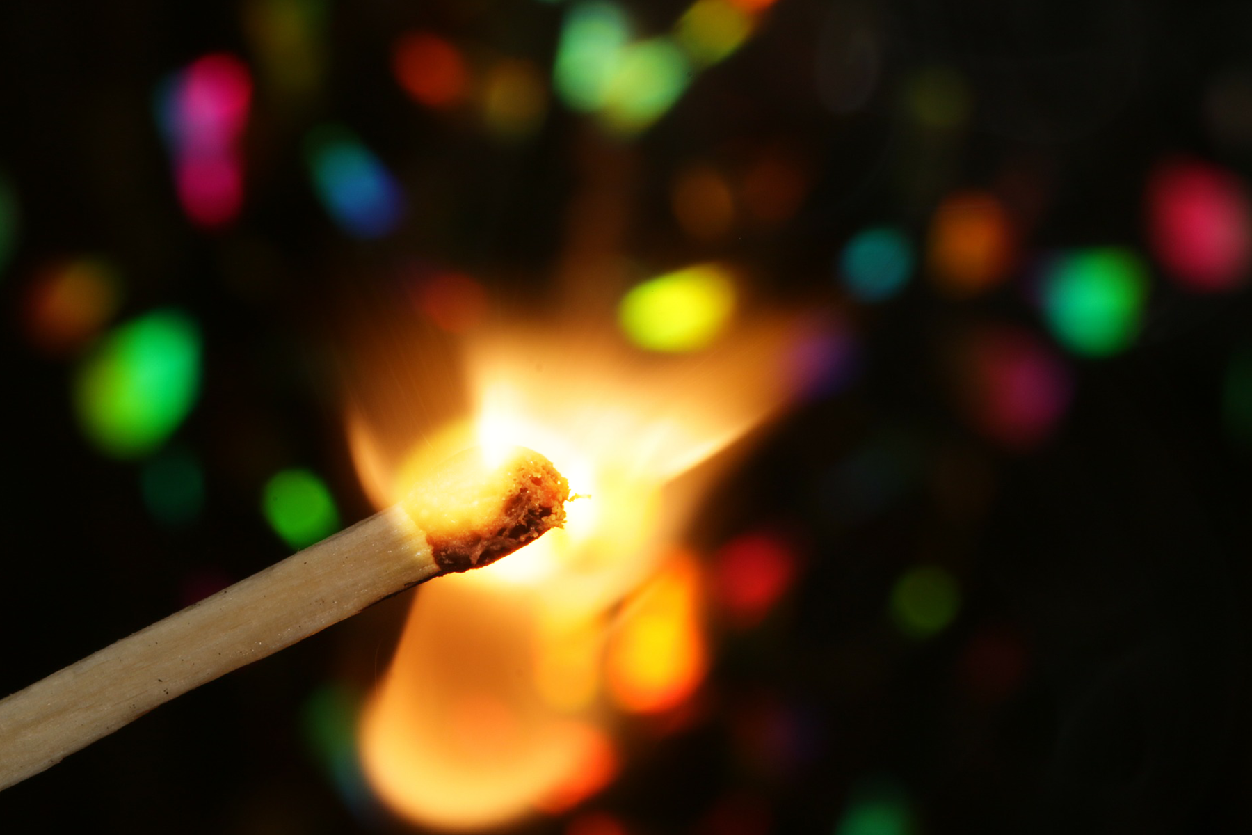
Spot Brightening is a very important skill to have. Sometimes – for whatever reason – an image will come out with a dark spot, or will have weird lighting. Spot-treating images can be an immensely helpful tool in your PHSH arsenal, especially with summer right around the corner, you know you always get that one Beach Day pic where there’s too many shadows.
And, like most of the other effects I’ve shown you, it’s secretly really easy once you know what to do.
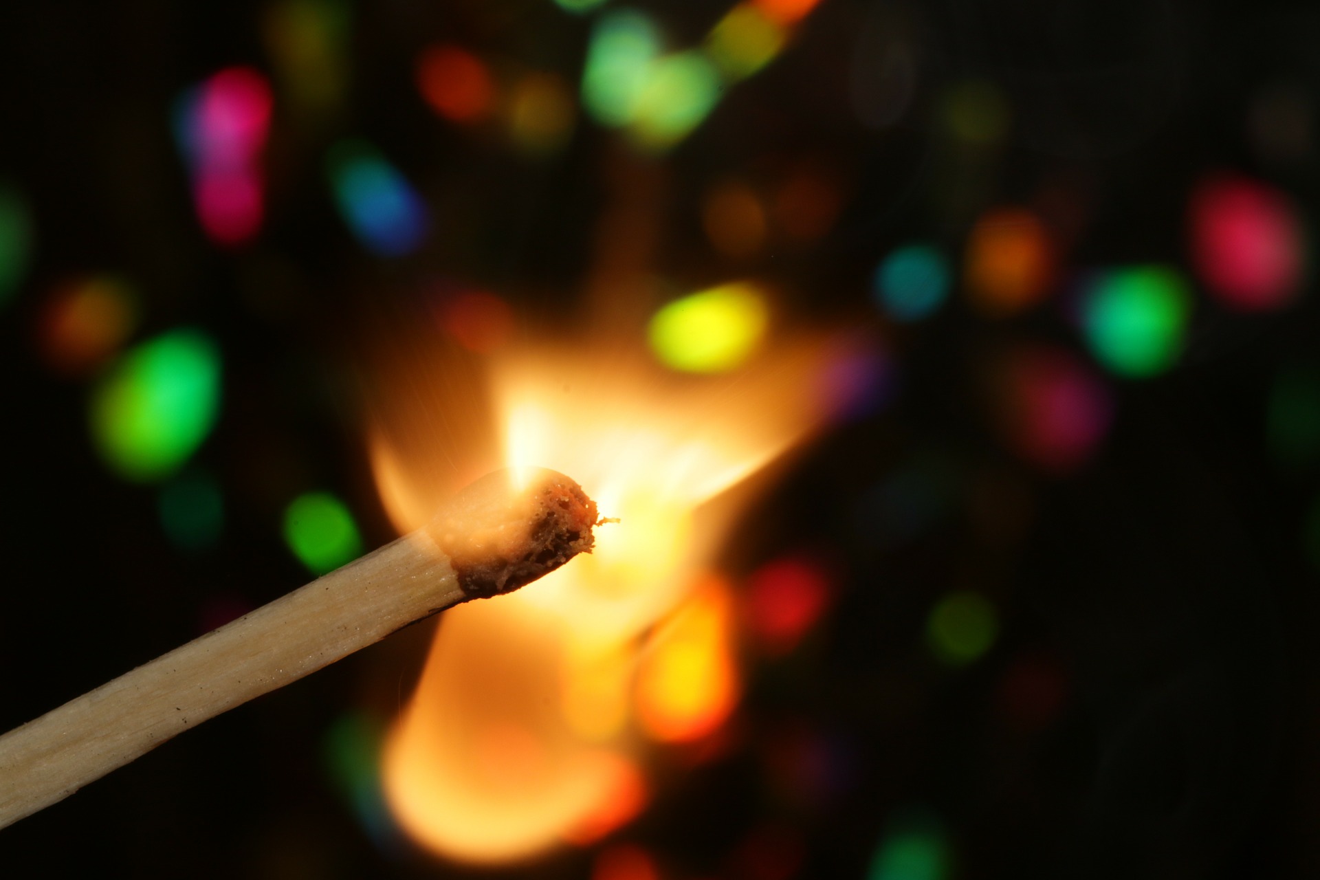
I’m going to use the teaser image from last month, even though most of it is dark already. I think keeping the images consistent is helpful when needing to look back at the effects while you practice them. So, for simplicity sake, we’ll be using the Match image:
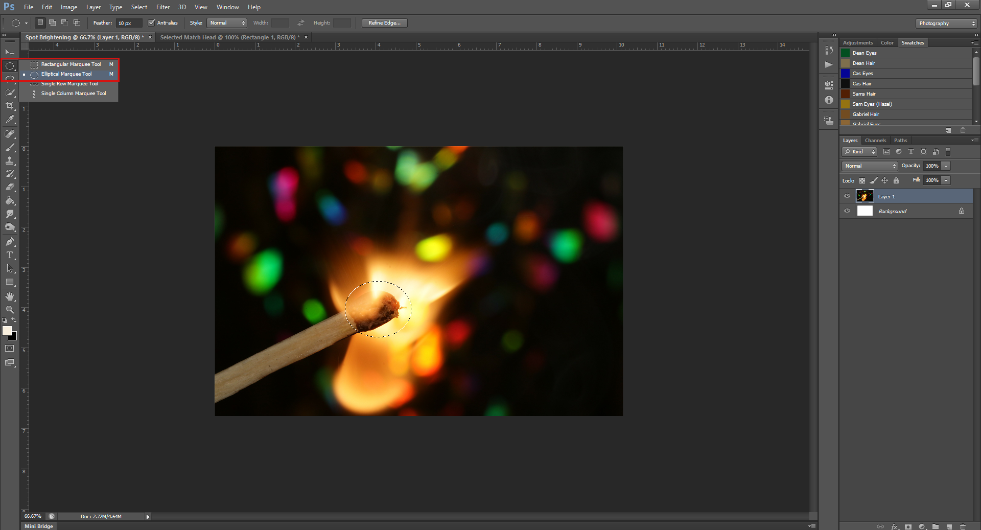
Step 1: Start a new Work File/Document/Whatever-You-Want-to-Call-It in PHSH and drag/drop the image into it. Don’t forget to resize so it fits into your work space.
Step 2. Using the Elliptical Selection Tool, select the head of the match, and a bit of the flame.
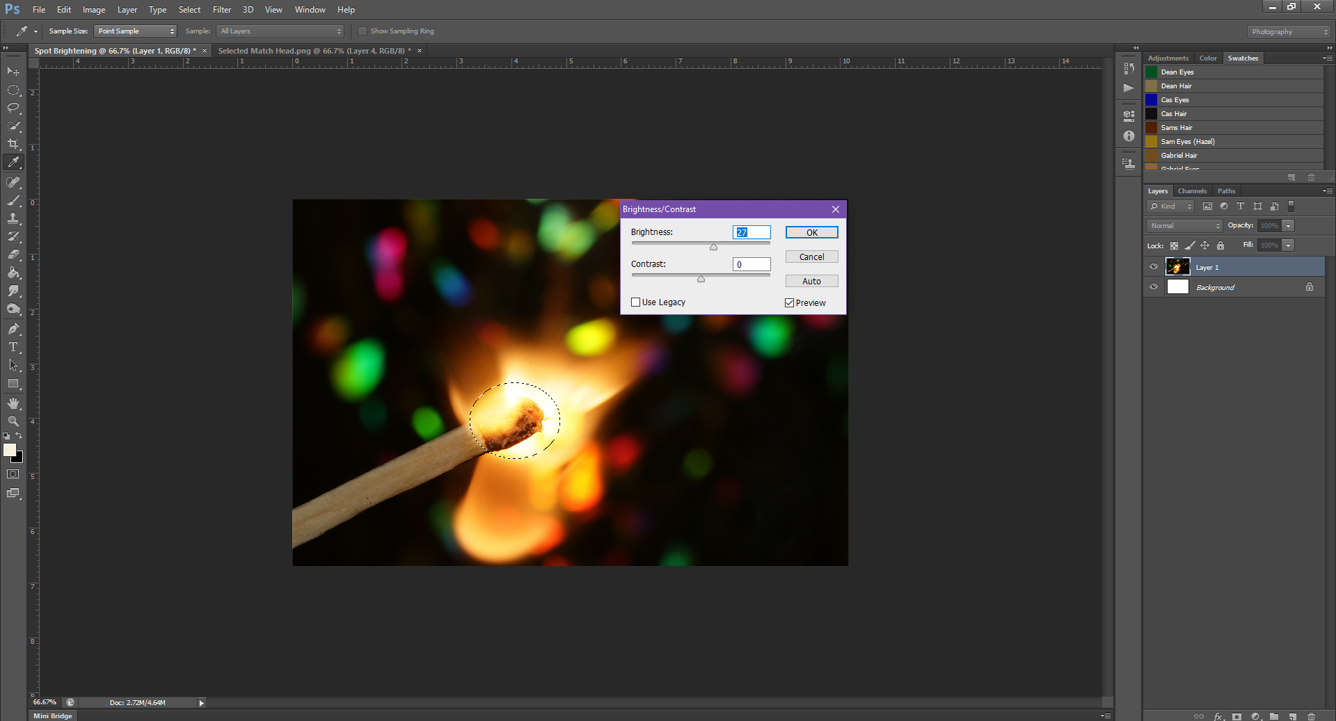
Step 3. With the head still selected, go up to Image – Adjustments – Brightness/Contrast
Step 4. In the Brightness/Contrast box, slide the Brightness slider toward the right to brighten the selection. Sliding it in the opposite direction will make the selection darker.
Step 4. Once you’re happy with the Brightness, click Okay to make the transformation stick to the picture – or, if you are in the Brightness/Contrast by accident, you can always Cancel to undo the change. (One of the great things PHSH has for most of the effects is the Live Preview, so while you’re playing with Brightness/Contrast, colours, etc. you can actively see what you’re changing on the image)
If, for instance, you need to make the selected area brighter than the slider will let you, you can hit ‘Okay’, stay on the selected area and then re-brighten it to whatever you need.
For instance, I brightened the picture at first to +64:
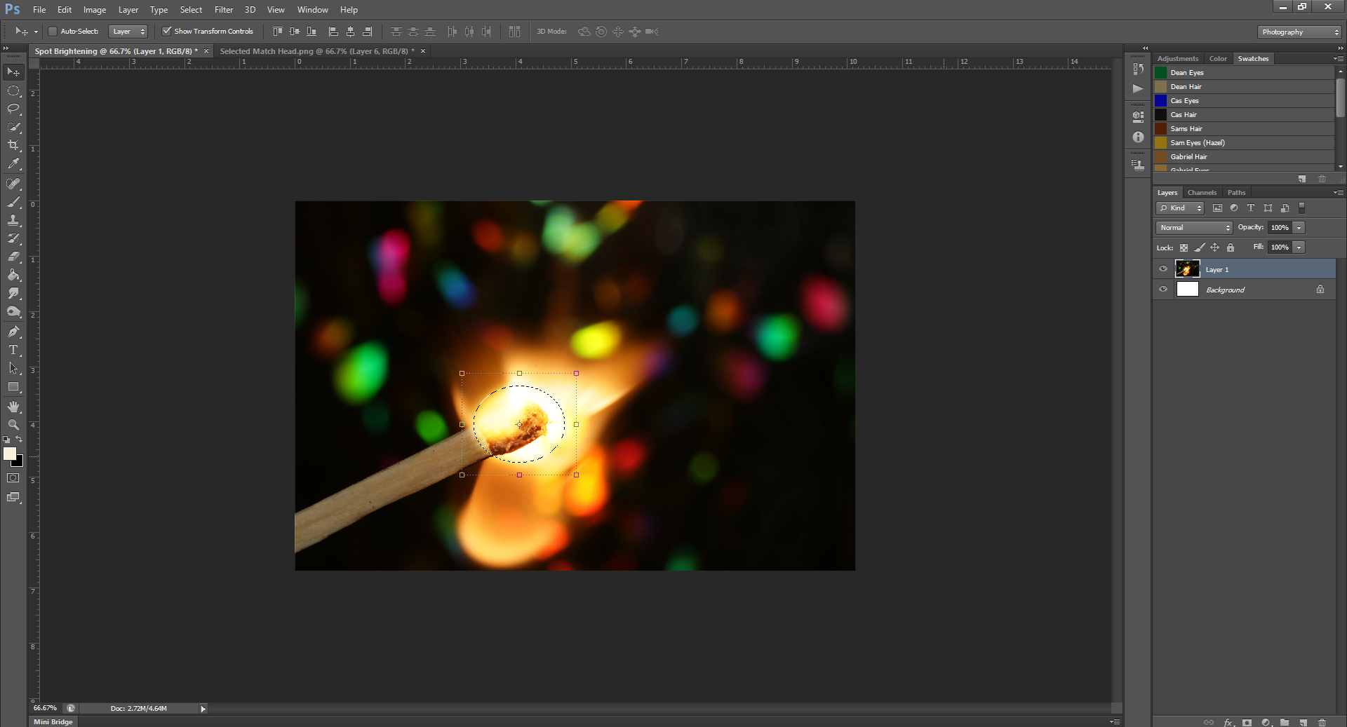
But if I needed it brighter, I could go back in and:
And so on, and so forth, until my hearts’ content:
You could basically do this until there is just a white hole in the middle of the picture.
Yep, that’s literally all there is to it.
I mean, there is another way you could do this – but that involves a hell of a lot more steps and Layer Masks – it just gets waaay too complicated. Which, truthfully, was the way I learned how to do it first before figuring out this easy way, and since these tutorials are here to make your lives easier, I’ll just refrain from sharing that overly-long pain-in-the-ass way.
Thank me later!
Aaand I don’t want you to get disappointed or anything, but this will be the last PHSH tutorial until October. Since I’ve started No. Mad. I’ll be focusing more on that for the next few months. Think of this time off as extra time for you to practice all the effects you’ve learned thus far.
Like the tutorial? Check out the rest of the series here!
Liking the site? Consider signing up for my Patreon, so I can continue bringing you the content you love!
Now that we’ve begun to get into some of the harder/less beginner-type effects, it occurred to me: I never addressed one of the simplest effects you can use to up your Photoshop game: changing a pictures’ opacity.
This can be super helpful if you need to add a background to your image, or need to add layers of pictures upon pictures.
So let’s get into it:
Step 1. You’re gonna need some pictures.
Let’s say you want to add this
To the background of this:
Step 1 is to open both the pictures, and a new document/project for you to work on.
Step 2: Drag the images into your working document, as I showed you in the Intro.
Step 3. Resize them so they fit into the document.
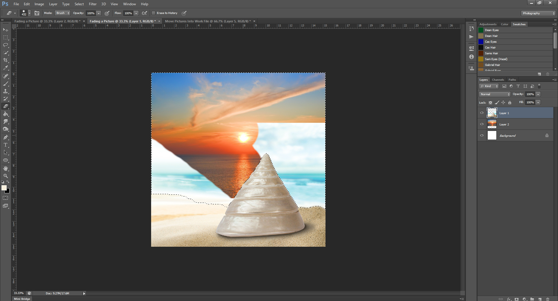
Now, we’re actually first going to have to use a different technique. Because the foreground picture with the shell already has a sky background, we’re going to have to remove that. To see how to do this, you can go look back over this tutorial.
Actually, never mind – I’m going to be using an even simpler way.
We’ll still be using the Quick Selection tool, and selecting the shell and the sand.
Now, instead of going up to Selection and doing the Refined Edge stuff, we’re just gonna right-click, and click on Select Inverse.
Go to the Erase tool, and erase the background.
And boom! Don’t forget to go back to the Quick Select tool, right-click and Un-Select the selection so we can move on. This is basically a faster way to erase, so it’s great to have in your arsenal. (Especially if you’re doing collages, it will shave a lot of time from your work)
Step 4. As you can see, the sunset picture doesn’t cover the entirety of the work file. This means we’re going to have to use another technique I already showed you: Content-Awareness Scaling.
For this picture, the Alpha 1 layer is going to be the sun, so it doesn’t get all stretched out.
Now that the sunset takes up the whole background, the shell looks out of place, and the sun is too low. So we’re going to drag the sunset picture up, until the shell is at the edge of the water.
Yes, we probably didn’t need to Content Awareness Scale the image as much as we did, since we just needed a bit more sky, but it’s always good to have too much of an image than too little. If you wanted to change the image location again, you would be able to.
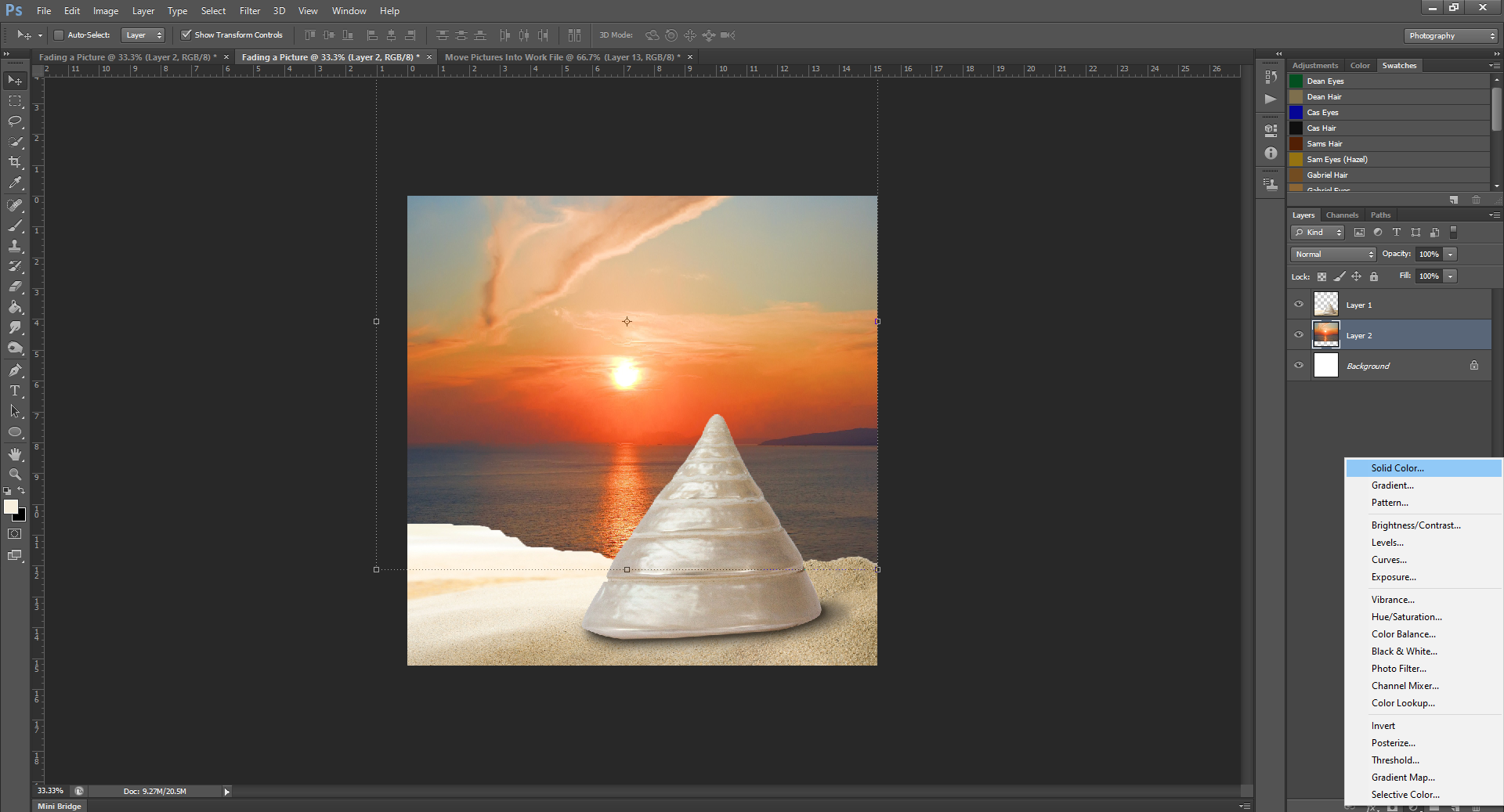
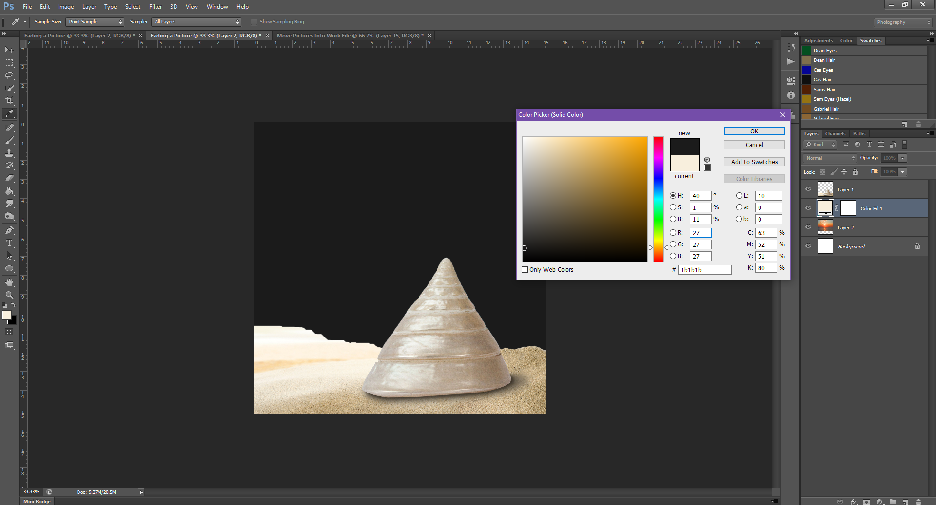
Step 5. To make the Dark Background, we’re going to add a Colour Layer under the other two pictures.
Because this is the darker background, we’re going to use a dark grey.
Step 6. And now for the part you all came for: changing the Opacity of a picture.
The Opacity filter is in the Layers Panel, on the top right.
Click on the little drop-down arrow to change the opacity of a picture. This will make a picture appear more or less see-through.
Because we want to be able to see a bit of the background through the pictures, we’ll be lowering the opacity just a bit.
Make sure you’re changing the opacity of the correct layer.
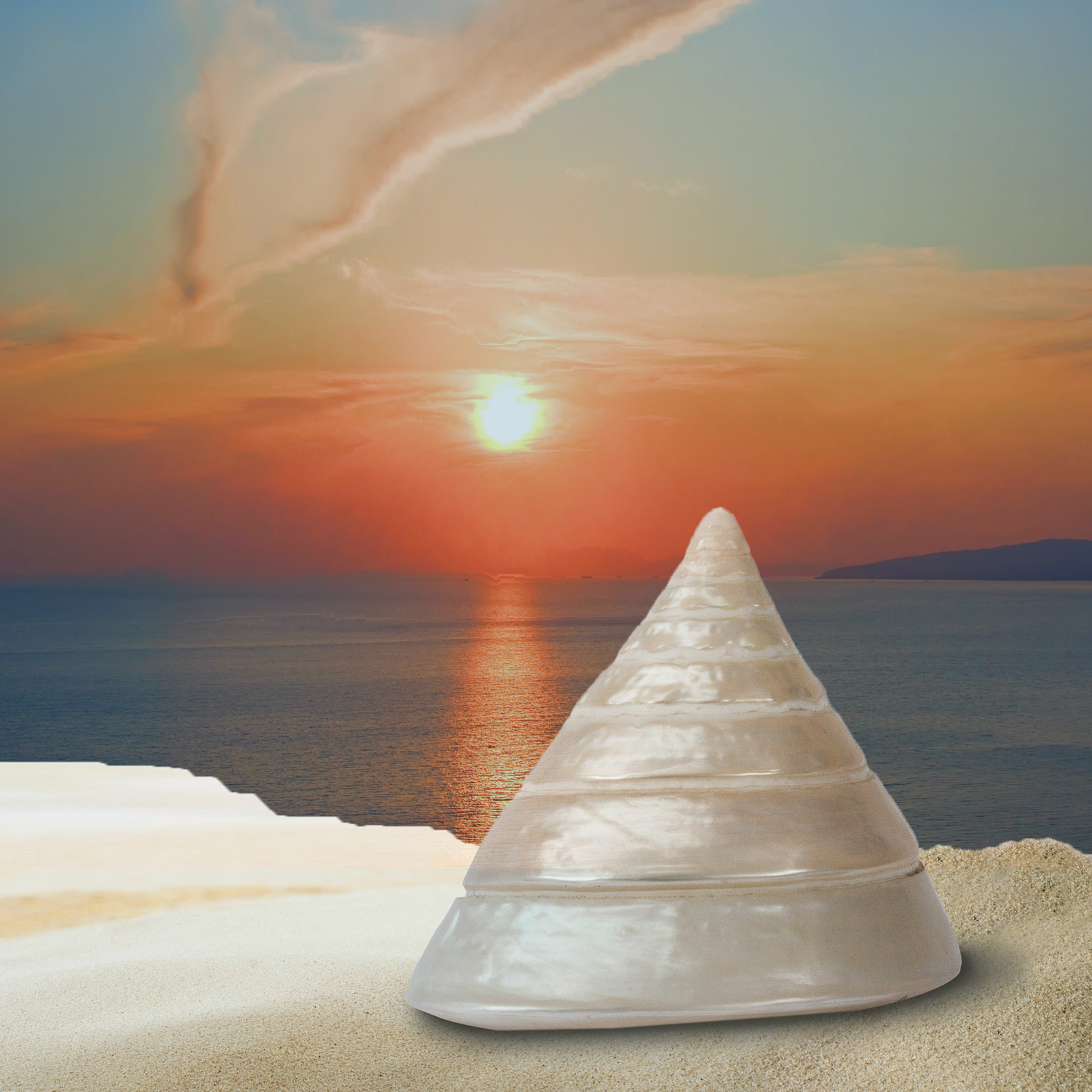
Notice how if you make the Opacity of the Shell picture too low, the background pic will start to show through? This can be useful in collages, or if you need to overlap a bunch of pictures, but for this simple tutorial, it’s too much. I’m going to lower the Opacity to just 90, so that we get some of the dark grey of the background, without the harsh line of the sunset picture showing through.
Now, because the sand is a much lighter colour, you may choose to Burn the picture as well, if you really want to get it to match.
You don’t always end up with a similar to Burned effect, like in the Light background.
It depends on the pictures themselves, mostly and what the colour schemes already are.
One good thing about adding the Colour Layer is that if you don’t like the background colour that is showing through, you can always change the colour to get the desired effect.
For example:
Changing the background colour to Red gives the picture a warmer feel
Whereas Blue gives a completely different vibe.
Play around with the colours and Opacity percents to see the different effects you can get.
Once you get the background colour you want, you’re done! Just be sure to save your work.
That wasn’t too hard, right? And you got to practice some other effect skills – see how the skills build on top of each other? Most pic manips will require some combination of the effects I’ve shown you, so it’s good to practice combining them to see what you can come up with, and which effects you like best.
Next month I’ll show you how to take this:
and brighten a specific spot on an image, like this:
I hope you all had a relaxing holiday season (or at least, had time to unwind now that it’s over) and are ready to dive head-first with me back into the tutorials.
To kick off the new year, I’ll be showing you how to use the Burn tool. It’s pretty straight forward, but if you need a quick refresher, go skim back over the Intro. It’s alright, I’ll wait.
…. You back? Good.
Okay, so using the Burn tool like I said is pretty straightforward, fortunately, this is one of the PHSH tools that’s aptly named. Using this tool will do exactly what the name implies: it’ll burn the picture.
If that sounds scary, I promise it’s really not that hard. You can control the intensity of the burn, so you don’t end up ruining the picture. Which is great, because sometimes, you just may want to go simple and say, darken the picture.
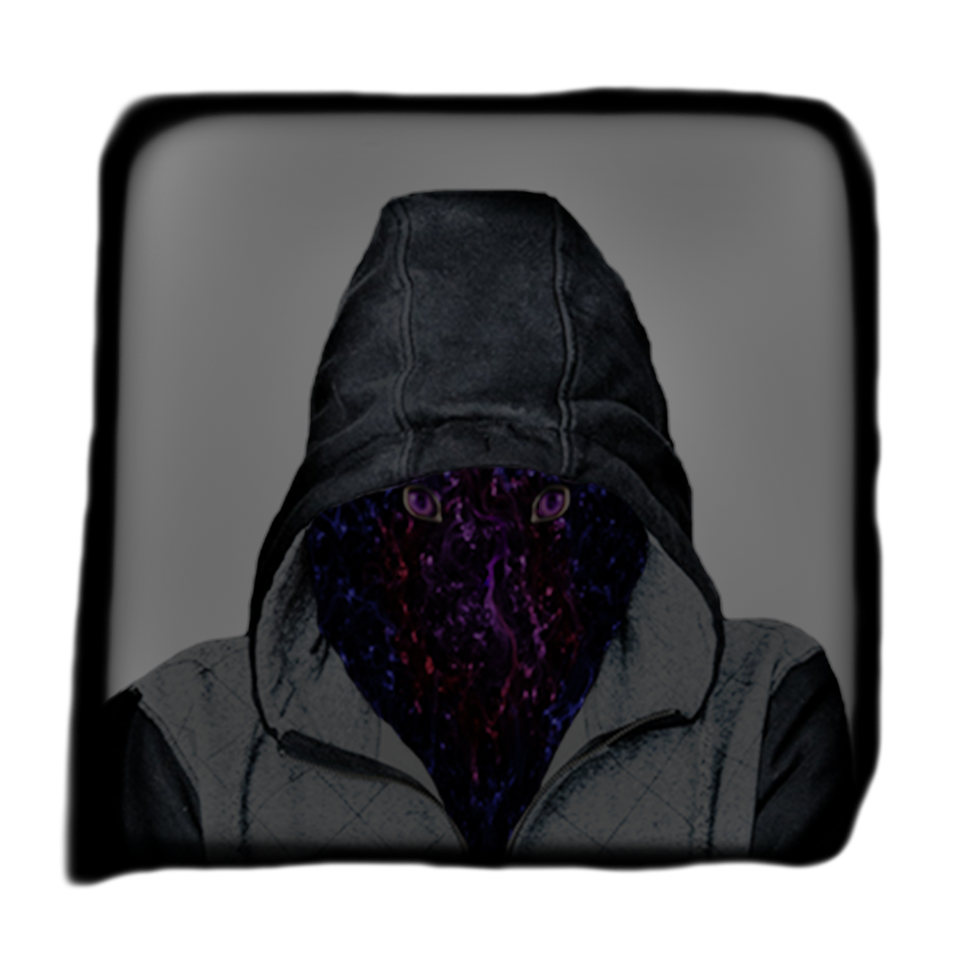
(Don’t mind the red background)
You could mess with the white balance or other picture exposure, but messing with those tends to be much more complicated.
Or, you may want to go for a more extreme manip, like actually making the picture appear to be burned:
Or you may need something in the middle. Regardless, it’s a very straight forward tool to use.
Let’s get started.
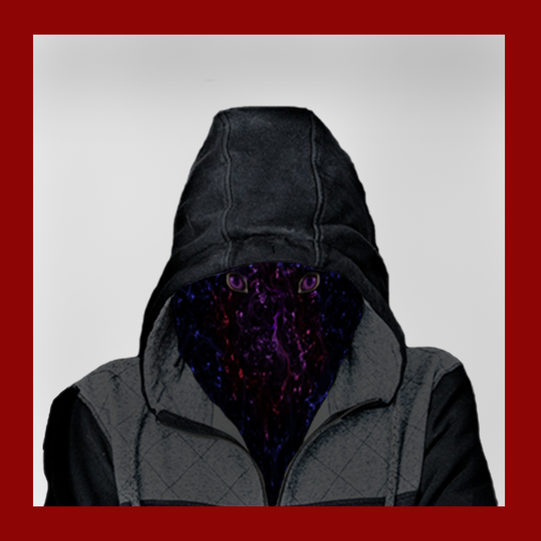
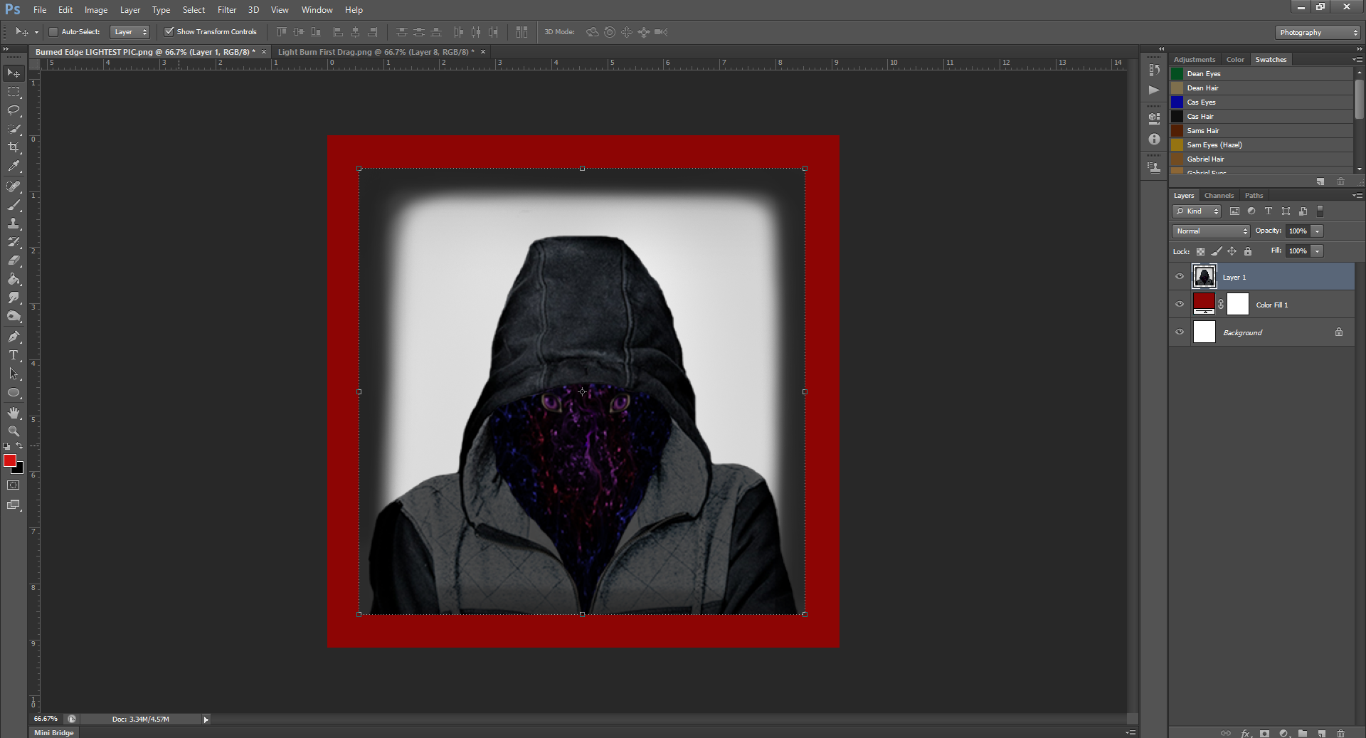
Today, we’ll be working with my I.D. pic, simply because I think it looks good burned. Pictures that tend to be darker and have lighter edges usually work better for this effect, but again, it depends how far you’re going.
Step 1.
Alright, so to start, you’re gonna need the un-touched picture.
Once you have this in a Layer, you may want to change the background colour from white, just so it’s easier to see where the edges of the picture are, so you can be more precise.
The colour of the background doesn’t really matter, especially since we can change it once you’re done, but I find it’s easier to work when you can see where the edge of the picture is.
Step 2.
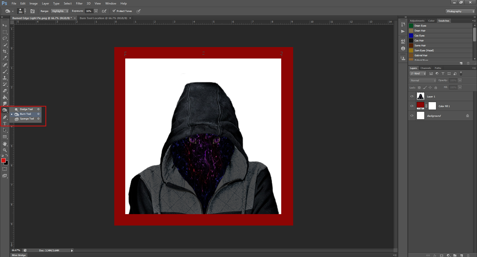
Alright, now that we have the picture, we’ll want to select the Burn tool from the left side Tool Bar. It’s the picture of a hand in a C shape, directly under the Blur/Sharpen/Smudge tool.
You may have to click on the box and manually select Burn from the drop-down menu. I believe the default image may be the Dodge tool, which looks like a lollipop.
Step 3.
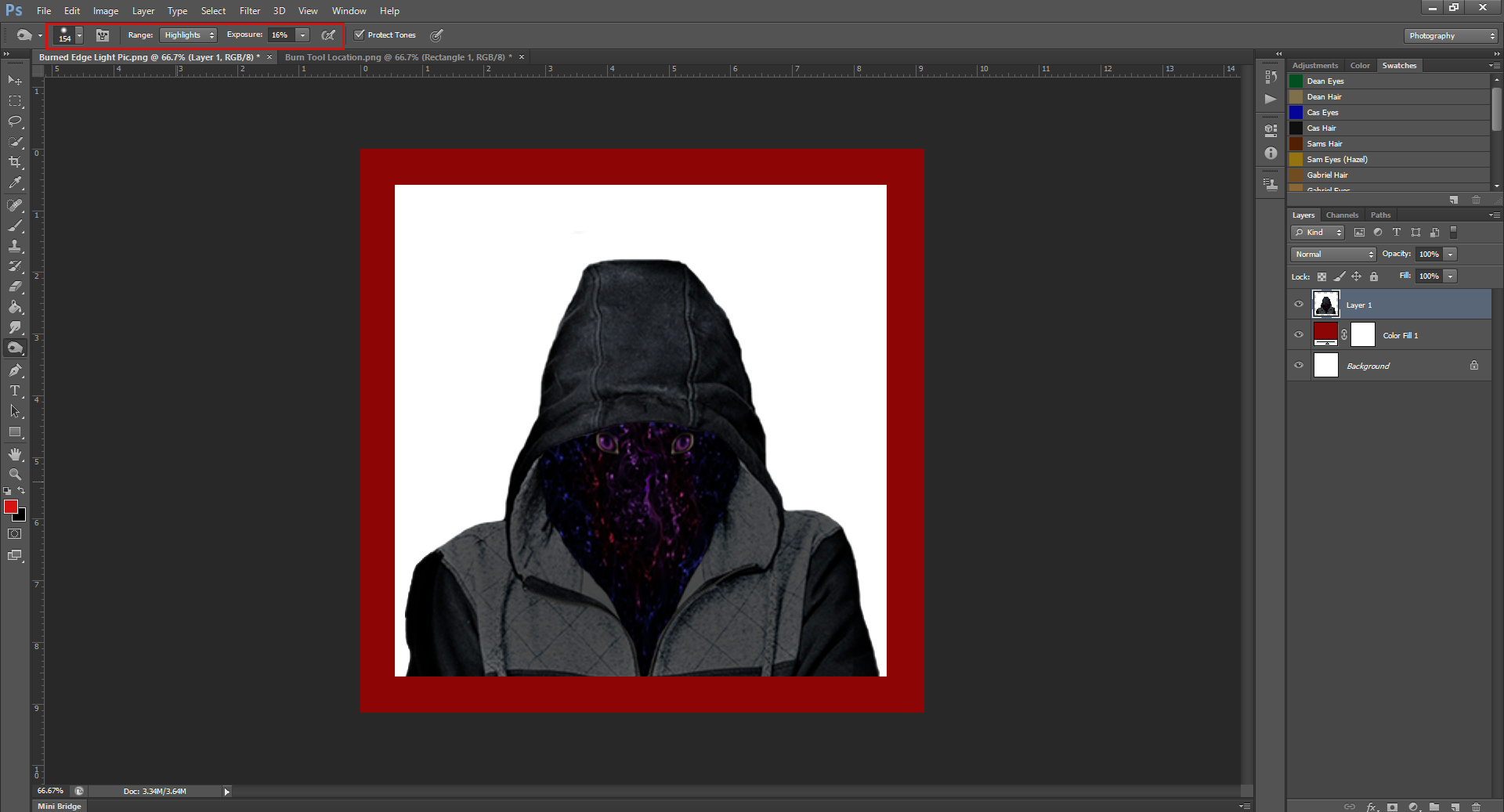
Once you have the Burn tool selected, (and the layer you want to use the tool on selected), you’ll notice some options came up at the top of the application, in the same space where the Eraser options are.
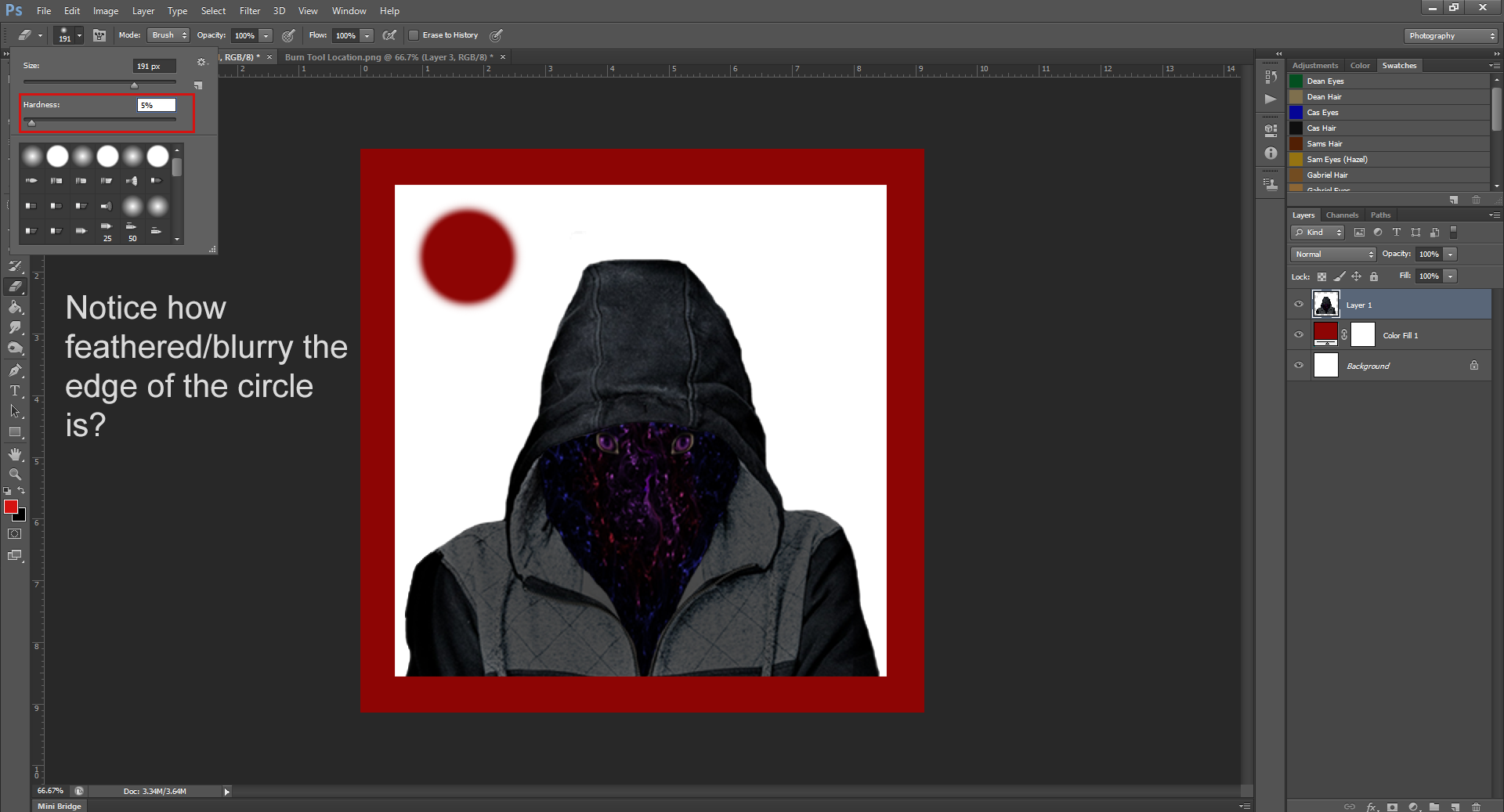
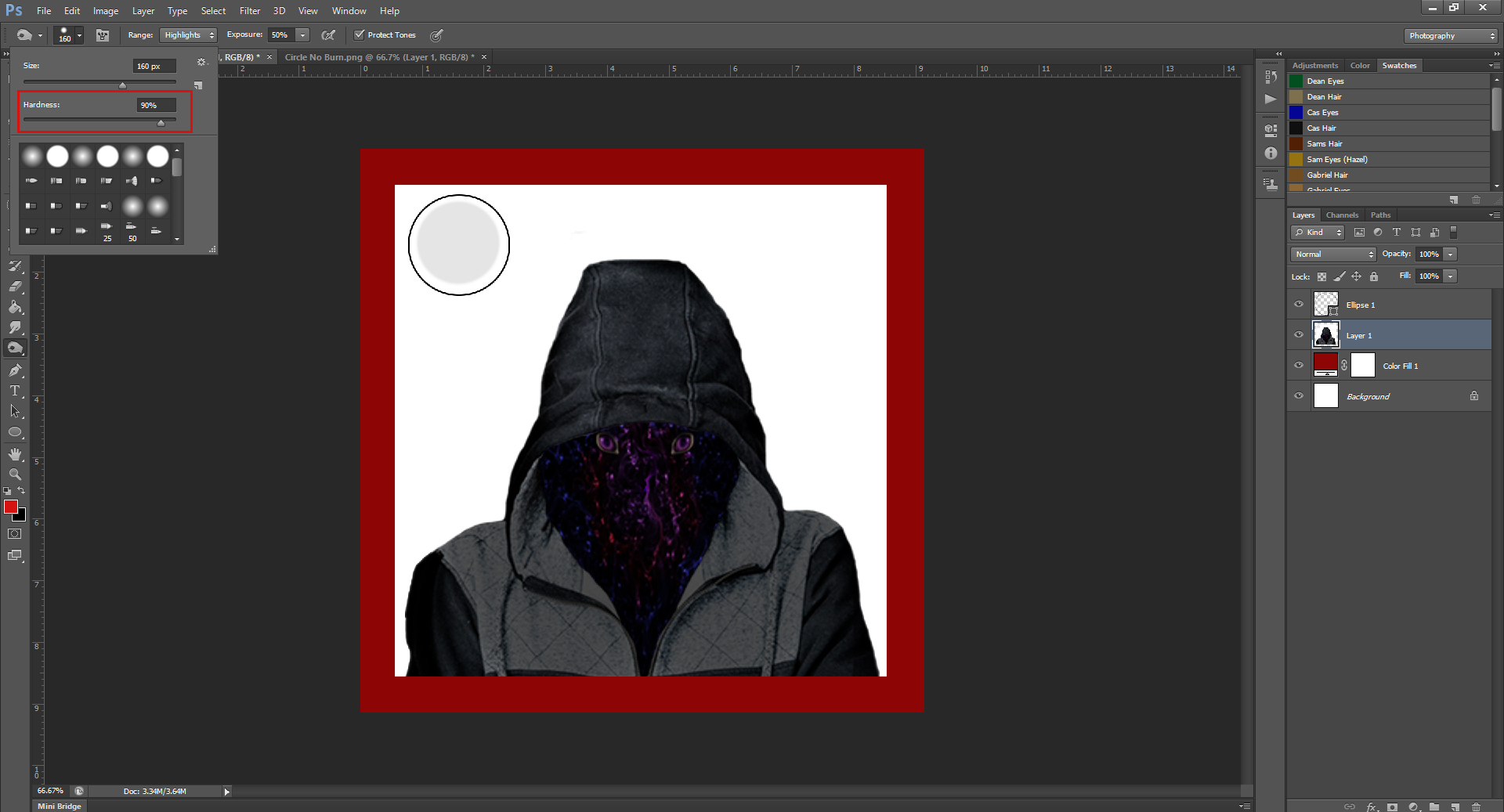
The drop-down menu with the circle in it is the brush size, similar to the Eraser, you can make it bigger or smaller by using the sliders. The Hardness slider underneath will determine how hard/feathered the edge of the tool will make. (These are both exactly the same as for the Eraser tool)
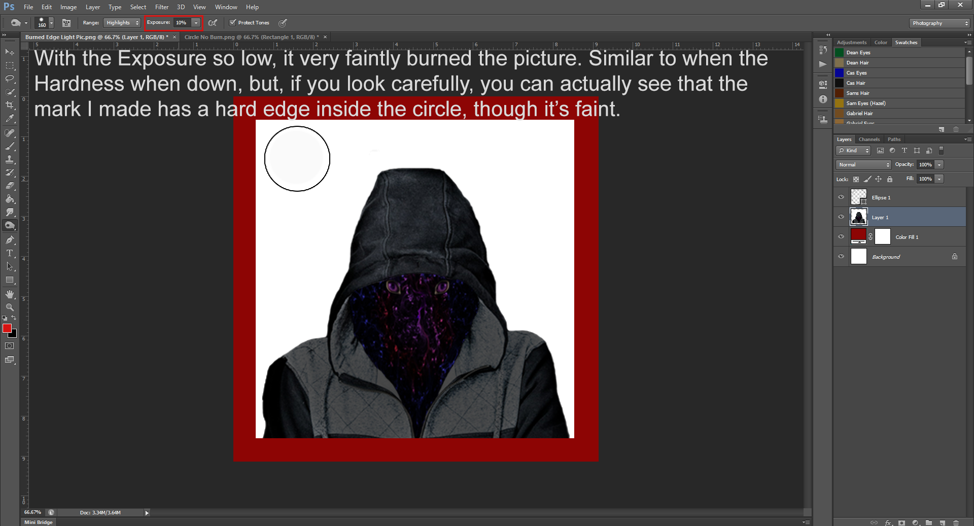
For example, if the Hardness is on 5%:
Or 90%:
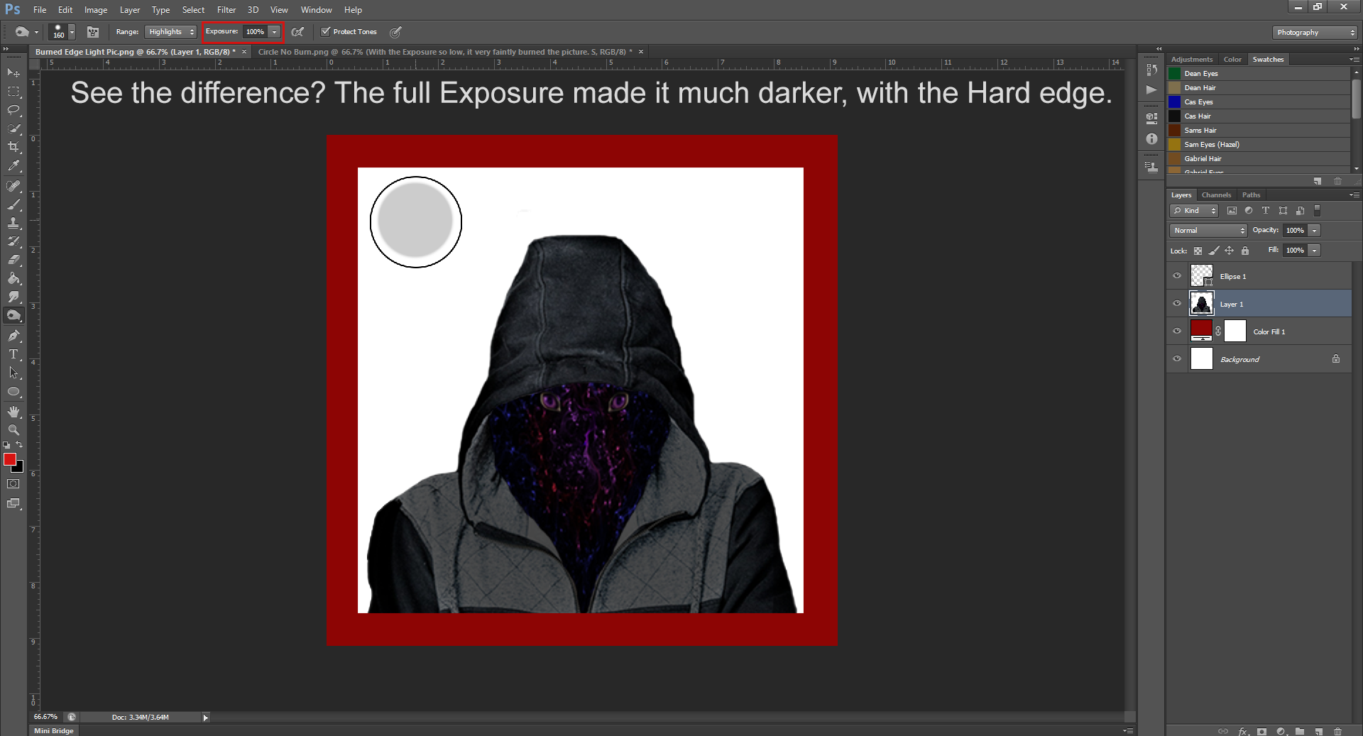
For the burn tool, it works the same:
(90% Hardness)
(5% Hardness)
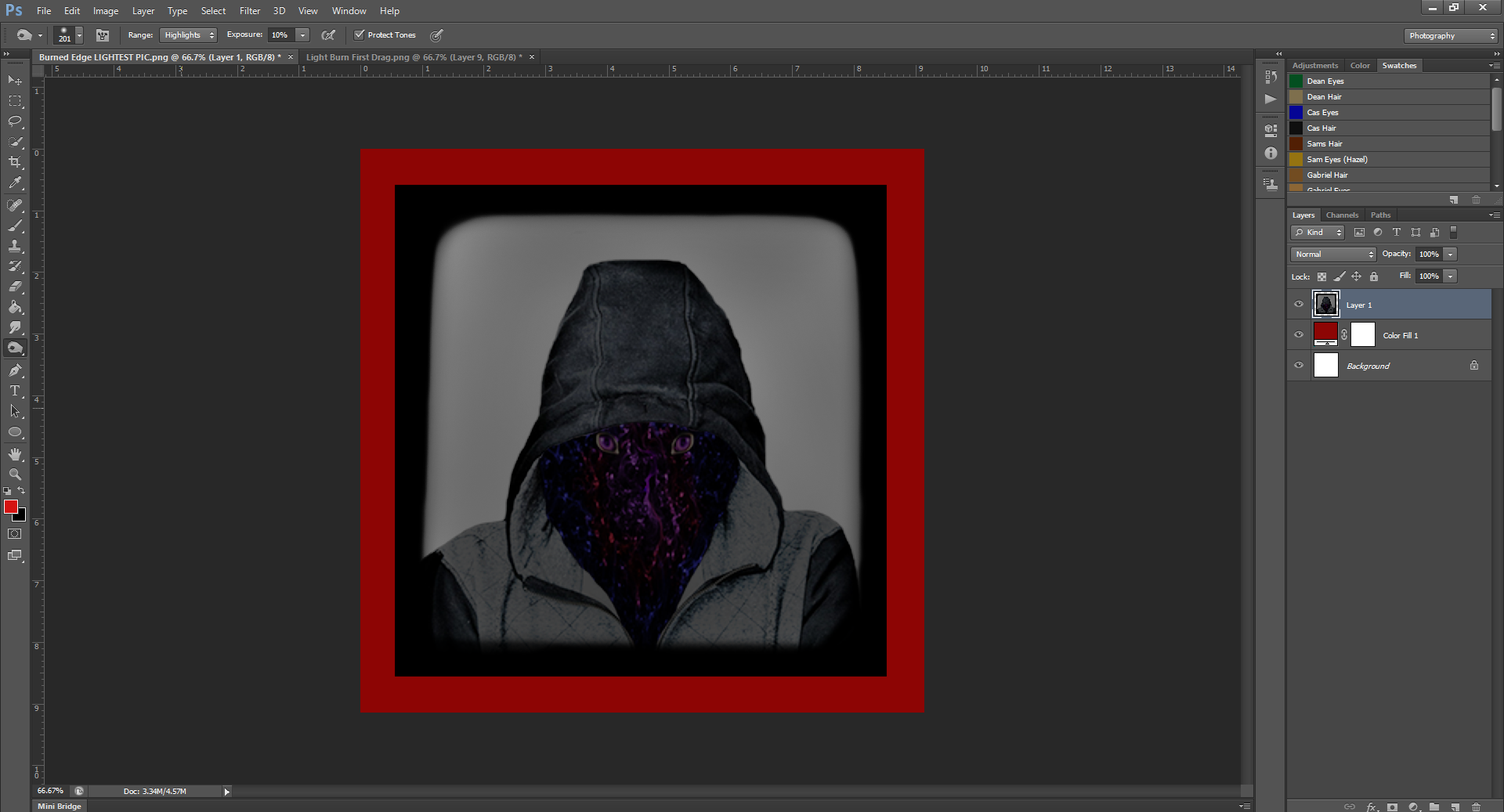
There’s also the option to change the Range. This will change the area of the picture you’re targeting. You can choose from either the Highlights, Mid-Lights or Shadows. I discovered that if you (for example) only target highlights, there will be a point where the image won’t get any darker. (I presume because it’s gotten rid of all the highlights)
When I was experimenting for the tutorial, as I did this, the picture didn’t get any greyer until after I changed what I was targeting. I recommend you play around with this, as it depends on the picture. I’ve tried changing the targeted areas in the past for other projects, and I saw no difference at all, as if the tool wasn’t working.
And the last option will be the Exposure. Next to the brush size, this is the most important part of using the Burn tool. The Exposure will determine how dark the section will get. I recommend not starting at 100, unless you want the entire picture to go near all black on your first go. I usually start small, and then up the Exposure depending on the look I was going for.
For the picture above with the burned-by-fire look, I used 100% Exposure on the edges. The rest of the picture, to just darken it, I used about 10-20.
Step 4.
Now that you know the options, let’s show you how I did the Soft Burned or just darkened picture, and then the Burned By Fire picture.
So, for the Soft Burn, I kept the Exposure low, about on 10, and I feathered the edge of the brush. Because I rubbed the tool all over the entire picture, I don’t actually think the Hardness made a difference, but since I was being ‘soft’ it just seemed to go.
Okay, so, set the brush size to really big (I used 300-400), and (while keeping the Exposure low) click and drag the brush over the entire picture.
And boom! Soft Burned pic is done. Told you it was easy!
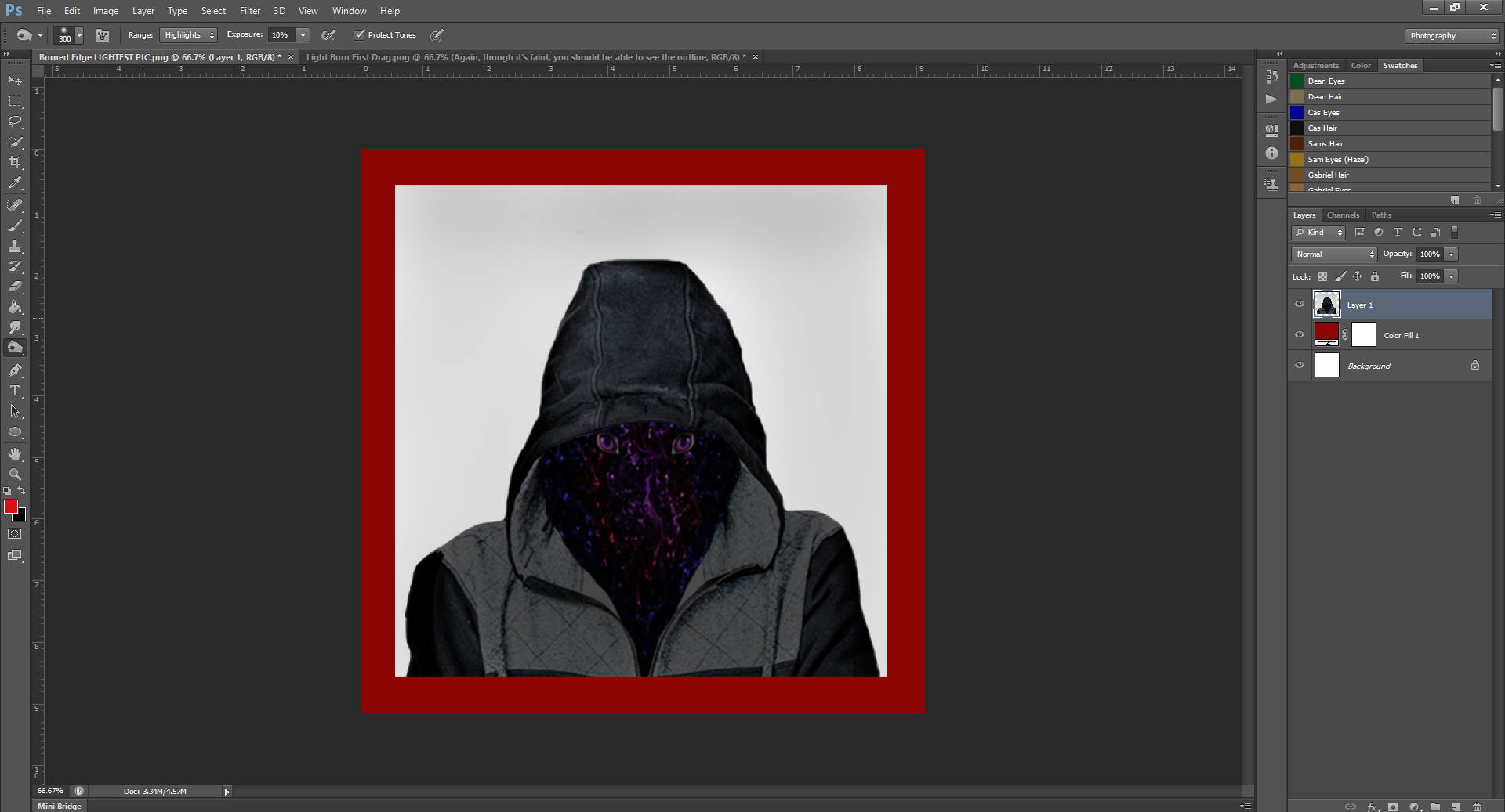
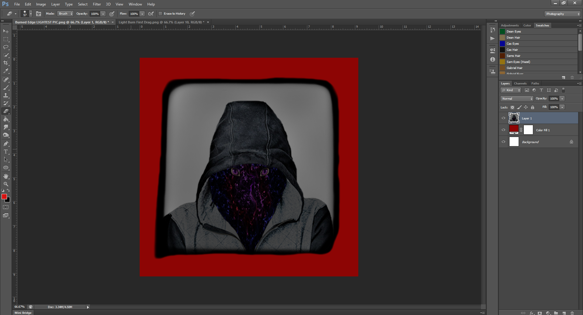
Now for the Burned By Fire picture, it’ll be the same thing. We can actually continue on from this picture, since it’s already burned.
For the Burned By Fire pic:
Now that we’ve got the whole thing looking a little singed, we’ll want to up the Exposure to about 50 and reduce the brush size (I reduced it to 130).
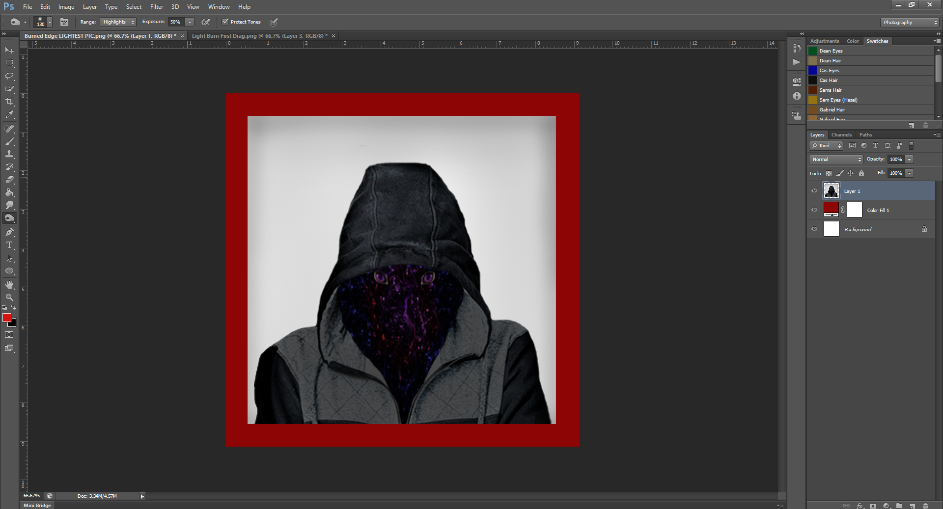
We’re going to just go around the edges of the picture now, similar to when we made a Border. You can leave the Hardness down at 4% for this as well. A lack of hard edge will make it look more realistic of a burn.
Now we’re going to do that again and again, until the border becomes almost black. So, keeping the stats where they are, continue to go around the edges until it becomes blackened.
At this point (it took me about 10 go a-rounds to get it this dark) you should up the Hardness to about 40-50 as well. We’re going to be concentrating now on just getting the edges black, so we’ll need to contain the burn a bit more.
After changing the Hardness, keep going.
Also: don’t worry about making the outline too clean cut straight, it’s okay if it’s a bit of wobbly lines. Again, it adds to the realism of if the picture were burned, and we’ll be erasing the very edge of the photo after anyway. And, as you’re going, make sure to round the edges of the corners slightly.
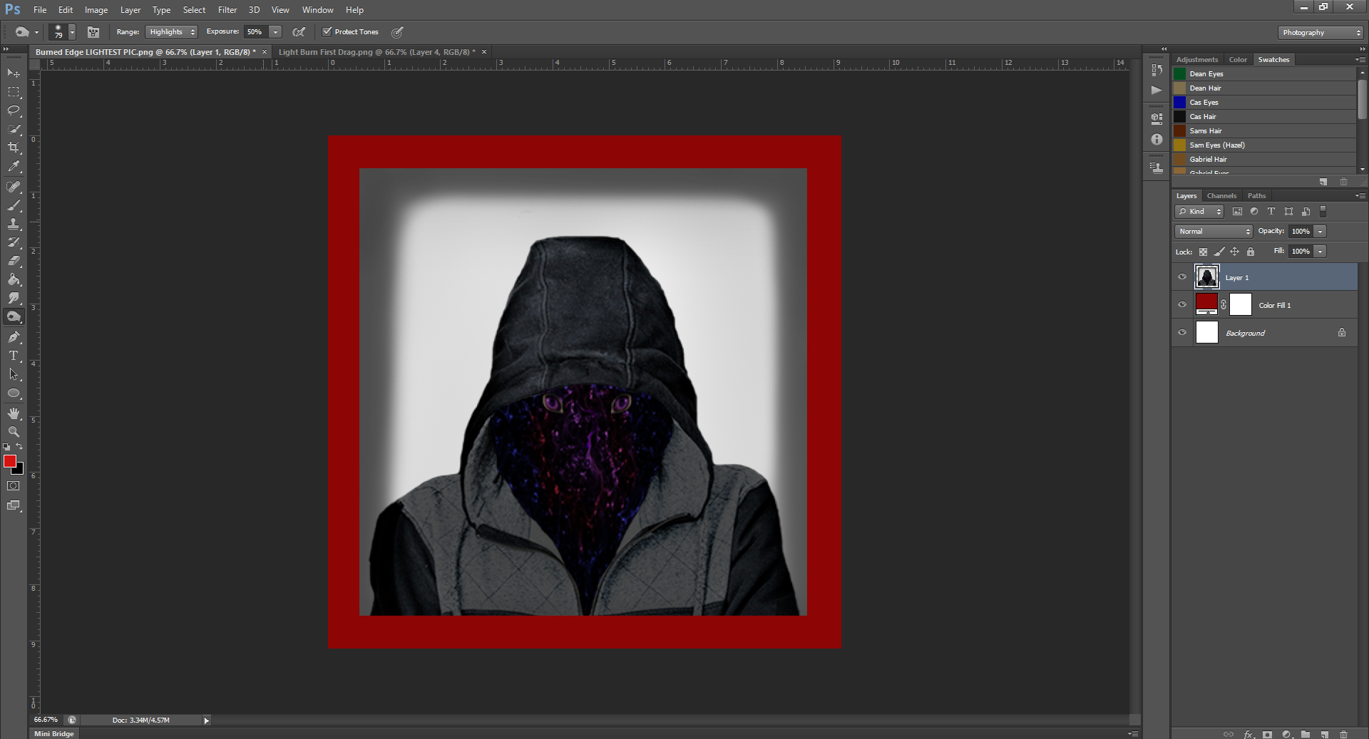
After a few more go arounds, you may notice that the border isn’t getting any darker any longer. Mine wouldn’t get darker than this:
That’s because we’ve been burning with the Highlights selected. Now we can change to either the Midtones or the Shadows. I like going to Midtones and then to Shadows, just because I like to do them in order. Again, I’m not entirely sure at this point, but since we’re trying to replicate what I did, we gotta do it the same way, right? Right.
Okay, so after selecting Midtones and going around a few more times, mine stopped getting darker again at this point:
At this point, you need to switch to the Shadows, and then keep going until the edges turn all the way black.
Okay, now that we got the edges, I think you can tell, the all over burn job we did at the beginning no longer matches, does it?
No worries, we’re gonna go back over the entire picture now. We had to wait to see how dark the edges were going to get, juuust in case we messed up.
Remember: You can always make the picture more burned, but it’s harder to un-burn it.
Alright, so to go over the entire picture, change the hardness to softer, the brush size to bigger, and the Exposure back down to about 10. And, you may need to switch the Range back to Highlights. If you try to go back over the lighter part of the picture with the Range still on Shadows, it may not work.
You don’t want to make it too much darker, but it has to match the edges. Try to get it to look as realistic as possible.
Now, you could leave it like this, but, for a little extra realism, I like to erase the hard edge of the picture. How often have you seen a burned picture with perfectly intact edges?
Exactly.
Switch from the Burn tool to the Eraser tool, change the size of the brush again (smaller), and keep the hardness semi-low. (50-60-ish)
Now – carefully – erase the very edges of the picture, and make sure to round the corners a bit. Again, this erase job doesn’t have to be perfectly straight.
And boom! That’s everything.
Don’t forget to take out/change the background so you can save the picture by itself, or drag it on over to whatever file you need it in!
This way of burning pictures does take longer (obviously) but depending on the look you’re going for, it’s also a more realistic effect.
You can pretty much use this burned technique on any photo. And of course, you can make the burned/blackened edges bigger or smaller if needed, so you can erase more of the picture for a more burned up effect.
Have fun practicing this technique until next month.
Like the tutorial? Check out the rest of the tutorials here!
Liking the site? Consider signing up for my Patreon, so I can continue bringing you the content you love!


 This turned the inside of the person white, and outlined them in black
 This step as it implies, inverts the black and white of the step above, so now the outline is white