I’ll admit, I’ve been using PHSH for a long time now, and Patterns have been one of those things I haven’t needed to use very often and am not 100% sure how exactly they work, so I’ve been a little afraid to attempt using them.
But then this year, I finally used one for the 10th Anniversary Re-Write of my first three books (at this point in time, only the first book is available to buy, the second is coming out in June!) to create the diamond effect for the sticker I used on the covers, and it wasn’t nearly as difficult as I thought it’d be, so I’ve decided to share it here!
And it’s only, like, 60/40 so I don’t end up forgetting how to do it myself later.
So, let’s get into it!
Step 1
Okay, so the first thing you need to do is decide what you need to add a pattern to and decide what kind of pattern you want to add.
Since I’ll be using the diamond text from the updated covers, the pattern I’ll be adding/using for this tutorial is going to be a diamond pattern, but you should be able to do this with any pattern you need.
Before we can add a pattern, we also need to pick an image to be the pattern.
The one I chose, was this:
If you want to follow this tutorial exactly, feel free to save the image above to work with. Or, if you prefer, find your own image.
The only requirement that’s needed for this image, is it has to be clear, and repeating.
Or, if you find the perfect image and it doesn’t repeat, you can always make it repeat yourself.
And if you don’t know how to do that, it’s super simple!(If you do know how to do this, just go ahead and skip down to Step 2)
All you have to do is set your PHSH document size to whatever you need – I usually like to start mine as a square, just because I find them easiest to resize in projects – and then line up your image in the top-left corner. Also, you can resize it, depending on how big/small you’ll need it to be.
Once you’ve done that, hold down ALT on your keyboard and then you can either click and drag the image or the image’s Layer in the Layers Panel to duplicate it.
Then, just use your arrow keys or drag the image until it’s next to the first, and so on. Do this as many times as you need to get the image to repeat along just the top line of the document. If you need to, use a Guide to help with keeping the images in-line.
Once you’ve got the first line done, go to the Layers Panel, select all of the images from the first line, then hold ALT to quick-duplicate all of them. Then repeat this until you have enough to fill the whole square.
To help keep things looking less-insane in your Layers Panel, I always like to create Groups for each line. I find this helps, especially if you have to return to a project later, in keeping things less confusing.
Once you’re done that, you can go ahead and save the project as both a .PSD and JPEG/PNG file. (The .PSD is the Photoshop file, which will leave all the Layers and such editable/intact, if you need to come back and change some things later)
Now, we can get back to the regular part of the tutorial!
Step 2
Now that we’ve got our pattern, we’ll need to convert the file to a .PAT.
Why didn’t you just save it as a .PAT to begin with?
Great question!
I tried to do that straight from Photoshop, but I didn’t have it available as an option. If you have that as an option, then great! You absolutely could’ve done that, instead, and will know for next time.
Fortunately for us, the internet is full of fast/free/easy convert-file websites.
Unfortunately, that site doesn’t have a .PAT convert option, so for the purposes of this tutorial, I actually ended up using this one.
I use that purple site for almost all of my other file converting needs, and recommend using it, if you need to convert files often.
Just go ahead and upload the file, click Convert, wait for it to finish, and then download/re-save it to your computer.
For ease, I usually name it Whatever File Name CONVERTED so I can easily distinguish it from the other one.
Step 3
Okay, now comes the actual reason you’re reading this tutorial: turning this image into a Pattern.
Are you ready?
All we have to do, is go up to Edit, then click the Define Pattern button.
Give the Pattern a name in the dialogue box that will help you distinguish it from the other patterns you already have, then click Okay to add it.
Yes, that’s really it.
Step 4
Okay, now all we have to do is apply the pattern to the text!
To do that, right-click on the text to bring up the Blend Mode options, scroll down to the Pattern Overlay option in the left-side menu.
Now, just select the pattern we added from the list of thumbnails, and hit Okay to apply it.
I also changed the Scale of my Pattern Overlay to 10% to line it up with the dots of the font I used, but that step is only required for the rest of this specific diamond effect, not for every pattern overlay.
And that’s it!
The text doesn’t look 100% the same yet, but that’s because this is only the first effect we needed to know to create this diamond text effect.
But don’t worry: I’ll be showing you guys how to complete the diamond texture effect over the next few tutorials!
Important: This is the 5th last article of 2025. I’ll be taking the last half of December and first half of January off from posting. I’ll be back January 19th, 2026 with the first article of the new year!
The time is here for the end of this PHSH Effect trilogy – just in time for Halloween! (Almost like that was planned…)
Since this is the last tutorial in this mini series of effects, you’ll want to make sure you’ve completed the first two so you have the appropriate base to work on today.
Step 1
The simplest way to add fire into a Photoshop picture, is to get some free images of fire from a royalty free site, and drag them into your current project. It’s a good idea to get a few different images, so the amount of flames, size, etc. is a little varied. Yes, we can (and will) be manipulating the images to fit them into our project, but it’s always easier to start with a picture that’s closer to the end result.
Alternatively, you can also always just screenshot the images above, crop and save them to your computer. (I recommend keeping a folder of stock images around, so you won’t have to go searching for them every time you want to create something)
Once you have the fire stock images you want to use, drag some into your current project so we can start getting to work. If you’d like, you can also rename their Layers to something identifying, like ‘Flame’ or ‘Fire’.
I also went ahead and moved all the previous tutorial burn/ember effects into their own folder, so we can start the project more ‘clean’.
Once the flames are actually in the project, hide all but one of the flame layers, and then re-size it to fit the part of the image you want it to be on. Also, change it’s Layer Mode to Screen. This will make it see-through, so we’ll be able to see the rest of our image through it.
My first flame picture has a reflection on the bottom, so I also had to Erase that from the image, before changing it’s Layer Mode to Screen. Since I was already erasing things, I also erased part of the background, since it stuck out a lot from where the flame was. You can do this too, if the flame pictures you’re using are similar, or, if they are already just the flame, feel free to skip this.
The flame picture I started with
The flame picture after I erased the reflection and partial background
Step 2
Next, we’re going to go up to the top menu, and click on Images – Adjustments – Curves, and then drag the bottom anchor inwards on the graph that pops up.
Sliding this anchor over will darken the blacks of the image so it helps to remove the background, without needing to spend time erasing around the fire.
This method might change the colour of your flames, as you see above. It’s also faster to use with things that have soft wisps like fire, smoke, etc. instead of the Quick Select/Erase Background method I usually use, because of all the soft edges. Erasing around a selection usually makes hard edges, which is why you go back over them with a softer Eraser, but that isn’t as effective, not only because it takes more time, but the Eraser is only one shape, and if you over-erase, it can give the image a faker feel.
Or it would, if the image you were overlaying the flame onto had a black background. As you can see above, mine does not, so I’ll have to go in with my Eraser tool and erase more of the black background, so it’s even closer to the flames.
I also haven’t completely re-sized the flame to fit my image yet. That’s because it’s easier to erase when the image is still big. Now that I’m done erasing the background, I’ll be zooming into my building and re-sizing my flame, to place it where I want to get ready for the next step.
Step 3
Now that we’ve got the flame background-less, we’re going to be Warping it so it looks like it’s actually coming off part of the subject. I didn’t really need to warp my flames on my building, since I chose a relatively square building with lots of straight lines.
But, since this is a tutorial, I’m going to show you how to do this part on a curved object, instead.
I did not add the embers or burns to the chess piece, because I was able to keep in on a dark background, and the Warping part for the flame is the important part, anyway. I did however, erase some of the left part of the flame, to get it a closer fit to the top of the chess piece.
So to use your Warping tool, you’ll want to right-click on one of the squares of box around the flame (the same ones that come up when you go to re-size it) and then pick Warp from the drop down menu that appears.
From here, click Warp, and you should notice the box is now a grid over the whole flame. Carefully, take one of the corners and drag it around, so it looks like the flame is wrapped around the curve of the object.
You’ll want to be careful not to over-warp here, as that can make the flame look fake, or, if you really over-do it, you’ll end up stretching the flame picture and it’ll just look distorted and weird, like bad pixel art.
An example of over-warping
Step 4
Once you’re happy with the warp job, we’re going to use our Smudge tool and again, carefully, drag the bottom edges of the flame, so it’s wrapped a little more around the curve/object. Make sure the Smudge tool is set to less than 100% Strength for this. Remember: you can always smudge more later, but it’s harder to undo a too-hard smudge. (Yes, even with the CTRL + Z/Undo options)
I personally used 50% Strength, and left the Hardness of the brush 100%, but feel free to play around with these values to get the best result for your image.
Step 5
After that, you just need to repeat these same steps on everywhere else you want to add flames to your image.
If needed, you can also go in with a soft Eraser to clean up any edges or weird bits on your flames. Then, once you’re happy with all the contouring/warping, you’re done! Don’t forget to Save the PHSH file and picture version of your new work.
As I said in the first tutorial of this mini-series, this effect will work on basically any picture, so you can light basically anything on fire!
Obviously some pictures will come out cooler than others. But, there’s never been a better time to explore, especially with Halloween only a few days away!
Are you in the spooky spirit yet? Not to worry if you’re not, today’s tutorial will get you there!
Like I said in the previous tutorial, the effect I’ll be showing you this week will be building on that one, so if you haven’t checked it out, now would be the time to do so.
I’ll even wait!
…
You back? Okay, cool!
Then let’s get started on this week’s tutorial: Embers.
This tutorial only has 4 steps but it is time consuming! We’re going to be painting in the embers by hand, so, fair warning. Also, I’ll apologize now for any (inevitable) frustration.
The finished product should be worth it, though!
Step 1
This week, we’re actually going to start in last week’s tutorial document, not a blank one. So, go ahead and open up your Photoshop file version of last week’s Burn effect. (It will be the .psd file, not the .jpeg or .png)
Or, if you prefer, you can create a new project and name it Embers, then drag and drop in your picture file of the Burn effect. Just keep in mind if you do this method, you won’t be able to change, add-on or alter the burn pattern, since it’ll be part of the image. If you end up wanting to tweak it, you’ll have to go through all the Burn tutorial steps a second time.
If you’re wondering: no, you’re not crazy. This is a different burn pattern from what I showed last week. If I haven’t mentioned already, I always do the effects at least twice: once when I’m experimenting/playing around, and the second time is a ‘live’ version I do when I write out the tutorials. (This is the one all the screenshots come from)
It’s the same picture and over-all concept, but if you ever notice the patterning doesn’t exactly match the tutorial pictures, this would be why. Also, despite my initials, I am in fact, not a robot, so I can’t replicate the patterning/brush strokes to look 100% the same between the versions. (Depending on the effect)
Step 2
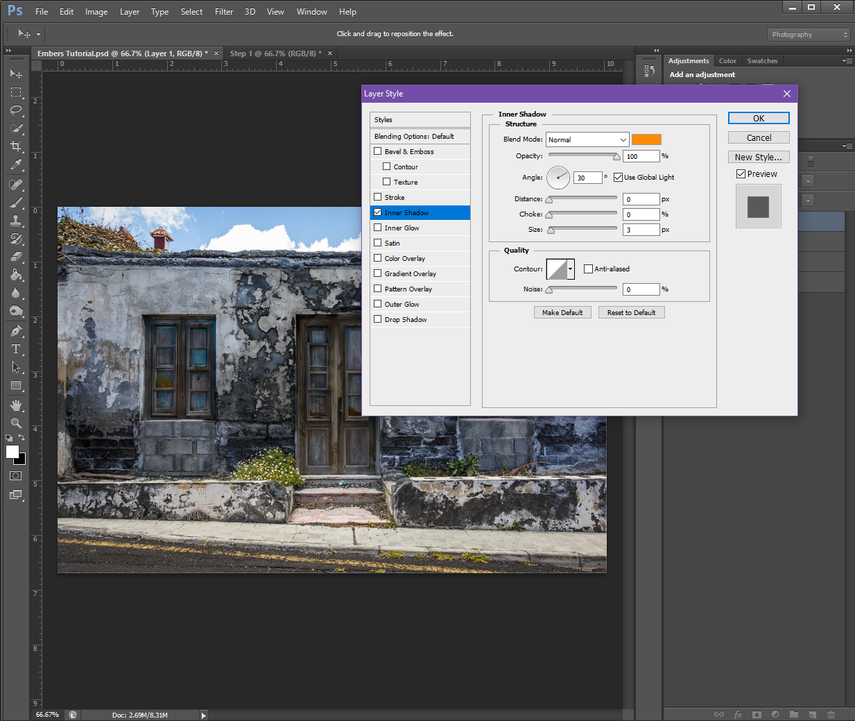
On a New Layer, go to the Blending Options menu (right-click on the layer) and turn on and fill in the following values:
Inner Shadow:
Structure
Blend Mode: Normal (Make the colour a Light Orange, I used #ff8d03)
Opacity: 100%
Angle: 30 (Check the Use Global Light box)
Distance: 0px
Choke: 0%
Size: 3px
Quality
Contour: Make it the top-right to bottom-left straight diagonal White and Black option (the one that looks like this / )
Anti-Alias: Make sure is un-checked
Noise: 0%
Outer Glow:
Structure
Blend Mode: Screen
Opacity: 100%
Noise: 0%
Colour: Make sure the Solid square is selected (not the Gradient) and set it to a Red-ish Orange (#fe7801)
Elements
Technique: Softer
Spread: 0%
Size: 18px
Quality
Contour: Make it the same as Inner Shadow
Range: 50%
Jitter: 0%
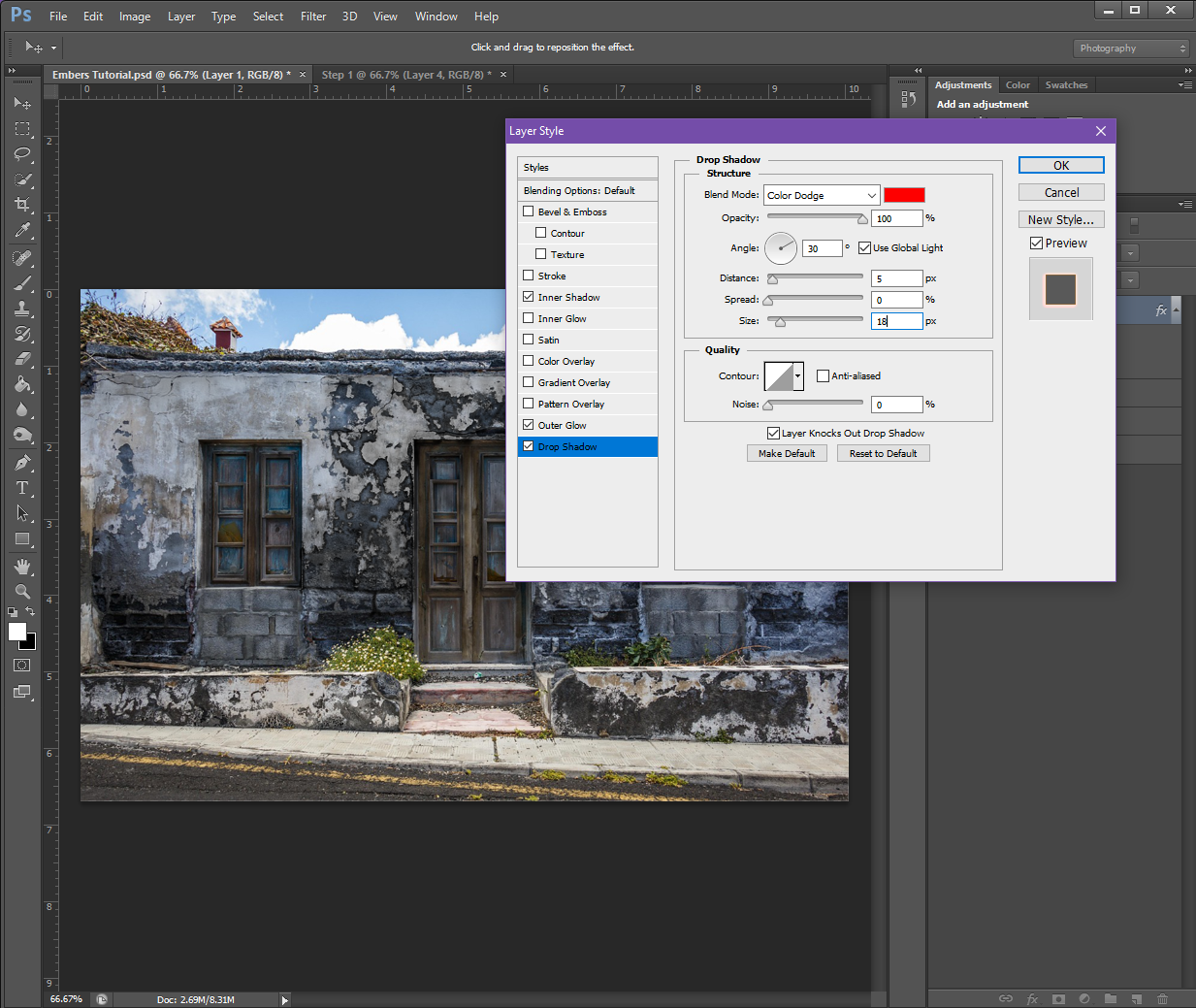
Drop Shadow:
Structure
Blend Mode: Colour Dodge (Set the colour to Red, #fe0000)
Opacity: 100%
Angle: 30 (Check Use Global Light)
Distance: 0px
Spread: 0px
Size: 18px
Quality
Contour: Make it the same as the Outer Glow
Noise: 0%
If you have a check box at the bottom that says Layer Knocks Out Drop Shadow, make sure it is check-marked.
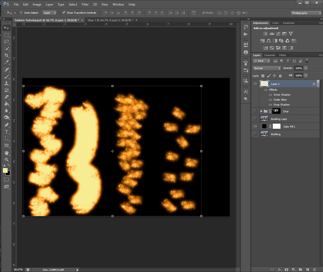
If you’d like to preview the effects, you can do so by going over to your Brush tool and selecting one of the ‘grungy’ brushes from the list, and then – while using a colour of Pale Yellow (#f8ec92) – make some brush strokes on the image.
The ‘grunge’ brush options – I don’t know why they’re called that, but in my PHSH quest, it usually just refers to the charcoal, chalk and pastel brush options
Or, you can set a Solid Colour background to preview the effect, like I did below:
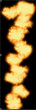
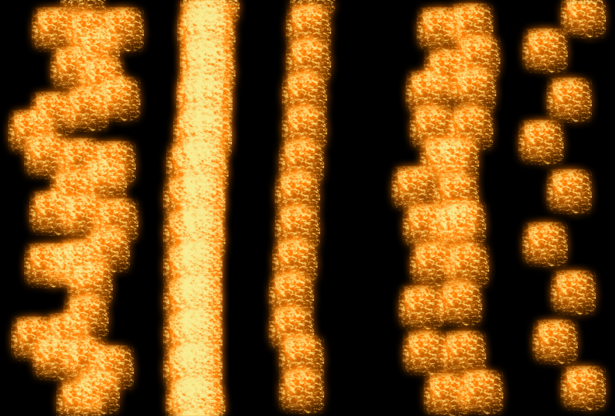
It may take some experimenting for you to figure out which brush you like best for the effect. I personally, ended up choosing a Charcoal brush. I also wanted to show you how using the brush differently will change the effect:
The furthest right pattern is what happens when I just clicked the brush once before moving to a different spot. (In my head, I call this ‘stamping’ because of the one-and-done method, but I’m not sure if it has a different name) The brush I chose also randomly changes directions, that’s why some of the pattern is horizontal and some are vertical.
The second in from the right is the same stamping method, but I did the brush strokes closer together.
The almost-solid yellow line is what happens when you use the brush normally. (Click and drag the brush in a direction you want, I made the line not-straight myself)
And lastly, the furthest left pattern is what happens when you combine the stamping and normal methods. For this one, I clicked and dragged in very short distances/spurts before moving on to the next part.
I want to emphasize here that there is no objectively ‘wrong’ brush to use. If you think it looks good and it works for your image, use it! There are a lot of different brushes you can experiment with, but I will say, as with the ash/burn effect, the ‘grunge’ brushes might work better than the plain round ones.
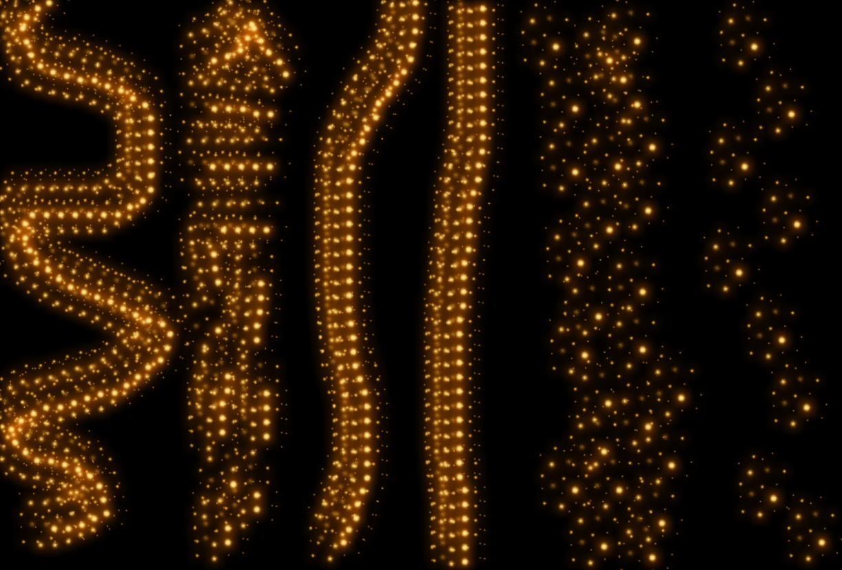
As I said above, I ended up using my Charcoal brush, but here is the effect with some different brushes:
Chalk Brush (I have multiples of these in different pixel sizes and slightly different patterns)
Star 26 Brush
Grass Brush (Apparently I have one of those?)
Sponge Brush Projection Brush
Soft Fur Brush (I’m pretty sure this is the brush I use when I make snow)
I have a range of brushes that are just called Spatter with the pixel size, this is a mix of the brushes in various sizes
and finally, here is what it looks like when using the plain Round brushes:
Step 3
Now that we’ve got the style and brush set up, it’s time to add the embers to your image!
To do this, select the appropriate brush Size and Hardness and start painting them in along some of the edges of the burn pattern. Try to think about how fire behaves – in most cases, fire takes the fastest path upwards, so if you chose a building, for example, you’ll want to add embers trailing up toward the roof. I’d also recommend zooming in (CTRL +) to your picture so you have better control over the placement of the embers.
If you’re not super impressed with how it’s looking at this stage, don’t worry. Most effects don’t look that great when you’re zoomed in. To check the actual progress, I recommend zooming out (CTRL – ) so you can see how the embers are looking in the picture as a whole.
If you’re still not happy with them even when zoomed out, you can use the Eraser tool to erase any parts that aren’t looking quite right so you can re-do them. (This is why it’s important we added the embers effect to their own Layer)
Depending on what brush and stroke technique you’re using, this part could take a while, so go slow and try not to get frustrated.
Also keep in mind, you can vary the Size and Hardness of your brush to help keep the embers from looking too monotone.
I actually re-did my ember trails a bunch of times because I just couldn’t get it to look ‘right’. One thing that helped me, was painting in the ember effect and then going back in with my Eraser tool to dirty up the lines and add a tapper to some of the trails.
Step 4
Once you’re happy with all your embers, to give it an even more realistic look, change the brush size and shape to one that is close to that snow one I showed above, then paint around the outside of some of the trails. This will make it look like some of the embers are floating off.
I did my floating embers on a different layer so I could easily erase and replace any I didn’t like without having to re-do the ember trails.
This also leads me to a very helpful tool when working with PHSH Effects: If you need to apply the same effect to a different layer, you can do so quickly by holding down the ALT key on your keyboard, then clicking on the FX symbol in the Layers Panel and dragging it to the layer you want to apply the effect to.
You’ll know if you did it correctly if all the Effect Text under the layer and the FX symbol transfers to the new layer.
And that’s it!
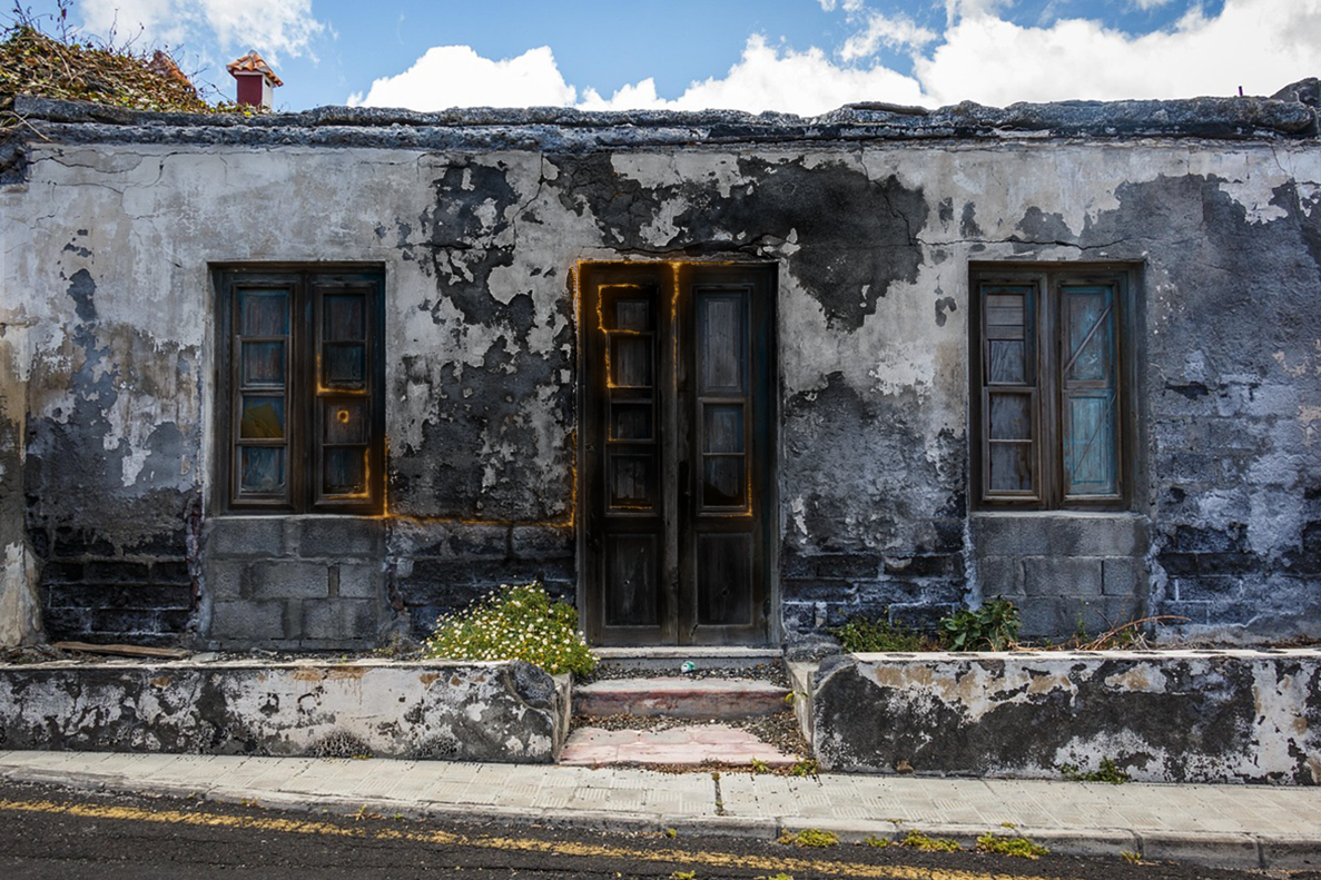
Because I didn’t do my char/burn layer super dark, I had to do my ember trails more subtly, so it looks like the building is just starting to catch fire, opposed to being in the middle of burning. I also took out the floating embers, because realistically, I don’t think there would be enough embers to have some floating up around the trails I made.
This means, my finished project, looks like this:
Which is the image I used on social media.
But, don’t worry – up next, I’m going to show you how to add flames to your burning image, so you’ll get to see a much cooler/less subtle version of the embers, just in time for Halloween!
I know I’ve already showed you guys a way to Burn things in Photoshop, but, that was with the Burn tool, which is objectively the ‘easy’ way to add that effect to your pictures.
But, you guys have come a long way since the first few tutorials, and with Halloween coming up, I thought now would be a great time to introduce you to the more complicated way to burn your pictures. This way I’m going to show you allows you to be more precise in your burning, which can be extremely helpful if you’re trying to edit a more detailed photo.
Step 1
As always, we’ll want to start with a brand new PHSH document and an image. I didn’t want to complicate things too much for the purposes of the tutorial, so I chose a simple building.
You can, of course, choose whatever kind of picture you’d like: the image above, a different kind of building, an ex’s face, a car, animal, etc. Whatever floats your boat! This effect should work with any kind of picture.
Once you’ve selected the picture you want to use, we’re going to need to make a Group. To do this, go down to the Layers panel and select the Group icon.
Next, we’re going to need to make a selection of the subject of the image. There’s a couple different ways to do this, so I will say to do whichever one you’re most comfortable with. For me, this means using the Quick Select tool and dragging it around the picture until everything I want is inside the dotted lines. For my specific picture, that’s just going to be the front of the building.
Now, we’re going to add a Layer Mask to the Group. To do this, go down to the bottom of the Layers Panel, and then click on the square that has a black circle in the middle of it. (This is the Layer Mask button)
The Layer Mask should only take on the shape of what you’ve selected. If it doesn’t, deselect (or hit CTRL + Z to Undo the last action) and try selecting the area and creating the Layer Mask again.
If you’re also not sure whether or not you’ve successfully created a Layer Mask because the thumbnail didn’t come up, you can go up to the top menu and then select Layer, then scroll down to Layer Mask and click the Reveal All option. This should make the thumbnail show up in the Layers panel, if it wasn’t already.
Step 2
Once that’s done, we’re going to start adding the ‘burn’ to the picture, which means we’re going to be playing around with the colours.
Before we do this, I’d recommend making a copy of your picture as-is, just in case you mess up/don’t like how things turn out/get confused and need a reminder of what the original looked like.
First thing we’re going to do, is go to Adjustments (which should be sitting on top of your Layers Panel) and add a Black and White Gradient Map and set it to 90% Opacity. The Gradient Map should be the last button in the last row, and looks like a gradual black to white square.
If, like me, your Gradient Map turned your Layer Mask the wrong colour, don’t panic! It applied the last/current colour in your Colour Swatches. (The ones showing in the swatches on the left-hand side at the very bottom of the Tool menu)
All you have to do to change this, is click the drop-down arrow next to the gradient that showed up in the Properties box, and then click a black to white gradient from the list.
Then, we’re going to add a Brightness/Contrast Adjustment (the sun looking icon in the Adjustments panel) and set the Brightness to -50 and the Contrast to 50.
Then we’re going to add a Curves adjustment (the 3rd icon in the Adjustment panel, that looks like an ‘s’ on a graph). The Curves adjustment values you change will depend on the initial colours of your picture, so if at the end things don’t look quite right, you can come back to this panel and re-adjust the values to see if it helps.
And finally, we’re going to add another Brightness/Contrast adjustment with the values of:
Brightness: -40
Contrast: 100
Once those are done, the picture should look like a higher contrasted black and white of the original.
Step 3
Create a new Group and name it something appropriate like Burn, Soot, Ash, Char, etc. And drop the first Group we made inside it.
Next, add a Layer Mask to the new group and fill it with Black. You might be able to do this by simply pressing CTRL + I on your keyboard. If not, you can Invert the colours by right-clicking and selecting the Invert Colour option.
Step 4
Now comes the fun part! We’re going to use any kind of Brush you want, and use it to brush the Layer Mask over any/every area of the picture you want to appear ashy/charred/burned. Make sure your brush colour is set to White, otherwise it won’t work.
You might find it helpful to separate the different areas of char into their own Groups. As long as you keep them all under the umbrella Char group, the brushing will work to uncover the black and white. Breaking them into different groups can be helpful if you uncover part of the mask where you didn’t want it and go to Erase. If it’s close to another area, you’ll end up erasing that part, as well, whereas if it’s in it’s own group, other parts won’t be affected.
Step 5 (Optional)
If you chose a picture with a smooth surface, (like a person’s skin) you can make the burn look more realistic by adding some texture to it!
To add texture, you can use any picture of a plain textured surface you may have, or, go to Filter – Texture and then click on the texture you’d like to add.
If using the picture method:
Place and re-size the textured image to fit the confines of your picture. You’ll also want to add it to whichever Group corresponds to the area you’re texturing. (Just so things don’t get confusing)
Once you’ve got it in the correct position, you’ll want to make it black and white. To do this, go up to Image – Adjustments – Black and White.
Next, you’re going to adjust the image’s Brightness and Contrast. The exact values will depend on the colours of your own image, but I’d recommend starting with a Brightness of -93 and Contrast of 100.
You’re also going to want to change the texture Layer from Normal to Overlay, so you can see the part of the image it’s over better. You’ll want to use Overlay here instead of Screen, because Overlay often darkens images, and Screen tends to lighten them. If however, they look the same to you, or if for some reason they are inverted (Screen makes the texture darker) use whichever one you prefer.
Lastly, you’ll need to repeat the texture overlay for every part of the image you darkened with the brush.
If you picked a picture that had a lot of texture already, like I did, you can go ahead and save your project once you’re happy with the results from Step 4.
And that’s it!
I hope you enjoyed this tutorial, and if you’re looking at your finished image and feeling like something is ‘missing’, don’t worry – the next tutorial I show you will be an effect that builds on this one.
It’s funny, because I ended up discovering this effect during my trial and error of working out the Rain tutorial.
I didn’t think I’d end up actually making a tutorial for this effect – since I only know of one application for it – but I figured, maybe someone else out there needs to add creepy/broken-down/horror vibes to their project.
So if that’s you: you’re welcome!
Step 1
Get a picture of a television set and add it to your project.
I personally decided to go with an older looking set because I think it will help make the effect look more real, but you can use any television picture you like.
Once you’ve decided on a picture to use, create a New Layer and then fill the layer with the colour black.
Step 2
Next, go up to the top menu bar and find Filter – Noise – Add Noise from the drop down menu.
You can play with these values later, but for now, we’ll want to keep them to:
Amount of Percent 25%
Distribution Mode: Gaussian
Also make sure the Monochromatic box is checked.
Step 3
Now, we’re going to add the static to the television. There’s a couple different ways to do this, but I’ll show you the fastest way first.
Go to the Layer Opacity and change it so you can see the picture under the Noise layer, but are still somewhat able to see the Noise layer. For me, this was 40%.
Once you’ve done that, go up and use the Rectangle Select tool, then outline a rectangle shape that’s a little bigger than the screen on the television set.
Next, we’re going to right-click on the layer and select Inverse Selection from the drop-down menu. Then, you’re going to use the Eraser tool and start erasing everything outside of the box you created.
This is getting rid of the Noise that’s over the rest of the layer, and will leave us with just the Noise over the screen of the television.
Continue erasing until you’ve got everything outside of the box you created.
Step 4
To deselect the box you’ve created, go back to the Select tool, right-click and then choose the Deselect option from the drop-down that comes up.
We’re going to need to zoom in for this next part, so go ahead and zoom in until the television screen is about the only thing we can see in the document.
Now that we have a better view of what we’ll be doing, the first thing we’ll be doing now is erasing the box to fit the screen of our television better.
If yours is already pretty perfectly fit, with minimal overlap, you can skip this step.
If you need to, don’t forget you can change the size of your Eraser to make it smaller and easier to work with while being zoomed in.
Step 5
Right-click on the Noise layer and select Warp from the drop down menu.
Then, very carefully, drag the edges of the Noise layer until it appears to bend slightly into the curves of the television screen. If you chose something closer to a flat screen/modern television set, you may not need to do this step as drastically, but slightly warping the layer will still help give it an air of realism.
Once you’re happy with the Warping of your Noise layer, hit Enter on the keyboard or try to click the Pointer tool, and then in the dialogue box that pops up, select Apply changes.
Step 6
If needed, you can re-erase the edges of the Noise layer so they match up with the edges of the television screen.
If not, go ahead and you change the Opacity of the Noise layer back to 100%.
If you want a subtler static on the television, you can keep the Opacity lower. Depending on why you’re adding the static, you can even keep it semi-see through, and add a picture to the screen, so it looks like it’s a bad connection, instead of just being completely out.
Once you decide you’re happy with whatever you decide, you can go ahead and save this bad boy because we are done!
Like this tutorial? Check out the rest of the series here!
This chalk effect can be used for all kinds of pictures – fake children drawings in summer, blackboard writing, etc. – but the reason I taught myself this effect was because I needed a chalk person outline for my book Crimson Smile’s cover.
Luckily, whether you’re using it for faux murder or something a little more PG, the steps are exactly the same!
Today I’ll be showing you how to do the effect with the murder outline, just because it’s the first way I learned, and I think it’s cooler than the other uses, but rest assured: I’ll show the more everyday use examples at the end of this tutorial.
Step 1
You’ll want to have a background image for this effect, so go through your library of royalty free images, or if you don’t have any saved, check out Pixabay or Pexels to download some. Today, since I’ve decided to keep the murder theme, I’ve chosen a night time road.
I’ve also changed it’s name from the default Layer 1 to Background, just to help keep things straight.
Once you have the Background picture, you’ll also need the person to apply the effect to. The simplest way to do this, is to find a silhouette picture of a person laying down (preferably, with their limbs out) and then outline and erase the inside. (Don’t worry, I’ll show you how to do that)
If you want to do it the long way, pick any picture of a person you want to use, and then manually erase all of them until just an outline of a person is left, and then dye the outline black.
All that’s left to do now is to erase the background of the person image (if your picture has one) and re-size the image to a more appropriate size, so it fits into your background image. You can also rotate the picture if needed.
Step 2
To get my person picture as just an outline, I’m actually going to use the Outer Glow technique, so go ahead and read through that tutorial if you need to. If you don’t, go ahead and skip to Step 3.
For this instance, instead of making the outline ‘glow’, I’m going to keep it a solid colour – I chose red for now, so you can see which part this step is – and keep the Opacity at 100%. I’m also going to change the Spread and Size values.
You can go ahead and play with these until you’re happy with your own outline.
Once you’re happy with the outline, all you need to do is go to the Eraser tool and use the Magic Eraser, then click on the inside of your person, to erase the inside, and just leave the outline.
After this, I also just changed my outline colour from red to black. You guys shouldn’t need to do this, unless you for some reason also made your outlines a bright colour.
Step 3
Okay, now that we’re set up, we can actually begin on the Chalk Effect!
To start, you’ll want to go up to the Filter tab in the top menu, then find Stylize in the drop-down and then click Find Edges.
If it doesn’t look like anything happened, don’t worry! You probably won’t be able to see this step because of the black colour, but it’ll become evident if we did it right during the next few steps.
Step 4
Next, we’re going to find Image in the top menu, and then go down to Adjustments, and click on the Invert option from the drop-down.
Then we’re going to go back up to Image – Adjustments and this time we’re going to click on the Desaturate option.
Step 5
Now we’re going to go back over to the Filter option in the top menu, and then click through to the Filter Gallery.
Welcome back to the Filter Gallery!
As you can see, the last time I was in here was for the Stained Glass tutorial.
Today, though, we’re going to find the Rough Pastels option – which is in the Artistic folder – and then put in these values:
Stroke Length: 0
Stroke Detail: 15
Texture: Canvas
Scaling: 60%
Relief: 13
Light: Bottom
Once you’ve done that, click the Okay button to apply the changes to your person. This will also close the Filter Gallery and bring you back to the main PHSH workspace.
If for some reason, like my Preview box, yours showed nothing, you should also be able to see the effect on your person outline.
Step 6
At this point, as I said, you should be able to see the effect on your person. If you cannot, as I didn’t, you may want to skip the Outer Glow step. This will depend on the picture you use.
The person silhouette I chose for the tutorial, didn’t need the Outer Glow step. But I didn’t realize that until this point in the tutorial.
After my Step 5 didn’t seem to work, I tried it again, without stopping to take the screenshots. This is something that has happened in a couple of past tutorials. Some of these effects require you to do them one right after another, not do one, wait, take a screenshot, switch tabs, save the picture, write down the step in an article, and then click back over.
It’s a tad annoying, but you learn more through trial and error, right?
Anyway, so after trying to do the effect again and it still didn’t work (despite not clicking away), I decided to try again, but this time I omitted the Outer Glow step. This is because I realized the Find Edges step can’t find any edges of the picture if we erase the picture and just leave the Glow outline.
PHSH doesn’t recognize the Glow effect as an outline of the person, so the other effects didn’t work.
Luckily, this was the only fix that was needed!
The below screenshots are the same exact sequence, just without the Glow to make the outline:
This turned the inside of the person white, and outlined them in black
This step as it implies, inverts the black and white of the step above, so now the outline is white
And hey, look at that, we have a preview now!
Okay, now we’re exactly where we should’ve been the first time around.
At this point, now we can safely use the Magic Erasure and erase the black part of our person.
Step 7
We’re pretty much done now, but if you think your chalk outline looks a little too… crispy white, especially against a darker background, you can go to the Blending Mode of the person layer and change it to something like Screen or Overlay. If this still doesn’t look quite right to you, you can also slightly change the Opacity until it fits.
Once you’re happy with the Opacity, you can also slightly Warp the image, if you need to.
This is a little thing that can help give the effect just that little extra push into being believable. You want the chalk to look like it’s actually on the road. You might also find it helpful to zoom in for this step.
But same thing, this comes down to personal preference and what pictures you started with.
Once you’re happy with the way you’ve Warped the picture, you’re done! Don’t forget to save both a PHSH (.psd) file and picture file of the effect.
At this point, you can also start playing around with different looks to explore what else you can do with the chalk effect!
For example, if you combine this effect with the Rain effect and lower the Opacity of the chalk layer to around 20%, it can also give the illusion that the chalk is being washed away.
Or as I said at the top of the tutorial, you can use this effect to make much more than just murder outlines!
Like… blackboard drawings!
Or blackboard writing!
Or….
Like this article? Check out the rest of the PHSH Tutorial series here!
In honour of it being Halloween month, I wanted to share a tutorial that I thought would fit that theme: stained glass!
This effect looks beautiful and complicated but luckily, it’s not that hard once you know how to do it.
Step 1
As always, we want to start with a base image. For this tutorial, I’m using a royalty-free picture of a Jack O Lantern.
This is usually where I tell you to use whatever picture you want, and technically, you can! But I want to warn you that this effect will look better if the picture isn’t too real life looking. Think cartoon, or clearly already drawn.
Once you have the picture you want set up on your document, you’ll want to get rid of the background, if there is one. In my case, this was achieved by just using the Quick Select tool on my Jack O Lantern and then Erasing the background.
Step 2
This is the part where we’re actually going to make the stained glass. We can do this one of two ways. The first way, takes forever and involves creating all the shapes yourself using the Line Tool.
The way I’m going to show you, however, is far easier. Just go on up to the top menu and go to Filter then click on Filter Gallery.
Once the Filter Gallery opens, you’ll want to open the folger on the right-hand side that’s labelled Texture and then click on the effect that says Stained Glass.
You’ll want to play around with the values that are listed all the way in the right-side panel to get the correct effect for your image.
The Cell Size changes the size of the stained glass ‘pieces’, Border Thickness changes the line thickness and Light Intensity as the name implies, changes the light.
For my image, I used the following values:
Cell Size: 6
Border Thickness: 4
Light Intensity: 2
Once you’re happy with the effect, click the OK button in the top right to generate it and take you back to the normal work screen.
Step 3
Technically, you can be done at this stage. You’ve successfully applied the stained glass effect to your foreground image. You can save it with a transparent background so you can drag and drop it into any of your other projects.
Or, if you’d like to leave this object as it’s own work file/image, you may want to follow the steps to make the background match. As I’m sure you can see, the white background is kind of ruining the magic of the effect.
To fix this, you’ll want to go to the bottom of your Layer’s Panel and click on the Add New Fill or Adjustment Layer button, then select Gradient from the pop-up menu.
In the Gradient Fill box that appears, you’ll want to select either a gradient you already have, or make a new one if you don’t have one that matches your images theme.
If you don’t know how to make a new Gradient, follow Step 4. If you already know how to make one, and/or already have one you’d like to use, skip to Step 5.
Step 4
To make a new Gradient, double click on whatever the current Gradient is that’s showing in the box to bring up the Gradient Editor.
To change the colours being used in the Gradient, click on the Colour Stop and choose a new colour from the Colour Picker that opens.
To keep with the Halloween theme, I’m going to make an Orange to Black gradient, so those will be the colours I select for each of my Colour Stoppers.
Once you’re happy with the colours of your Gradient, you can click the OK button to apply them.
If you think you’ll use this Gradient again in the future, you can also save it by giving it a name and clicking the New button at the end of the Name field.
Step 5
Now that you have a Gradient for the background you want to use, in the Gradient Fill box, you can play around with the Angle and Style to see what fits with your picture best.
For the purposes of this tutorial, I decided to keep it simple, so I kept the Style as Linear, and didn’t change the Angle.
Once you’re happy with these settings, click OK.
Step 6
Now all we’re going to do is apply the Stained Glass filter to the background image. You may need to change the values used for the Cell Size and Light Intensity, that’s okay!
Play around with them and see what matches your image best. Or, if you’d like, you can change the values so that instead of matching your foreground object exactly, you can make it stand out slightly.
For example, I made my background values as follows:
Cell Size: 10
Border Thickness: 4
Light Intensity: 5
As you can see, I changed the values, and here is what it looks like:
If you’re curious, here is what the image looks like when I used the same values for both the fore- and background:
Step 7
My image doesn’t look quite as right as I think it could, so I’m just going to change my Jack O Lantern’s Layer Type from Normal to Hard Light.
If your image looks like it doesn’t need anything after adding the stained glass effect to the background, feel free to skip this step and go right to saving because we’re done!
As I said earlier, this last little tweak (and some little ones above) will depend on the image you started with, do to the difference in colours, style, etc. So feel free to play around with the values to find what works best for you!
A lot of Photoshopping involves just editing multiple pictures together to create your desired final image. Because of this, there’s usually multiple ways to achieve specific effects. Editing multiple images together is usually faster and easier, assuming you can find appropriate stock photos to work from.
But, it’s not nearly as fun.
There’s a certain magic/slight ego trip you get from adding something to your project that you created from nothing. And you should! It’s super cool to know you have that power. It can also save you time from sifting through a bunch of stock photos, trying to find the right one.
So, how do you create clouds from scratch? Let’s find out!
Step 1
As always, you’ll want to start a new project, and it’s helpful if you start with a background image that clouds wouldn’t look out of place in.
For this tutorial, I chose the following image:
But, you can start on a plain coloured background, if you don’t want to work on an image. Just make sure you change the background colour from White so that you can actually see the clouds.
Step 2
Once you have your background sorted, you’ll want to select the Brush tool.
After you’ve got the Brush Tool selected, go up to the menu at the top, so we can change some of the Brush attributes.
In the Brush Menu, we’re going to change the Hardness to 0% and the size to a roughly big one. The exact size will depend on the size of your document. For me, the Size was 55 pixels.
Once you’ve done that, you’ll want to click on the button beside the Brush Preset Picker. In my version of Photoshop, the button is a folder background with what I’m assuming are paint brushes in a cup over top of it.
This button is called the Brush Panel button. And, you may have guessed, clicking it will open the Brush Panel.
We could’ve also changed the Size and Hardness from this panel, but for most Photoshop things, using the Brush Preset Picker is faster.
From this panel, we’re also going to change the Brush’s Spacing to 35%.
Step 3
Depending on the size of your document and the picture you chose, that might be all you need to change before you start adding clouds to your image!
To add the clouds, now that you’ve got your brush set up, all you need to do is paint them in using your mouse.
To help make them look like they belong, you’ll want to draw the shape of the clouds that go with your image. For the picture I chose, white, fluffy clouds would work, so that’s the type I’ll paint in.
I’ve also added a New Layer to paint the clouds on, instead of adding them directly onto my background image. This way, if I mess up or don’t like the shape of a cloud, I can easily erase it, without also erasing the sky.
I’ve also gone ahead and renamed the layer to Clouds. This is optional, but renaming layers to keep them straight is a good habit to form, especially when you work on more complicated effects that have a lot of layers.
Also, don’t forget to make sure this layer is on top of the background layer, otherwise you won’t be able to see the clouds you paint!
Keep adding clouds to your image until you’re happy with it, then save the PHSH file and PNG/JPEG file and boom! You’re done.
This additional step is 100% optional, as it depends entirely on the type of cloud you’re attempting to create.
Step 4
For this step, you’ll want to go back to the Brush Panel, and check-mark and change the following options:
Shape Dynamics:
Size Jitter: 50%
Control: Off
Minimum Diameter: 30%
Angle Jitter: 0%
Control: Off
Roundness Jitter: 20%
Control: Off
Minimum Roundness: 1%
Scattering:
Both Axes: Check Mark, 120%
Control: Off
Count: 10
Count Jitter: 100%
Control: Off
After you turn on and change these values, you can go ahead and test out your new cloud brush, to see the difference it made.
Once you finish adjusting the Scattering, you can go ahead and hide/close the Brush Panel again by clicking the double arrow button at the top of the panel.
Then, you can go ahead and test out the new clouds brush, to see the difference it made. If you like the look of these clouds better, go ahead and erase the Step 3 clouds and repaint them with the Step 4 settings.
Or, if you didn’t notice a difference, or don’t like the way the new clouds look on your image, you can un-check the Shape Dynamics and Scattering settings to revert the brush back to the Step 3 settings and repaint the clouds. Or, if you painted the Step 4 clouds on a different layer, you can go ahead and just delete that layer, keeping your Step 3 clouds.
Or, if you want to get crazy with it, you can paint a mix of both setting’s clouds.
As I said above, it’ll all depend on the image you’re trying to create!
Of course, you can play around with the settings above to find what value changes work best for you.
After you get the hang of painting white, fluffy clouds, feel free to keep experimenting! Change the percentage values, the Size of the brush and even the Hardness! That’s how you’ll learn to create different kinds of clouds, like… long, white clouds.
Or wispy, barely-there clouds.
Or cloud writing.
Or even… different coloured magical clouds!
Like this tutorial? Check out the rest of the series here!
Technically, this Photoshop effect isn’t strictly for making tear drops, you can use it to create any other clear liquid drops – sweat, condensation, big rain drops, etc. But since I first learned this technique because I needed to make a tear drop – for the creation of my 6th book cover, Broken – that’s the name I’m sticking with.
Like most of the other effects I show you, there’s multiple ways you can create tear drops in Photoshop, and again, like most of the other effects, it’s not nearly as hard as it may seem.
Step 1
As always, you’ll need to start with an image you’d like to add the effect on. Since I’m going to be showing you this for a tear drop – and since I already had the picture on hand – I’m going to be using the same sad girl face I used on my book cover.
Feel free to use the picture above, or you can choose your own sad person, or water bottle, or forehead if you’re going to be creating sweat or condensation. Though I will say, it might be easier to follow along with the tutorial in the same way first. Just so that you have the steps down before you start deviating from the tutorial. I’ll add example pictures of condensation and sweat at the end of the tutorial, so you can see what it looks like on those images, too.
Okay, so once you have the picture you want to add the effect to, we’re going to make a New Layer, and then on that New Layer, use the Pen Tool to draw a shape. Preferably, a tear/water drop shape. (Or as close as you can get) If you’d like, you can also rename this layer to something simple yet identifying, like Pen Tear Drop.
If you’ve never used the Pen Tool before, the way to use it is by clicking multiple times, which are called Anchor Points, to create the shape you want. It’s similar to the Polygonal Lasso Tool (which I showed you in this tutorial), except the line doesn’t hold until you create the next Anchor Point.
Each one of those squares are the Anchor Points where I clicked. If you don’t use multiple Anchor Points to create your shape, you won’t end up with a shape, but you’ll instead just have a dot. Or if you click once to ‘start’ the tool and once to ‘stop’, you’ll get a line.
For example:
So you’ll want to make sure to use the Anchor Points to create the shape, otherwise the Pen Tool won’t appear to work. If you need to, you can also zoom in on your picture to make creating the shape easier. To zoom in, use the CTRL and + buttons on your keyboard. (Zooming out is CTRL – , makes sense, right? Clicking ‘+’ brings you more/closer and ‘-’ minuses/moves you farther away)
Step 2
Once you have a shape you’re happy with, you’re going to right-click on the shape and then select Make Selection from the drop-down Menu that appears.
In the Make Selection Dialogue box that appears, you shouldn’t need to change anything from the default, but this might depend on your version of Photoshop, so I’ll list what the values should be below. Once you finish changing them, or if you didn’t need to change them at all, just click the Okay button.
Feather Radius: 0 pixels
Anti-Aliased Check Box should be Check-marked
New Selection for Operation (in my version of PHSH, the other options are greyed out)
After you click the Okay button, you should notice that the shape you drew is now now shows the dotted selection lines, instead of the Anchor Point square dots.
Once you finish that, you’ll want to Fill the shape with white. To do this, you can use the CTRL + Delete buttons on your keyboard, or if you switch from the Pen Tool to the Selection tool and then right-click on the shape, select Fill from the drop-down menu, and then pick White from those options.
If you noticed my Layers panel has an extra layer, this is because I created 2 tear drop shapes. The first one I forgot to fill with white, and then wondered why Step 3 wasn’t working. I had to go back and re-draw the tear, so it will be a different shape for the rest of the tutorial. Also see? Even us pros mess up!
Once your shape is filler with White, you can now Deselect it (right-click using the Pen or Selection tool and choose Deselect) to get rid of the dotted outline. After this, go on over to the Layers Panel and change the Fill to 0%. You can either do this by sliding the slider all the way to the left, or simply type the number 0 into the box.
Step 3
Next, you’re going to right-click on the Tear Drop layer and bring up the Blending Options Dialogue Box. From there, you’re going to check-mark the Bevel and Emboss option, and then change the following values:
Bevel and Emboss:
Inner Bevel
Smooth
Depth: 530
Direction: Up
Size: 50
Soften: 0
Angle: -90,
Altitude: 0
Highlight Mode: Screen (White)
Opacity: 50%
Shadow Mode: Multiply
Opacity: 75%
After you change the Bevel and Emboss values, you’ll also want to add an Inner Shadow, with the following values:
Inner Shadow:
Linear Burn (Leave Black)
Opacity: 30%
Angle: -63 (Uncheck Global Light)
Distance: 4
Choke: 0
Size: 16
And finally, a Drop Shadow, with the following values:
Drop Shadow:
Multiply (Leave Black)
Opacity: 55%
Angle: 127
Distance: 7
Spread: 0
Size: 8
At this stage, your tear should actually look like a tear. If however, you’re in the same boat as I am and it’s not looking even remotely close, don’t panic!
I discovered through creating yet another tear (yes, I ended up making 3 for this tutorial) that you need to do the steps not only in order, but without breaking between them, especially between making the selection, filling with white and first applying the Bevel and Emboss effect.
I have no idea why, but for some reason, the Bevel and Emboss effect just won’t look the same if you take breaks between those steps. I know it makes no sense, but sometimes Photoshop is just… let’s say finicky.
My 2nd tear drop ended up looking badly because to make these tutorials, I’m writing the steps while I’m also doing the effect in Photoshop. This is not only in case I need to make any tweaks to the steps I already have written, but also so I can get the screenshots used in the tutorial.
Unfortunately this breaking up of the steps seems to make the Bevel and Emboss effect act weird, so I had to make another tear and do the first steps up to the Bevel and Emboss values a second time.
I’ll admit it you can’t tell that the shape looks better in that picture, but you can clearly see the difference between the third tear and the second one at the same stage.
After seeing the Bevel and Emboss wasn’t acting wonky, I went ahead and applied the Inner Shadow and Drop Shadow.
I noticed however that while this third tear was looking closer, it still wasn’t quite as accurate as I thought I could make it, so I also changed the values for the effects to the following:
Bevel and Emboss:
Style: Inner Bevel
Technique: Smooth
Direction: Down
Depth: 530
Size: 10
Soften: 0
Angle: -124 (Uncheck Use Global Light box)
Altitude: 0
Highlight Mode: Screen (White)
Opactiy: 68%
Shadow Mode: Mulitple (Dark Grey #373737)
Opacity: 75%
Inner Shadow:
Blend Mode: Linear Burn (Lighter Grey #525252)
Opacity: 30%
Angle: -145 (Make sure Use Global Light is un-checked)
Distance: 4
Choke: 0
Size: 8
Drop Shadow:
Blend Mode: Multiple (Dark Grey #1e1e1e)
Opacity: 55%
Angle: 127
Distance: 4
Spread: 0
Size: 3
If your tear isn’t looking quite like a tear, try these second set of values to see if that helps. A lot of the time in Photoshop, trial and error is the only way to get an effect to look right. This is because of a lot of different factors, but the main one will be the image you’re applying the affect to. If you’re not using the same picture I am the colours, lighting, shadows, etc. are all going to be different, so the values you choose to create your effect will vary.
This is why I always recommend playing around with values, to see if you can find different ones than what I use to get the effect to work on your image.
Step 4
Yes, there’s still another step to the tear process! However, these last two steps are completely optional. This step, which involves warping your tear shape to make it look more realistic really only needs to happen if you didn’t draw the shape exactly how you wanted it to look the first time around.
If you’re already happy with the shape of your tear, feel free to skip ahead to Step 5!
If you’d like to try changing the shape of your tear, follow along. This is called Warping, which I may have talked about before, but off the top of my head I don’t remember, so I’ll just explain it again.
To Warp your shape, right-click on the shape and then select Warp from the drop-down menu that appears. If the first time you right-click the only options that come up say the current layer name (in my case, Tear 3) and Layer 1, you’ll first need to click on one of the squares that’s outlining the shape. (The ones you’d use if we were going to resize it)
After clicking the resize square, then right-clicking should bring up the drop-down with the Warp option.
You should notice after selecting Warp that a box/grid shows up over your tear, with little circles at certain points around it. These circles are the points you’ll use to warp the image.
I’d suggest starting out small, because over-warping could ruin all your hard work. Try at first if you can, to just slightly warp the tear so it looks like it’s moving over the bottom of the eyelid. This should mean slightly adding a curve to the top part of the tear.
Once you’re happy with your warped tear, click Apply in the dialogue box, or the Enter button on your keyboard to keep the changes.
Step 5
The final step (aside from saving) is to add a highlight to your tear. This is also an optional step, since the Bevel and Emboss effect should’ve added at least a slight highlight to your tear. But if you want to add another one, here’s how:
You’re going to make a New Layer and can rename it something identifiable (I called mine Highlight). Then, use your Pen Tool to draw another shape. This one should be smaller than your tear, and a skinny, almost banana shape. Once you’re happy with the shape, the process is the same: Right-click to Make Selection and then CTRL + Delete to make it white.
After this, you can change it’s Opacity so it’s not as stark white, or rotate it if you didn’t draw it exactly the same bend as the tear.
Once you’re done fiddling with the highlight, or if you didn’t think you needed one, go ahead and zoom out and take a look at your masterpiece!
If you’re happy with how it looks zoomed out, the only step left to do is save your file! Don’t forget to save both a .psd (Photoshop) file and a picture (.jpeg, .png, etc.) file so that you have a work file, just in case you need to come back to it. (Or to remember how you created the effect)
Like this tutorial? Check out the rest of the series here!
I was going to say I chose to do a sunset so we could get over our winter blues, but we actually had a pretty mild winter where I am, so not too sure how well that works. Whether or not you also had a mild winter, learning to make a sunset effect in Photoshop can still be fun!
This tutorial is one of the simpler ones, so you’ll have plenty of time to practice, and might pick it up faster than some of the others!
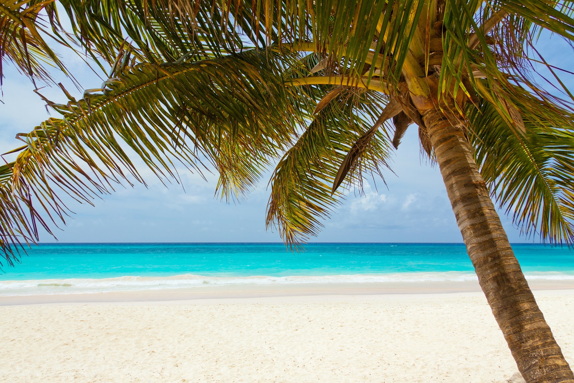
For this tutorial, it’s going to really help you out if you choose an image that’s almost a sunset, anyway. I initially tried this effect myself (as well as some Youtube tutorials) using a picture that had high-noon sun lighting and it just did not work. At all. I’ll show you that disaster at the end of the tutorial, so you can see.
Now normally, I’d consider using a picture that’s already close to what you want to achieve as ‘cheating’ – if you were going to just use the pre-made picture as-is, you might as well go all the way and just find a full sunset picture – but seeing the difference between the high-noon picture and the one I ended up using was so drastic, I’m giving it a pass. (Also because I couldn’t figure out how to make it work on the high-noon picture)
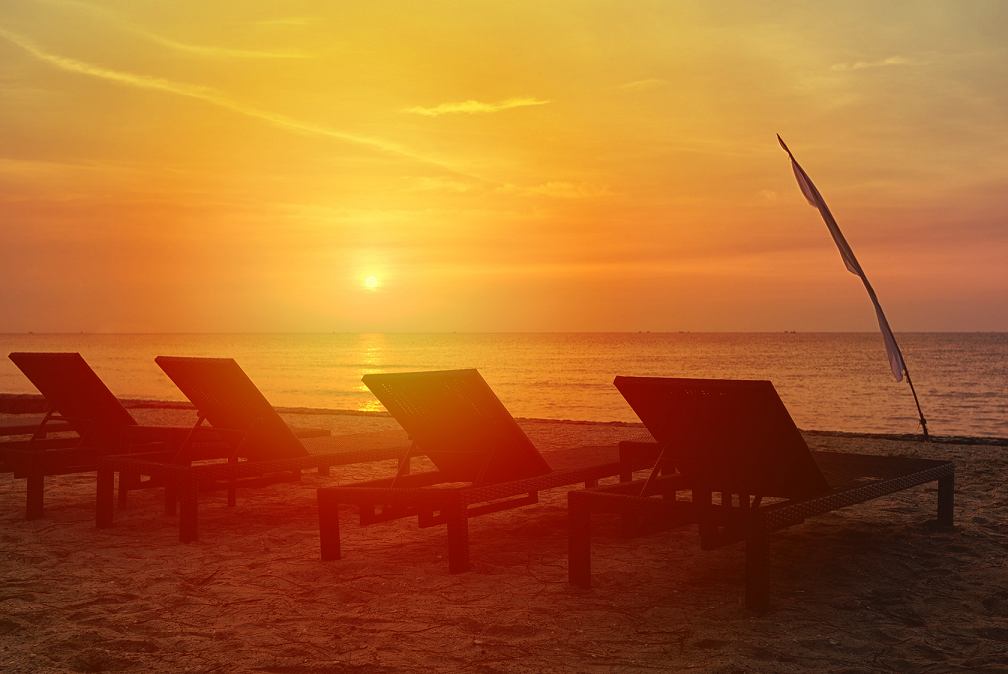
This is the picture I ended up using:
Step 1
After re-sizing your picture to fit your new work document, you’ll want to make a Gradient Layer.
You’re going to have to create your own sunset colour gradient for your image. The specific colours you use will heavily depend on the colours your image already has. If you don’t pick colours that are already somewhat close, it won’t tint the image correctly and will end up looking very fake.
You’ll want to use 4 sunset colours, and then the last colour you’ll need to make light grey.
For my image, these are the colours I used:
1st: Pale Yellow: Colour Code #fffac4
2nd Brighter Yellow: Colour Code #fcf38d
3rd Pale Orange: Colour Code #ffbb5b
4th Brighter Orange: Colour Code #ff8b2e
If you plan on using this effect often, feel free to Save this Gradient by giving it a name and then pressing the New button to add it to your Gradient Presets.
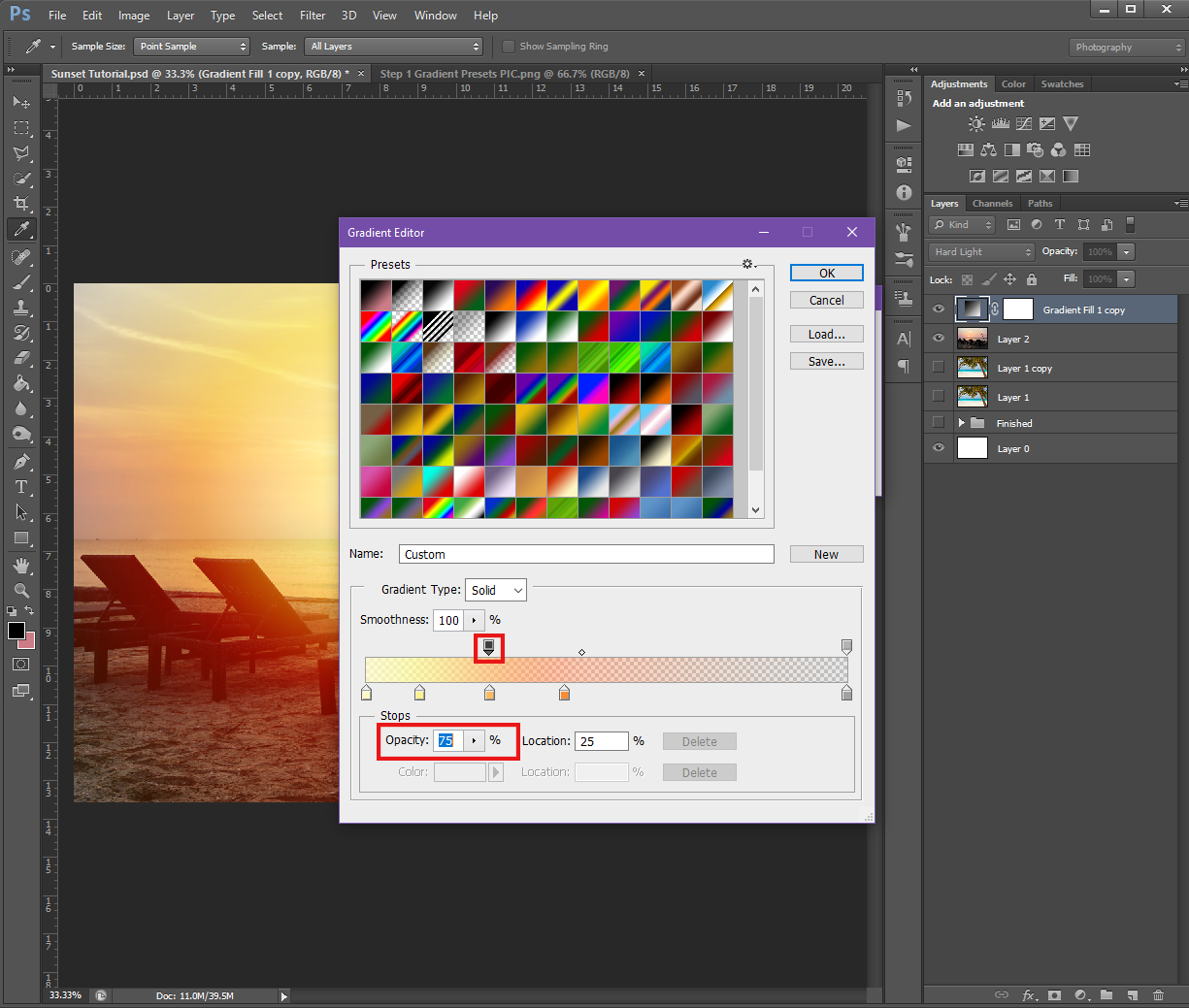
Once you have the correct colours, you’ll want to click on the colour bar to make one of those pointer things show up on the top of the bar, and then change it’s Opacity to 75%. Or, you can just drag the pointer that’s already at the top on the left side (over the pale yellow) over until it’s over the Pale Orange and change that ones Opacity.
You’ll also want to change the Opacity of the pointer that’s over the Grey to about 30%.
Once you’ve changed those Opactities, click the Okay button.
Then once you’re back in the Gradient Fill dialogue box, change the Style to Radial, change the Angle to 130 and change the Scale to between 120-135, depending on what works best with your image. (Mine was 135)
Step 2
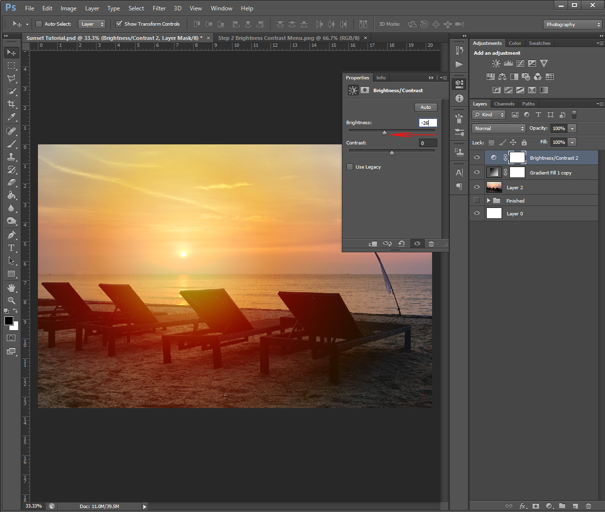
Now we’re going to change the Brightness of the picture. To do this, go back to the Create New Fill/Adjustment Layer at the bottom of the Layers Panel and select Brightness/Contrast from the menu.
In the Panel that pops up, you’ll either want to slide the Brightness slider down or just replace the value by typing in -26.
After you successfully lower the Brightness, just click on the double arrows at the top right-hand side of the panel to close it.
Step 3
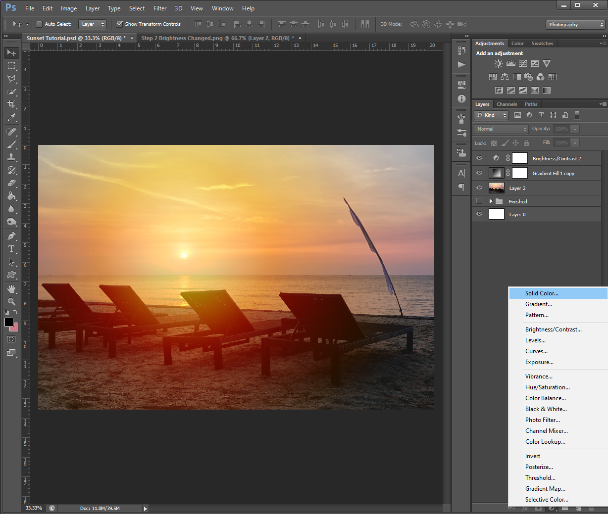
Now we’re going to add a filtered look to the whole picture. To do this, we’re going to add 2 Solid Colour Layers.
To make the 1st Colour Layer, go back down to the Create New Fill/Adjustment Layer at the bottom of the Layers Panel and click on Solid Colour.
The first colour we’re going to pick is going to be a darker colour. For my image, I had to choose a shade of Brown (#644503), however in one of the tutorials I saw on Youtube, the person made this colour a pinky Red. This will depend entirely on the image you chose.
If you find it easier, feel free to use the colours I’m using in this tutorial, and then once you’ve gone through all the steps, go back and see if changing the colours will make the image look better/more realistic.
The next colour layer we’re going to add is going to be a bright colour. For my image, I found a bright Orange (#ff7200) worked well. The Youtube tutorial person made this colour a pale yellow.
Step 4
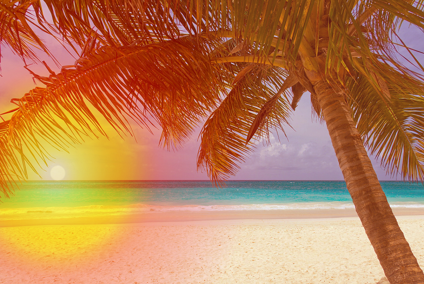
Now that we’ve got both the colour layers, it’s time to incorporate them into the image!
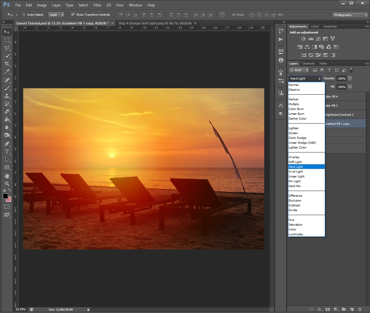
Still being on your bright colour layer, change the Opacity to 35% and change the Blend Mode to Soft Light.
Next, go back to your darker colour (Brown) layer and change it’s Opacity to 27%, and then change this one’s Blend Mode to Vivid Light.
Step 5
At this point, you should see your image looking sunset-y. If you don’t and you’ve been following the tutorial colours, don’t worry. You might just have to change the colours to suite your own image.
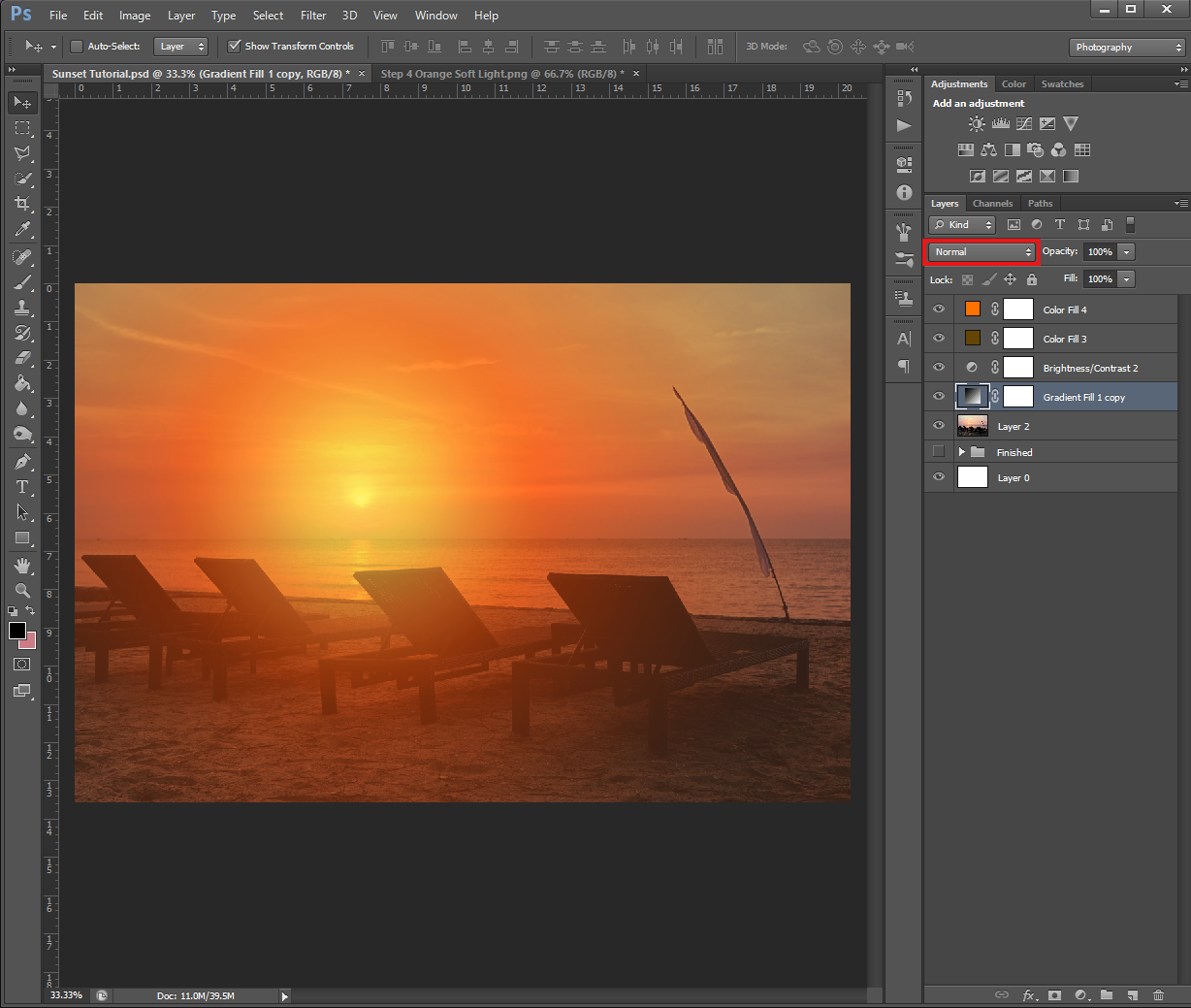
For this step, we’re going to go back to the Gradient layer, and change it’s Blend Mode to Hard Light.
It doesn’t look like my image colour changed because I already had the Gradient layer’s Blend Mode to Hard Light. If it was on Normal (like yours should be), this should be what it looks like:
Step 6
Can you believe we’re already at the last step? Yep, it’s true!
The last thing you need to do is drag your darker colour (Brown) layer so it’s sitting underneath the Gradient layer.
To do this, just click on the layer in the Layer’s Menu and then drag it until it’s under the Gradient layer. Once it’s in the right place, take your finger off the mouse button.
Once you’ve got the darker colour under the Gradient, all you need to do is save because this effect is now done! Don’t forget to save both a PHSH file (.psd) and a picture file (.png, .jpeg, etc.), this way you can go back if you need to adjust something and/or to just play around with colours or layers later.
Also, as promised, here are my failed attempts at creating a sunset on a picture with high-noon lighting.
First, the original picture:
And now the first failed attempt. This attempt was the one I did by following a Youtube tutorial.
And this is the failed attempt from after I changed colours to see if that would help.
The 2nd attempt was closer, but no matter how I tweaked the colours – whether making them more red, more orange or more yellow – I just couldn’t make it work with the lighting. No matter what I did, it just kept looking fake/edited. I also had to add the sun to the image, and I feel like that also contributed to the failure of it.
So yeah, in case you didn’t know: just because I make these tutorials doesn’t mean I don’t also still fail at making effects! This is why I always try to remind you guys not to feel bad or get down on yourselves if you try an effect and it doesn’t work. There are many factors that go into making an effect work – the picture you choose, your version of Photoshop, and sometimes I swear just if you’re having a lucky day.
Keep practicing and fiddling around and you should get it eventually!
Also I don’t remember if I’ve ever said, but if you guys ever have questions about any of the effects I share, please feel free to reach out and ask! The whole reason I started this tutorial series was to help people (mainly indie authors) and it wouldn’t be very helpful if you found the tutorial confusing, or come away with more questions than answers.
Like this tutorial? Check out the rest of the series here!


 The flame picture I started with
 The flame picture after I erased the reflection and partial background
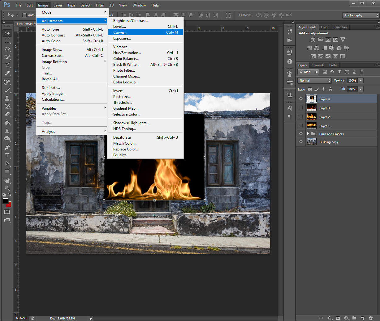


 An example of over-warping


 This turned the inside of the person white, and outlined them in black
 This step as it implies, inverts the black and white of the step above, so now the outline is white


 If you noticed my Layers panel has an extra layer, this is because I created 2 tear drop shapes. The first one I forgot to fill with white, and then wondered why Step 3 wasn’t working. I had to go back and re-draw the tear, so it will be a different shape for the rest of the tutorial. Also see? Even us pros mess up!