I’ll admit, I’ve been using PHSH for a long time now, and Patterns have been one of those things I haven’t needed to use very often and am not 100% sure how exactly they work, so I’ve been a little afraid to attempt using them.
But then this year, I finally used one for the 10th Anniversary Re-Write of my first three books (at this point in time, only the first book is available to buy, the second is coming out in June!) to create the diamond effect for the sticker I used on the covers, and it wasn’t nearly as difficult as I thought it’d be, so I’ve decided to share it here!
And it’s only, like, 60/40 so I don’t end up forgetting how to do it myself later.
So, let’s get into it!
Step 1
Okay, so the first thing you need to do is decide what you need to add a pattern to and decide what kind of pattern you want to add.
Since I’ll be using the diamond text from the updated covers, the pattern I’ll be adding/using for this tutorial is going to be a diamond pattern, but you should be able to do this with any pattern you need.
Before we can add a pattern, we also need to pick an image to be the pattern.
The one I chose, was this:
If you want to follow this tutorial exactly, feel free to save the image above to work with. Or, if you prefer, find your own image.
The only requirement that’s needed for this image, is it has to be clear, and repeating.
Or, if you find the perfect image and it doesn’t repeat, you can always make it repeat yourself.
And if you don’t know how to do that, it’s super simple!(If you do know how to do this, just go ahead and skip down to Step 2)
All you have to do is set your PHSH document size to whatever you need – I usually like to start mine as a square, just because I find them easiest to resize in projects – and then line up your image in the top-left corner. Also, you can resize it, depending on how big/small you’ll need it to be.
Once you’ve done that, hold down ALT on your keyboard and then you can either click and drag the image or the image’s Layer in the Layers Panel to duplicate it.
Then, just use your arrow keys or drag the image until it’s next to the first, and so on. Do this as many times as you need to get the image to repeat along just the top line of the document. If you need to, use a Guide to help with keeping the images in-line.
Once you’ve got the first line done, go to the Layers Panel, select all of the images from the first line, then hold ALT to quick-duplicate all of them. Then repeat this until you have enough to fill the whole square.
To help keep things looking less-insane in your Layers Panel, I always like to create Groups for each line. I find this helps, especially if you have to return to a project later, in keeping things less confusing.
Once you’re done that, you can go ahead and save the project as both a .PSD and JPEG/PNG file. (The .PSD is the Photoshop file, which will leave all the Layers and such editable/intact, if you need to come back and change some things later)
Now, we can get back to the regular part of the tutorial!
Step 2
Now that we’ve got our pattern, we’ll need to convert the file to a .PAT.
Why didn’t you just save it as a .PAT to begin with?
Great question!
I tried to do that straight from Photoshop, but I didn’t have it available as an option. If you have that as an option, then great! You absolutely could’ve done that, instead, and will know for next time.
Fortunately for us, the internet is full of fast/free/easy convert-file websites.
Unfortunately, that site doesn’t have a .PAT convert option, so for the purposes of this tutorial, I actually ended up using this one.
I use that purple site for almost all of my other file converting needs, and recommend using it, if you need to convert files often.
Just go ahead and upload the file, click Convert, wait for it to finish, and then download/re-save it to your computer.
For ease, I usually name it Whatever File Name CONVERTED so I can easily distinguish it from the other one.
Step 3
Okay, now comes the actual reason you’re reading this tutorial: turning this image into a Pattern.
Are you ready?
All we have to do, is go up to Edit, then click the Define Pattern button.
Give the Pattern a name in the dialogue box that will help you distinguish it from the other patterns you already have, then click Okay to add it.
Yes, that’s really it.
Step 4
Okay, now all we have to do is apply the pattern to the text!
To do that, right-click on the text to bring up the Blend Mode options, scroll down to the Pattern Overlay option in the left-side menu.
Now, just select the pattern we added from the list of thumbnails, and hit Okay to apply it.
I also changed the Scale of my Pattern Overlay to 10% to line it up with the dots of the font I used, but that step is only required for the rest of this specific diamond effect, not for every pattern overlay.
And that’s it!
The text doesn’t look 100% the same yet, but that’s because this is only the first effect we needed to know to create this diamond text effect.
But don’t worry: I’ll be showing you guys how to complete the diamond texture effect over the next few tutorials!
Important: This is the 5th last article of 2025. I’ll be taking the last half of December and first half of January off from posting. I’ll be back January 19th, 2026 with the first article of the new year!
The time is here for the end of this PHSH Effect trilogy – just in time for Halloween! (Almost like that was planned…)
Since this is the last tutorial in this mini series of effects, you’ll want to make sure you’ve completed the first two so you have the appropriate base to work on today.
Step 1
The simplest way to add fire into a Photoshop picture, is to get some free images of fire from a royalty free site, and drag them into your current project. It’s a good idea to get a few different images, so the amount of flames, size, etc. is a little varied. Yes, we can (and will) be manipulating the images to fit them into our project, but it’s always easier to start with a picture that’s closer to the end result.
Alternatively, you can also always just screenshot the images above, crop and save them to your computer. (I recommend keeping a folder of stock images around, so you won’t have to go searching for them every time you want to create something)
Once you have the fire stock images you want to use, drag some into your current project so we can start getting to work. If you’d like, you can also rename their Layers to something identifying, like ‘Flame’ or ‘Fire’.
I also went ahead and moved all the previous tutorial burn/ember effects into their own folder, so we can start the project more ‘clean’.
Once the flames are actually in the project, hide all but one of the flame layers, and then re-size it to fit the part of the image you want it to be on. Also, change it’s Layer Mode to Screen. This will make it see-through, so we’ll be able to see the rest of our image through it.
My first flame picture has a reflection on the bottom, so I also had to Erase that from the image, before changing it’s Layer Mode to Screen. Since I was already erasing things, I also erased part of the background, since it stuck out a lot from where the flame was. You can do this too, if the flame pictures you’re using are similar, or, if they are already just the flame, feel free to skip this.
The flame picture I started with
The flame picture after I erased the reflection and partial background
Step 2
Next, we’re going to go up to the top menu, and click on Images – Adjustments – Curves, and then drag the bottom anchor inwards on the graph that pops up.
Sliding this anchor over will darken the blacks of the image so it helps to remove the background, without needing to spend time erasing around the fire.
This method might change the colour of your flames, as you see above. It’s also faster to use with things that have soft wisps like fire, smoke, etc. instead of the Quick Select/Erase Background method I usually use, because of all the soft edges. Erasing around a selection usually makes hard edges, which is why you go back over them with a softer Eraser, but that isn’t as effective, not only because it takes more time, but the Eraser is only one shape, and if you over-erase, it can give the image a faker feel.
Or it would, if the image you were overlaying the flame onto had a black background. As you can see above, mine does not, so I’ll have to go in with my Eraser tool and erase more of the black background, so it’s even closer to the flames.
I also haven’t completely re-sized the flame to fit my image yet. That’s because it’s easier to erase when the image is still big. Now that I’m done erasing the background, I’ll be zooming into my building and re-sizing my flame, to place it where I want to get ready for the next step.
Step 3
Now that we’ve got the flame background-less, we’re going to be Warping it so it looks like it’s actually coming off part of the subject. I didn’t really need to warp my flames on my building, since I chose a relatively square building with lots of straight lines.
But, since this is a tutorial, I’m going to show you how to do this part on a curved object, instead.
I did not add the embers or burns to the chess piece, because I was able to keep in on a dark background, and the Warping part for the flame is the important part, anyway. I did however, erase some of the left part of the flame, to get it a closer fit to the top of the chess piece.
So to use your Warping tool, you’ll want to right-click on one of the squares of box around the flame (the same ones that come up when you go to re-size it) and then pick Warp from the drop down menu that appears.
From here, click Warp, and you should notice the box is now a grid over the whole flame. Carefully, take one of the corners and drag it around, so it looks like the flame is wrapped around the curve of the object.
You’ll want to be careful not to over-warp here, as that can make the flame look fake, or, if you really over-do it, you’ll end up stretching the flame picture and it’ll just look distorted and weird, like bad pixel art.
An example of over-warping
Step 4
Once you’re happy with the warp job, we’re going to use our Smudge tool and again, carefully, drag the bottom edges of the flame, so it’s wrapped a little more around the curve/object. Make sure the Smudge tool is set to less than 100% Strength for this. Remember: you can always smudge more later, but it’s harder to undo a too-hard smudge. (Yes, even with the CTRL + Z/Undo options)
I personally used 50% Strength, and left the Hardness of the brush 100%, but feel free to play around with these values to get the best result for your image.
Step 5
After that, you just need to repeat these same steps on everywhere else you want to add flames to your image.
If needed, you can also go in with a soft Eraser to clean up any edges or weird bits on your flames. Then, once you’re happy with all the contouring/warping, you’re done! Don’t forget to Save the PHSH file and picture version of your new work.
As I said in the first tutorial of this mini-series, this effect will work on basically any picture, so you can light basically anything on fire!
Obviously some pictures will come out cooler than others. But, there’s never been a better time to explore, especially with Halloween only a few days away!
Are you in the spooky spirit yet? Not to worry if you’re not, today’s tutorial will get you there!
Like I said in the previous tutorial, the effect I’ll be showing you this week will be building on that one, so if you haven’t checked it out, now would be the time to do so.
I’ll even wait!
…
You back? Okay, cool!
Then let’s get started on this week’s tutorial: Embers.
This tutorial only has 4 steps but it is time consuming! We’re going to be painting in the embers by hand, so, fair warning. Also, I’ll apologize now for any (inevitable) frustration.
The finished product should be worth it, though!
Step 1
This week, we’re actually going to start in last week’s tutorial document, not a blank one. So, go ahead and open up your Photoshop file version of last week’s Burn effect. (It will be the .psd file, not the .jpeg or .png)
Or, if you prefer, you can create a new project and name it Embers, then drag and drop in your picture file of the Burn effect. Just keep in mind if you do this method, you won’t be able to change, add-on or alter the burn pattern, since it’ll be part of the image. If you end up wanting to tweak it, you’ll have to go through all the Burn tutorial steps a second time.
If you’re wondering: no, you’re not crazy. This is a different burn pattern from what I showed last week. If I haven’t mentioned already, I always do the effects at least twice: once when I’m experimenting/playing around, and the second time is a ‘live’ version I do when I write out the tutorials. (This is the one all the screenshots come from)
It’s the same picture and over-all concept, but if you ever notice the patterning doesn’t exactly match the tutorial pictures, this would be why. Also, despite my initials, I am in fact, not a robot, so I can’t replicate the patterning/brush strokes to look 100% the same between the versions. (Depending on the effect)
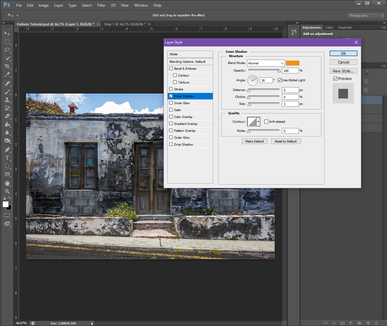
Step 2
On a New Layer, go to the Blending Options menu (right-click on the layer) and turn on and fill in the following values:
Inner Shadow:
Structure
Blend Mode: Normal (Make the colour a Light Orange, I used #ff8d03)
Opacity: 100%
Angle: 30 (Check the Use Global Light box)
Distance: 0px
Choke: 0%
Size: 3px
Quality
Contour: Make it the top-right to bottom-left straight diagonal White and Black option (the one that looks like this / )
Anti-Alias: Make sure is un-checked
Noise: 0%
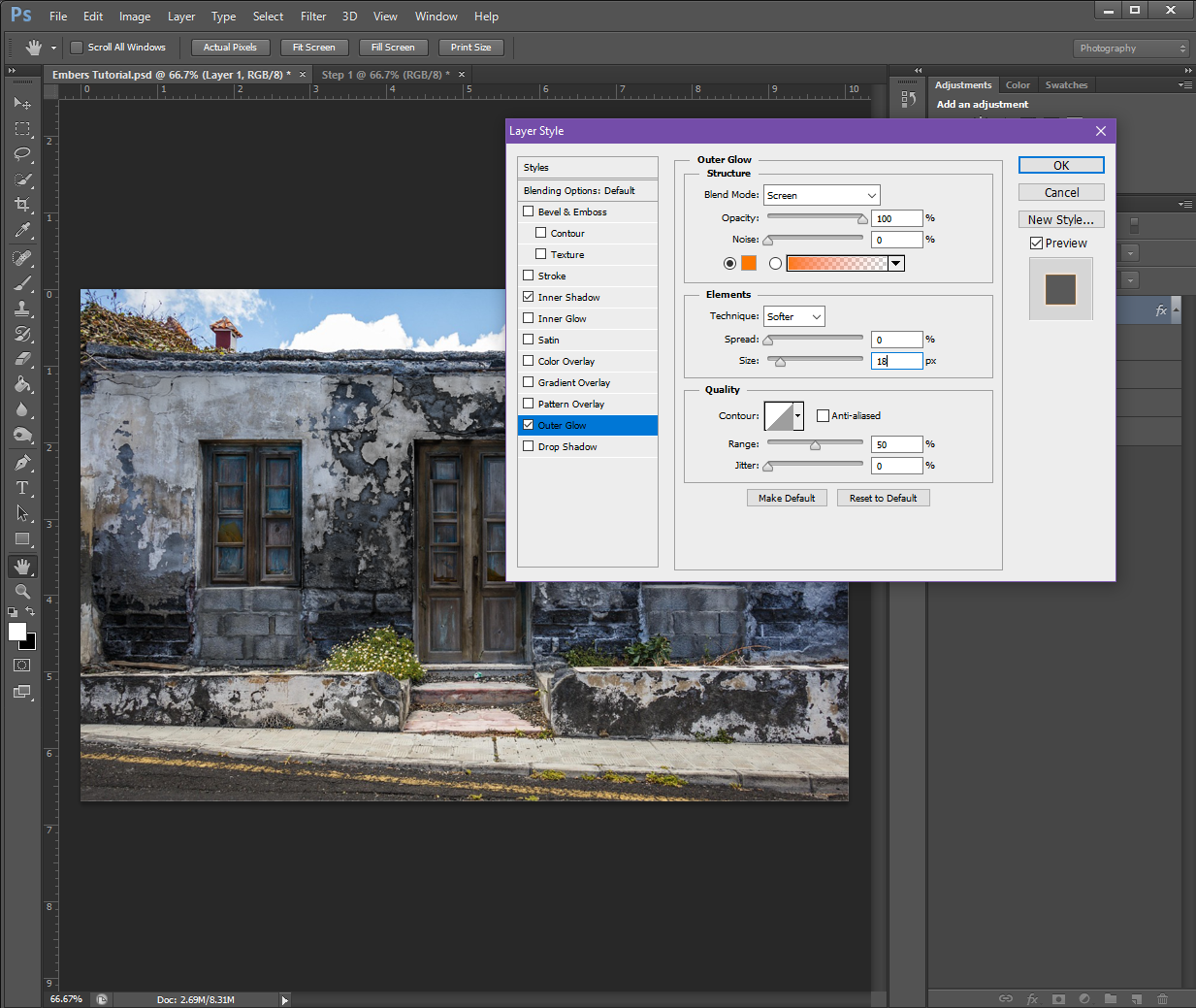
Outer Glow:
Structure
Blend Mode: Screen
Opacity: 100%
Noise: 0%
Colour: Make sure the Solid square is selected (not the Gradient) and set it to a Red-ish Orange (#fe7801)
Elements
Technique: Softer
Spread: 0%
Size: 18px
Quality
Contour: Make it the same as Inner Shadow
Range: 50%
Jitter: 0%
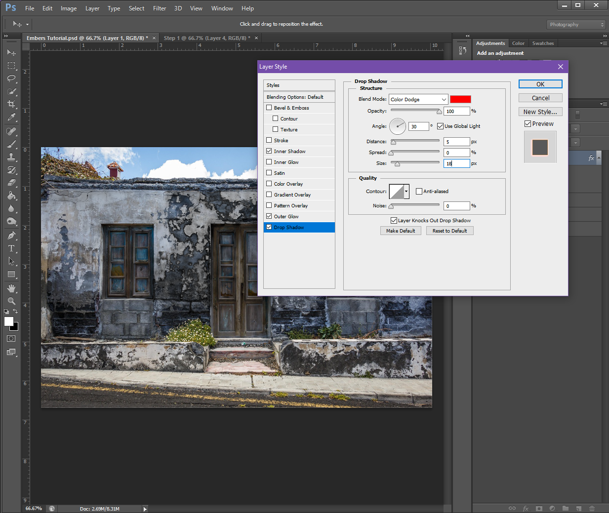
Drop Shadow:
Structure
Blend Mode: Colour Dodge (Set the colour to Red, #fe0000)
Opacity: 100%
Angle: 30 (Check Use Global Light)
Distance: 0px
Spread: 0px
Size: 18px
Quality
Contour: Make it the same as the Outer Glow
Noise: 0%
If you have a check box at the bottom that says Layer Knocks Out Drop Shadow, make sure it is check-marked.
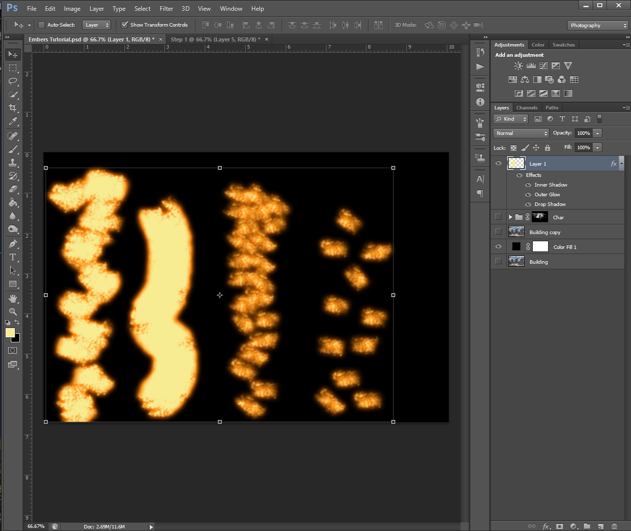
If you’d like to preview the effects, you can do so by going over to your Brush tool and selecting one of the ‘grungy’ brushes from the list, and then – while using a colour of Pale Yellow (#f8ec92) – make some brush strokes on the image.
The ‘grunge’ brush options – I don’t know why they’re called that, but in my PHSH quest, it usually just refers to the charcoal, chalk and pastel brush options
Or, you can set a Solid Colour background to preview the effect, like I did below:
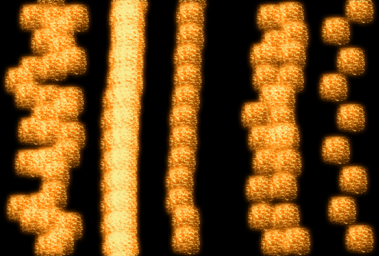
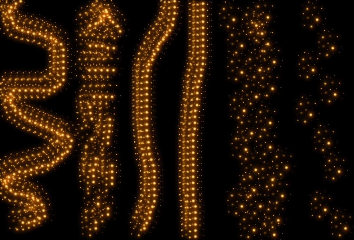
It may take some experimenting for you to figure out which brush you like best for the effect. I personally, ended up choosing a Charcoal brush. I also wanted to show you how using the brush differently will change the effect:
The furthest right pattern is what happens when I just clicked the brush once before moving to a different spot. (In my head, I call this ‘stamping’ because of the one-and-done method, but I’m not sure if it has a different name) The brush I chose also randomly changes directions, that’s why some of the pattern is horizontal and some are vertical.
The second in from the right is the same stamping method, but I did the brush strokes closer together.
The almost-solid yellow line is what happens when you use the brush normally. (Click and drag the brush in a direction you want, I made the line not-straight myself)
And lastly, the furthest left pattern is what happens when you combine the stamping and normal methods. For this one, I clicked and dragged in very short distances/spurts before moving on to the next part.
I want to emphasize here that there is no objectively ‘wrong’ brush to use. If you think it looks good and it works for your image, use it! There are a lot of different brushes you can experiment with, but I will say, as with the ash/burn effect, the ‘grunge’ brushes might work better than the plain round ones.
As I said above, I ended up using my Charcoal brush, but here is the effect with some different brushes:
Chalk Brush (I have multiples of these in different pixel sizes and slightly different patterns)
Star 26 Brush
Grass Brush (Apparently I have one of those?)
Sponge Brush Projection Brush
Soft Fur Brush (I’m pretty sure this is the brush I use when I make snow)
I have a range of brushes that are just called Spatter with the pixel size, this is a mix of the brushes in various sizes
and finally, here is what it looks like when using the plain Round brushes:
Step 3
Now that we’ve got the style and brush set up, it’s time to add the embers to your image!
To do this, select the appropriate brush Size and Hardness and start painting them in along some of the edges of the burn pattern. Try to think about how fire behaves – in most cases, fire takes the fastest path upwards, so if you chose a building, for example, you’ll want to add embers trailing up toward the roof. I’d also recommend zooming in (CTRL +) to your picture so you have better control over the placement of the embers.
If you’re not super impressed with how it’s looking at this stage, don’t worry. Most effects don’t look that great when you’re zoomed in. To check the actual progress, I recommend zooming out (CTRL – ) so you can see how the embers are looking in the picture as a whole.
If you’re still not happy with them even when zoomed out, you can use the Eraser tool to erase any parts that aren’t looking quite right so you can re-do them. (This is why it’s important we added the embers effect to their own Layer)
Depending on what brush and stroke technique you’re using, this part could take a while, so go slow and try not to get frustrated.
Also keep in mind, you can vary the Size and Hardness of your brush to help keep the embers from looking too monotone.
I actually re-did my ember trails a bunch of times because I just couldn’t get it to look ‘right’. One thing that helped me, was painting in the ember effect and then going back in with my Eraser tool to dirty up the lines and add a tapper to some of the trails.
Step 4
Once you’re happy with all your embers, to give it an even more realistic look, change the brush size and shape to one that is close to that snow one I showed above, then paint around the outside of some of the trails. This will make it look like some of the embers are floating off.
I did my floating embers on a different layer so I could easily erase and replace any I didn’t like without having to re-do the ember trails.
This also leads me to a very helpful tool when working with PHSH Effects: If you need to apply the same effect to a different layer, you can do so quickly by holding down the ALT key on your keyboard, then clicking on the FX symbol in the Layers Panel and dragging it to the layer you want to apply the effect to.
You’ll know if you did it correctly if all the Effect Text under the layer and the FX symbol transfers to the new layer.
And that’s it!
Because I didn’t do my char/burn layer super dark, I had to do my ember trails more subtly, so it looks like the building is just starting to catch fire, opposed to being in the middle of burning. I also took out the floating embers, because realistically, I don’t think there would be enough embers to have some floating up around the trails I made.
This means, my finished project, looks like this:
Which is the image I used on social media.
But, don’t worry – up next, I’m going to show you how to add flames to your burning image, so you’ll get to see a much cooler/less subtle version of the embers, just in time for Halloween!
I know I’ve already showed you guys a way to Burn things in Photoshop, but, that was with the Burn tool, which is objectively the ‘easy’ way to add that effect to your pictures.
But, you guys have come a long way since the first few tutorials, and with Halloween coming up, I thought now would be a great time to introduce you to the more complicated way to burn your pictures. This way I’m going to show you allows you to be more precise in your burning, which can be extremely helpful if you’re trying to edit a more detailed photo.
Step 1
As always, we’ll want to start with a brand new PHSH document and an image. I didn’t want to complicate things too much for the purposes of the tutorial, so I chose a simple building.
You can, of course, choose whatever kind of picture you’d like: the image above, a different kind of building, an ex’s face, a car, animal, etc. Whatever floats your boat! This effect should work with any kind of picture.
Once you’ve selected the picture you want to use, we’re going to need to make a Group. To do this, go down to the Layers panel and select the Group icon.
Next, we’re going to need to make a selection of the subject of the image. There’s a couple different ways to do this, so I will say to do whichever one you’re most comfortable with. For me, this means using the Quick Select tool and dragging it around the picture until everything I want is inside the dotted lines. For my specific picture, that’s just going to be the front of the building.
Now, we’re going to add a Layer Mask to the Group. To do this, go down to the bottom of the Layers Panel, and then click on the square that has a black circle in the middle of it. (This is the Layer Mask button)
The Layer Mask should only take on the shape of what you’ve selected. If it doesn’t, deselect (or hit CTRL + Z to Undo the last action) and try selecting the area and creating the Layer Mask again.
If you’re also not sure whether or not you’ve successfully created a Layer Mask because the thumbnail didn’t come up, you can go up to the top menu and then select Layer, then scroll down to Layer Mask and click the Reveal All option. This should make the thumbnail show up in the Layers panel, if it wasn’t already.
Step 2
Once that’s done, we’re going to start adding the ‘burn’ to the picture, which means we’re going to be playing around with the colours.
Before we do this, I’d recommend making a copy of your picture as-is, just in case you mess up/don’t like how things turn out/get confused and need a reminder of what the original looked like.
First thing we’re going to do, is go to Adjustments (which should be sitting on top of your Layers Panel) and add a Black and White Gradient Map and set it to 90% Opacity. The Gradient Map should be the last button in the last row, and looks like a gradual black to white square.
If, like me, your Gradient Map turned your Layer Mask the wrong colour, don’t panic! It applied the last/current colour in your Colour Swatches. (The ones showing in the swatches on the left-hand side at the very bottom of the Tool menu)
All you have to do to change this, is click the drop-down arrow next to the gradient that showed up in the Properties box, and then click a black to white gradient from the list.
Then, we’re going to add a Brightness/Contrast Adjustment (the sun looking icon in the Adjustments panel) and set the Brightness to -50 and the Contrast to 50.
Then we’re going to add a Curves adjustment (the 3rd icon in the Adjustment panel, that looks like an ‘s’ on a graph). The Curves adjustment values you change will depend on the initial colours of your picture, so if at the end things don’t look quite right, you can come back to this panel and re-adjust the values to see if it helps.
And finally, we’re going to add another Brightness/Contrast adjustment with the values of:
Brightness: -40
Contrast: 100
Once those are done, the picture should look like a higher contrasted black and white of the original.
Step 3
Create a new Group and name it something appropriate like Burn, Soot, Ash, Char, etc. And drop the first Group we made inside it.
Next, add a Layer Mask to the new group and fill it with Black. You might be able to do this by simply pressing CTRL + I on your keyboard. If not, you can Invert the colours by right-clicking and selecting the Invert Colour option.
Step 4
Now comes the fun part! We’re going to use any kind of Brush you want, and use it to brush the Layer Mask over any/every area of the picture you want to appear ashy/charred/burned. Make sure your brush colour is set to White, otherwise it won’t work.
You might find it helpful to separate the different areas of char into their own Groups. As long as you keep them all under the umbrella Char group, the brushing will work to uncover the black and white. Breaking them into different groups can be helpful if you uncover part of the mask where you didn’t want it and go to Erase. If it’s close to another area, you’ll end up erasing that part, as well, whereas if it’s in it’s own group, other parts won’t be affected.
Step 5 (Optional)
If you chose a picture with a smooth surface, (like a person’s skin) you can make the burn look more realistic by adding some texture to it!
To add texture, you can use any picture of a plain textured surface you may have, or, go to Filter – Texture and then click on the texture you’d like to add.
If using the picture method:
Place and re-size the textured image to fit the confines of your picture. You’ll also want to add it to whichever Group corresponds to the area you’re texturing. (Just so things don’t get confusing)
Once you’ve got it in the correct position, you’ll want to make it black and white. To do this, go up to Image – Adjustments – Black and White.
Next, you’re going to adjust the image’s Brightness and Contrast. The exact values will depend on the colours of your own image, but I’d recommend starting with a Brightness of -93 and Contrast of 100.
You’re also going to want to change the texture Layer from Normal to Overlay, so you can see the part of the image it’s over better. You’ll want to use Overlay here instead of Screen, because Overlay often darkens images, and Screen tends to lighten them. If however, they look the same to you, or if for some reason they are inverted (Screen makes the texture darker) use whichever one you prefer.
Lastly, you’ll need to repeat the texture overlay for every part of the image you darkened with the brush.
If you picked a picture that had a lot of texture already, like I did, you can go ahead and save your project once you’re happy with the results from Step 4.
And that’s it!
I hope you enjoyed this tutorial, and if you’re looking at your finished image and feeling like something is ‘missing’, don’t worry – the next tutorial I show you will be an effect that builds on this one.
Aside from actually finishing a story, naming your characters is the next bane of any writer’s existence.
Not only are you expected to encapsulate their entire personality into one word, you also have to pick a name that’s unique enough it’ll make readers remember, but isn’t too far out there, lest it becomes a meme (like the ever popular Twilight baby, or Bubblewrap Cumberbun) and, it needs to be a name you actually like. (Yes, even if they’re your villain)
Picking the perfect name for a character can be as hard as naming your child, because… well, characters are essentially the same as your kids. They’re extensions of yourself that eventually become their own people with their own thoughts, feelings and opinions. And so when you’re there, looking down at them when they’re nothing more than a squishy little personality-less blob, it can be a daunting task to slap a label on them. Especially because it’s something they’ll have for life.
No pressure.
Now, I know there’s a ton of different articles out there all telling you they’ve unlocked the only secret ‘right way’ to go about naming characters. There’s everything from mundanefully helpful like looking up common names for the region/country you want your story to take place in, to the way out there, like feeling the name’s aura, or you should pick a certain name because Mars is in retrograde.
Would you like to learn the real secret?
There is no one ‘right’ way to name them!
What works for someone else might not work for you, and that’s okay. It’s called a process because there’s no one way to do it. Every tip others give you can help, but don’t think any one person knows the be-all, end-all of how to write ‘properly’. I don’t care if they’re professors who’ve spent their entire 30+ year careers unravelling the structures of the craft, or the most famous writers in history. No one person knows everything about writing.
No one.
You can take the tips they’ve collected over the years and use it to help your writing, but don’t you dare let any internet trolls – or your imposter syndrome – tell you that you aren’t a ‘real’ writer if you don’t follow what they tell you.
Yes, this even goes for the advice I give you here.
I hope to God you aren’t only following my advice. There are tons of things I don’t know! I just learned this year that ‘spaghetti westerns’ weren’t named because cowboys ate spaghetti, and that you can’t drink salt water even if you boil it first. I am an idiot!
And so is everyone else.
That’s what makes humans the crazy, weird, fascinating beings we are.
You know your characters best, and only you can pick a worthy name.
Doing things like using a baby name website or a random name generator can help your brain get unstuck when you begin to panic-spiral into ‘I need a name to keep writing but can’t think of one, oh my God just pick something already, it’s been 4 months!’ but you shouldn’t just pick the first name you see or one you generate.
Feel it out.
Does this name actually fit your character? Think about it! Let it roll around in your head for a few days, or weeks. Make your other characters say it. Does it fit in their mouth? Does it feel like an anvil that just completely kills the conversation, or does it flow? Does it fit with the other circle of friend names?
It’ll look weird if your story revolves around Molly, Michael, Millie and Gilbert, if that stand-out name doesn’t stand out for a reason.
It’s true, fiction can be whatever you want it to be, and rules are more like guidelines. However, if you are going to break certain ‘rules’, you need to know how it’ll be perceived by your audience. Most people will spend your story waiting for the ‘weird’ name reveal, and will become disappointed if you don’t point it out, or explain why it’s there.
It needs to serve a purpose.
Also, when naming a character, you can test out a few names. Just because you pick one doesn’t mean you have to stick to it! If you’re using a placeholder name, or a name you’re on the fence about, continue writing and re-assess. Now you’ve continued fleshing out the character, are you feeling like a different name would fit them better? Then change it! Hell, give them more than one name. Give them two, or ten!
Does the name you picked lend itself well to nicknames? Are you planning on making it a joke that the character’s legal name is one thing, but their much-preferred nickname is nothing even remotely close to it? Was their name a family relic, so they keep it as a tie to the family they’ve never known? Do they like their name? Do they hate it?
Did you even ask them?
That last part sounds a little crazy, yes, but it’s also effective. You sit there and hallucinate about people who aren’t real talking all day anyway, what’s one more imaginary conversation? Picture yourself asking them if they like the name you chose. What do they say?
How do they react?
Like this article? Check out more writing tips here!
For almost as long as writing has been a thing, so has showing a trusted friend a piece of work before showing it to the masses. Yes, beta readers themselves are almost as old as the invention of writing, but that hasn’t stopped modern day writers from having a divide between whether or not using them can be helpful, or hurtful.
So, should you be using beta readers?
Well, the answer, perhaps frustratingly, is ‘it depends’.
Everyone has different reasons for writing, and for sharing their work, and the use of beta readers being needed or not can only be determined by you. Like many other things – such as word webs, outlining and font style – beta readers are just another tool writers can use to complete their work.
But, this doesn’t mean you can’t get any concrete answers!
Below I’ve listed a few pros and cons of using beta readers that might help you make your decision.
Pro 1: They Catch Mistakes
Writers are humans. And as humans, we tend to make mistakes! Especially if we’re writing in the dark at 3am, lit by nothing more than the glow of our computer screens.
But even if we’re typing away in broad daylight, fuelled by much more than just coffee (or whisky, if you’re going for a classic writer motif), mistakes can still happen. Misspelled words, funky punctuation and other weird typos can all slip passed even the most intense of proof-reading sessions, and getting a fresh set of eyes on a story (or article) before you publish it for public consumption – or say, hand it over to a professional publishing house – can help you catch mistakes you may have missed.
Does this mean that your work will be 100% perfect after having a beta reader look it over? Of course not! Beta readers are humans too, and chances are they won’t catch every mistake, either. No matter how good of a job they do.
But does that mean you shouldn’t bother at all? Some writers swear by beta readers and refuse to publish any work that hasn’t been beta reader certified. Others just type whatever comes to mind and hit publish not 5 minutes after a work is done coming out of their brains.
Let’s say for example, you use a beta reader, and they catch 90% of mistakes that are in your work. That means that piece is 90% more proof-read/public ready than it would’ve been if you hadn’t.
Con 1: Your Work Is No Longer Just On Your Timetable
As stated above, beta readers are humans. And that means that they have their own lives that they need to tend to. This can mean your timetable of publishing a work has to get pushed back if a beta reader hasn’t finished proofing a work you sent them.
Yes, some writers give beta readers certain deadlines to follow, but again, that doesn’t mean the human you handed your work over to will stick to it.
Whether it be an unforeseeable emergency, getting lost in knowing what day of the week it is or poor planning, they might just not be able to meet your deadline. And then as a writer what do you do? Do you give them the benefit of the doubt and wait until they’re able to finish? Push back your timeline to accommodate their schedule?
What if they say they’re half-done? Do you bite the bullet and wait or have them just send you what they have? Or, do you find another beta reader and start the process over from scratch?
Speaking from experience, feeling like you’re stuck being at the mercy of someone else’s life/timeline when all you want to do is get a work out there can be extremely stressful.
Pro 2: You Get (Almost) Instant Feedback
Do you hate having to wait months or sometimes years to find out if the masses liked your work? Do you wish you could get an immediate feel for if your audience would enjoy a project before you devote another six months of your life to it?
Enter, beta readers!
They can give you feedback on a work much more quickly than waiting for a general audience publishing could.
This can help ease immense stress if you tend to worry about the performance of your work. Or, if you have an idea for a new project, but you’re not sure how your audience would feel about it – maybe you deviated from your usual genre, or just feel like spicing things up – handing a rough outline or bullet points of the new idea over to a beta reader can give you immediate feedback on whether or not this is something worth pursuing, or if you shouldn’t try to re-invent your wheel.
Con 2: They Might Give You Too Much Feedback
Humans can’t help themselves when asked to give their opinions on things. We love to give our opinions on every- and anything we can. Whether it’s a new trend, whatever the ‘it’ colour of the season is, or a new fad drink – we feel almost compelled to tell anyone who will listen our opinions… whether it was asked for, or not.
Most good writer-beta-reader relationships have been built by years of back and forth, mutual respect and, perhaps even becoming friends.
And despite maybe starting out with a more professional and very transactional relationship, as you both get more comfortable sharing your opinions and views with each other, some people tend to over-step and start commenting on things you never asked for.
For example, say in the beginning of your relationship with a beta reader, the only thing you asked them to proof in your work is grammar. Or punctuation.
And for a few months or even years, that’s all you got. Just works with circled grammatical and/or punctuational errors. (If that’s not a word yet, then it is now, you’re welcome, world)
But then through the going outs for coffee, or video chats, you two became comfortable around each other and the next work your beta reader sends back has more opinions than you asked for.
Sure, maybe they’ve still circled missing commas or periods, but now there’s also stars by the beginnings of paragraphs and notes like, an evil twin plot twist? Isn’t that a tad cliche? or actually, bunnies are quite cute and adorable, why would you take the stance of them being demonic?
Suddenly, they’re giving you their two cents on the plot of the story, or the topic of your article. Cents you never asked them to give! And now you’re in an awkward spot. Do you tell them you appreciate the extra feedback, but you’d prefer if they kept to the scope of their duties? Do you try to argue your reason for the evil twin twist, or show them the evidence you compiled about the bunnies secretly being satanic?
It can be a hard scenario to navigate, and at worse, it may lead to a following out and at that point, you wouldn’t just be losing a beta reader, but also a friend.
Pro 3: You Have Someone Rooting For Your Work (Other Than You)
Being a writer can be a pretty isolating experience. You spend the majority of your time plopped in front of a computer, typing away with headphones on, staring at a screen, basically hallucinating while ignoring the world.
But, on the flip side, you’re getting lost in these wonderful world’s you’re creating, and following along with some of the most exciting people you’ve never met through amazing adventures you’ll never get to actually experience.
It can be breath-taking and awe-inspiring to be a witness to such wonderful things…. and then it can crush you right on down to dust to realize no one else can get excited with you. (Yet)
Being super passionate about things usually means you want to share them with the world, but, as a writer, you often have to wait months (or years) until being able to unleash your creations.
It can be hard not to have anyone to geek out with when you feel like you could explode with excitement. And sometimes, the waiting can turn those excited voices in your head to critics. Your once bubbly thoughts have turned to some serious over-thinking.
Why did you choose to go with an evil twin twist? Everyone and their mother has seen that done before. Did you really think you could get away with doing it in a fresh and exciting way? Or worse, even get away with doing it at all? Who do you think you are?
Enter: Beta reader! (Again)
Before you manage to spiral completely into an overthinking cloud of shame and regret, your beta reader can help shed some light on why that plot does make sense for your story, how it captivated them when they read it and how they share your excitement for having the world learn of the twists and turns that unfold!
Yes, I used just a fictional writer in the example above, but the same can be true for a non-fiction writer! Maybe you did a risque expose on some local stores in your area who don’t seem to be selling quite what they advertise, or maybe you were told a story wouldn’t be worth your time, but you decided to pursue it anyway because you just had a gut feeling it was bigger than what it seemed.
Sometimes having a cheerleader of your work who isn’t you is just what the No Overthinking Doctor ordered. It can help you keep things into perspective and help re-ignite your excitement for a project that perhaps you finished months ago that is finally getting it’s turn in the spotlight.
Con 3: They Might Steal Your Idea
Before anyone decides to come at me with pitch forks and torches, let me explain.
Unfortunately, not every human on this planet is a decent one. Also unfortunately, sometimes, the bad guys pretend to be good guys so they can swindle unsuspecting actual nice people.
As a writer, each of your ideas is probably closer to a baby than something you’d decide to throw away, and it can be extremely hard to trust letting another person in on an idea – especially if you know it’s one that will take you time to execute.
The first person you let in on a concept that exists nowhere except for inside your brain is an extreme act of trust, and unfortunately, some people will use that trust to their advantage. They may take your idea and rush to the finish line, putting it out ahead of your schedule and claiming it for their own.
Or worse, they might even just copy/paste what you send them and post it word-for-word somewhere, just because they can.
I’m not saying to be paranoid and never let anyone see your work, I’m just saying you should be careful. Do not just place a Craigslist ad for a beta reader and then e-mail over your entire unpublished manuscript to the first guy who answers!
Have at least some sort of vetting process in place. Make sure you trust the person before signing them onto your team. And, keep in mind that even with vetting processes, people still steal ideas from each other every day.
Look at how many movies there are about that exact concept! Or even, at how many knock-off brands that exist.
Some people just want to take the easy way for whatever reason, and as a creative, you should be as careful as possible, especially as I said, when it comes to things that don’t yet exist outside of your brain.
These obviously aren’t all the pros and cons of using a beta reader for your work, but I think, they’re some of the biggest things you’ll want to consider before deciding if you should – or shouldn’t – use one.
And if you’re curious: I don’t personally use beta readers.
I like doing projects from start to finish all the way through on my own. I like learning as I go and think it’s cool to see my body of work reflect that.
As I grow, my work grows.
That’s something that I’ve always thought was cool, even way back in elementary school when I used to read. Finding a spelling mistake or a missing word in a published book was like a secret game between me and the author.
Of course the author would never know, since 8 year old me wasn’t going to go to the trouble of mailing them a letter pointing out the mistake, but I still enjoyed it.
One example of this that I have myself, would be when my sixth book, Broken (which was published back in 2021), came out, my father bought a copy to support me. He called me when he was about halfway through the book and – after telling me he loved the characters and could see a whole series with them in it – told me I had apparently mixed up ‘starring’ and ‘staring’. He said, at first, he thought I had done it on purpose, but as he continued reading he realized I actually just didn’t know which spelling was for which word.
Did I go back and re-upload the whole book with the changes once it was pointed out to me? Nope.
If you buy a copy of Broken today, the characters will still be ‘starring’ into each other’s eyes.
But, every story I’ve written since I got that phone call? Has the correct spelling.
Some might say it makes me look ‘unprofessional’ for leaving spelling mistakes in my books/stories, but I think, if you stick around a while, it’ll just show you how far I’ve come. Like watching a Youtuber who starts with hanging a white bed sheet behind them who uses their laptop’s built-in-microphone, then seeing them grow into having actual background or green screen behind them and a professional mic.
Seeing the journey is part of the fun… right?
Like this article? Check out more writing tips here!
It’s funny, because I ended up discovering this effect during my trial and error of working out the Rain tutorial.
I didn’t think I’d end up actually making a tutorial for this effect – since I only know of one application for it – but I figured, maybe someone else out there needs to add creepy/broken-down/horror vibes to their project.
So if that’s you: you’re welcome!
Step 1
Get a picture of a television set and add it to your project.
I personally decided to go with an older looking set because I think it will help make the effect look more real, but you can use any television picture you like.
Once you’ve decided on a picture to use, create a New Layer and then fill the layer with the colour black.
Step 2
Next, go up to the top menu bar and find Filter – Noise – Add Noise from the drop down menu.
You can play with these values later, but for now, we’ll want to keep them to:
Amount of Percent 25%
Distribution Mode: Gaussian
Also make sure the Monochromatic box is checked.
Step 3
Now, we’re going to add the static to the television. There’s a couple different ways to do this, but I’ll show you the fastest way first.
Go to the Layer Opacity and change it so you can see the picture under the Noise layer, but are still somewhat able to see the Noise layer. For me, this was 40%.
Once you’ve done that, go up and use the Rectangle Select tool, then outline a rectangle shape that’s a little bigger than the screen on the television set.
Next, we’re going to right-click on the layer and select Inverse Selection from the drop-down menu. Then, you’re going to use the Eraser tool and start erasing everything outside of the box you created.
This is getting rid of the Noise that’s over the rest of the layer, and will leave us with just the Noise over the screen of the television.
Continue erasing until you’ve got everything outside of the box you created.
Step 4
To deselect the box you’ve created, go back to the Select tool, right-click and then choose the Deselect option from the drop-down that comes up.
We’re going to need to zoom in for this next part, so go ahead and zoom in until the television screen is about the only thing we can see in the document.
Now that we have a better view of what we’ll be doing, the first thing we’ll be doing now is erasing the box to fit the screen of our television better.
If yours is already pretty perfectly fit, with minimal overlap, you can skip this step.
If you need to, don’t forget you can change the size of your Eraser to make it smaller and easier to work with while being zoomed in.
Step 5
Right-click on the Noise layer and select Warp from the drop down menu.
Then, very carefully, drag the edges of the Noise layer until it appears to bend slightly into the curves of the television screen. If you chose something closer to a flat screen/modern television set, you may not need to do this step as drastically, but slightly warping the layer will still help give it an air of realism.
Once you’re happy with the Warping of your Noise layer, hit Enter on the keyboard or try to click the Pointer tool, and then in the dialogue box that pops up, select Apply changes.
Step 6
If needed, you can re-erase the edges of the Noise layer so they match up with the edges of the television screen.
If not, go ahead and you change the Opacity of the Noise layer back to 100%.
If you want a subtler static on the television, you can keep the Opacity lower. Depending on why you’re adding the static, you can even keep it semi-see through, and add a picture to the screen, so it looks like it’s a bad connection, instead of just being completely out.
Once you decide you’re happy with whatever you decide, you can go ahead and save this bad boy because we are done!
Like this tutorial? Check out the rest of the series here!
This chalk effect can be used for all kinds of pictures – fake children drawings in summer, blackboard writing, etc. – but the reason I taught myself this effect was because I needed a chalk person outline for my book Crimson Smile’s cover.
Luckily, whether you’re using it for faux murder or something a little more PG, the steps are exactly the same!
Today I’ll be showing you how to do the effect with the murder outline, just because it’s the first way I learned, and I think it’s cooler than the other uses, but rest assured: I’ll show the more everyday use examples at the end of this tutorial.
Step 1
You’ll want to have a background image for this effect, so go through your library of royalty free images, or if you don’t have any saved, check out Pixabay or Pexels to download some. Today, since I’ve decided to keep the murder theme, I’ve chosen a night time road.
I’ve also changed it’s name from the default Layer 1 to Background, just to help keep things straight.
Once you have the Background picture, you’ll also need the person to apply the effect to. The simplest way to do this, is to find a silhouette picture of a person laying down (preferably, with their limbs out) and then outline and erase the inside. (Don’t worry, I’ll show you how to do that)
If you want to do it the long way, pick any picture of a person you want to use, and then manually erase all of them until just an outline of a person is left, and then dye the outline black.
All that’s left to do now is to erase the background of the person image (if your picture has one) and re-size the image to a more appropriate size, so it fits into your background image. You can also rotate the picture if needed.
Step 2
To get my person picture as just an outline, I’m actually going to use the Outer Glow technique, so go ahead and read through that tutorial if you need to. If you don’t, go ahead and skip to Step 3.
For this instance, instead of making the outline ‘glow’, I’m going to keep it a solid colour – I chose red for now, so you can see which part this step is – and keep the Opacity at 100%. I’m also going to change the Spread and Size values.
You can go ahead and play with these until you’re happy with your own outline.
Once you’re happy with the outline, all you need to do is go to the Eraser tool and use the Magic Eraser, then click on the inside of your person, to erase the inside, and just leave the outline.
After this, I also just changed my outline colour from red to black. You guys shouldn’t need to do this, unless you for some reason also made your outlines a bright colour.
Step 3
Okay, now that we’re set up, we can actually begin on the Chalk Effect!
To start, you’ll want to go up to the Filter tab in the top menu, then find Stylize in the drop-down and then click Find Edges.
If it doesn’t look like anything happened, don’t worry! You probably won’t be able to see this step because of the black colour, but it’ll become evident if we did it right during the next few steps.
Step 4
Next, we’re going to find Image in the top menu, and then go down to Adjustments, and click on the Invert option from the drop-down.
Then we’re going to go back up to Image – Adjustments and this time we’re going to click on the Desaturate option.
Step 5
Now we’re going to go back over to the Filter option in the top menu, and then click through to the Filter Gallery.
Welcome back to the Filter Gallery!
As you can see, the last time I was in here was for the Stained Glass tutorial.
Today, though, we’re going to find the Rough Pastels option – which is in the Artistic folder – and then put in these values:
Stroke Length: 0
Stroke Detail: 15
Texture: Canvas
Scaling: 60%
Relief: 13
Light: Bottom
Once you’ve done that, click the Okay button to apply the changes to your person. This will also close the Filter Gallery and bring you back to the main PHSH workspace.
If for some reason, like my Preview box, yours showed nothing, you should also be able to see the effect on your person outline.
Step 6
At this point, as I said, you should be able to see the effect on your person. If you cannot, as I didn’t, you may want to skip the Outer Glow step. This will depend on the picture you use.
The person silhouette I chose for the tutorial, didn’t need the Outer Glow step. But I didn’t realize that until this point in the tutorial.
After my Step 5 didn’t seem to work, I tried it again, without stopping to take the screenshots. This is something that has happened in a couple of past tutorials. Some of these effects require you to do them one right after another, not do one, wait, take a screenshot, switch tabs, save the picture, write down the step in an article, and then click back over.
It’s a tad annoying, but you learn more through trial and error, right?
Anyway, so after trying to do the effect again and it still didn’t work (despite not clicking away), I decided to try again, but this time I omitted the Outer Glow step. This is because I realized the Find Edges step can’t find any edges of the picture if we erase the picture and just leave the Glow outline.
PHSH doesn’t recognize the Glow effect as an outline of the person, so the other effects didn’t work.
Luckily, this was the only fix that was needed!
The below screenshots are the same exact sequence, just without the Glow to make the outline:
This turned the inside of the person white, and outlined them in black
This step as it implies, inverts the black and white of the step above, so now the outline is white
And hey, look at that, we have a preview now!
Okay, now we’re exactly where we should’ve been the first time around.
At this point, now we can safely use the Magic Erasure and erase the black part of our person.
Step 7
We’re pretty much done now, but if you think your chalk outline looks a little too… crispy white, especially against a darker background, you can go to the Blending Mode of the person layer and change it to something like Screen or Overlay. If this still doesn’t look quite right to you, you can also slightly change the Opacity until it fits.
Once you’re happy with the Opacity, you can also slightly Warp the image, if you need to.
This is a little thing that can help give the effect just that little extra push into being believable. You want the chalk to look like it’s actually on the road. You might also find it helpful to zoom in for this step.
But same thing, this comes down to personal preference and what pictures you started with.
Once you’re happy with the way you’ve Warped the picture, you’re done! Don’t forget to save both a PHSH (.psd) file and picture file of the effect.
At this point, you can also start playing around with different looks to explore what else you can do with the chalk effect!
For example, if you combine this effect with the Rain effect and lower the Opacity of the chalk layer to around 20%, it can also give the illusion that the chalk is being washed away.
Or as I said at the top of the tutorial, you can use this effect to make much more than just murder outlines!
Like… blackboard drawings!
Or blackboard writing!
Or….
Like this article? Check out the rest of the PHSH Tutorial series here!
In honour of it being Halloween month, I wanted to share a tutorial that I thought would fit that theme: stained glass!
This effect looks beautiful and complicated but luckily, it’s not that hard once you know how to do it.
Step 1
As always, we want to start with a base image. For this tutorial, I’m using a royalty-free picture of a Jack O Lantern.
This is usually where I tell you to use whatever picture you want, and technically, you can! But I want to warn you that this effect will look better if the picture isn’t too real life looking. Think cartoon, or clearly already drawn.
Once you have the picture you want set up on your document, you’ll want to get rid of the background, if there is one. In my case, this was achieved by just using the Quick Select tool on my Jack O Lantern and then Erasing the background.
Step 2
This is the part where we’re actually going to make the stained glass. We can do this one of two ways. The first way, takes forever and involves creating all the shapes yourself using the Line Tool.
The way I’m going to show you, however, is far easier. Just go on up to the top menu and go to Filter then click on Filter Gallery.
Once the Filter Gallery opens, you’ll want to open the folger on the right-hand side that’s labelled Texture and then click on the effect that says Stained Glass.
You’ll want to play around with the values that are listed all the way in the right-side panel to get the correct effect for your image.
The Cell Size changes the size of the stained glass ‘pieces’, Border Thickness changes the line thickness and Light Intensity as the name implies, changes the light.
For my image, I used the following values:
Cell Size: 6
Border Thickness: 4
Light Intensity: 2
Once you’re happy with the effect, click the OK button in the top right to generate it and take you back to the normal work screen.
Step 3
Technically, you can be done at this stage. You’ve successfully applied the stained glass effect to your foreground image. You can save it with a transparent background so you can drag and drop it into any of your other projects.
Or, if you’d like to leave this object as it’s own work file/image, you may want to follow the steps to make the background match. As I’m sure you can see, the white background is kind of ruining the magic of the effect.
To fix this, you’ll want to go to the bottom of your Layer’s Panel and click on the Add New Fill or Adjustment Layer button, then select Gradient from the pop-up menu.
In the Gradient Fill box that appears, you’ll want to select either a gradient you already have, or make a new one if you don’t have one that matches your images theme.
If you don’t know how to make a new Gradient, follow Step 4. If you already know how to make one, and/or already have one you’d like to use, skip to Step 5.
Step 4
To make a new Gradient, double click on whatever the current Gradient is that’s showing in the box to bring up the Gradient Editor.
To change the colours being used in the Gradient, click on the Colour Stop and choose a new colour from the Colour Picker that opens.
To keep with the Halloween theme, I’m going to make an Orange to Black gradient, so those will be the colours I select for each of my Colour Stoppers.
Once you’re happy with the colours of your Gradient, you can click the OK button to apply them.
If you think you’ll use this Gradient again in the future, you can also save it by giving it a name and clicking the New button at the end of the Name field.
Step 5
Now that you have a Gradient for the background you want to use, in the Gradient Fill box, you can play around with the Angle and Style to see what fits with your picture best.
For the purposes of this tutorial, I decided to keep it simple, so I kept the Style as Linear, and didn’t change the Angle.
Once you’re happy with these settings, click OK.
Step 6
Now all we’re going to do is apply the Stained Glass filter to the background image. You may need to change the values used for the Cell Size and Light Intensity, that’s okay!
Play around with them and see what matches your image best. Or, if you’d like, you can change the values so that instead of matching your foreground object exactly, you can make it stand out slightly.
For example, I made my background values as follows:
Cell Size: 10
Border Thickness: 4
Light Intensity: 5
As you can see, I changed the values, and here is what it looks like:
If you’re curious, here is what the image looks like when I used the same values for both the fore- and background:
Step 7
My image doesn’t look quite as right as I think it could, so I’m just going to change my Jack O Lantern’s Layer Type from Normal to Hard Light.
If your image looks like it doesn’t need anything after adding the stained glass effect to the background, feel free to skip this step and go right to saving because we’re done!
As I said earlier, this last little tweak (and some little ones above) will depend on the image you started with, do to the difference in colours, style, etc. So feel free to play around with the values to find what works best for you!
If you’ve been a writer for any length of time, or paid attention during English class, you’ve probably heard about how one way we categorize different kinds of writing is by word count. Like how you probably know short stories are, well, short, compared to a novel.
But if you’re a writer, you might be asking yourself: do I really need to pay attention to these distinctions?
The short answer, as with most things, is: it depends!
It mostly depends on why you’re writing, or what you’re attempting to write for. For example, if you’re writing a story in the hopes of submitting it to a magazine, you’ll want to make sure you stay inside the word count they give you as part of the instructions. Same as, if you’re contracted to write a book to send off to a publisher, most of them won’t publish works in certain genres if they’re not within the expected range. This is usually because they know avid readers of a certain genre are typically expecting a certain word count, and if your book is shorter, or longer than such, people might not read it. (Unless you’re an already established big name – for example, Stephen King can colour outside the lines)
On the other hand, if you’re writing just for you, adhering to a strict word count limit isn’t as necessary and, I’d even go so far to say, it can actually be detrimental!
If you’re trying to write a story while keeping a firm word count in the forefront of your mind, you might find you’re more frustrated, distracted, and it might just become all around harder for you to get the story out of your head.
I recommend just letting your story flow, and not worry about a word count until you’re done getting it out of you. Once you have it down on paper, then you can add the word count parameters as part of your editing. If you’ve come up too short, see if you can fit an extra scene in, or if you’re over, see if there’s parts you can take out without changing the flow or plot, or leave it on a cliffhanger/to-be-continued, if you’re planning to make it a series.
One of my all time favourite pieces of writing advice I’ve ever gotten is: a story takes as long as it takes.
It makes writing sound so simple, doesn’t it?
I keep this advice in mind all the time, which is why I don’t bother checking a word count of a story until I’m done writing it. Now, I know I’m lucky, since I mostly write for myself on Patreon, (and here) I don’t have to adhere to a strict word count limit. The only word count rules I have to keep in mind are ones that were self-imposed. (And those were only put in place because I upload so many)
That said, I still think it’s a better way to write, and would recommend anyone to try adopting this style!
Instead of getting bogged down with all the nit-picky editing elements – oh, your story is 10 words off from your word count, you used ‘too many’ adjectives, you misspelled a word – if you let your critical editing voice sleep – or beat it to death with a stick, because you’re a good writer, damn it! Stop being so hard on yourself! – you can focus all your energy on telling the story.
In my opinion, telling the story is the most important part of writing. Screw the rules! Take your time, focus, and tell your story. It’s more important to tell it ‘correctly’ than to try and squish it to fit into a predetermined sized box so it’s ‘right’.
Also, in my experience, if you take the time and tell the story you want, in the way you want, most readers won’t care if it’s a little over or under a specific word count. They’ll just be happy they have a new favourite piece to add to their collection.
Also also, once you get the story down how you want it, and know the word count, it can help narrow your focus of where to submit it. Instead of being at the mercy of the magazine, publisher’s, etc. rules, you can find the rules that fit your story, instead.
Like this article? Check out more writing tips here!


 The flame picture I started with
 The flame picture after I erased the reflection and partial background


 An example of over-warping


 This turned the inside of the person white, and outlined them in black
 This step as it implies, inverts the black and white of the step above, so now the outline is white


