![]()
Happy October, everyone!
Are you in the spooky spirit yet? Not to worry if you’re not, today’s tutorial will get you there!
Like I said in the previous tutorial, the effect I’ll be showing you this week will be building on that one, so if you haven’t checked it out, now would be the time to do so.
I’ll even wait!
…
You back? Okay, cool!
Then let’s get started on this week’s tutorial: Embers.
This tutorial only has 4 steps but it is time consuming! We’re going to be painting in the embers by hand, so, fair warning. Also, I’ll apologize now for any (inevitable) frustration.
The finished product should be worth it, though!
Step 1
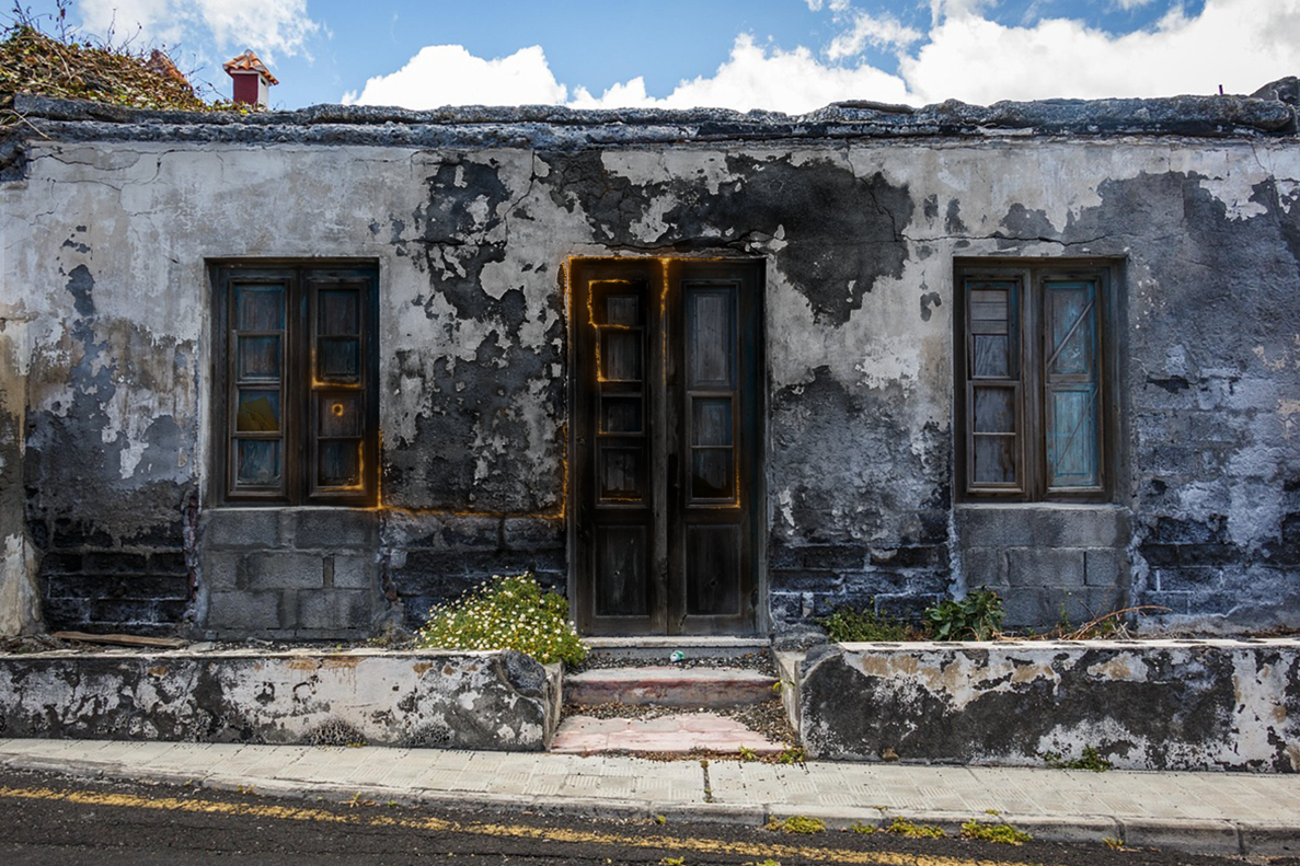
This week, we’re actually going to start in last week’s tutorial document, not a blank one. So, go ahead and open up your Photoshop file version of last week’s Burn effect. (It will be the .psd file, not the .jpeg or .png)
Or, if you prefer, you can create a new project and name it Embers, then drag and drop in your picture file of the Burn effect. Just keep in mind if you do this method, you won’t be able to change, add-on or alter the burn pattern, since it’ll be part of the image. If you end up wanting to tweak it, you’ll have to go through all the Burn tutorial steps a second time.
If you’re wondering: no, you’re not crazy. This is a different burn pattern from what I showed last week. If I haven’t mentioned already, I always do the effects at least twice: once when I’m experimenting/playing around, and the second time is a ‘live’ version I do when I write out the tutorials. (This is the one all the screenshots come from)
It’s the same picture and over-all concept, but if you ever notice the patterning doesn’t exactly match the tutorial pictures, this would be why. Also, despite my initials, I am in fact, not a robot, so I can’t replicate the patterning/brush strokes to look 100% the same between the versions. (Depending on the effect)
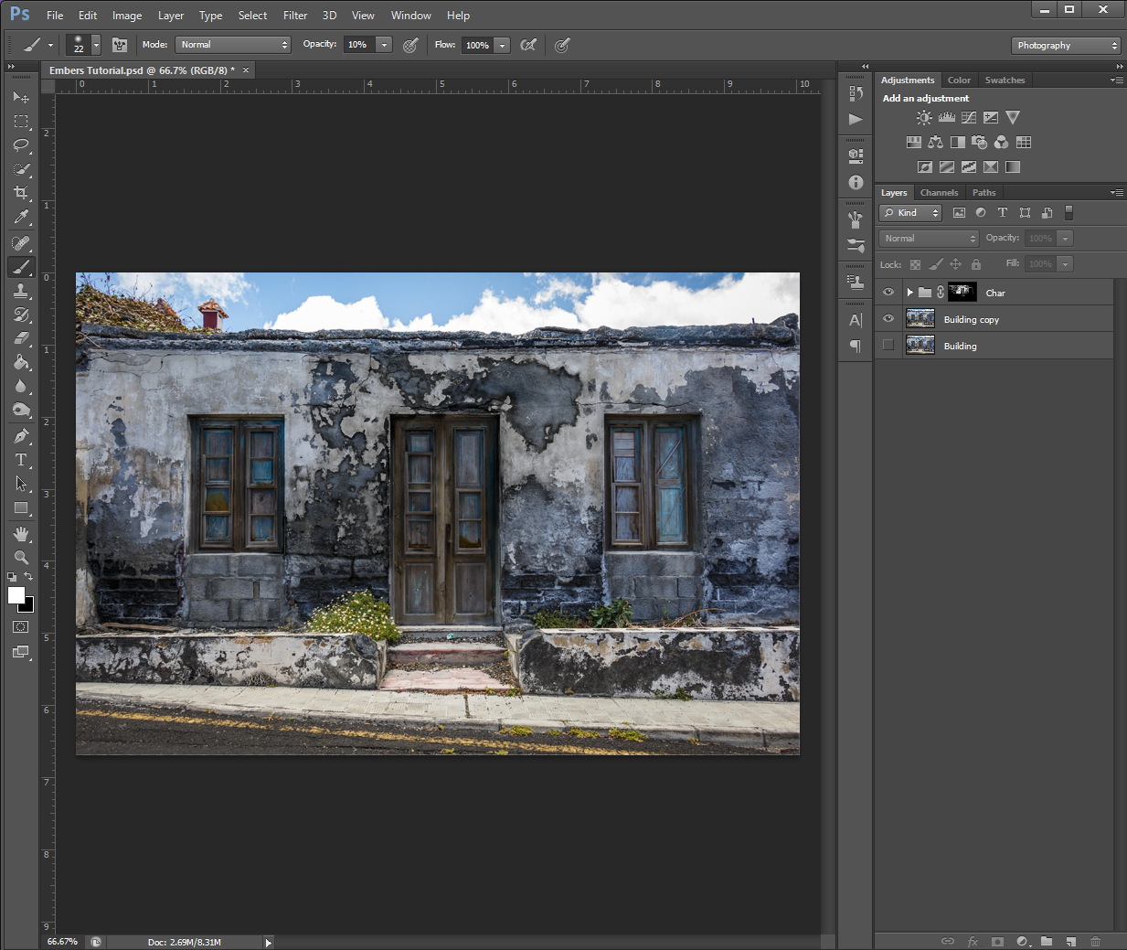
Step 2
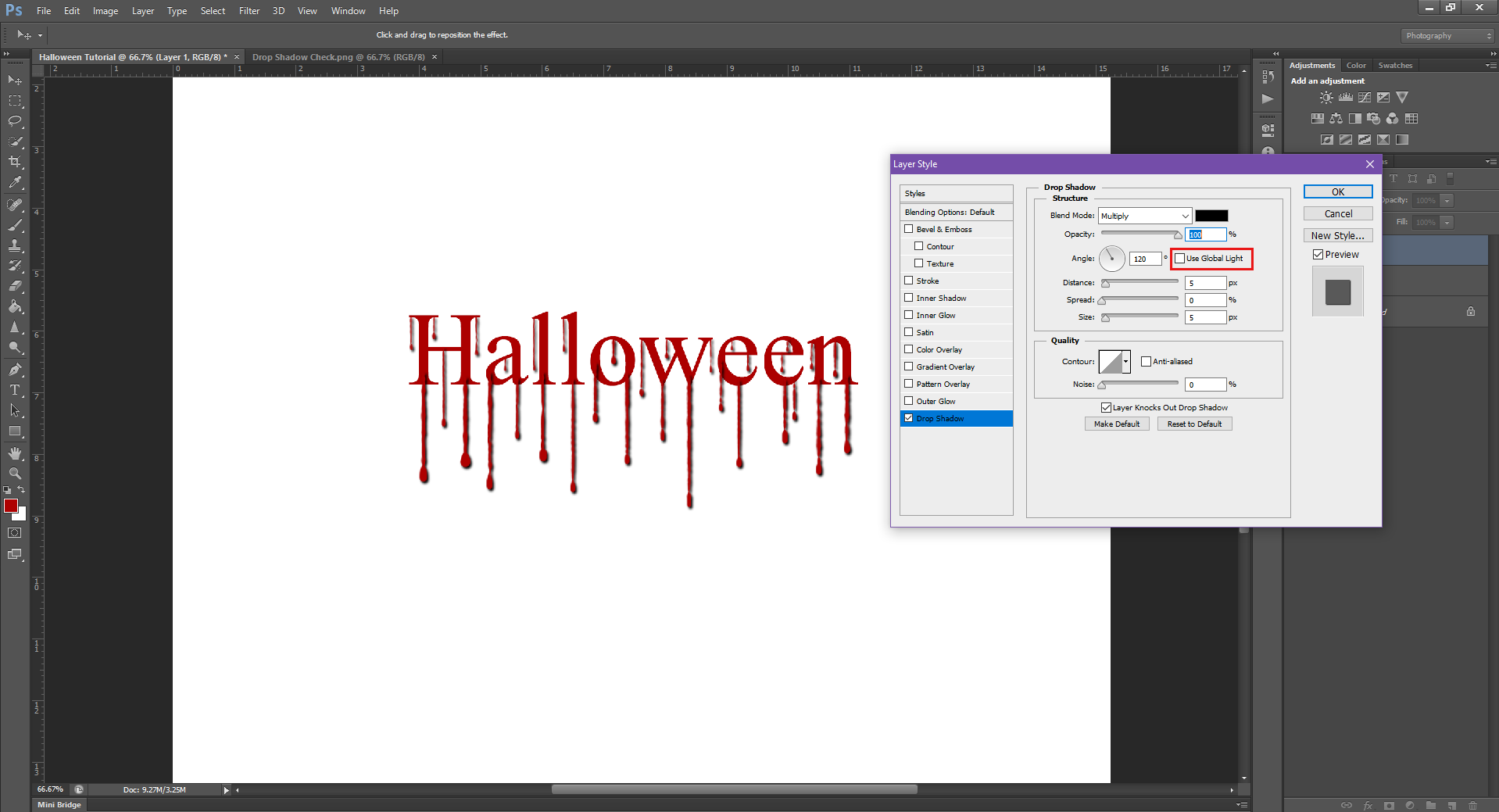
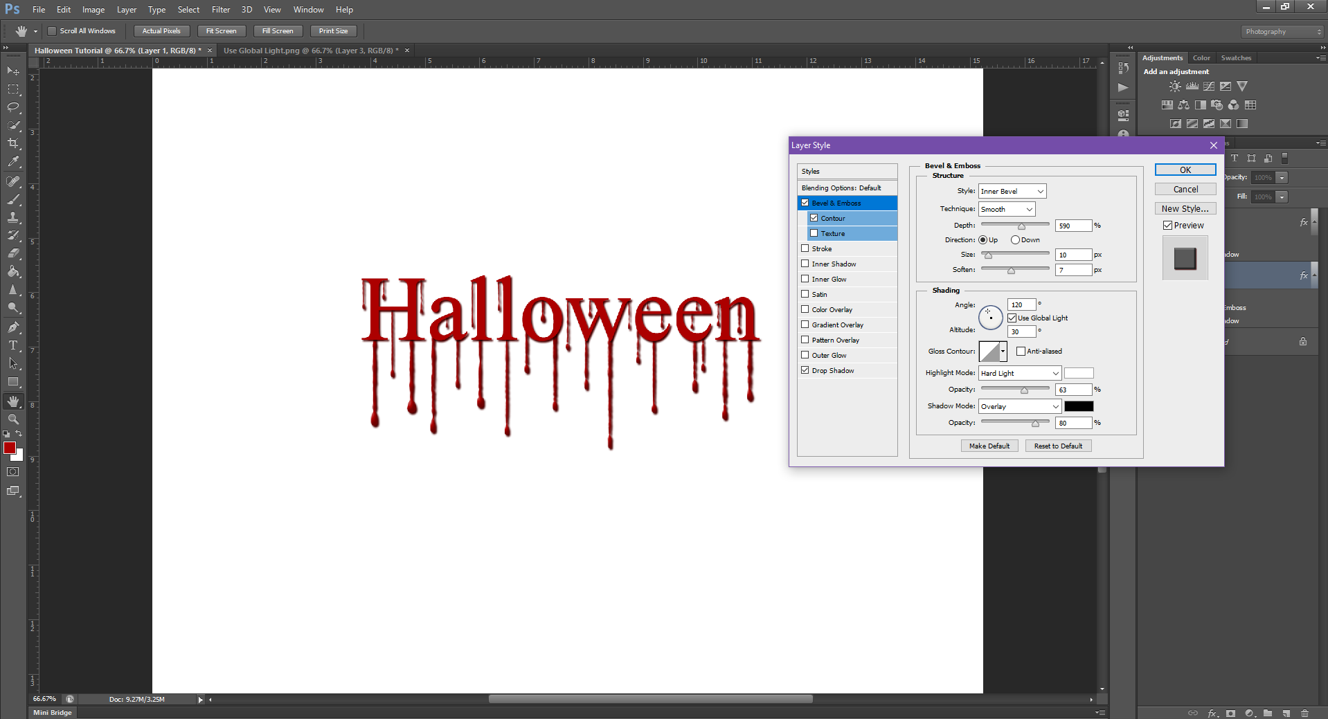
On a New Layer, go to the Blending Options menu (right-click on the layer) and turn on and fill in the following values:
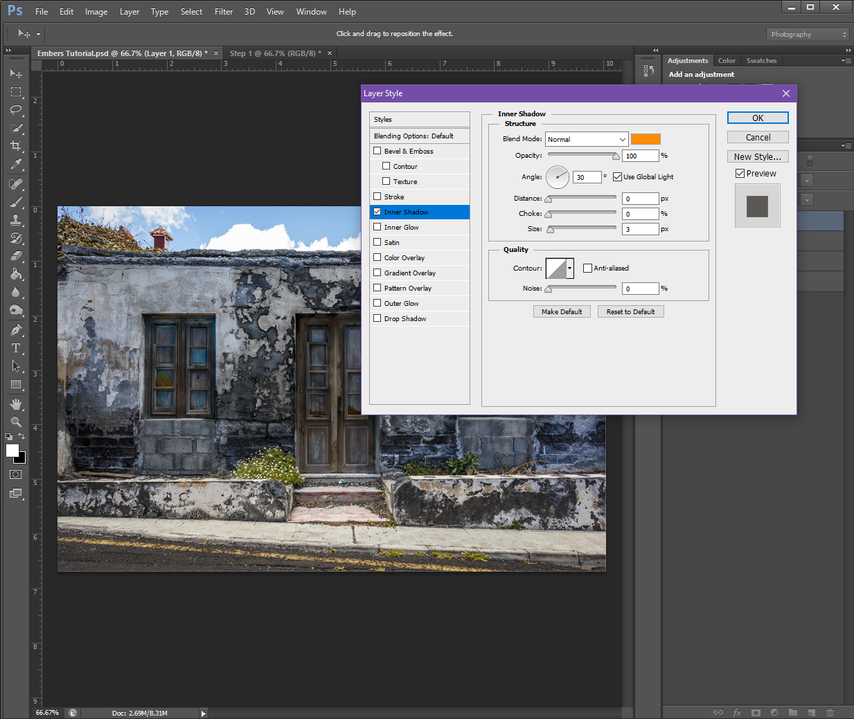
Inner Shadow:
Structure
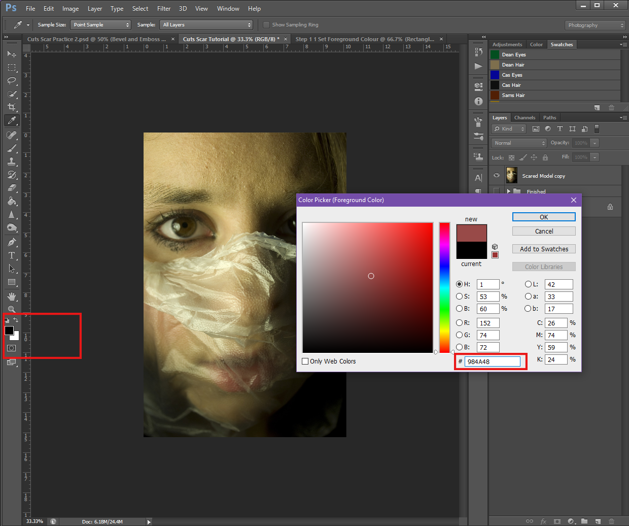
Blend Mode: Normal (Make the colour a Light Orange, I used #ff8d03)
Opacity: 100%
Angle: 30 (Check the Use Global Light box)
Distance: 0px
Choke: 0%
Size: 3px
Quality
Contour: Make it the top-right to bottom-left straight diagonal White and Black option (the one that looks like this / )
Anti-Alias: Make sure is un-checked
Noise: 0%
Outer Glow:
Structure
Blend Mode: Screen
Opacity: 100%
Noise: 0%
Colour: Make sure the Solid square is selected (not the Gradient) and set it to a Red-ish Orange (#fe7801)
Elements
Technique: Softer
Spread: 0%
Size: 18px
Quality
Contour: Make it the same as Inner Shadow
Range: 50%
Jitter: 0%
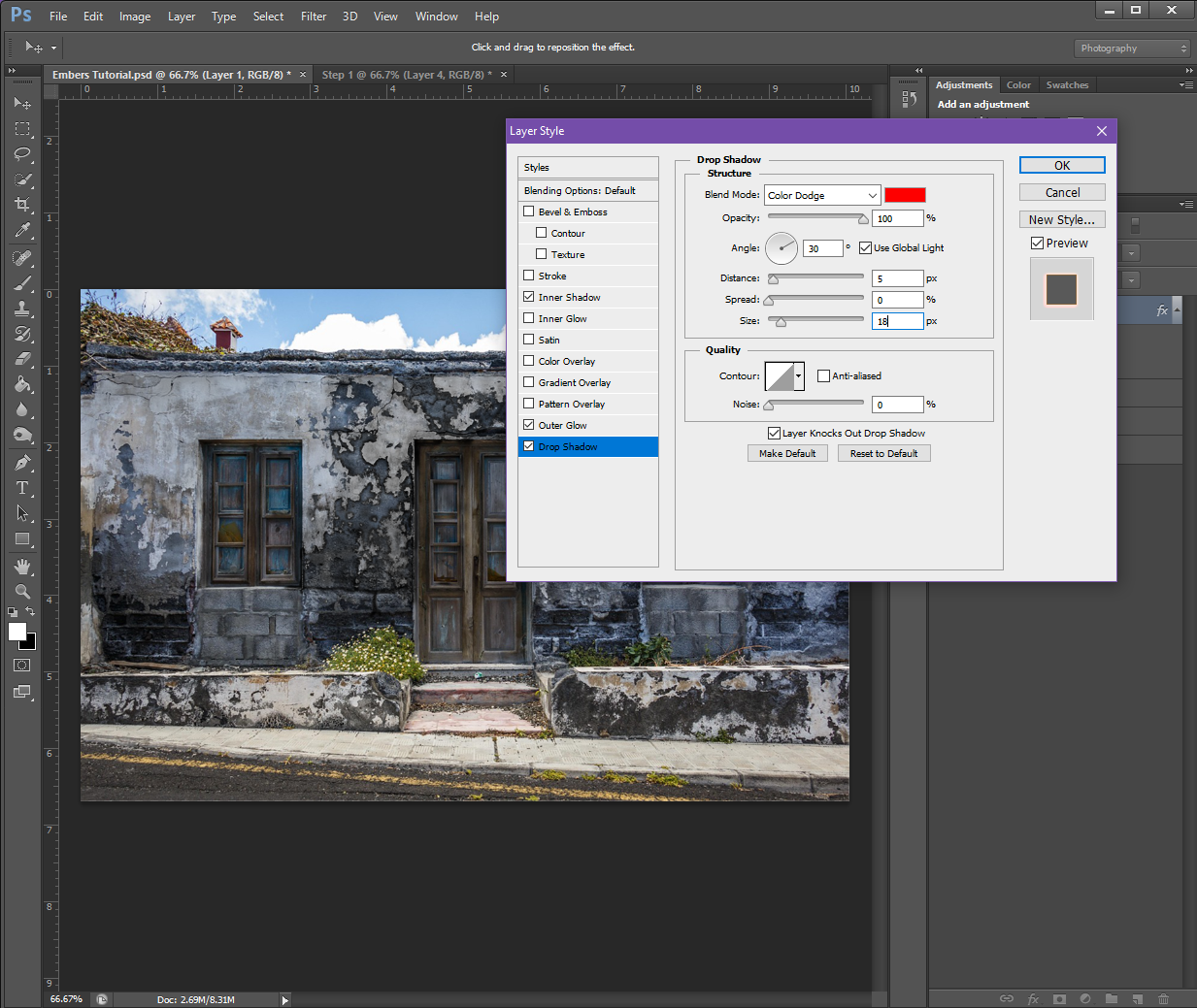
Drop Shadow:
Structure
Blend Mode: Colour Dodge (Set the colour to Red, #fe0000)
Opacity: 100%
Angle: 30 (Check Use Global Light)
Distance: 0px
Spread: 0px
Size: 18px
Quality
Contour: Make it the same as the Outer Glow
Noise: 0%
If you have a check box at the bottom that says Layer Knocks Out Drop Shadow, make sure it is check-marked.
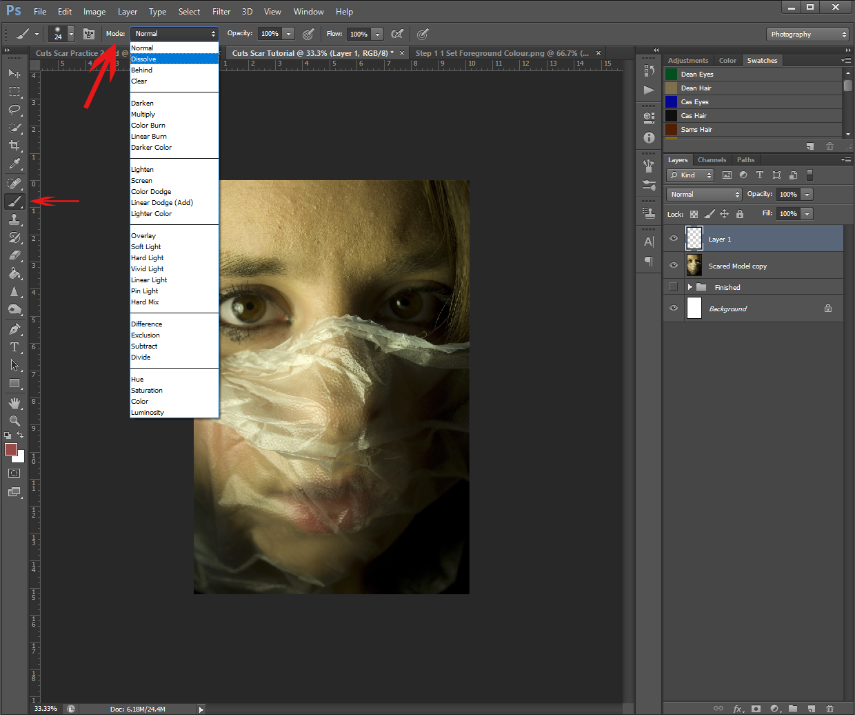
If you’d like to preview the effects, you can do so by going over to your Brush tool and selecting one of the ‘grungy’ brushes from the list, and then – while using a colour of Pale Yellow (#f8ec92) – make some brush strokes on the image.

The ‘grunge’ brush options – I don’t know why they’re called that, but in my PHSH quest, it usually just refers to the charcoal, chalk and pastel brush options
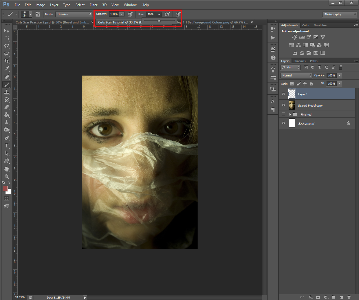
Or, you can set a Solid Colour background to preview the effect, like I did below:
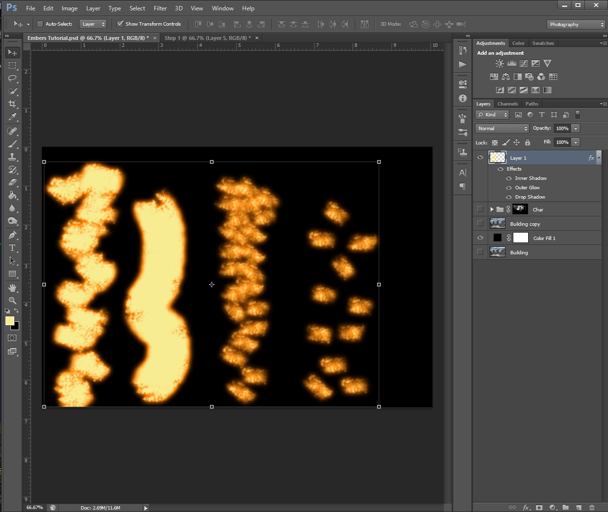
It may take some experimenting for you to figure out which brush you like best for the effect. I personally, ended up choosing a Charcoal brush. I also wanted to show you how using the brush differently will change the effect:

The furthest right pattern is what happens when I just clicked the brush once before moving to a different spot. (In my head, I call this ‘stamping’ because of the one-and-done method, but I’m not sure if it has a different name) The brush I chose also randomly changes directions, that’s why some of the pattern is horizontal and some are vertical.

The second in from the right is the same stamping method, but I did the brush strokes closer together.

The almost-solid yellow line is what happens when you use the brush normally. (Click and drag the brush in a direction you want, I made the line not-straight myself)
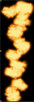
And lastly, the furthest left pattern is what happens when you combine the stamping and normal methods. For this one, I clicked and dragged in very short distances/spurts before moving on to the next part.
I want to emphasize here that there is no objectively ‘wrong’ brush to use. If you think it looks good and it works for your image, use it! There are a lot of different brushes you can experiment with, but I will say, as with the ash/burn effect, the ‘grunge’ brushes might work better than the plain round ones.
As I said above, I ended up using my Charcoal brush, but here is the effect with some different brushes:

Chalk Brush (I have multiples of these in different pixel sizes and slightly different patterns)

Star 26 Brush

Grass Brush (Apparently I have one of those?)
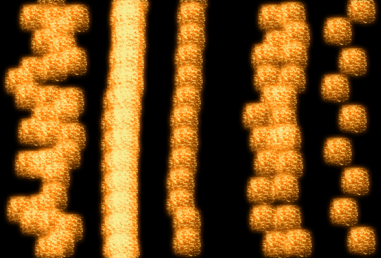
Sponge Brush Projection Brush
Soft Fur Brush (I’m pretty sure this is the brush I use when I make snow)

I have a range of brushes that are just called Spatter with the pixel size, this is a mix of the brushes in various sizes
and finally, here is what it looks like when using the plain Round brushes:

Step 3
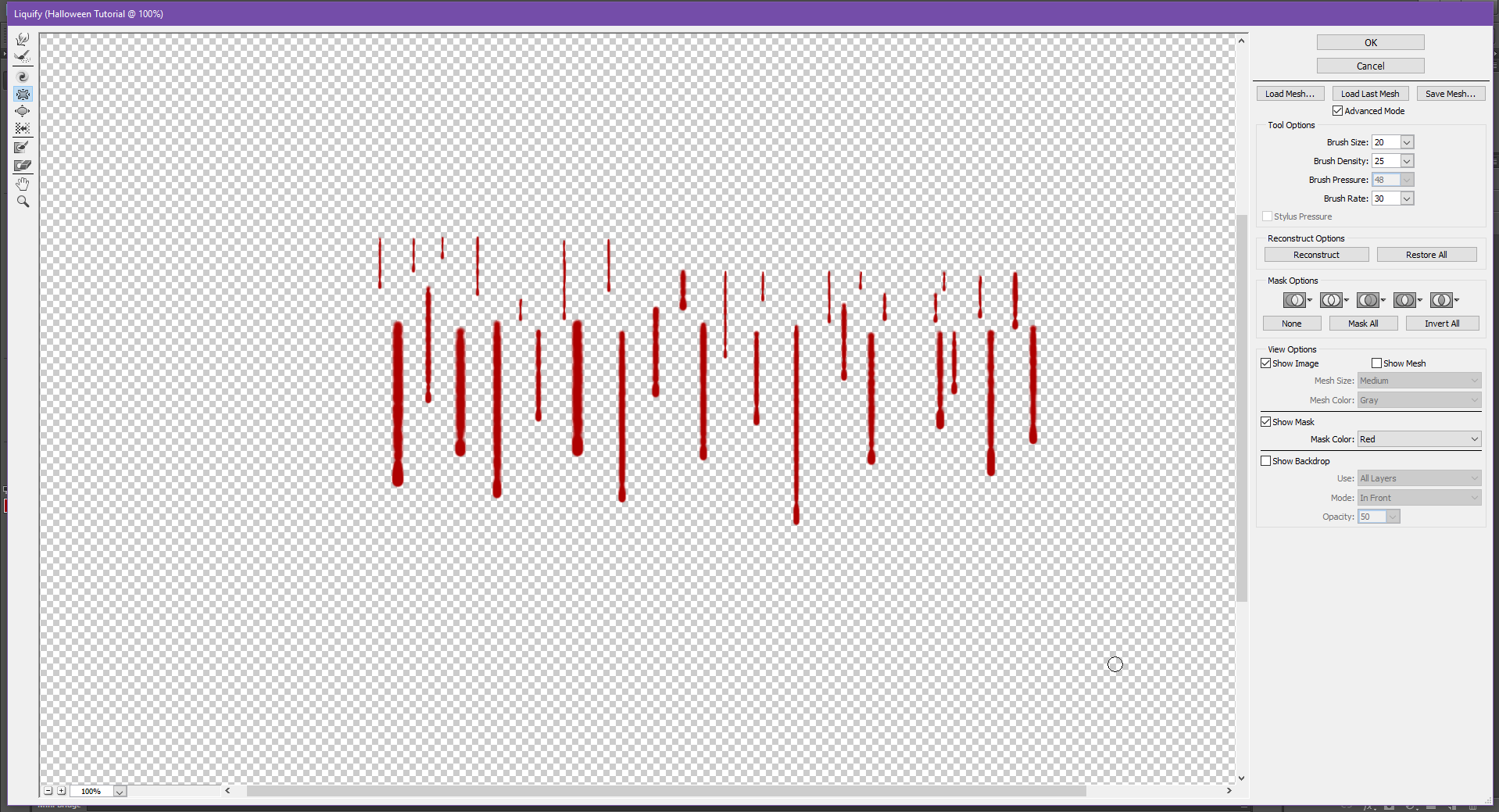
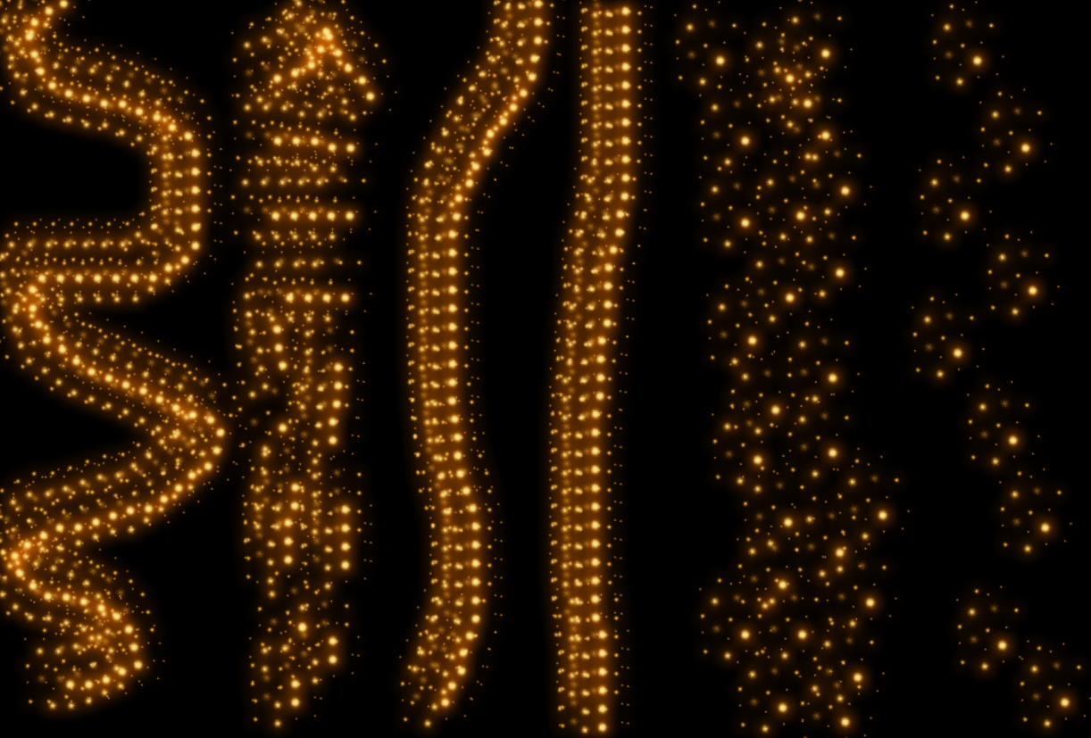
Now that we’ve got the style and brush set up, it’s time to add the embers to your image!
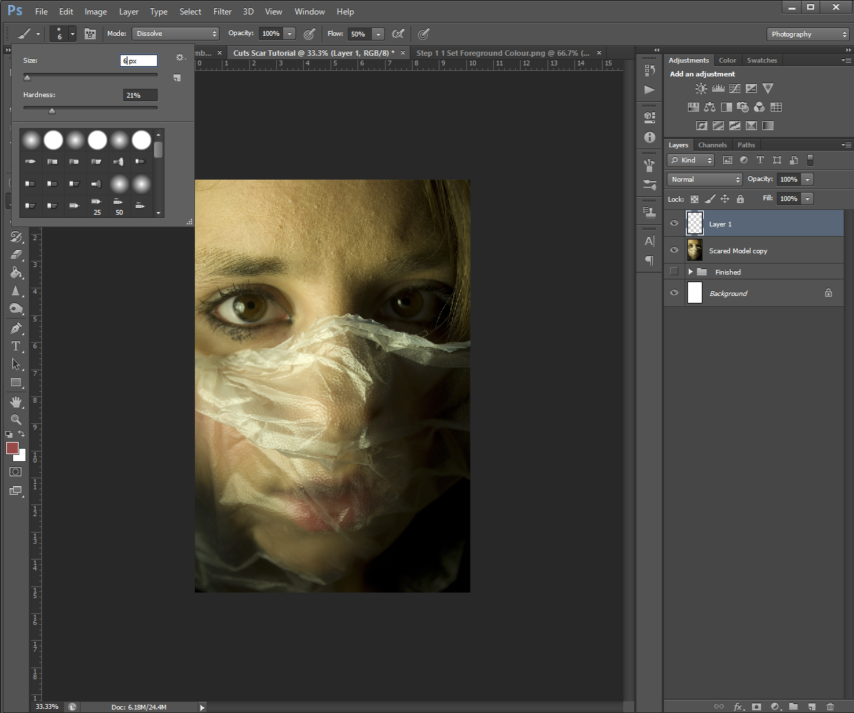
To do this, select the appropriate brush Size and Hardness and start painting them in along some of the edges of the burn pattern. Try to think about how fire behaves – in most cases, fire takes the fastest path upwards, so if you chose a building, for example, you’ll want to add embers trailing up toward the roof. I’d also recommend zooming in (CTRL +) to your picture so you have better control over the placement of the embers.

If you’re not super impressed with how it’s looking at this stage, don’t worry. Most effects don’t look that great when you’re zoomed in. To check the actual progress, I recommend zooming out (CTRL – ) so you can see how the embers are looking in the picture as a whole.
If you’re still not happy with them even when zoomed out, you can use the Eraser tool to erase any parts that aren’t looking quite right so you can re-do them. (This is why it’s important we added the embers effect to their own Layer)
Depending on what brush and stroke technique you’re using, this part could take a while, so go slow and try not to get frustrated.
Also keep in mind, you can vary the Size and Hardness of your brush to help keep the embers from looking too monotone.
I actually re-did my ember trails a bunch of times because I just couldn’t get it to look ‘right’. One thing that helped me, was painting in the ember effect and then going back in with my Eraser tool to dirty up the lines and add a tapper to some of the trails.

Step 4
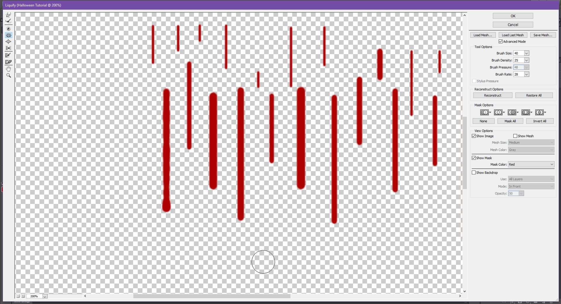
Once you’re happy with all your embers, to give it an even more realistic look, change the brush size and shape to one that is close to that snow one I showed above, then paint around the outside of some of the trails. This will make it look like some of the embers are floating off.

I did my floating embers on a different layer so I could easily erase and replace any I didn’t like without having to re-do the ember trails.
This also leads me to a very helpful tool when working with PHSH Effects: If you need to apply the same effect to a different layer, you can do so quickly by holding down the ALT key on your keyboard, then clicking on the FX symbol in the Layers Panel and dragging it to the layer you want to apply the effect to.

You’ll know if you did it correctly if all the Effect Text under the layer and the FX symbol transfers to the new layer.

And that’s it!

Because I didn’t do my char/burn layer super dark, I had to do my ember trails more subtly, so it looks like the building is just starting to catch fire, opposed to being in the middle of burning. I also took out the floating embers, because realistically, I don’t think there would be enough embers to have some floating up around the trails I made.
This means, my finished project, looks like this:
Which is the image I used on social media.
But, don’t worry – up next, I’m going to show you how to add flames to your burning image, so you’ll get to see a much cooler/less subtle version of the embers, just in time for Halloween!
Like this tutorial? Check out more here!


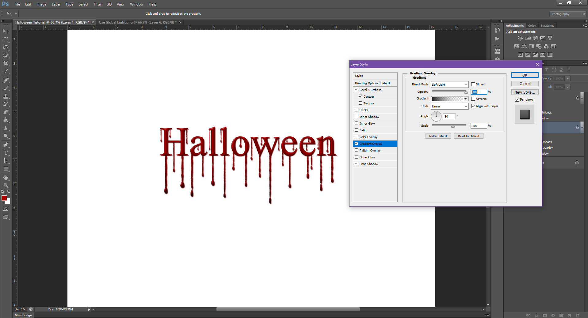
 If you noticed my Layers panel has an extra layer, this is because I created 2 tear drop shapes. The first one I forgot to fill with white, and then wondered why Step 3 wasn’t working. I had to go back and re-draw the tear, so it will be a different shape for the rest of the tutorial. Also see? Even us pros mess up!


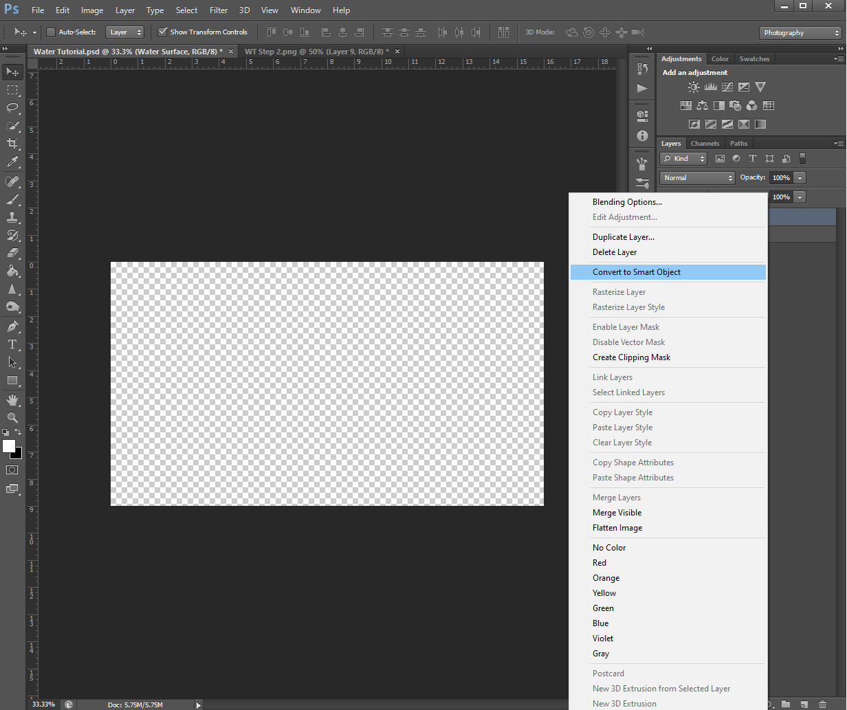
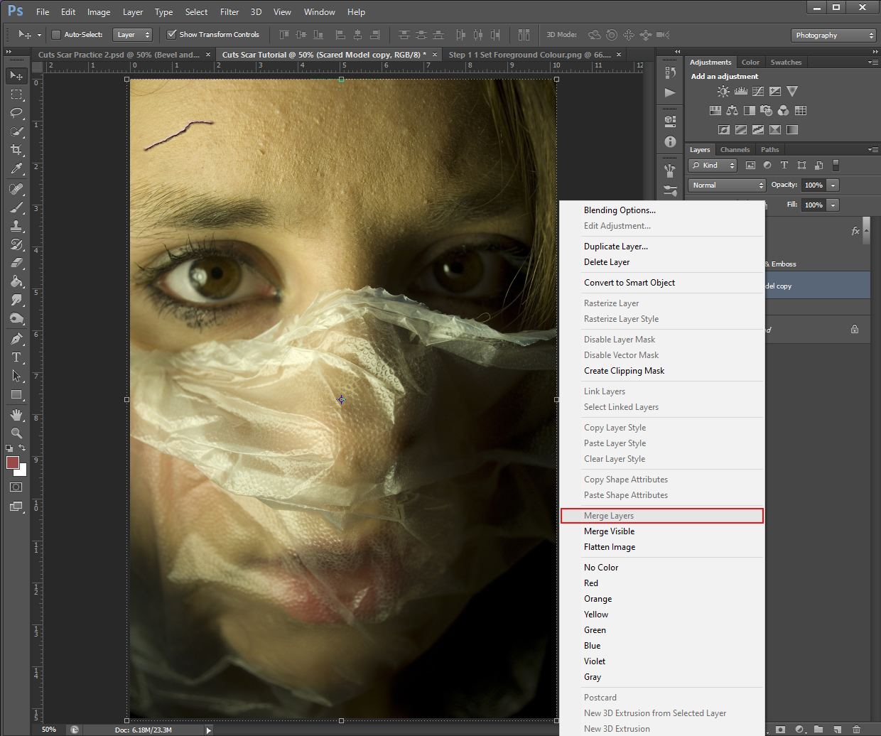 The option Merge Layers shouldn’t be greyed out if you have both selected. My option is greyed out because my computer is dumb sometimes and won’t show a click drop-down menu when I want it to. The picture above is my options while only having 1 layer selected.


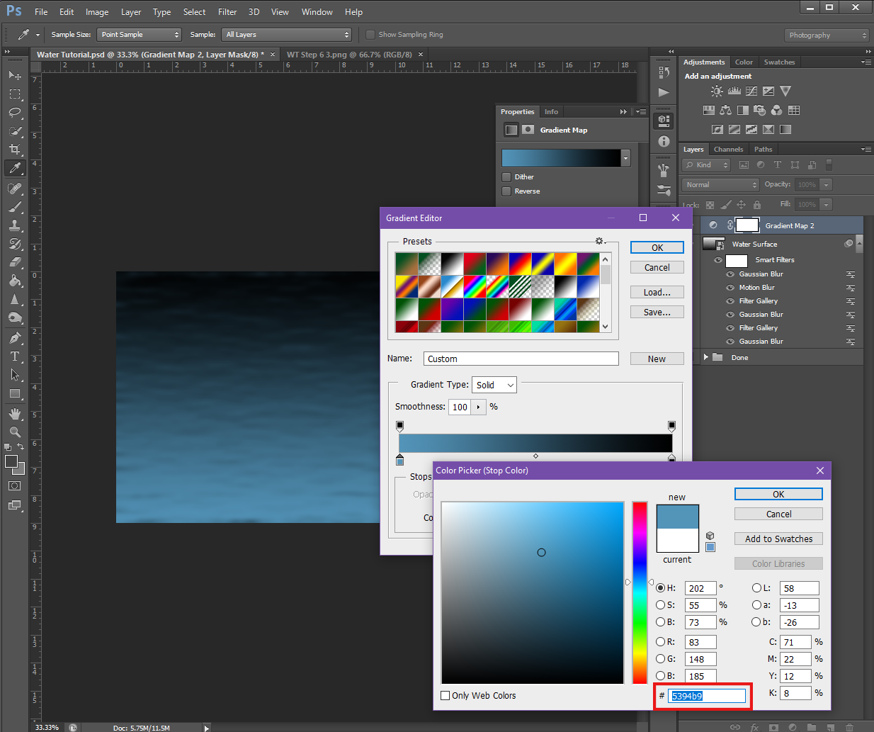
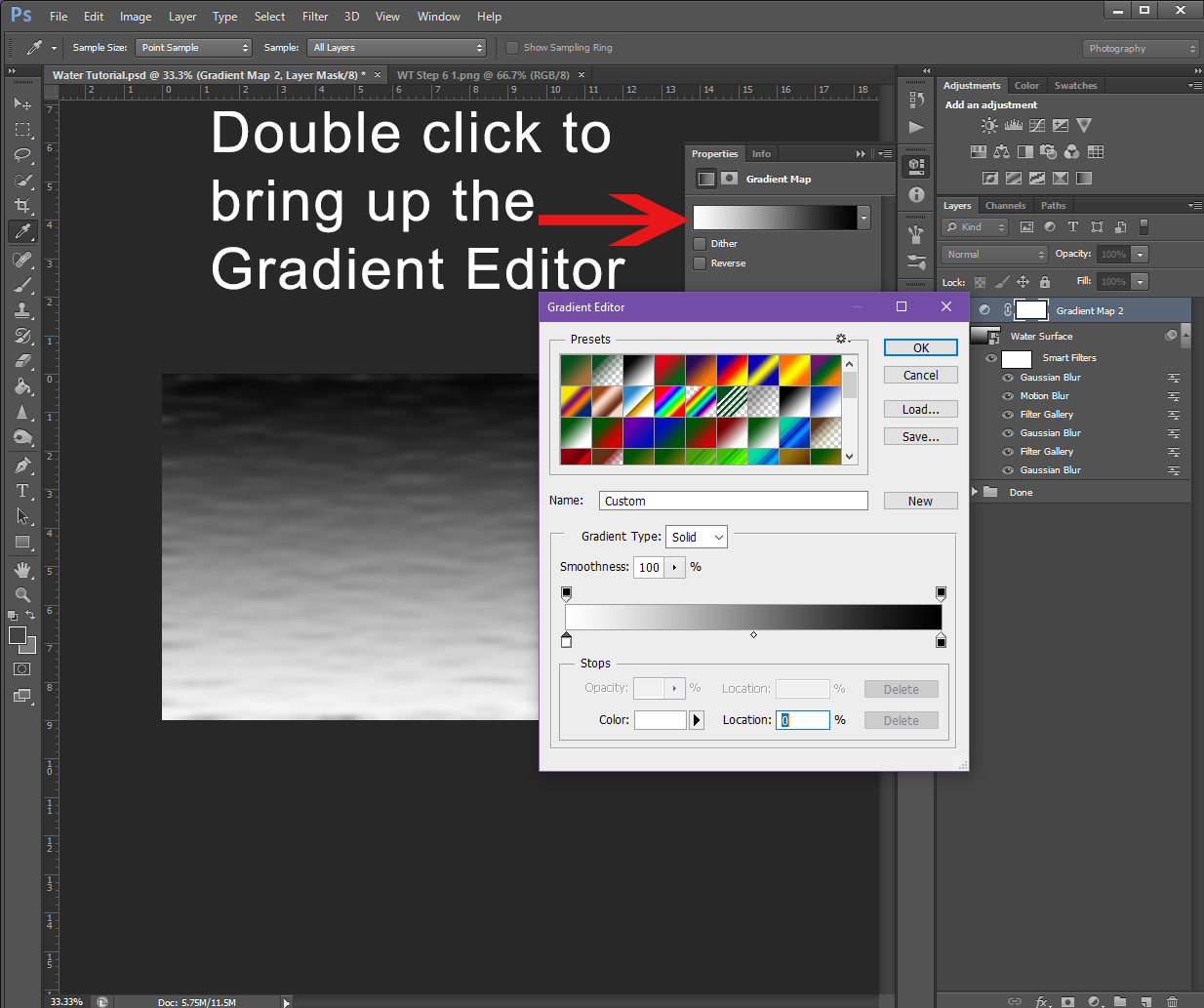 Gradient Editor
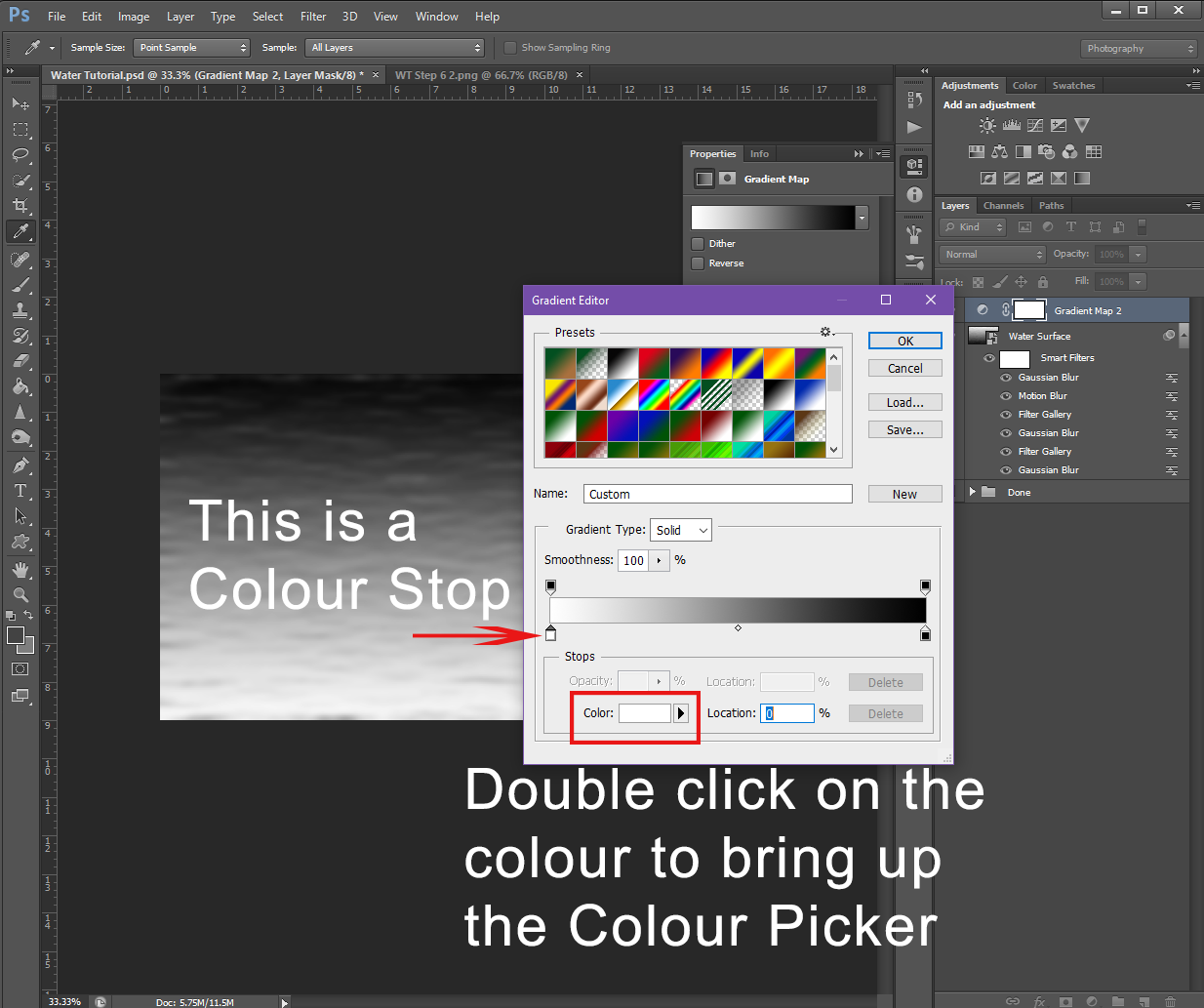 Double click Colour Stop to bring up Colour Picker