Alright, now that we’ve tackled some practical effects for pictures, it’s time to switch gears and show you how to edit the picture as a whole.
For this months’ tutorial, I’m going to show you how to change the background of a picture from the default white (or any other colour) to transparent. This is handy for, say, if you want to change the colour of the background, or if you’re making merch, and want the design to be available on an array of different coloured backgrounds.
This also comes in handy if you ever need to add a picture that has a background to your existing design. Instead of erasing around the foreground object, you can make the background transparent and then just place it. This can save you a lot of time. (Trust me)
Let’s get started.
First things first, you’re gonna need an image with a background you want to make transparent. For the purposes of this tutorial, I’ll just be using this:
Simple, yes, but the steps are the same no matter how complicated an image is.
Step 1. Make a new Colour Layer. It can be whatever colour you want.
Step 2. Switch back to the image, and select the Magic Eraser. Click on the white spaces of the image, and the white should disappear.
Step 3. Continue using the magic eraser on the image until all the white is gone.
Step 4. Now that the white is gone, all we have to do is delete the Colour Layer. Do this by clicking and dragging it down to the trash can on the bottom right side in the Layers Panel.
Once you delete the Colour Layer, you’ll see the background of the image change to grey and white checkers, this now means the background is transparent. You can now save this layer as is and use it for whatever backgrounds you want. Whether it be solid colours, or actual pictures, your transparent pic is now ready to use.
That wasn’t so hard, was it? Check out next months’ tutorial, where I’ll show you how to do this magic:
Like this tutorial? Check out the rest of the series here!
Liking the site? Consider signing up for my Patreon, so I can continue bringing you the content you love!
This month, we’ll be keeping with the word effects, and I’m going to show you how to make a carved/chiselled effect on wood, metal or concrete.
There’s two ways I’ve found to do this, so I’ll be showing you both. They both take roughly the same amount of skill, but one of them works better for making the words looked carved into a variety of backgrounds, and the other is more specific to the three backgrounds listed above.
This is the first way, which looks best on either a wood, metal or concrete background, using the Times New Roman or another similar font.
This is the second way to do it, and as you can see, it easily works on a non-wood, metal or concrete background, and doesn’t need to be done using the Times New Roman font.
Way #1:
Step 1. Get a metal/wood/concrete background. You can do so by either finding one on a royalty-free image site (such as Pixabay.com) or, you can right-click and save the two pictures below to use as the background for this tutorial.
Step 2: Once you have the pictures, open PHSH and make a new document. Drag the pictures to your work document and resize if necessary. Once that’s done, type a phrase or sentence you want to change. For the purposes of this tutorial, I’ll just use ‘Carved’. Also, to keep things simple, I’m just going to use the Times New Roman font, and made it 150pt size. (My canvas size is roughly 25cm x 17cm)
With this way to do it, you’ll want to make sure that your font colour is just plain black.
Step 3: Right-click on the Type layer (‘carved’ word) and go to the Blending Options.
In the Default Blending Options (the panel that opens right when you click on it), go to Blend Mode, and select Screen from the drop-down menu.
Step 4: Once you select Screen, you’ll notice the word disappeared. Don’t freak out, it’s still there (as evidenced in the Layers panel), we just can’t see it right now.
Next, go to Bevel and Emboss, and copy the values listed below:
Style: Outer Bevel
Technique: Chisel Hard
Depth: 200%
Size: 12 (or 6 depending on how the finished product looks)
Angle: -45, 30 (be sure to uncheck the Use Global Light box)
Highlight Mode: Overlay, Opacity: 100
Shadow Mode: Multiply, Opacity: 75
Step 5: Once you’ve got that all changed, then go down the left-side list to Inner Shadow, and input these values:
Blend Mode: Multiply
Opacity: 100%
Angle: 120 (uncheck Use Global Light)
Distance: 16
Choke: 16
Size: 12
Once that’s done, go down the list again to Colour Overlay, and apply these values:
Black
Blend Mode: Overlay
Opacity: 55
Once you’re done applying all three of those effects, click Okay to apply them to the Layer.
You should notice the text changing while applying each of those effects, and once you apply the Colour Overlay, you should notice the word now looks like it’s carved into the wood.
And that’s it for this way! You can press on the Eye symbol in the Layers panel that’s next to each Layer, so you can see the effect on the teal metal and the concrete backgrounds.
Now that I’ve shown you how to do that way, I’ll show you how to do it the second way below. Be sure to save the above work so you don’t lose it!
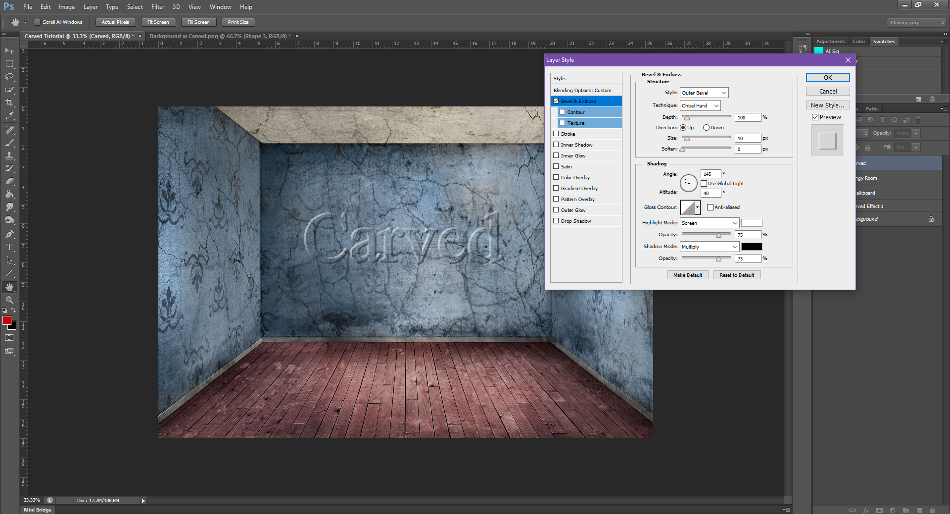
Way #2
Step 1: Open a fresh document, and drag and drop any other background you want to use. (This time it doesn’t have to be a wood/metal or concrete picture) For this one, I’ll use a room with wallpaper and a chalkboard.
Step 2: Type the word/phrase you want to use. Again, I’ll just be using ‘carved’ for the tutorial.
Step 3: This time, go to Fill, which is in the top of the Layers panel, and change it to 0%.
Step 3: Now, we’ll be going back to the Blending Options, and back to Bevel and Emboss. Change the values to:
Style: Outer Bevel
Technique: Chisel Hard
Depth: 100%
Direction: Up
Size: 10, Soften: 0
Angle: 145, 40 Degrees (Uncheck Use Global Light)
Highlight Mode: Screen, Opacity: 75%
Shadow Mode: Multiply, Opacity: 75%
Now go back down to Inner Shadow:
Blend Mode: Multiply (Black), Opacity: 90%
Angle: 145 Degrees (Uncheck Use Global Light)
Distance: 15, Choke: 30, Size: 15
And lastly, back down to Colour Overlay:
Blend Mode: Soft Light
Colour: Black
Opacity: 75%
Once you’re done that, click Okay to apply the effects. Don’t forget to save your work!
As they are now, both these effects look pretty much the same. The one (big) difference here, is the first way tends to not look right if you try to use a font that’s not close in nature to Times New Roman, and doesn’t work that well if you change the font colour from black.
This second way works for a myriad of different fonts and colours. It’s also faster to do, which can help save you time so you’re not spending too much time on one effect.
Another thing I’ve found works best using the second way, is changing the colour used in the Colour Overlay.
For example:
Looks fine on the chalkboard background, too. Although we’d need to rotate the text to make it match.
Here, I used way #2, but instead of using black for the Colour Overlay, I used red – giving the poster a bit more of a morbid feel by making the words look like they have blood in the dents.
Feel free to play around with different colours, angles to see which combination works well for what you need. Also, a quick side note: the Distance/Choke/Size values will most likely vary depending on the size of your font. Don’t be afraid to play around to see how the effect will look in different situations.
As always, don’t forget to save your work as either (or both) a PSD and/or PNG file. I’d hate to have you get the effect just right and then lose all that hard work because you forgot to save it!
Next time I’ll show you how to give a picture a transparent background. Keep your eye out for that July 29th.
In keeping with the theme from last month, we’ll be continuing with text manipulations (check out the basics here). Specifically, we’ll be going through the different kinds of Warping Text there is.
Now, there are 15 different options to warp text in PHSH, I’m going to go through all of them, but will try to keep it brief. You can play around with the settings yourself and see what you like best.
Like the Drop Shadow, Warping Text isn’t the hardest PHSH effect to learn, but can definitely come in handy.
Alright, let’s get into it.
Step 1: Make a new document/project. (Mine is 6in x 6in, for simplicity)
Step 2: Using the Type tool, add text to the document. For the sake of the tutorial, I’m going to just work with ‘warp text’. The Warp Text effect will work with whatever you type, so if you need to say add text to a book cover (or poster), it won’t matter.
To keep things basic, I’m also just going to stick with black text on a white background, and Times New Roman, but again, this effect will work with almost every font/colour/background.
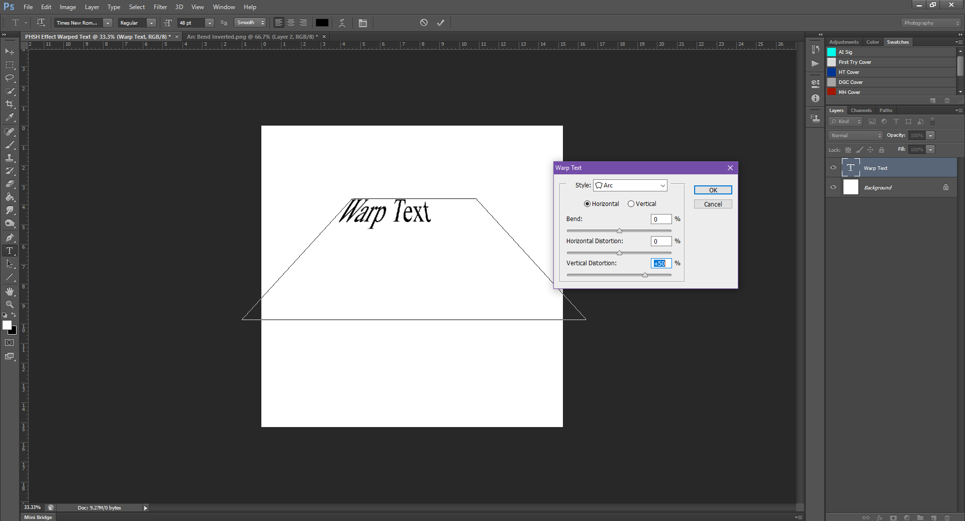
Step 3: While still using the Type tool, right click in the text box, then select Warp Text from the options.
Step 4: From the Style drop-down menu, first warp option we’ll be using is the Arc. (If you’re using a different version of PHSH, the order of the effects may change, and/or you may not have all the effects listed)
Once you click on the Arc option, you’ll notice your text is well, arced. See those Bend, Horizontal Distortion and Vertical Distortion options? These are the things we’ll be using for all the effects in this dialogue box. And, depending on the values, they’ll change how the text looks.
For example, my default Bend value is +50. This made the text arc so wide that it’s now cut off from the document. To get it back on the document, I can either lessen the Bend value, or, I can click ‘Okay’ (if you’re happy with the warping done) and then I could easily just move the text layer over so it’s no longer off the edge of the document.
Because this is just a tutorial, I’ll ‘fix’ it by lessening the Bend. To do this, just click and drag the arrow along the line, and you should be able to see the text change with the changing Bend in real time.
See how the text is getting less Arced? If you go past the 0 on the scale, it will begin to Arc down.
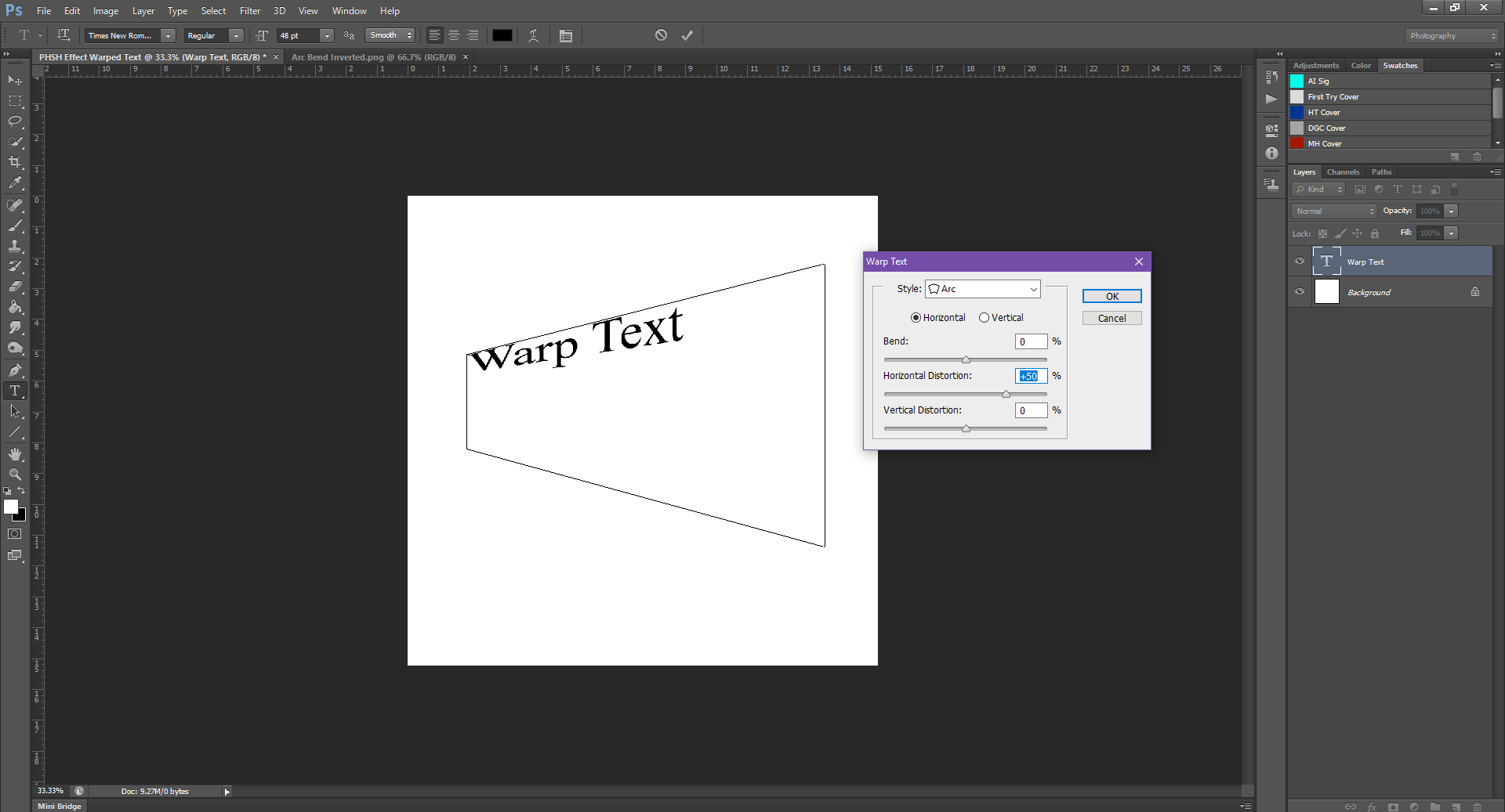
Once you get the right Bend you need, you can move on to if you need to Horizontally or Vertically Distort the Warp. The Horizontal Distortion values will either squish, or enlarge one side of the text, while the Vertical Distortion will make the text look like it’s flying at, or away from you. (Like the scrolling text at the beginning of Star Wars).
I left the Bend at 0 for the following pictures so you can see each value by itself.
Now that you know what these values do, you can use them in conjunction with each other.
The below pictures are the text with a Bend + Vertical and Bend + Horizontal Distortions.
That’s how those values act with the Arc Style. If we choose another Style from the drop-down, the options will remain the same, but the way the text is warped will change.
To keep things simple, I’m just going to go down the list in order, and show the effect with Bend only. The Horizontal and Vertical Distortions do the same thing for each, and I don’t want the pictures to get too repetitive.
You can also change the options from being applied horizontally to vertically, at the top, just under the Style selection.
Feel free to play around with these on your own as needed, too. And, once you find a style of warping you like, don’t forget to save!
Next month I’ll be sticking with the text effects and show you how to make this:
Like this article? Check out the rest of the photoshop tutorial series here!
Liking the site? Consider signing up for my Patreon, so I can continue bringing you the content you love!
Now that I’ve shown you how to scale an image without distorting it, I’m going to delve a bit into specifics with this effect: adding a Drop Shadow to text.
It’s not the fanciest or coolest (or hardest) effect you can make in PHSH, but you gotta walk before you can run, right?
Let’s get started.
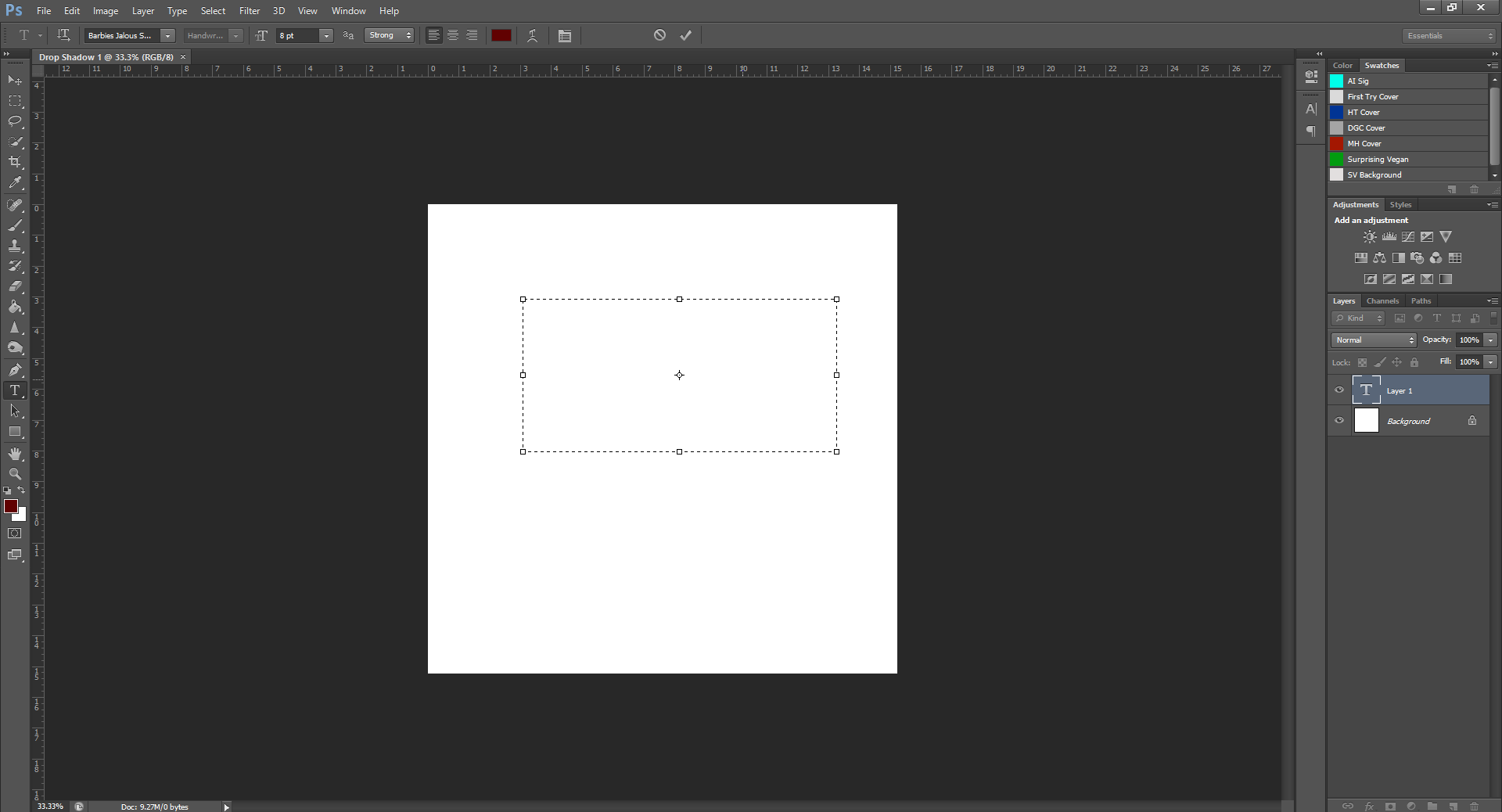
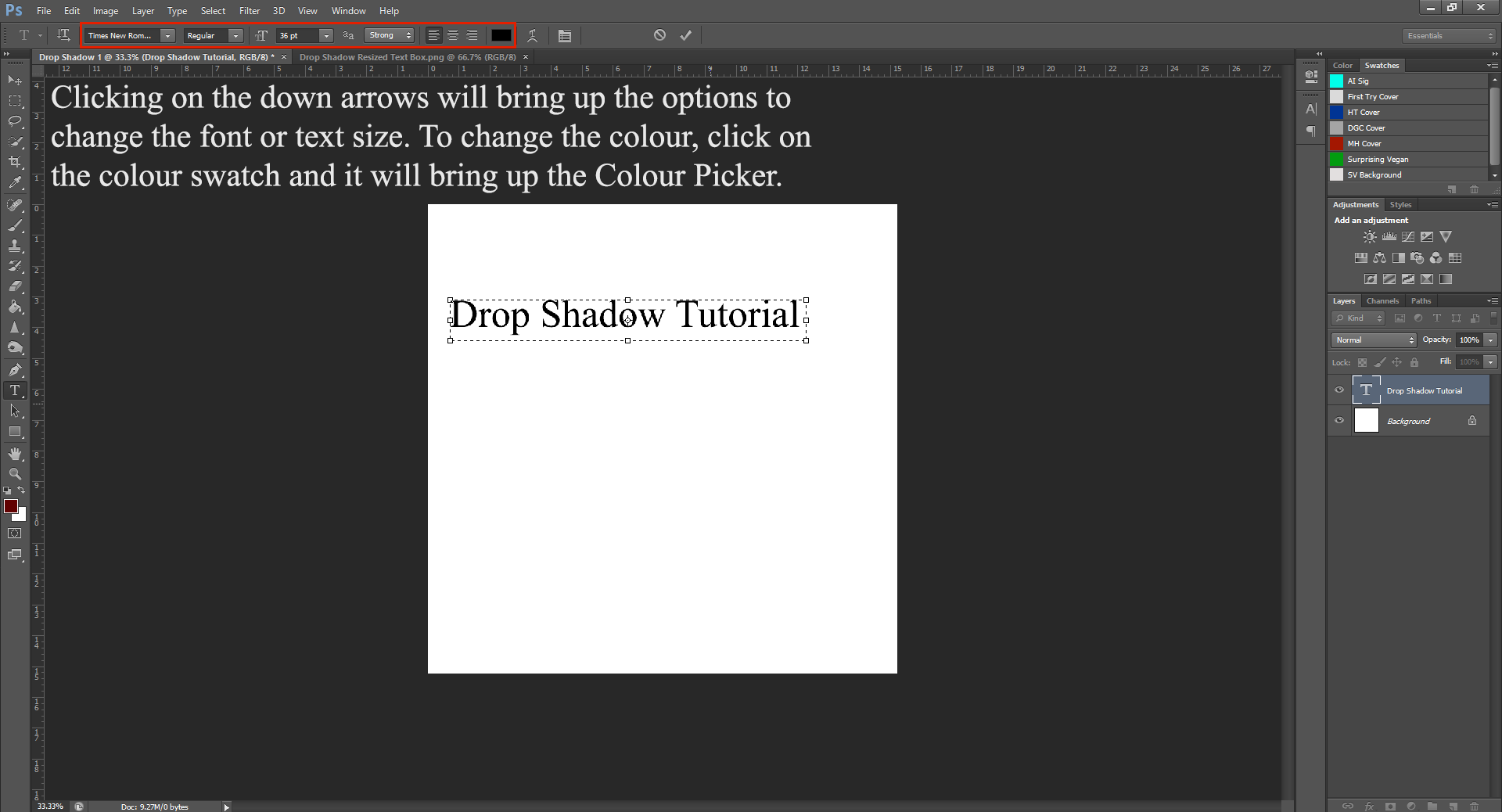
Step 1 – Open PHSH and make a new document. For simplicity, I made my document 6in x 6in.
Step 2 – Going down to your Type tool, you’ll want to click and drag somewhere on your canvas to create a text box. Type whatever you want in the box. You’ll notice that when you create a Text box, it automatically makes the text a New Layer.
Step 3 – To resize your Text box, click and drag one end of the box toward the words typed. Do this until the box is more or less the same size as the words.
Step 4 – You could also change the colour of your text, or the font and size you’re using in the top menu while you’re in the text box.
For this tutorial, I’m just going to keep things simple and leave the text black against a white background.
Step 5 – In the Layers panel (to the right) right-click on the Text Layer and select Blending Options from the menu.
Step 6 – From the left-side menu in the Blending Options dialogue box, click on Drop Shadow.
Step 7 – This is where it can get complicated, depending on what you need the Drop Shadow for. Since this is just a tutorial, I’ll try to keep this part as simple as possible.
Looking at the Drop Shadow options, these values are all the defaults for my computer. If yours is different that’s okay, because you often won’t be keeping the default values anyway.
It’s hard, but you can see the Drop Shadow effect applied between this picture and the last one.
Let’s go through the options:
Blend Mode – This will change how the effect looks. This I feel like has bigger impact on some of the other Blending Mode options, such as Colour Overlay. For Drop Shadows, I usually just leave the default Multiply setting.
Beside Blend Mode, you’ll notice there’s a colour swatch. Clicking on it will bring you to the Colour Picker, where you can change the colour of your shadow. This is helpful if you want to match the shadow to the background colour of your document.
Opacity – This changes how dark the shadow appears. If you want the shadow to be more transparent, lower this setting.
Angle – This changes how the shadow looks. For instance, the default angle 120 makes the shadow appear from the top left corner down. Playing around with the angle will change where the shadow appears. (I drastically changed the distance to better demonstrate the changing angles)
Also, I always uncheck the Use Global Light box that’s by the angle. If you’re adding a shadow to more then one piece of text, Use Global Light will change the angle, distance, etc. for all the text, not just the one you’re working on. This can be annoying if needing to add multiple text boxes. I would recommend getting in the habit of always un-checking this box.
There’s a little grey square to the right side of the options, this is a preview of where the shadow is. In case it’s hard to see on the document, you can use this preview to help you determine what works the best for your project.
Distance – This changes how far away from the text the shadow is. For better showing of the angle, I jacked the distance to 150. I usually don’t have the distance too far away from the words. Usually when I work with Drop Shadow, I leave it around 5-10. One thing I’ve noticed is depending on the size of the font, you may need to make the shadow distance greater, without it looking too far away from the words.
Spread – This changes how ‘thick’ the shadow looks. The higher the number, the thicker it gets.
Size – This changes how big the shadow actually is. Changing the size is great if you want to ‘soften’ the shadow, or make a shadow appear more like a fuzzy glow.
I changed the size of the Drop Shadow here to a higher number to give it that blurry/neon lighting effect. I also changed the colour from the black to red.
Contour – I’m not entirely sure what this does, to be honest. I believe it’s something similar to the angle the shadow is? I don’t really use this, unless a specific effect I’m Googling tells me to.
Noise – This will change how ‘smooth’ the edges of the shadow look. Remember white noise channels on old school T.V.s? This is essentially that. I usually leave this to the default 0. I’ve yet to have a need to add noise to a shadow.
Feel free to play around with these settings to get the desired shadow effect you want. When you’re done playing around with the settings, click the ‘Okay’ button on the side to apply the effect. If you need to change the effect after, just right-click on the layer again and head back into Blending Options. You’ll be able to edit the effects for as long as you keep the Layers separate. Once you flatten the image/save it as a PNG or JPEG file, you won’t be able to edit the effect, due to the fact the work was collapsed into one single layer. This is why I always save a PSD version (I usually label it ‘UnFlattned’) along with a flattened picture, just in case I need to go back and change something.
Like this tutorial? Check out the rest of the series here!
Liking the site? Consider signing up for my Patreon, so I can continue bringing you the content you love!
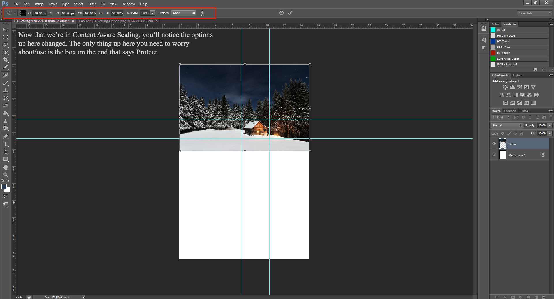
This week, I’ll be showing you how to Content Awareness Scale and image. Which is a really fancy way of saying we’re going to learn how to resize an image, while protecting a part of the foreground that we don’t want to distort.
If you didn’t, please check out my PHSH Intro post, as this one builds on what was learned there. (Also, if you need a refresh of how to add an image to the PHSH document)
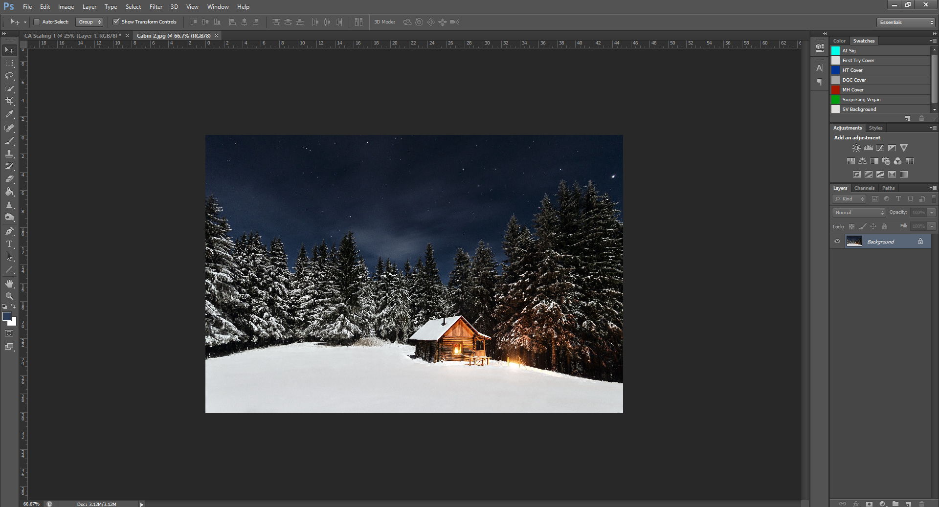
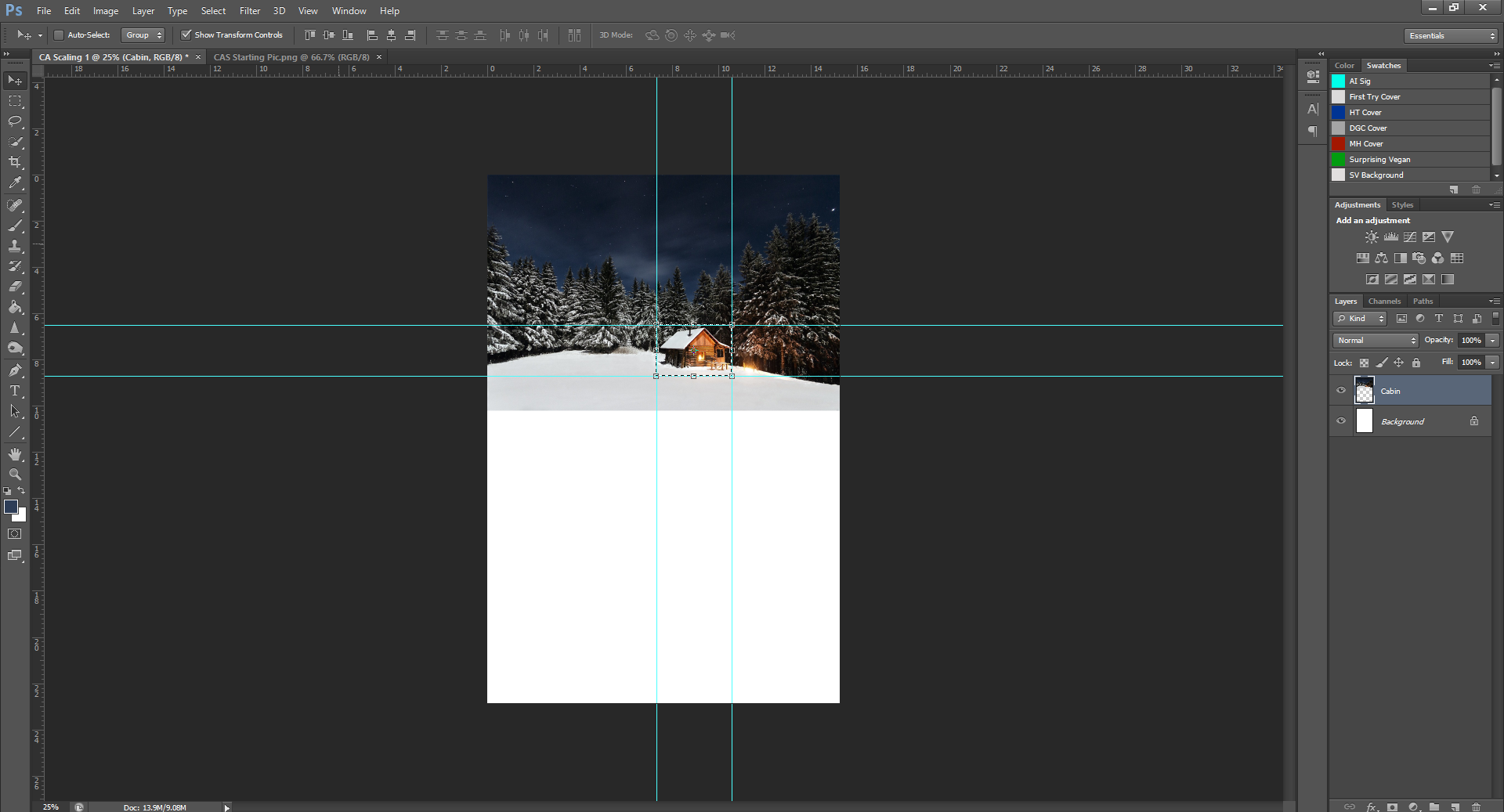
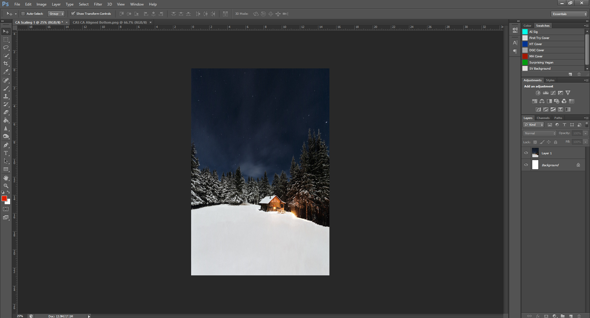
Okay, so, for this tutorial, we’ll be using the cabin picture I used on my Holiday Treats book.
Please right click on the image, save it, then open it in PHSH, so you’re starting here:
Alright, now that you’ve got that, we’re going to change the document size to 6inx9in. Resize the image to fit into the newly sized canvas.
Okay, now the first step is to use the Selection tool to draw a box around the cabin. (Feel free to use the Guidelines to help you if needed)
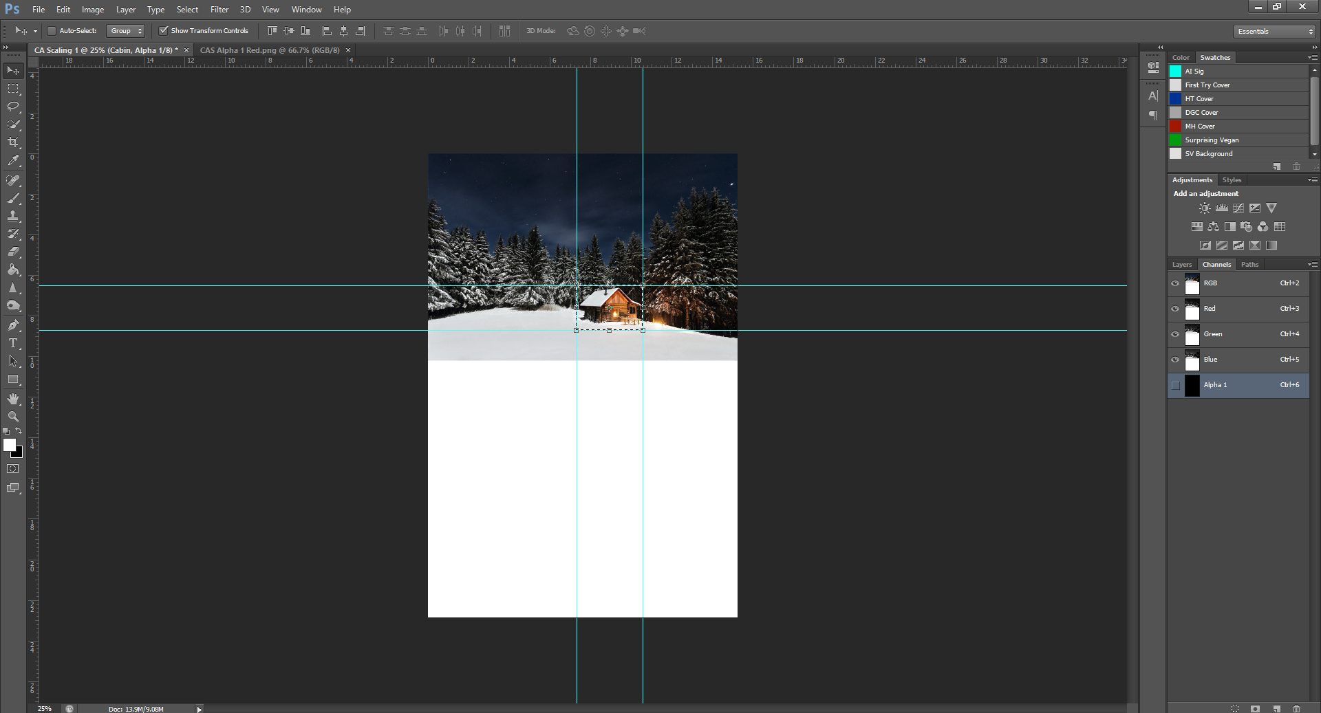
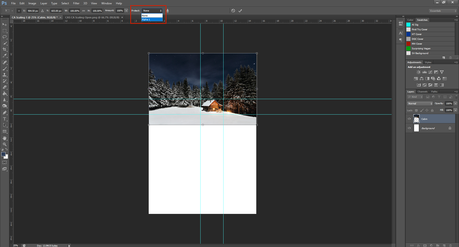
In the right hand side panel, see how you’re currently in the Layers panel? Click over to the Channels panel, then go down to the bottom and click the New Channel button. This will create a new Channel with just the cabin. It’s fine to leave it named Alpha 1, the name doesn’t really matter.
Now that your document is the right colour, and we’ve created Alpha 1, switch back over to the Layers tab. You’ll notice now that you’ve switched back, the Layer you had previously selected is now greyed out, instead of blue. That means it’s no longer selected. To re-select the layer (so we can keep working) you’ll want to click on the Background layer, then click back to the picture layer. It should now be selected/highlighted blue.
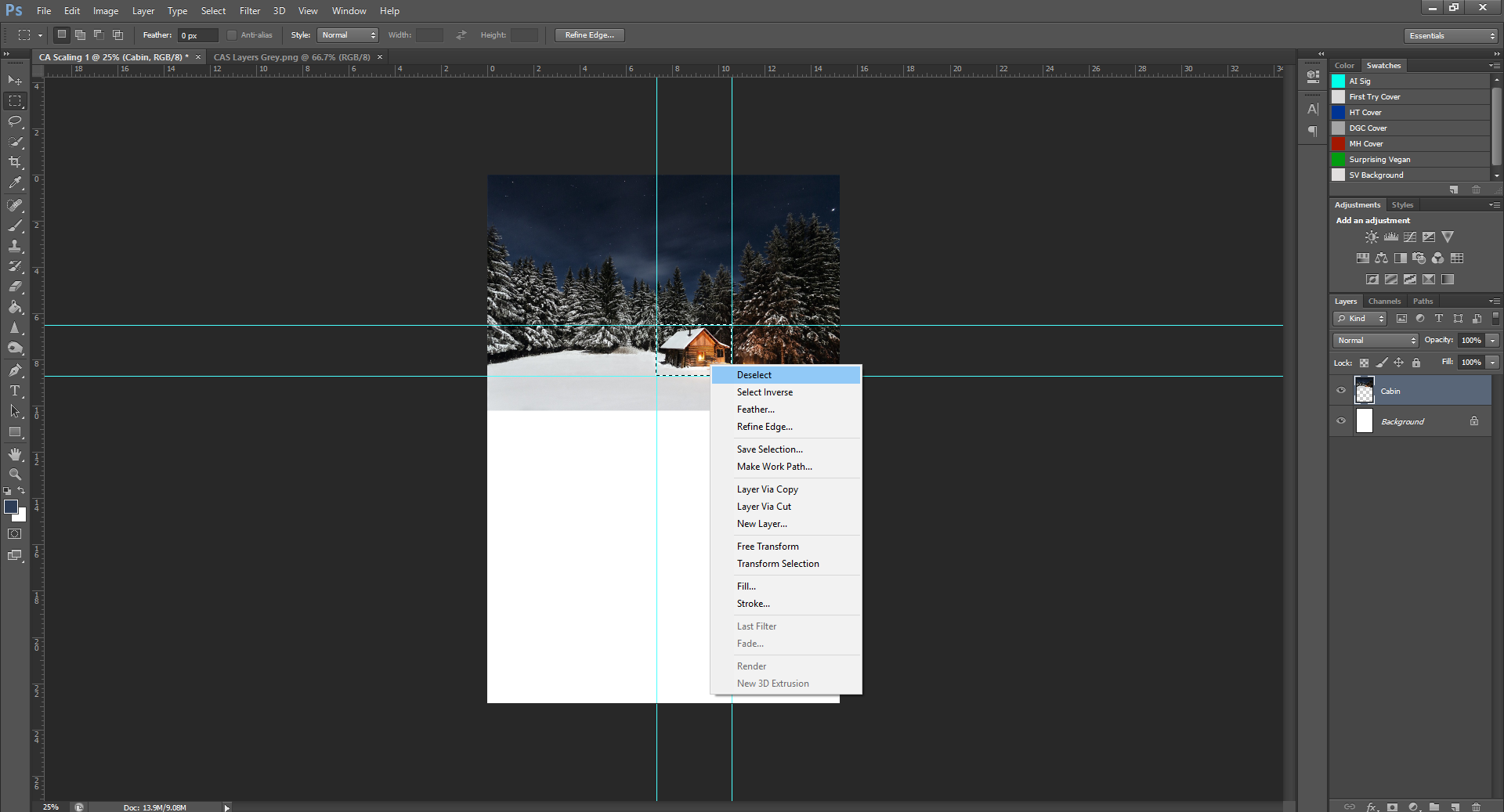
Using the Selection tool again, right click in the box you made and click on Deselect. This will get rid of the box around the cabin – now that we’ve created the Channel, we don’t need the cabin to be selected.
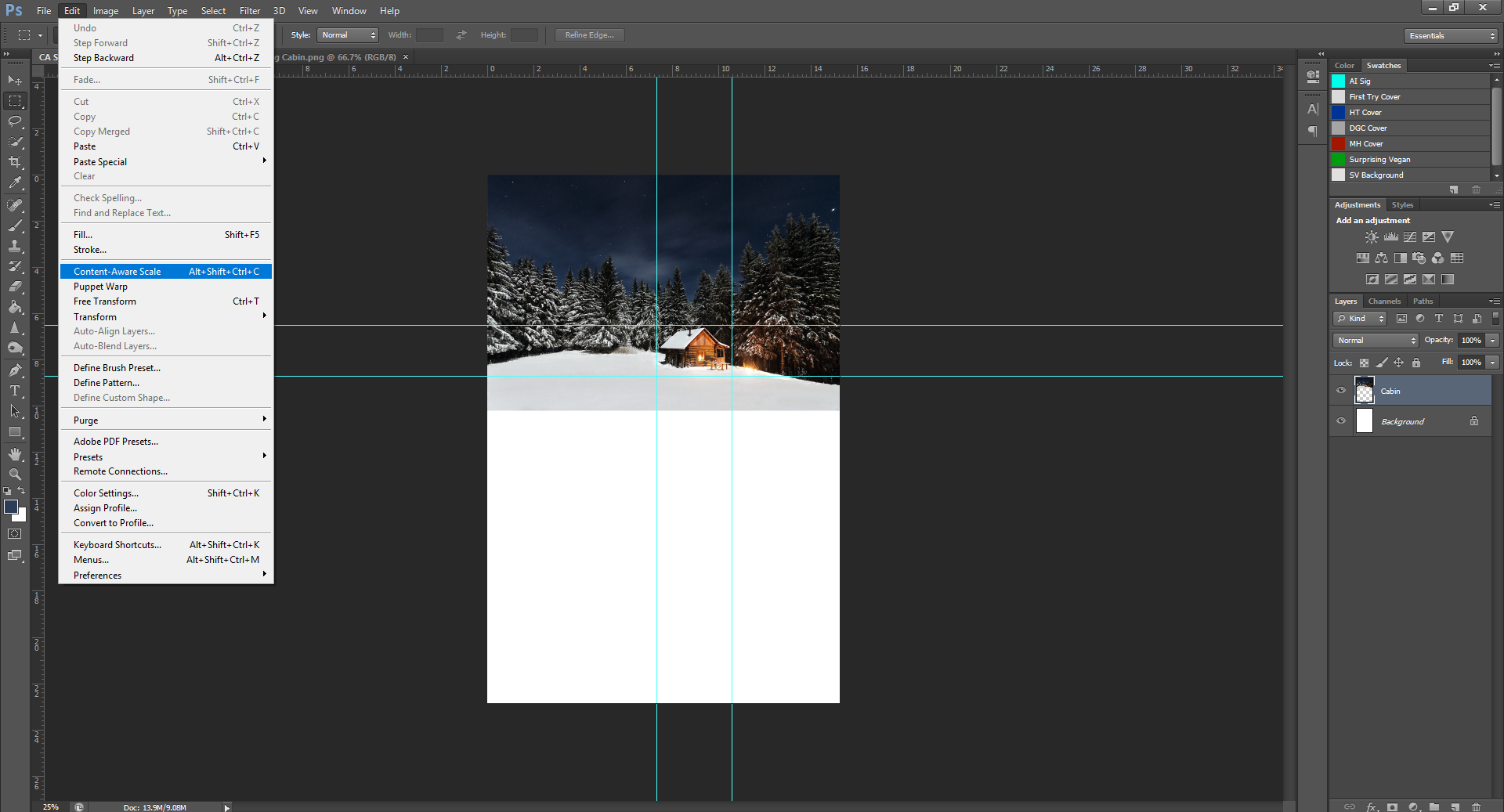
Now we’re basically back to how we started, except we’ve got an extra channel. This is the part where we do the actual Content-Awareness Scaling. (CA Scaling)
Going to the top Menu, click on Edit, then scroll down to Content Awareness Scale and click it.
See the box on the end there that says ‘Protect’? Click the drop-down menu and select Alpha 1. This will… well it’s gonna protect the cabin from stretching while we resize the picture.
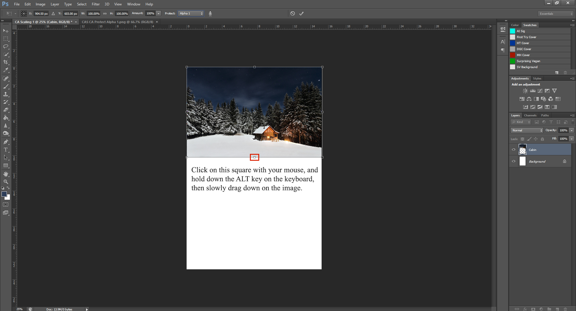
This is the fun part, now we’re gonna stretch the picture, and the cabin won’t be affected.
To do this, click on the box on the bottom in the middle, and hold down ALT as you slowly drag the sizing box down.
You’ll notice that the top of the picture is moving too, that’s what holding down the ALT key does – allows you to move both sides at the same time.
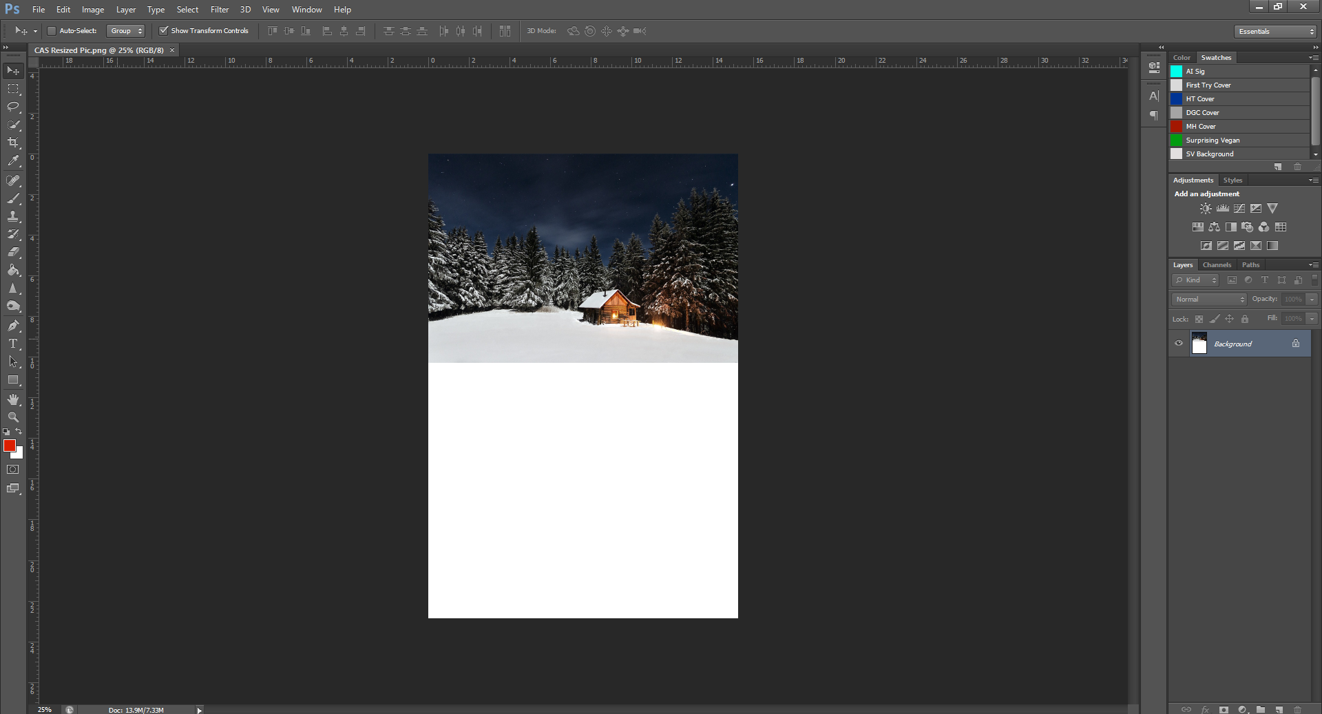
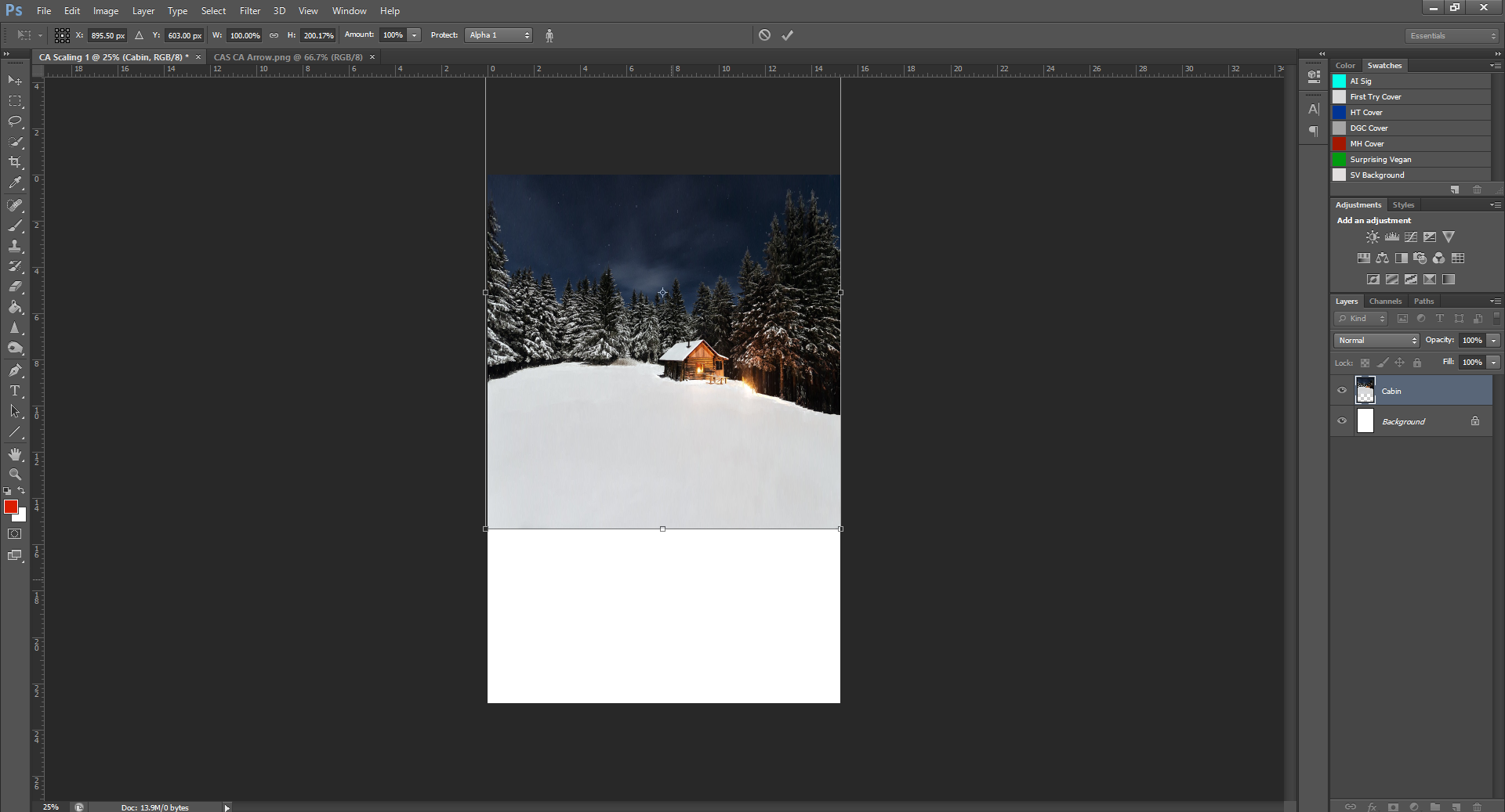
Keep dragging the image until the top of the box disappears off the canvas.
Once that happens, go over to your Select tool, click it. A dialogue box will come up and ask to apply the changes, click Apply. Then, drag the image down from the top of the canvas, lining it up with the bottom.
Notice how much bigger the background is? But the cabin stayed the same size! We didn’t get the picture to the exact dimensions of the canvas, but that’s okay.
To get the picture to the right size, we can just go back up to Edit – Content Aware Scale, and do it again until it matches the canvas size. Don’t forget to Protect Alpha 1!
(For this sizing, we don’t need to hold down ALT, because we just need to stretch the top to the top of the canvas, we don’t need to resize the bottom.)
Ta-da! Now, is the most important part – save.
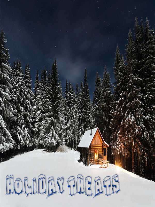
This is a pretty handy PHSH skill I wish I had learned before doing the cover for my book.
For a side-by side comparison, here’s the cover when I first did it (before I knew how to CA Scale) and after I learned.
See the difference? The first one you can definitely tell that I stretched the image.
That’s why this is one hell of a PHSH skill to know how to do, and, it’s not that hard, either. Once you practice and do it a few times, you’ll be able to do it no problem.
Next tutorial, I’ll show you how to add a Drop Shadow to text:
Look out for that May 6th.
Like this tutorial? Check out the rest of the series here!
Liking the site? Consider signing up for my Patreon, so I can continue bringing you the content you love!
You’ve just finished writing this amazing novel, and are so pumped to get it out and into the world. All your dedication, time and energy has been poured into this baby of yours, and you want nothing more then to see it flourish.
Now there’s only one problem: It needs a cover.
But, you’re a writer, you don’t know how to design a book cover! You can barely crop an image in Photoshop – maybe you don’t even have Photoshop. And you definitely can’t shell out a bunch of money to hire somebody design it for you. (There’s a reason ‘starving artist’ is the phrase and not ‘stuffed artist’)
Well, today’s your lucky day – you’ve found the beginnings of an article series I’m just starting to help people exactly in your shoes learn how to make a cover.
No, I didn’t take any marketing courses, nor do I have any formal training. I took a Media Arts class in gr. 10 and learned how to use Photoshop. However, I was requested by JD Stanley to help with their book covers. Before I helped, JD could barely erase a background. Oh, and I made all my own covers, too. (Not to mention the book posters and collages on this website)
Bottom line, I’m not professionally trained – but I know my way around enough to do things myself. It was actually JD who told me I could start this series! (Seriously, some of JD’s questions boggled my mind – what do you mean you don’t know how to zoom in?)
Fear not, I’ll be giving you the low-down throughout the next few months on how you too can not-suck at using Photoshop.
Let’s start at the very beginning: Making a New Document.
Step 1: Do you have Photoshop? If not, you should go download it. (I use CS6, so if you have a newer/older version some details may differ) If you already have it, you’re part-way there!
Step 2: Open Photoshop. (… Double click on the desktop icon)
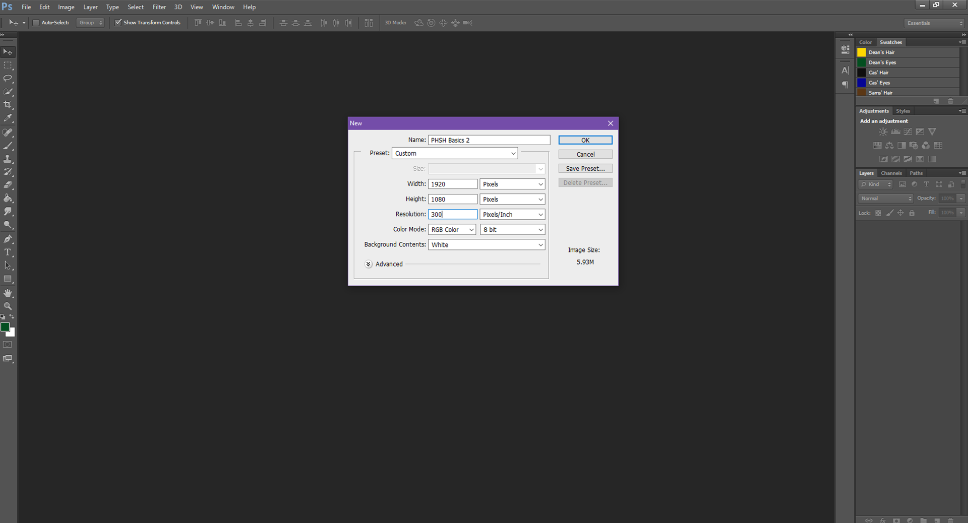
Step 3: Go to File listed in the top menu and select New from the drop-down menu.
Step 4: In the box that popped up, give your file a name. I just chose to keep it simple.
Tip: PHSH = short form for Photoshop. From here on out, I’ll be referring to the program by the short form, because it’s faster to type.
You’ll also want to set the dimensions. My dimensions are set to 1920×1080 (pixels) by default because I was taking screen-shots of myself opening PHSH for this tutorial. You can make the dimensions however big/small you want. You also don’t have to use ‘pixels’ as the unit of measure. I typically use inches. I would suggest you make your dimensions 10x10in for simplicity.
Also, if your Resolution is set to 72px by default, you’ll most likely want to change it to 300px – this will make the image clearer.
Once you do this, click the Okay button.
Step 5: Now that this is done, you should see a white page that’s to your specified dimensions. This is your document size.
If you can’t see the edges of your document, you might be zoomed in. Hold down CTRL and press the minus button (beside the 0 on the keyboard) to Zoom Out. Zoom Out until you can see the edges of the document. This will make working easier.
Congratulations, you just made your first PHSH file! That wasn’t so hard, was it?
Alright, now I’ll be going through the Tools on the Toolbar that are listed down the left-side of the program.
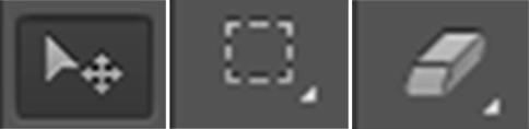
This first one is the Pointer/Mouse function. It does exactly what you’d think – let’s you use your mouse as normal within the document. Allows you to click on different things, etc. You’ll be switching back to this a lot while you work, so it’s important you know what it does.
Next you have the Selection Tool. This allows you to make a selection around a certain part of an image, cut/crop/copy and/or protect a section of a picture from being Erased.
Actually, wait, I’m not gonna go through all the tools right now – I forgot a step. To show you what some of these tools do, you’re gonna need a picture!
Okay, so to Insert a Picture into a document:
Step 1: First, I want you to right click on the image below, and select Save Image As… from the menu. Give it a name, and save it to your Desktop, for simplicity.
Step 2: Now you have the image, go back up to File, and this time, instead of clicking ‘New’, click on Open.
This should bring you to your Desktop. Click on the image I just had you save, and then hit ‘Open’. This will open the image in a new PHSH document.
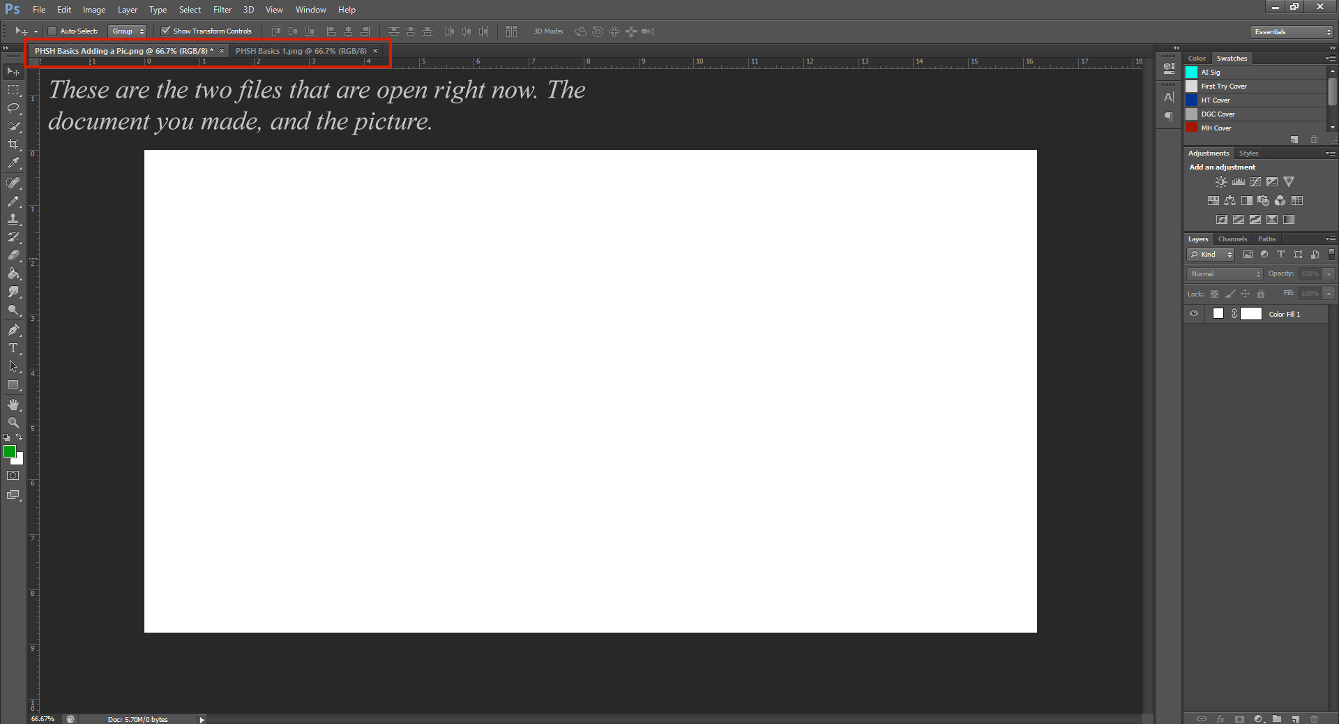
See those tabs? Anytime you have more then 1 PHSH file open, you’ll be able to switch between them by clicking on the tabs.
Step 3: Okay, now we have the image, and our blank document. You’re gonna want to move the picture to the new document.
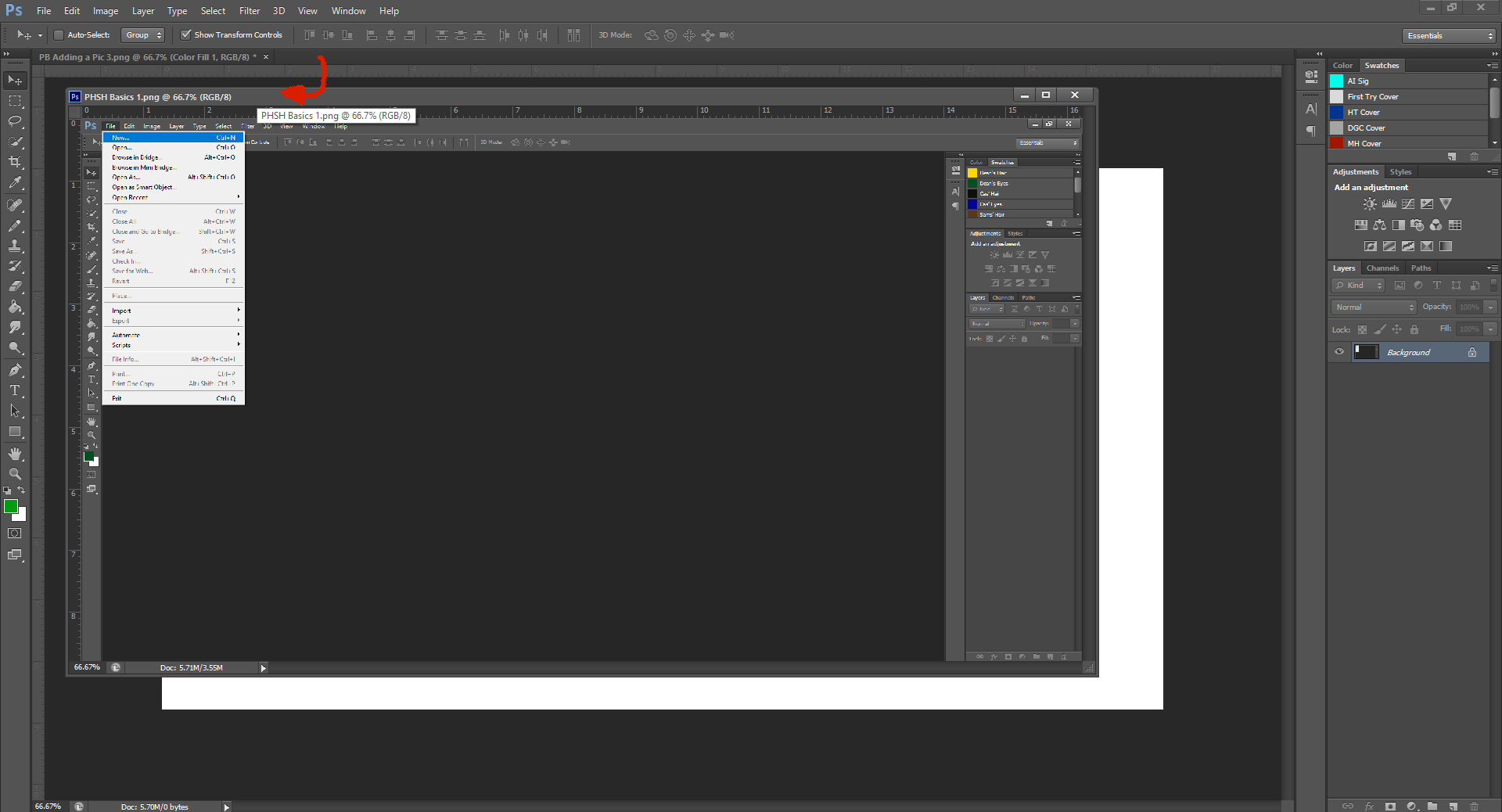
To do this, you’ll want to click on the tab that’s the picture, and drag it off the line, a little to the left. Then let go – this makes the file open in a new PHSH window. (If you’ve ever accidentally opened a link in a new Window instead of Tab on your browser, it’s exactly the same as that, but in PHSH. If you haven’t done that, don’t worry.)
Now, click on the image itself, not the tab, and drag the image into the blank document. Let go once it’s there, and you should see a New Layer with the image was created in your blank document (which should now have the picture)
Now that we have the image in our document, you can Exit the image that’s still open in the window – we don’t need it anymore.
To center the image, click on Layer 1 (if it’s highlighted in Blue that layer is already selected) then, go back to your image, and drag it down into the document until it’s centered.
And that’s how you move a picture into your PHSH file!
Okay, now that we’ve covered that, I’ll be going back to some of the Tools.
I’ll go back to showing you the Select Tool.
Now that we have an image, I’m going to show you how to erase part of the image. (Especially because the PHSH pictures inside a PHSH picture is starting to confuse me, so we’re gonna fix that)
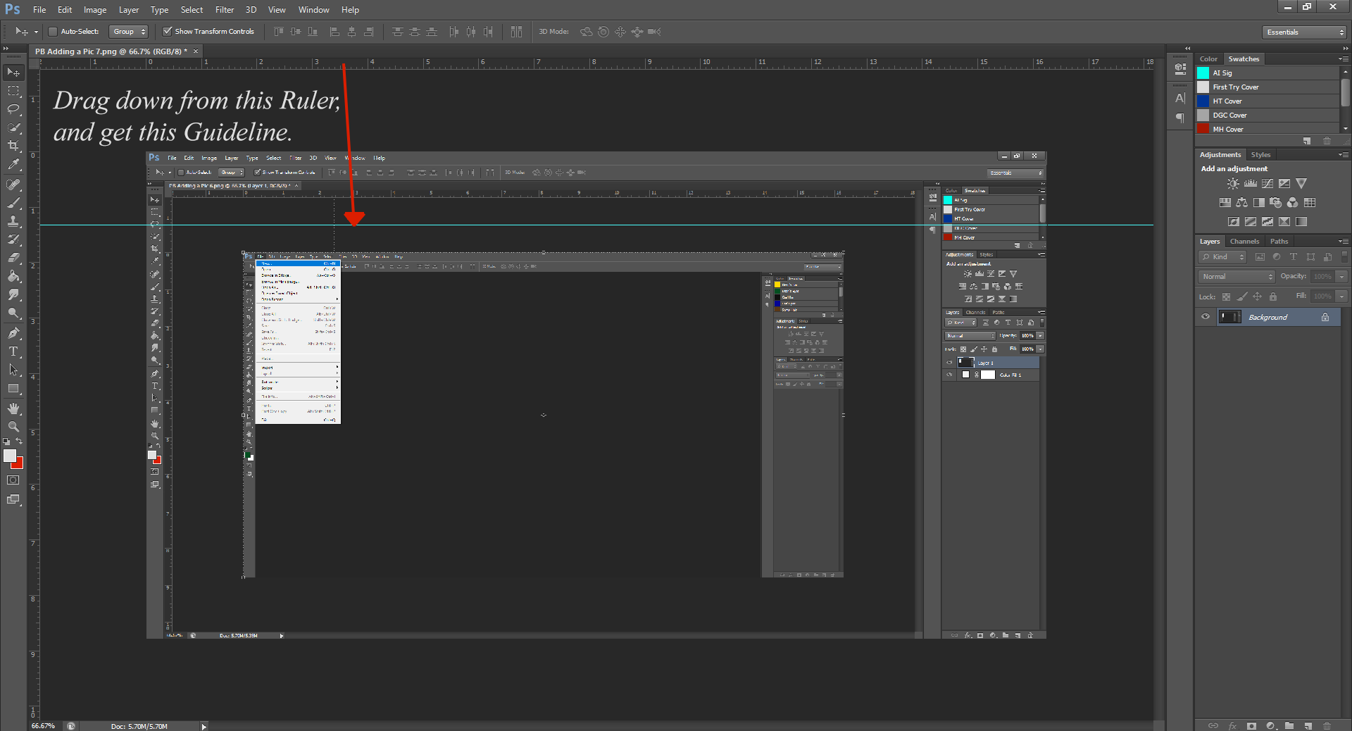
Okay, first: See the Rulers that are around the edges of the file? Click and drag down from the top Ruler – a turquoise/green line should now be on the document – this is called a Guideline. If you don’t have Rulers showing, go up to View and click on the Ruler option listed. (There should now be a check mark next to the option – this means it’s turned on)
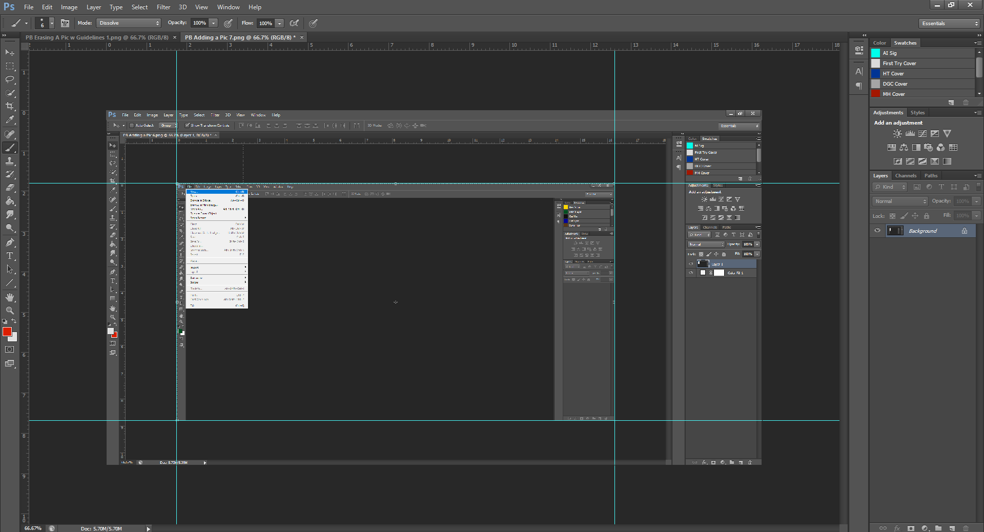
You’ll want to drag this Guideline to the edge of the image we centered. Then, go back up to the top, and drag another one to the bottom. Drag two more Guidelines out from the left-side Ruler, so now the image should be completely boxed in by the Guidelines.
Now that you have your Guidelines in place, go over to the Toolbar, and click on the Select Tool.
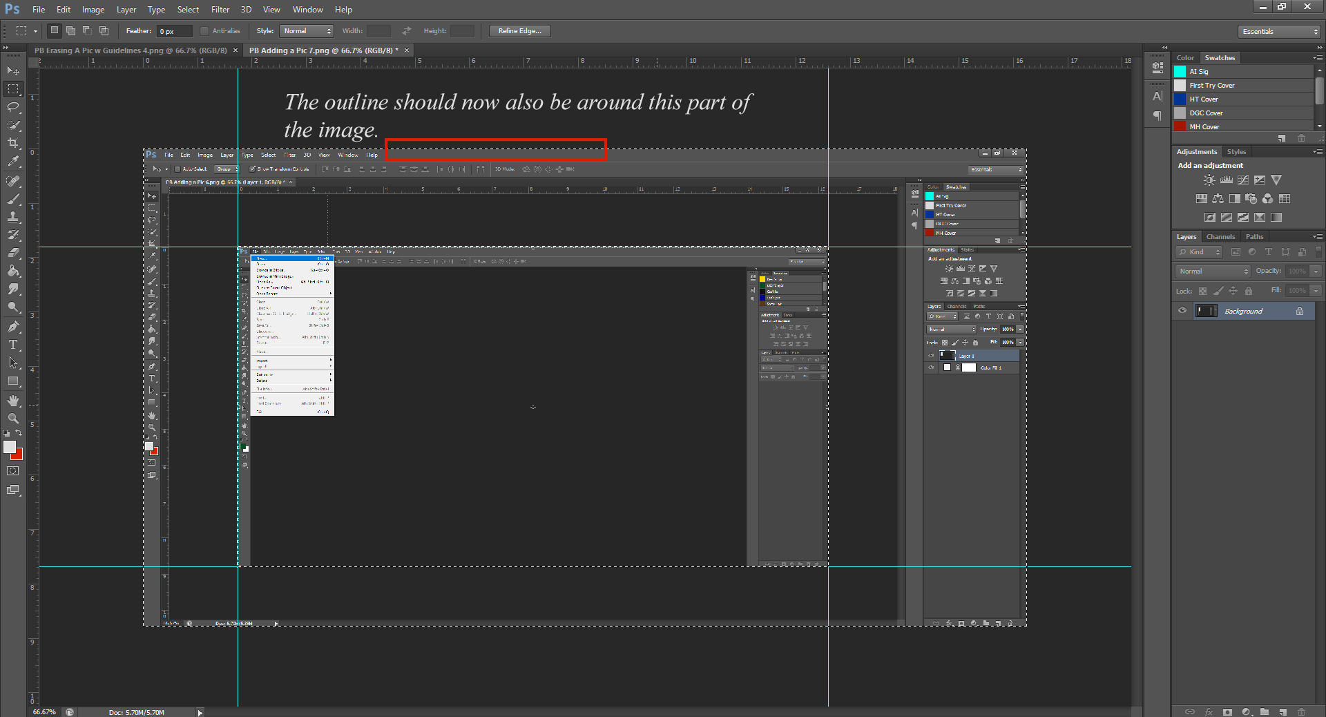
Click and drag the outline box to the dimensions of the Guidelines. (It might ‘snap’ once you get close to the lines, that’s okay) Let go, and now you should see a dotted box along the Guidelines.
Right-click in the Selected box/Guideline area, and select the Select Inverse option. You should notice that now there’s a bigger perforated box outlining the whole picture.
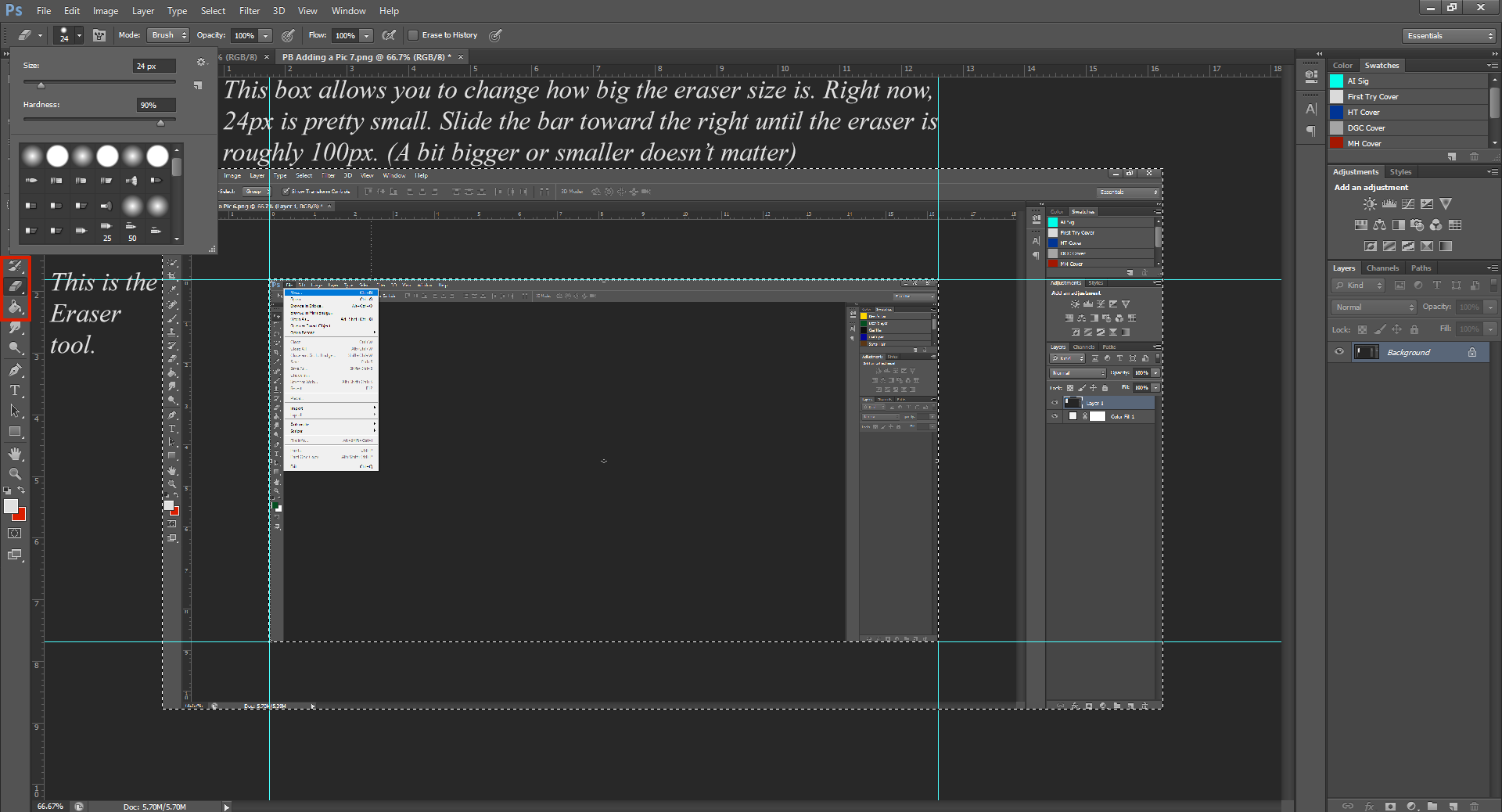
Now comes the less confusing part. Go back to your Toolbar, and select the Eraser tool.
Now that you’ve got the Eraser selected, click and drag your mouse (exactly how you used to do it in Paint) around the image, and you’ll begin erasing the outer-part, without touching the part we selected before. Because we inverted the selection, the part we want to keep is safe, and you’ll only erase the outside of the image, regardless of if your mouse touches the part we want to keep.
(Your background colour is hopefully white instead of red, don’t mind that. It’s typically white)
Continue erasing until just the middle part remains.
Now, go back up to the Select tool, right-click again on the image, and this time click on Deselect. Now the selected box is gone, you’re left with only the image. To get rid of the Guidelines, you can just drag them back up into the Rulers and they’ll disappear. (Make sure you switch from the Select tool back to the Mouse tool)
Now that we’ve erased the background, we need to change the dimensions of the document, to get rid of all the white space.
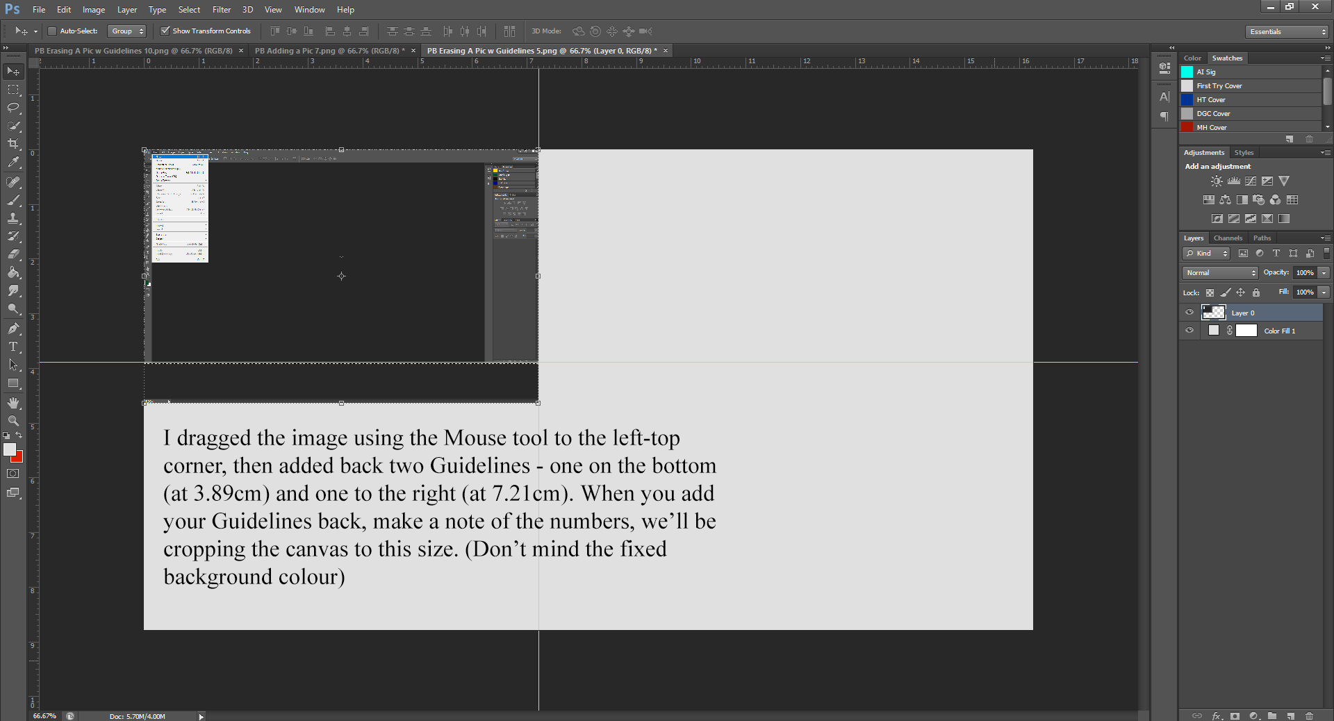
To do this, (the easiest way) is to drag the picture to the top left corner, and then place two Guidelines at the bottom and to the right of the image, taking note of the dimensions.
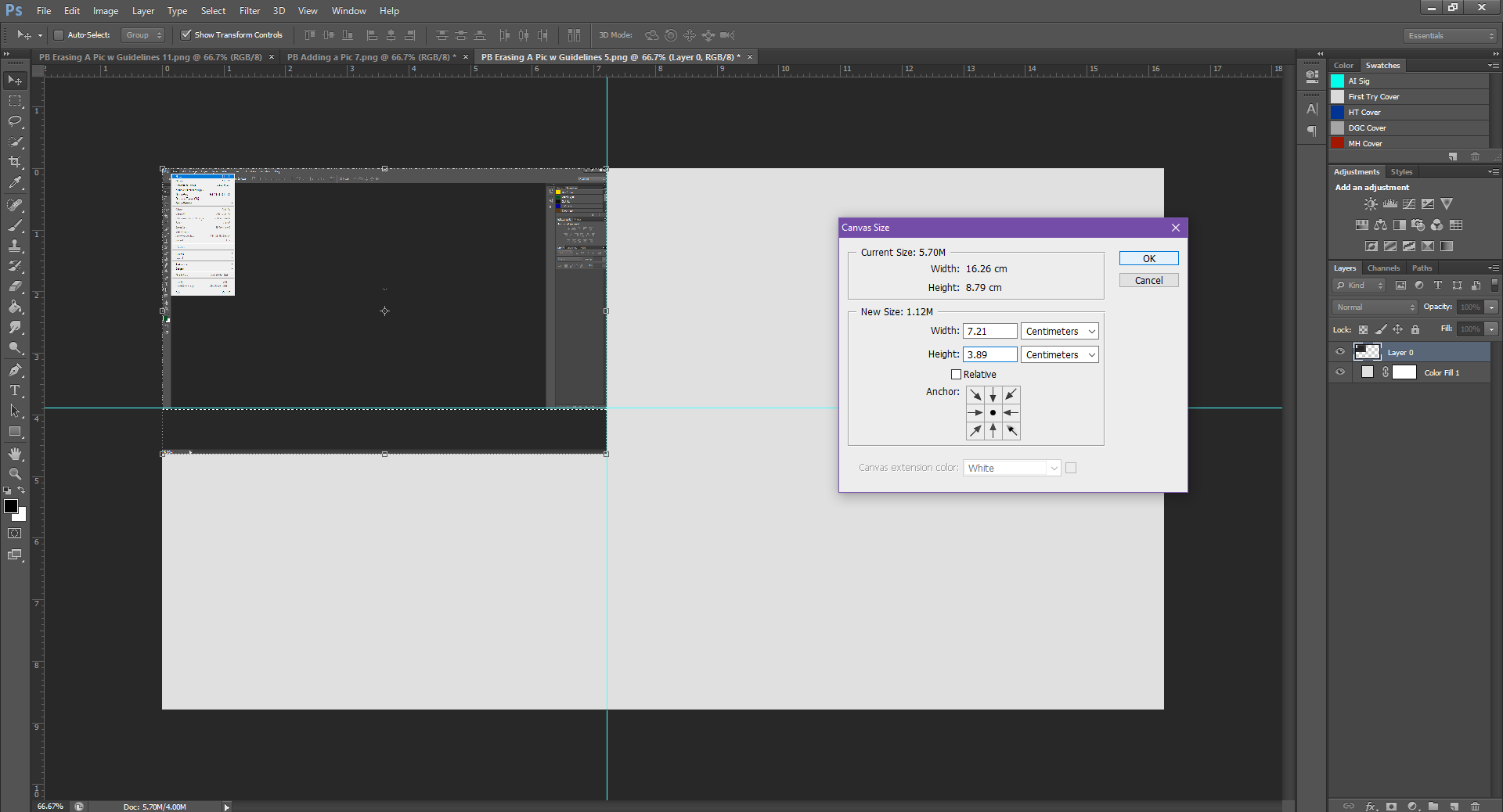
Once you’ve made a note of the Guideline dimensions, go to the menu at the top and click on Image, then go down to Canvas Size.
In the Canvas Size box, you’ll be able to change the dimensions of your canvas. Type in the dimensions you got from the Guidelines (mine were 3.89cm x 7.21cm) and click Okay.
Don’t freak out – your picture is still here! The canvas size shrunk, so now it’s outside of the canvas size. Using your Mouse tool, drag the image to be centered on the canvas again, and this time, it should be a perfect fit, with no white background showing.
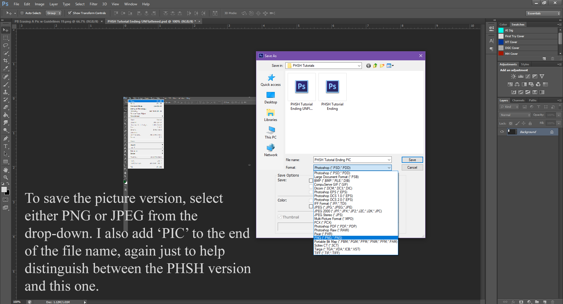
The last step always: SAVE.
We’ll be saving two versions of the file. The first being a .psd or Photoshop file. Saving your work this way allows you to keep all the layers separate. This is especially handy should you need to return to the image later to edit it further. I usually label these saved files as ‘Whatever Project I’m Working On UNFlattened’ so at a glance, it’s faster to know which file is which.
The second version you’ll be saving as, is either a .png or a .jpeg. These are picture files that condense all the layers to be 1 image. These are usually the images that end up on websites, as profile pictures, and, most importantly, the ones allowed to be uploaded for your book cover. Amazon may also require a PDF version, you do it in exactly the same way, except instead of selecting PNG or JPEG from the list, you select PDF.
And there you have it! You now know how to make a new file, crop images, and save in a few different formats. That’s the most basic aspect of PHSH skills you’ll need.
Lastly, I’ll go through a few of the tools you’ll probably use the most.
I’ve already shown you the Mouse, Select and Eraser tool.
Because I don’t want this tutorial to go on too much longer, I’ll just go through the rest of Tools in point form.
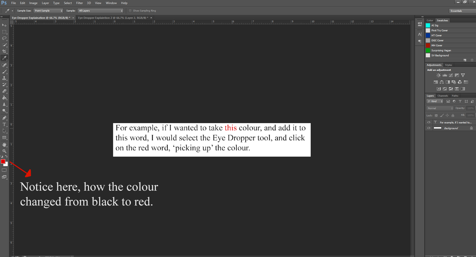
Eye-Dropper – This allows you to ‘pick up’ a sample of colour from one part of the file, and use it elsewhere. You’ll notice when you use the Eye dropper, the colour you picked up is now in the Colour Swatches, allowing you to easily use the colour elsewhere in the document.
Paint-Bucket – Exactly what it used to do in Paint. It fills the entire area with whatever colour you select. (If you have it within a closed shape, it will only fill in the closed shape, not the whole canvas)
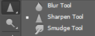
Blur/Sharpen/Smudge – Again, these do exactly as the name implies. They Blur, Sharpen and/or Smudge the picture. You can change the size of them similar to the Eraser tool. This is especially handy if say, you’re erasing a hair line, and need to not make the edges of hair so defined. (You would blur them slightly to make it look un-erased)
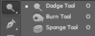
Dodge/Burn/Sponge – I’m not entirely sure what the Dodge or Sponge part of the this tool does (when I used the Dodge tool last, it made the picture turn a grey-er colour), but the Burn tool burns the picture like a lighter. Handy if you want to make the edges of an image appear burned, or if you want to blacken/darken the image as a whole.
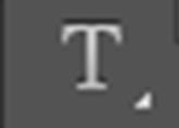
Type – Allows you to add text to the picture. This is what I used to add the text on the images used in this tutorial.
Shape – Allows you to add different shapes to the canvas: Square, Rectangle, Line, etc.
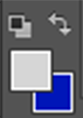
Colour Squares – This is where it tells you what colours you’re currently using. The small arrow above the bigger boxes, will switch whatever colours you’re using currently to black and white.
Alight, I know that was a lot of info to take in, so take a breath – you made it all the way to end! Also, I’m sure that wasn’t nearly as daunting a task as you first thought it’d be. PHSH is funny like that, it’s such a big program, and there are a lot of different elements to it – at first glance it’s definitely intimidating. But it doesn’t need to be. All those different elements just mean you can make some kick-ass pictures with it!
I hope you enjoyed this intro to the world of PHSH, and feel free to practice and play around with the program a bit, that’s how I learned some of the stuff I know.
Next time, I’ll show you a very handy way to scale images without distorting them. You can look for that April 8th.
Like this article? Check out the rest of the tutorial series here!
Liking the site? Consider signing up for my Patreon, so I can continue bringing you the content you love!